
To Add a Trendline in Google Sheets
- Double-click on the chart to open the Chart Editor.
- Go to the “Customize” tab.
- Under “Series,” check the “Trendline” checkbox.
OR
- Customize various aspects of the trendline, including its type, color, opacity, thickness, and labelling.
- You can analyze the fit of the trendline with the “R²” value, with a higher value indicating a closer fit.
OR
- To add trendlines to multiple data columns, follow the same procedure as for a single trendline.
- You can apply trendlines individually to specific series by going to “Series” > “Apply to all series” and selecting the series you want.
In this article, we will learn about how to add a trendline in google sheets. A trendline is a line mostly used in charts that shows the trend between the data within the chart. The trendlines are highly useful and common with scatter charts to immediately describe the trend of the data either upward or downward.
If you look at a scatter chart without a trendline it will be impossible to judge the data direction, but if you add a trendline with the scatter chart you will easily understand where the data is going and what the most impactful area is. This is why we use trendlines and today we are going to learn everything about the trendline, how to add it, how to edit it, how to add multiple trendlines etc.
Use cases of Trendline in Google Sheets
We need so much graphical representation and charts when working with data, we often do critical data analysis and make different charts to get useful insights and understanding of the data in this way we must need to understand the elements of the charts and a trendline is one of the important elements of the chart. That’s why need to learn about trendlines, how to add a trendline, how to customize a trendline, and also how to add multiple trendlines when we have multiple data columns in the same chart.
The trendline is also known as the line of best fit, but in google sheets and data analysis, we called it a trendline which is easier to understand. In general, a trendline is a bound line for the movements of the data variables inside a graph, it looks like a diagonal line can be used when we have a minimum of three or more data pivot points.
How to Add a Trendline in Google Sheets
In this section, we will see step-by-step procedures to understand the trendline, its need, and usage along with the help of examples of charts and dummy data. Let’s first understand how a basic chart looks like without a trendline vs with a trendline.
Add a Trendline in Google Sheets – A Simple Scatter Chart
Let’s make a simple scatter chart with some sample data, to understand this example, follow the steps below
Step 1
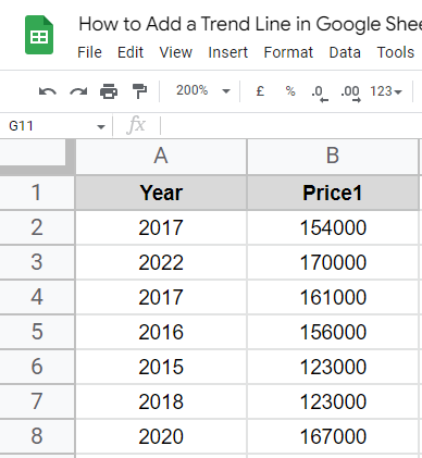
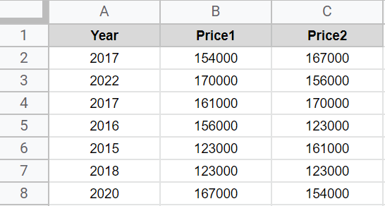
Sample data
Step 2
Add a chart
2.1 Select the data
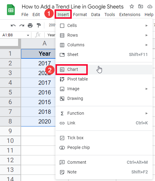
2.2. Go to Insert > Chart
2.3 Select a Scatter Chart

Step 3
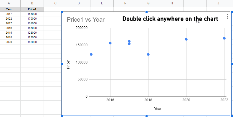
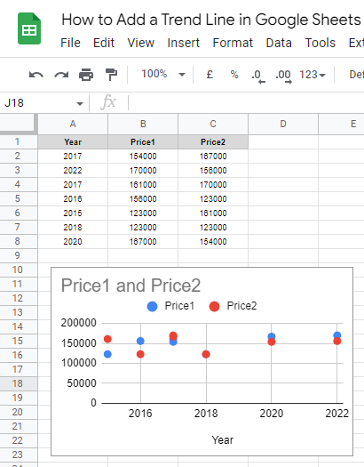
Now you can see the chart is being added (no trendline by default)
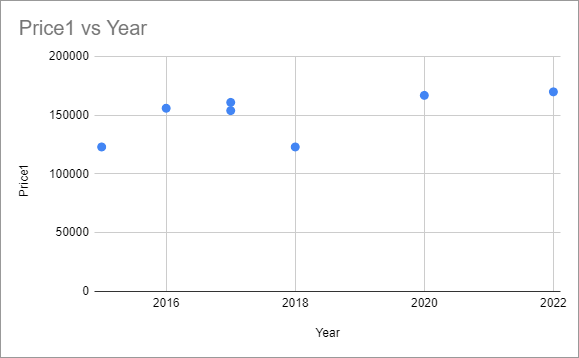
Can you tell the trend of the data looking at this chart? No, you can not
Now let’s add a trendline to this chart.
Add a Trendline in Google Sheets – Adding a Trendline
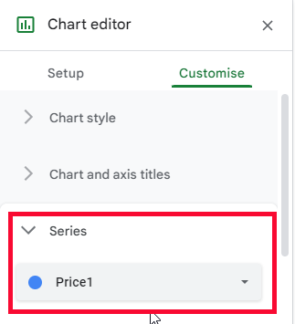
Step 1
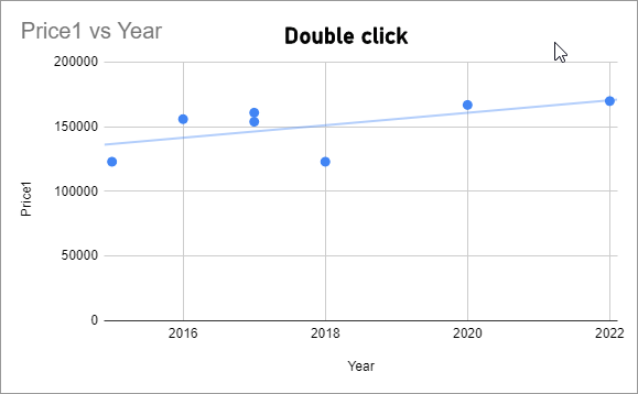
Double click on the chart
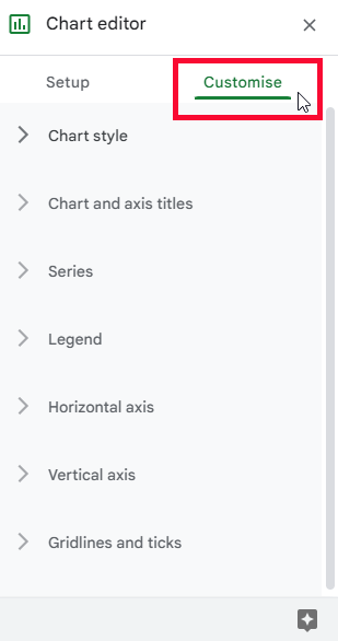
Step 2
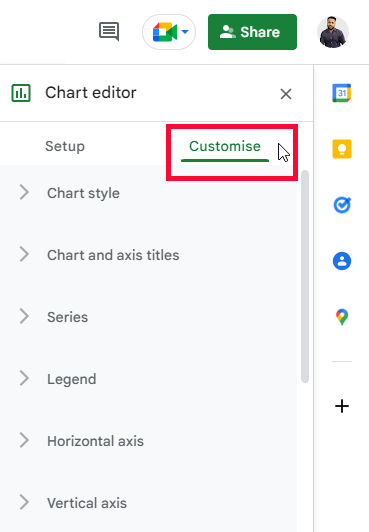
Go to Customize tab in the chart editor
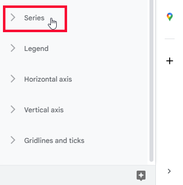
Step 3
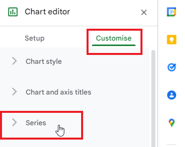
Go to Series
Step 4
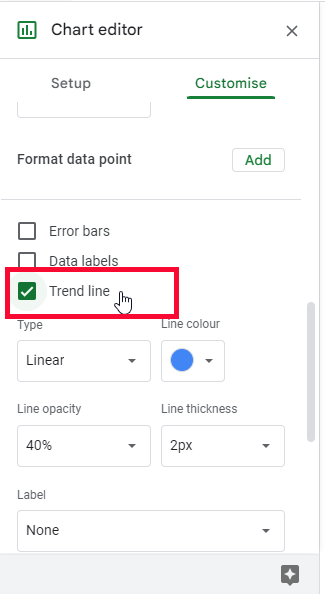
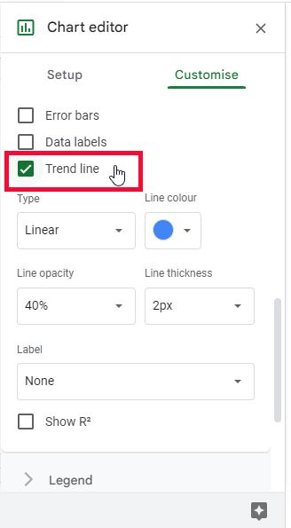
Scroll down, tick on the trendline checkbox
Step 5
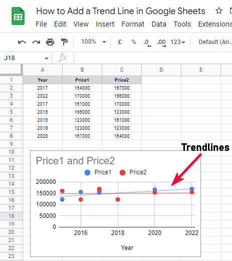
You have added a trendline
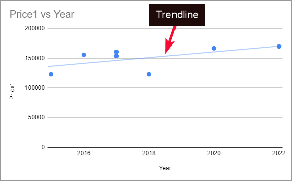
Now can you tell the trend of the data? Yes, easily you can see the trendline and easily tell whether it’s going upward or downward.
This is why the trendline is very important and useful.
We have added a trendline, but can we customize it? Yes, we can customize it, we have a lot of customization options available to customize the color, size, thickness, and many other elements of our trendline. Let’s customize it.
Add a Trendline in Google Sheets – Customizing a Trendline
In this section, we will customize a trendline using the Customize tab of the chart editor.
Step 1
Open the chart editor by double-clicking on the chart
Step 2
Go to Customize tab
Step 3
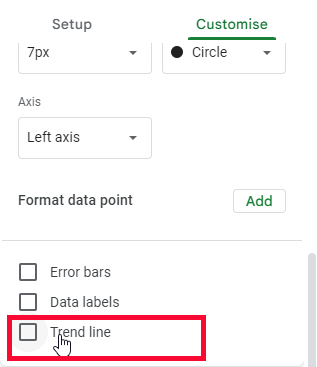
Click on Series Drop down and below you can see the trendline checkbox
Step 4
As soon as you tick on this checkbox, the customization dashboard will appear.
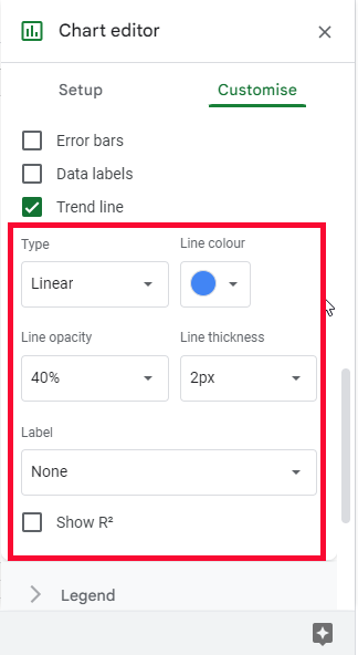
Now let’s see all the options in detail
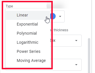
Type
Here, you can change the type of the trendline, you have many mathematical expressions to show your trendline such as linear, exponential, polynomial, logarithmic, power series, and moving average trend lines, the default value is linear
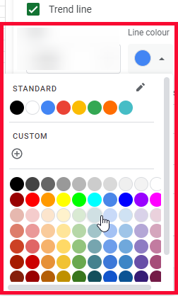
Line color
Here you can set the color of your trendline, the default color is blue
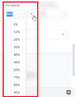
Line opacity
Here you can set the opacity of the line by passing numbers or by selecting from given numbers.
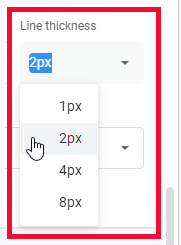
Line thickness
You can set the thickness of the trendline in px, the default value is 4px
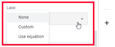
Label
As a label for the trendline, you can use None, Equation, or Custom (you can write your label)
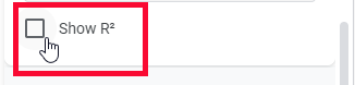
R2 checkbox
This value helps you analyze how closely the trend line fits the data. The closer this value is to the origin, the closer the fit is.
So this is how you can easily customize your trendline using all the above options.
Add a Trendline in Google Sheets – Adding Multiple Trendlines
In this section, we will learn how to add multiple trendlines, for multiple data columns. In the above example, we had one column for both axis but we can have multiple columns for price so in that condition we can easily add two trendlines for both prices. The procedure is the same Go to Series > Tick on the trendline checkbox and all the trendlines will be added for your all columns of data. But, if you want to add a trendline for some columns and not for some columns you can still do that.
Step 1
Multiple data columns
Step 2
Add the scatter chart
Step 3
Add trendline
Step 4
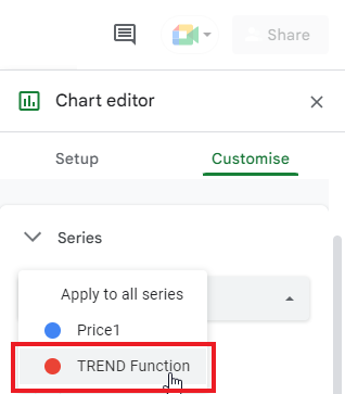
To set a trendline individually for a series Go to Series > Click on the “Apply to all series” dropdown and select individual series to edit
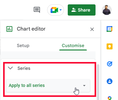
This is how you can apply trendline and all other customization features to specific series of all series.
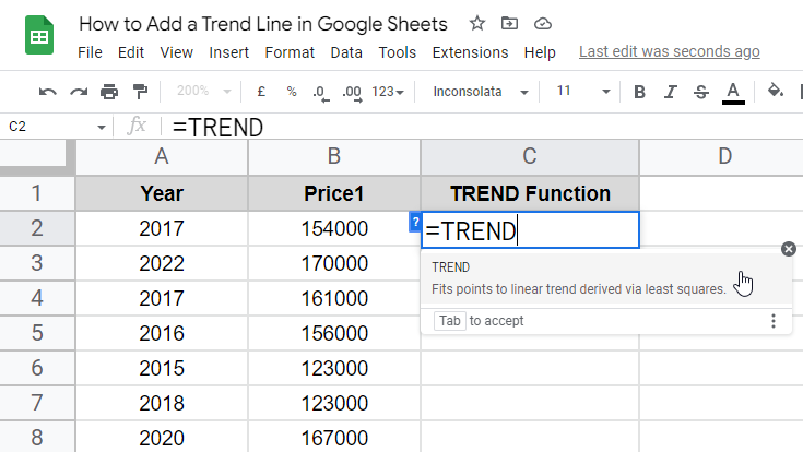
Add a Trendline in Google Sheets – Using TREND Function
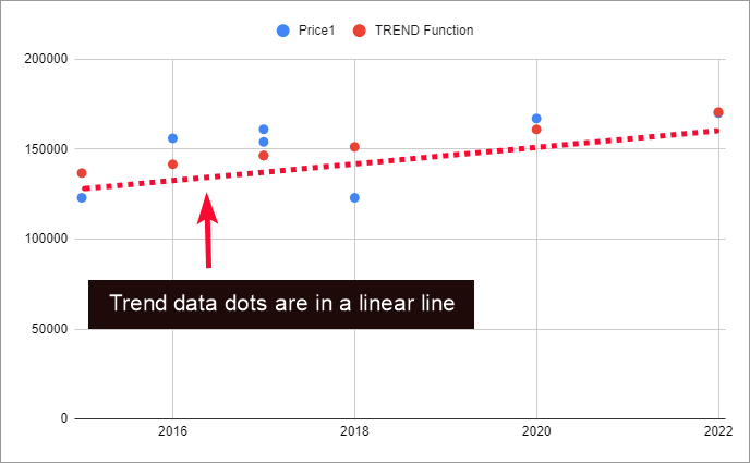
In this section, we will see how to add a trend line in google sheets using the TREND function. The TREND function is used to find the trend of the data. It tends to calculate the trend is creating together by all the pivot points in the table or column. So we can find the trend values for each point and then plot these values along with the data values in the chart, the points of the trend values will be in a linear fashion, so we can use a trendline to connect the points and it will act like a trendline. So without adding a trendline from the chart we can see the trend of our data using the TREND function manually.
TREND function takes three arguments and returns a numeric value which is the trend for each data point.
Syntax
=TREND(known_data_y, [known_data_x], [new_data_x])
Known-data-y: it’s a mandatory parameter in which we need to define the data points.
Rest are the optional parameters to define known data of x and new data for x.
Note: It’s not a TREND Function tutorial, that’s why I am keeping things very simple for you.
Step 1
The TREND function
Step 2
Pass the first argument (data column)
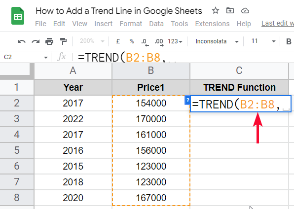
Step 3
Pass the second argument (known data on the x-axis concerning the chart)
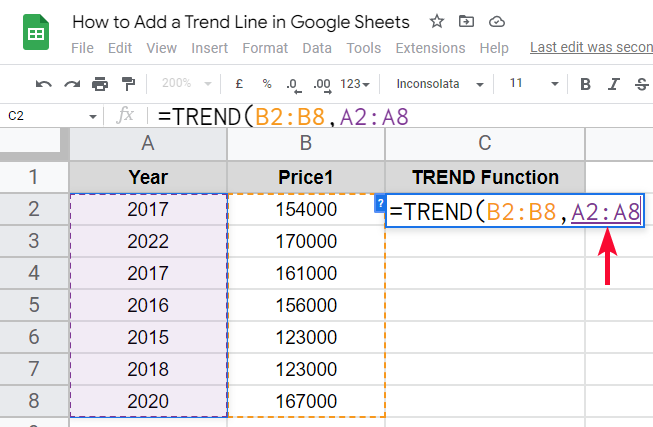
Step 4
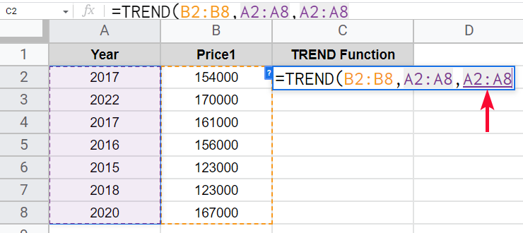
Pass the third argument (new data on the x-axis of the chart)
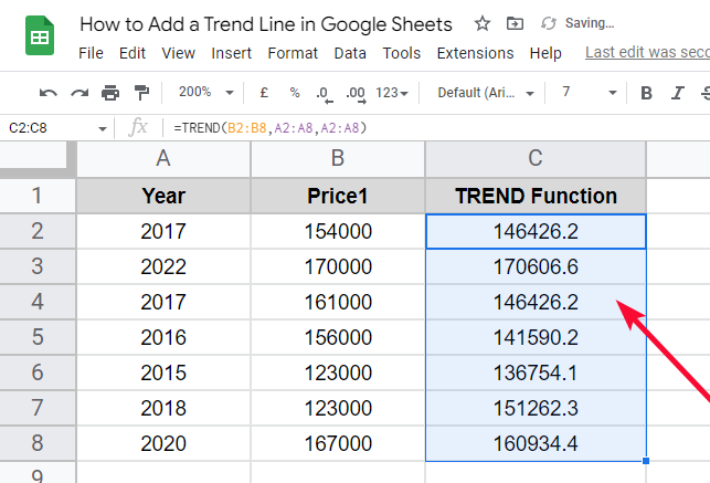
Step 5
Press Enter key, and you get the value of the trend for each data point
Step 6
Now select the entire data (three columns), and insert the chart
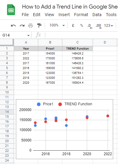
Step 7
You can see the trend values are in a linear fashion
Step 8
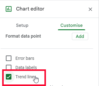
Enable trendline for the trend value to connect the dots
Step 9
The trendline is added, this is how you can use the TREND function to get the trendline
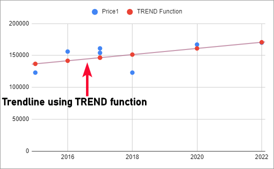
This is how you can add a trendline for your data series using the TREND function manually. Its a trend for your data which is showing as another data series
I hope you find this tutorial helpful.
Download/Copy Google Sheets Practice Workbook
Notes
- The trendline is also called the line of best fit
- The trendline can be customized by color, opacity, thickness, etc
- The trendline can be added for all series, and also for individual series
- The trendline is not enabled by default you need to enable it whenever you create a chart in google sheets
Frequently Asked Questions
How to quickly add a trendline in google sheets?
You need to have some data to add a chart of that data, after adding the chart go to chart editor and then go to Series dropdown and scroll down to find the checkbox of the trendline, check on it and your trendline will be added to your cart. As you tick on the checkbox, you will see the many options for customizing your trendline you can use them to customize the type, color, thickness, opacity, etc.
Conclusion
Wrapping how to add a trendline in google sheets. We have learned what is a trendline. what is the use of a trendline, we have seen a simple scatter chart with and without the trendline to see how important it is to see the data trend and the relationship between the multiple data series and their trends. I tried to include all the important things in this tutorial, we have discussed how to add single and multiple trendlines for your chart. We also discussed how to add a trendline for your specific data series, and in the last section, we saw a function TREND function to calculate the trend of the data within the sheet without using a chart then we plotted it into the chart along with the original data points to see the trend of the trending values data without enabling the trendline for the actual data series.
I hope you find this article helpful. I will see you soon with another helpful tutorial. Till then take care. Keep learning with Office Demy.


