
To Make Box and Whisker Plot in Google Sheets
- Add your dataset with one or multiple data sets.
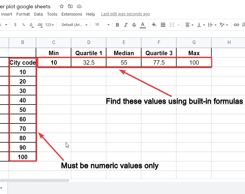
- Include a column for the five-number values you want to display: Minimum, Quartile 1, Median, Quartile 3, and Maximum.
- Use formulas to find these values in your dataset.
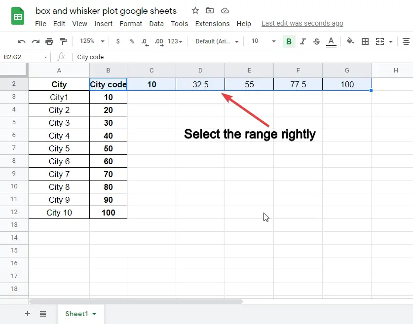
- Select the data values along with their headers.
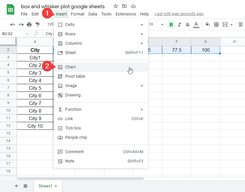
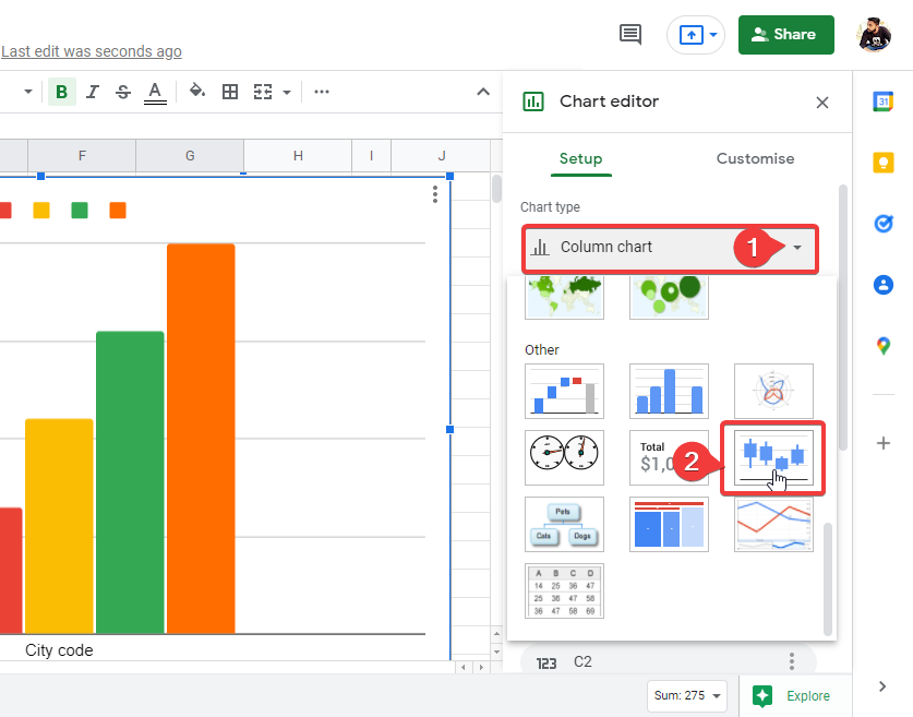
- Go to Insert > Chart and choose the Candlestick Chart.
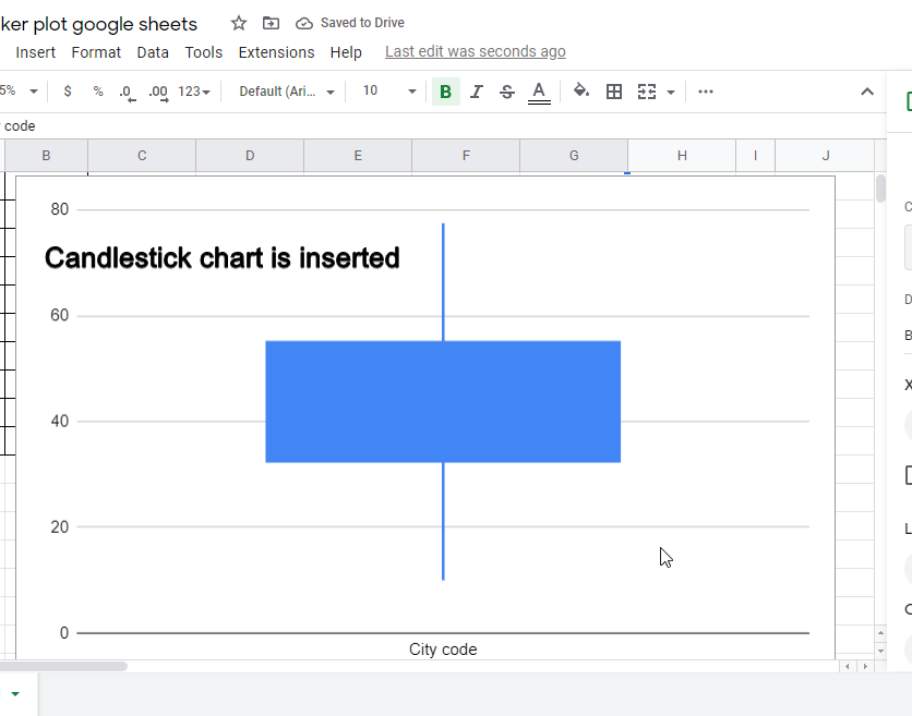
- Click to insert the chart.
Today’s article is going to be about box and whisker plot google sheets, box and whisker plots are mostly used identically to graphically represent the variability of a given dataset. It is a form of a chart that represents some values, the values are called 5-numbers that are needed to provide to this chart initially. We will see these five values, we will also see how to drive these values from a data set, and finally, we will see how we can insert a chart that represents box and whisker plot google sheets.
Google sheet is an amazing tool that helps us to maintain complex tabular data online and provide us ease of sharing it. we can use tons of built-in functionalities in google sheets that can be accessed without any external installation or a library. We will explore many features in this series of articles so stay tuned, and keep learning with us.
What is Box and Whisker Plot Google Sheets?
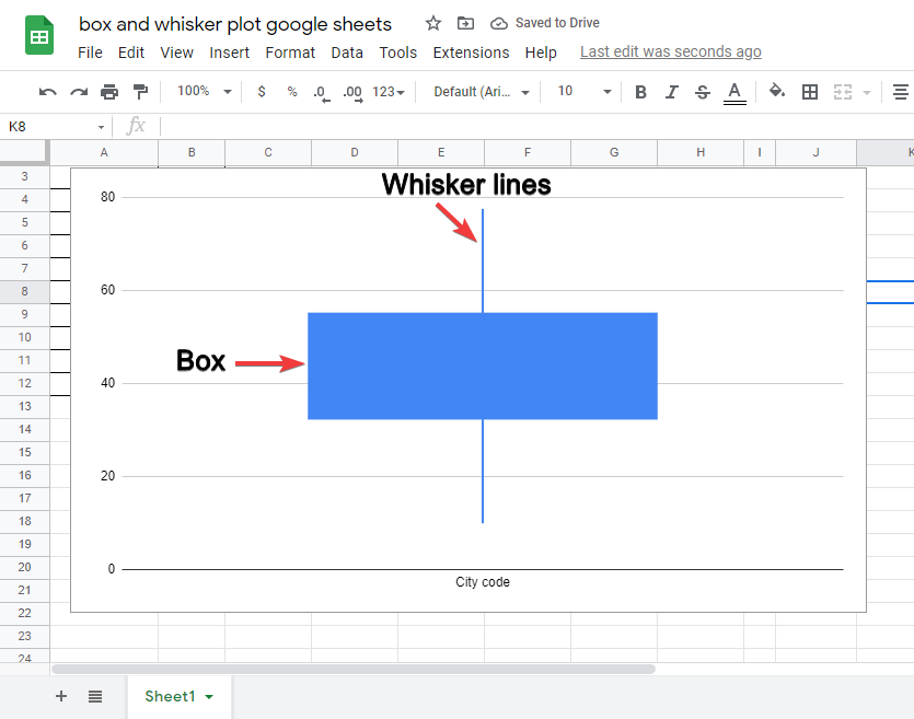
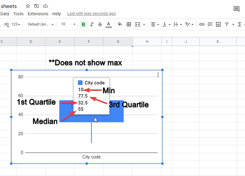
Box and whisker plot google sheets are two parts of a candlestick chart that is a preset chart available in google sheets, this chart represents 5-numbers of a data set that provide a very easy and understandable picture of understanding that dataset. The 5-numbers that we need to define in the data are; Minimum, Quartile 1, Median, Quartile 3, and Maximum. Let’s understand these numbers and how to find out their values.
Minimum is self-explanatory; it’s the minimum values of a given data set, Quartile 1 is the first quartile in the dataset, we can find it using a built-in formula, then there is the median, the median is the mid-point value of a data set. We can also find it using a built-in formula, then we have quartile 3 which is the third quartile of our data set, and finally again a self-explanatory maximum, it is the maximum value of the data set. All these numbers can be found using pre-defined formulas. We will see it in detail below steps.
Why do we use box and whisker plot google sheets?
Charts are essential in all kinds of data present on the internet. charts and graphs help us to represent our data that can be understood quickly and more effectively than plain text. We have a lot of graphical presets in google sheets to represent different kinds of data, along with all, one we have a candlestick chart, this chart help us to represent our data in the shape of candlesticks that contain a box-like shape, and a whisker line. This shape shows 4 data points that can be very quickly understood by anyone seeing that diagram without reading the actual data set.
- To represent a big dataset using a comprehensive candlestick chart
- To showcase four main values of a big dataset
- To read a big dataset very quickly using box and whisker plot
Video Tutorial: Box and Whisker Plot in Google Sheets
How to Make Box and Whisker Plot in Google Sheets
Step 1
Add one or multiple data sets on your sheet, data set may have two columns, and the second one must contain only numbers.
You can use the reference of the data set given in the link below.
Step 2
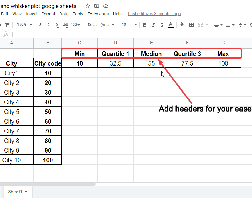
Add your column with the five-numbers headers we discussed above in this article.
Step 3
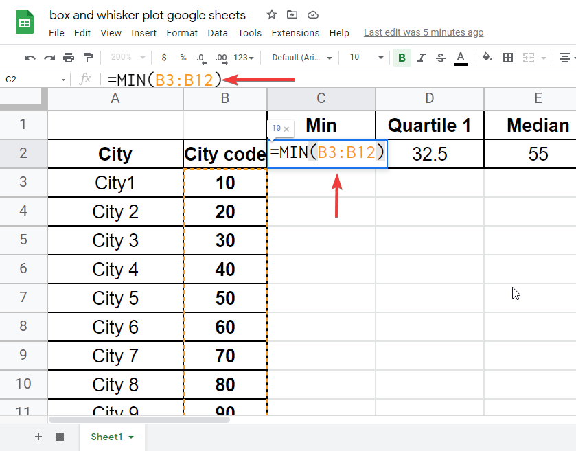
Now, add formulas to find the values of 5-numbers to plot in the diagram.
- Min
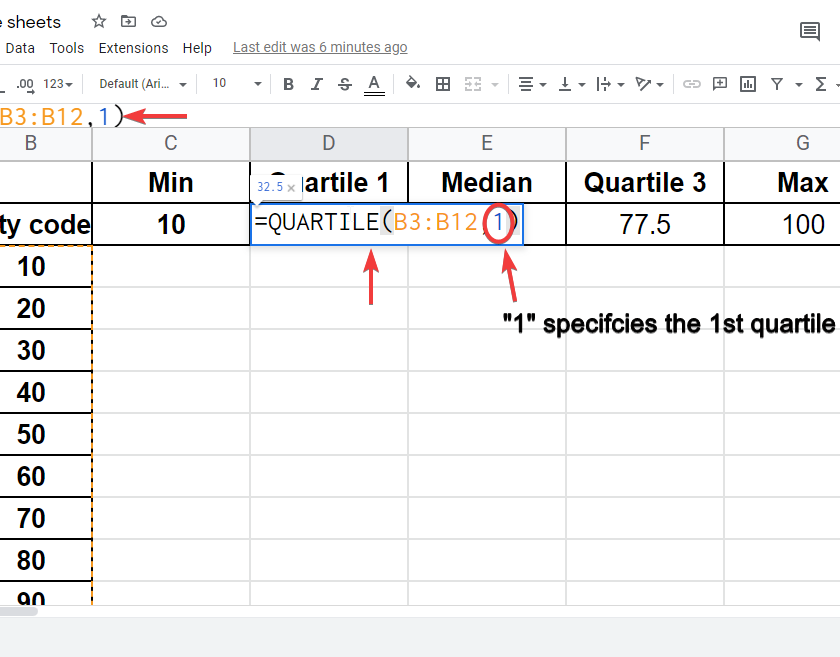
- Quartile 1
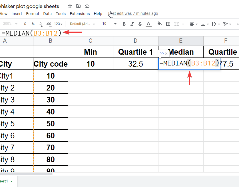
- Median
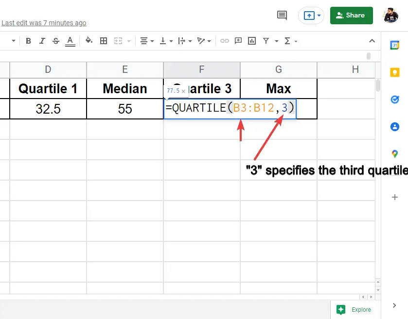
- Quartile 3
-
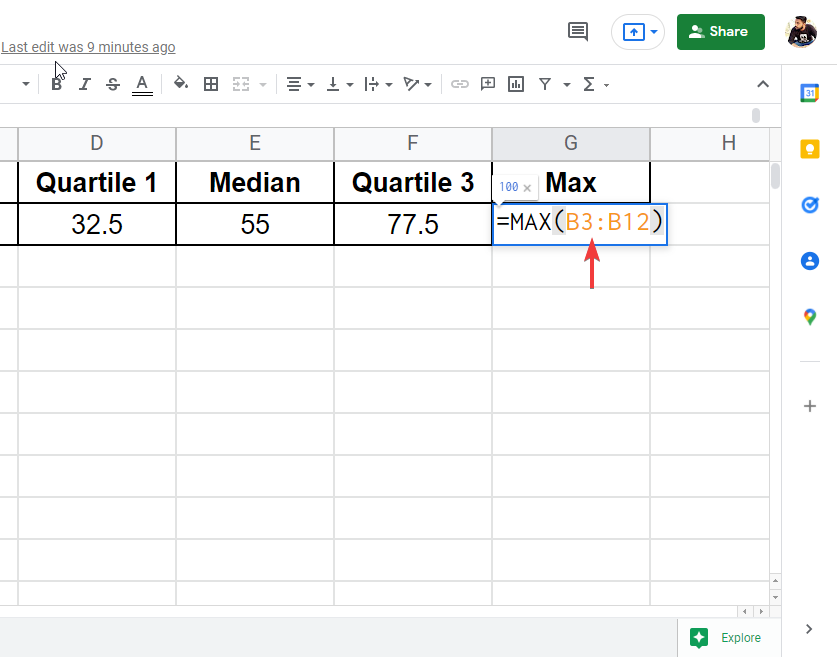
- Max
-
Step 4
Now the data set is ready, Select the data values along with the data heading, then go to insert > chart > and find a candlestick chart. Click on it to insert.
Notes
- Carefully find out the values using formulas, defined in step 3.
- Carefully select the data range, it will show an error if you don’t select the right range.
- For more than one data set, you will have to repeat all the steps for multiple data sets.
- You can use multiple data sets to represent their values in a single candlestick chart.
Frequently Asked Questions
Is Making a Box Plot in Google Sheets Similar to Making a Box and Whisker Plot?
Creating box plots in google sheets is very similar to making a box and whisker plot. The term box plot is commonly used to refer to the same visual representation of data. Whether you use one term or the other, the process of creating this type of plot remains the same in Google Sheets.
Conclusion
In this article, we learned Box and whisker plot google sheets, this is one of the most confusing topics students find when they are working with data sets and charts. But, after going through this article you will get everything clear in your mind. You will never be going to forget it if you properly follow and understood the steps. So, after this article, we can answer the question; What are box and whisker plot google sheets? Why do we need box and whisker plot google sheets? How can we read box and whisker plot google sheets? Can we plot multiple datasets in a single chart? and many more things we learned in this article. You have learned everything about it. you only need to do it rightly, and understand the dataset requirement along with formulas to find out the right values. If you like this article, then do write your experience in the comments, and don’t forget to share this quick guide with your friends. also do subscribe to our OfficeDemy blog to get future updates.


