
To use Color Scale in Google Sheets
- Select the data (excluding the header).
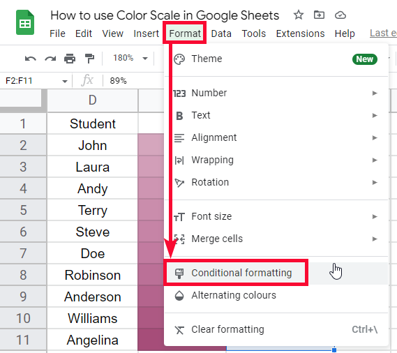
- Go to Format > Conditional formatting.
- Click on the “Color Scale” tab.
- Choose a predefined color scale or create a custom one.
- Define colors for the minimum, midpoint, and maximum values.
- Click “Done” to apply.
In this article, we will learn how to use color scale in google sheets. The color scale is used to display your data with a group of colors and each value has a color based on its group for example a data having 1 to 5 numbers, now a color scale will be added to this data so the data will be divided into 3 groups 4-5 are from maximum group, 1-2 from the minimum group, and 3 is from the mid group. So, the colors will be the lightest for the max values and will be darker for the min value and the average color will be for the mid value.
Now, this is just a concept not a constant. You can change the colors, of course, you can change the intensity of the colors based on numbers, percentages, or percentiles. what I have described above is the default working of a color scale when directly applied to data. But we have a lot of customization options to customize the color scale, change colors, and change the spectrum of the color variations based on data regarding numbers, percent, or percentile. We can also change the max, min, and mid values for it.
Why use Color Scale in Google Sheets
The color scale is one of the best ways to display the statistical data and let the user quickly pick up the max, min, and midpoints of the data at a glance. Color scale defines the overall variation of the data and also helps to quickly figure out the data direction. The color scale is a feature inside conditional formatting in google sheets, where we have some pre-defined color scales to use, we can also make our color scales here in sheets. To learn a color scale, we should know the basics of conditional formatting in google sheets.
And after learning color scale we will be able to create fantastic heat maps in google sheets, and we will talk about that later. So I hope you have got an idea of why you need to learn how to use color scale in google sheets.
How to use Color Scale in Google Sheets
Here we will learn step by step, we will start with how to use color scales in google sheets for the very first time, then we will move and will customize the color scales, then will create our color scales, and similarly, we will go ahead and implement some practical examples to learn color scale with all its attributes.
How a Color Scale Looks like on a Sorted data
A color scale based on conditional formatting can be applied to numeric data only, it cannot be applied to other data types such as strings, and characters. They are only numbers, and they can be floating points numbers, percentages, or percentiles as well
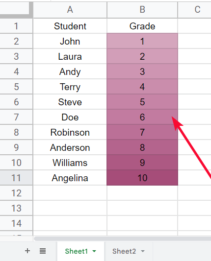
Let’s say you have a dataset in which you have some students from standard 1 to 10. Here for the standard column, you can apply a conditional formatting color scale based on numbers.
Let’s have a look at this
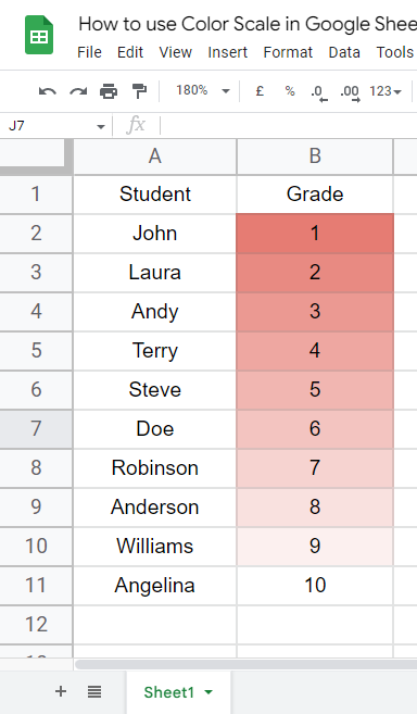
Well, it looks like a very good pattern.
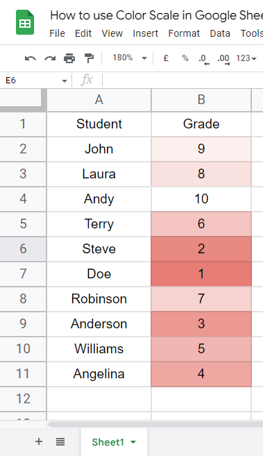
How a Color Scale Looks on Unsorted data
The color scale looks good on sorted data but does not look very good on an unsorted list
See the same data set unsorted
Don’t worry, it’s not all about color scales, there are tons of things we can do using color scales let’s see how to add a color scale practically on a dataset
How to use Color Scale in Google Sheets – Adding a Color Scale
In this section, let’s add a color scale a sample data.
For this you need to follow the below steps simply
Step 1
Select the data (not header)
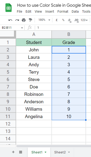
Step 2
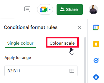
Go to Format > Conditional formatting
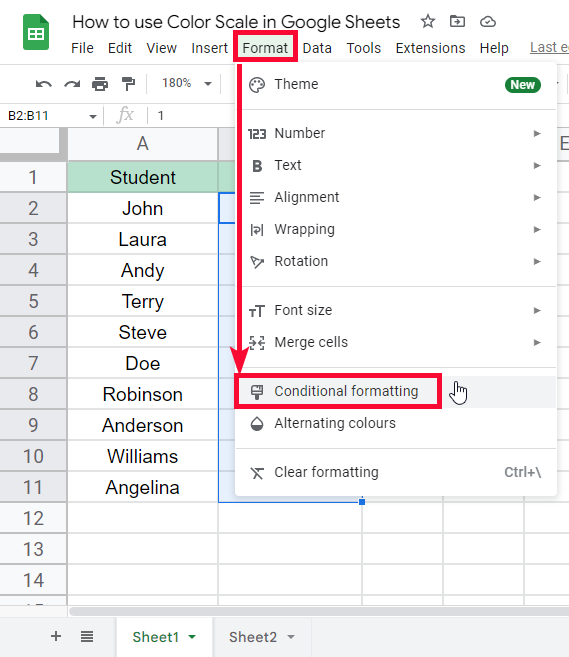
Step 3
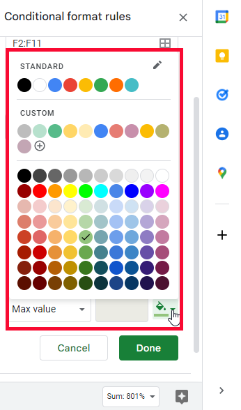
Click on the Colour Scale tab
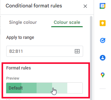
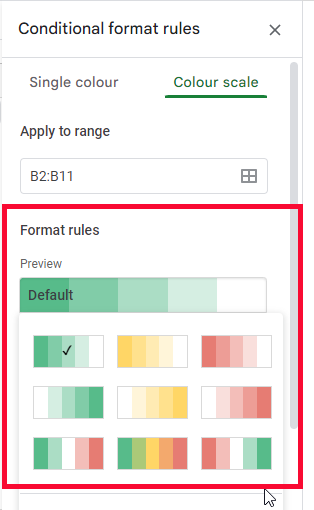
Step 4
In the below Format rules section, click on the scale to select any pre-defined color scale
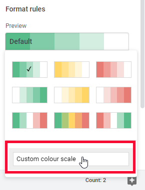
Step 5
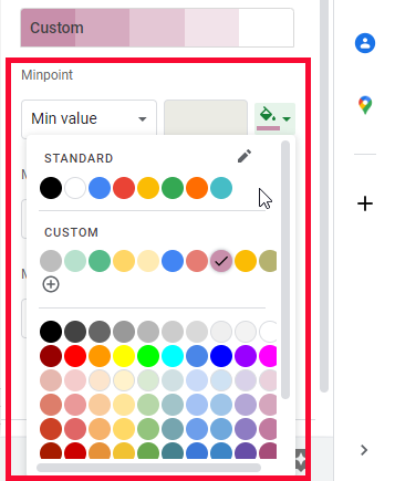
Click on Custom Colour scale to make your color scale
Step 6
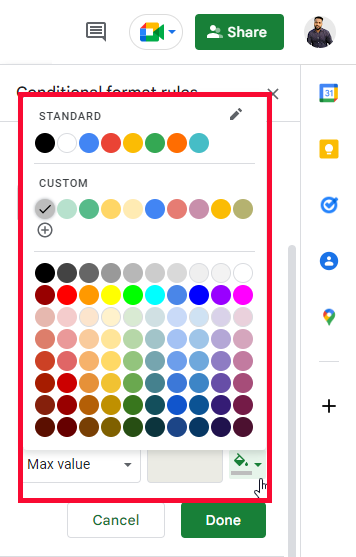
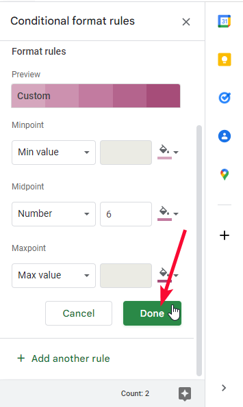
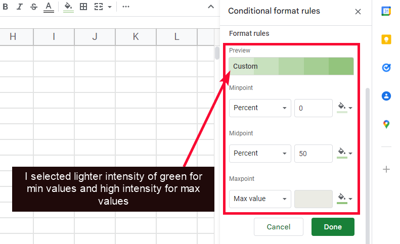
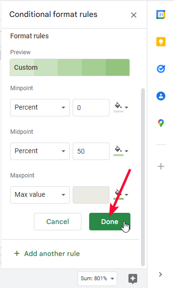
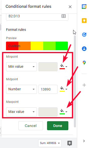
To define your color scale, you need to define two colors for min and max value
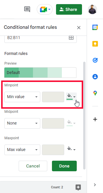
Step 7
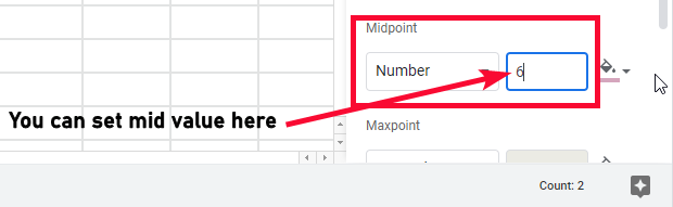
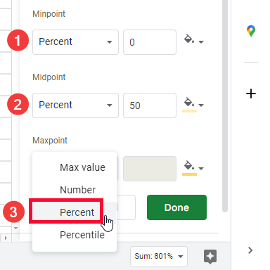
By default, mid value is locked, but you can unlock and define it by choosing any unit other from the dropdown (use according to your data)
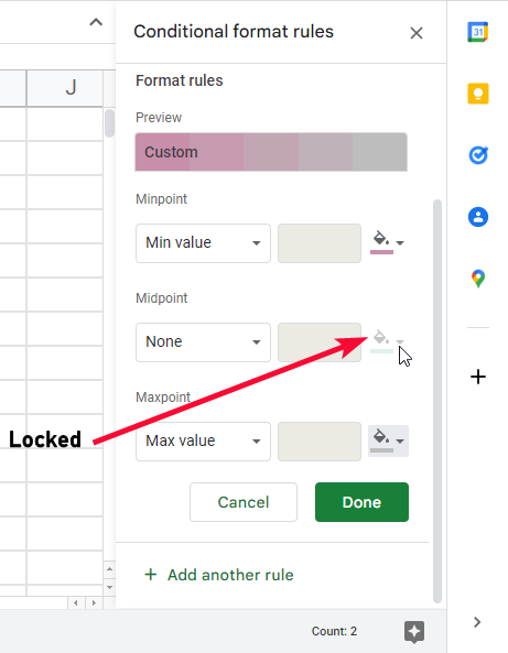
Step 8
Now define a color for the midpoint
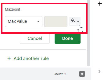
Step 9
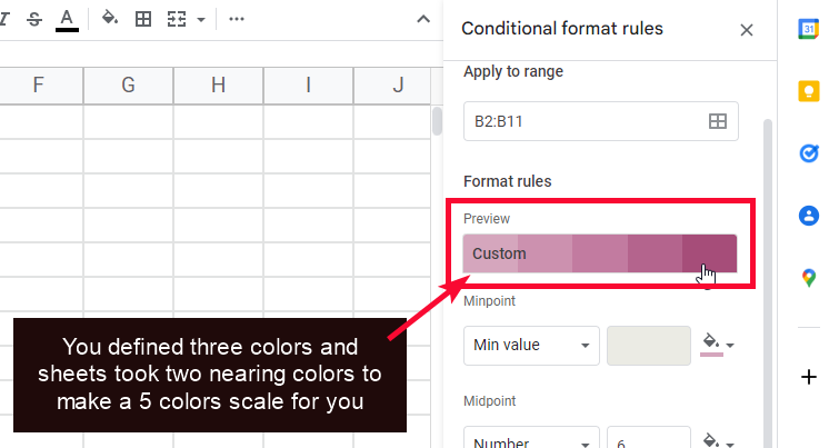
You can see all your five colors in the preview section (three colors are given by you and the other two are picked by sheets between that defined range of color)
Step 10
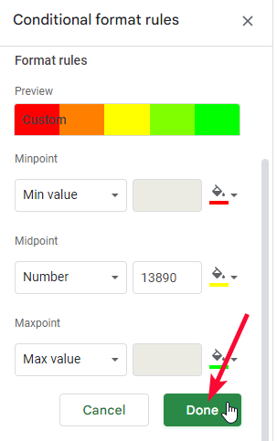
Click Done to save the changes and apply this to your data
This is how you can use color scale in google sheets.
How to use Color Scale in Google Sheets – Color Scale based on Percentages
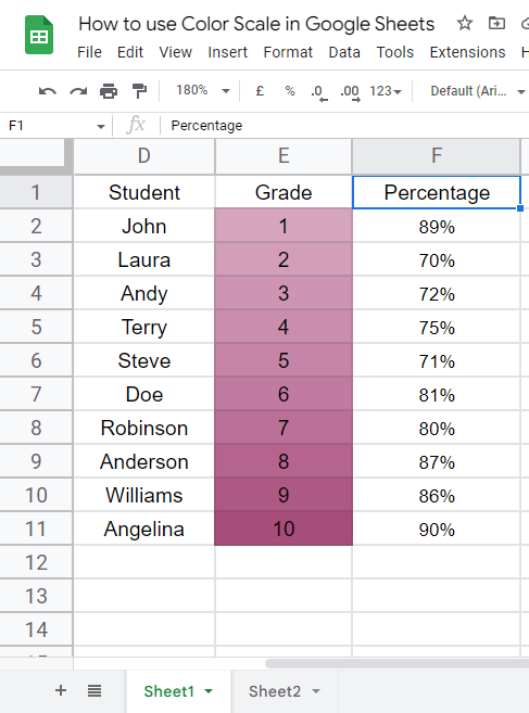
In this section, we will learn how to use color scale in google sheets based on a percentage of the values. We can make students percentages for a batch of students using a simple color scale.
For this example, I have a simple data set in which I have some students’ names and their percentage marks.
Step 1
Sample data
Step 2
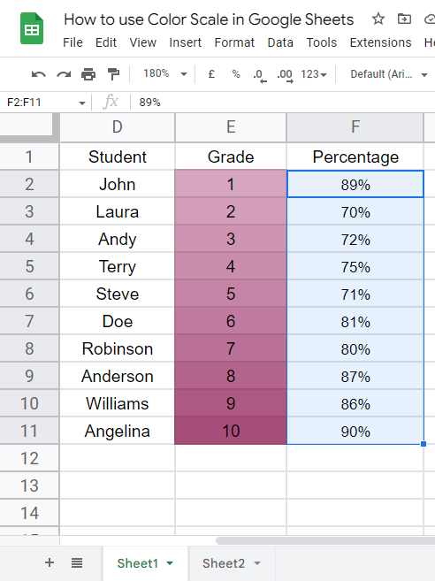
Select the data column (excluding header)
Step 3
Go to Format > Conditional Formatting
Step 4
Select percentage as the unit from min, mid and max dropdowns.
Step 5
Select colors for a min, mid, and max color pickers
Step 6
Click on done and you’re done, your data is color scales as percentages.
This is how you can use color scales for percentage values.
How to use Color Scale in Google Sheets – Creating a Heatmap
In this section, we will learn how to create a heat map using a color scale in google sheets. A heat map is a visual representation of data based on color where lighter color shows one data point and the intensity of the colors shows the other data point and the average colors are meant to be the center or midpoint of the data. We can assume it is like 1-10 where 1 will be the darkest 5-6 will be average and 10 will have the lowest intensity. In this way, we can easily where our values are smaller and where we need to work to increase or decrease the value.
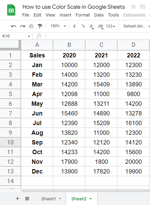
For this example, I have a sample data set of the sales of the last three years and I will use three data points to describe their color of them, and all between values will take nearing color or low or high intensity/hue of that color.
Step 1
Sample data
Step 2
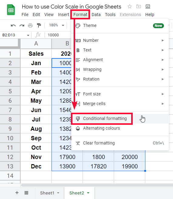
Select columns data, go to Format > Conditional formatting
Step 3
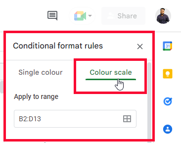
Select the color scale tab and define colors for all three points
Step 4
Click on done. You have seen how easily we can see the values and can analyze the data to predict the values very quickly
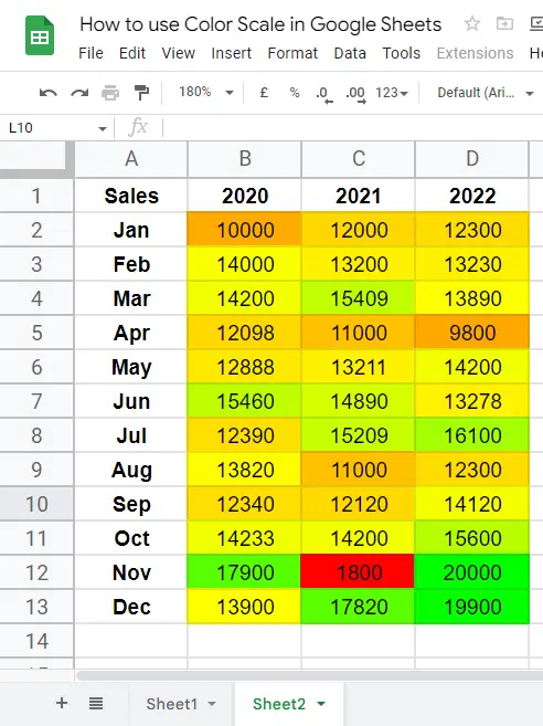
This is how we can use color scale in google sheets to create a heat map. Now heatmaps are not limited to these, we may have some very big data sets and some very complex heatmaps since this tutorial is mainly based on the color scale, so we will learn heatmaps in detail in some other tutorial in the future. For now, I hope you have got a basic idea about the heat maps.
Download/Copy Google Sheets Workbook
Useful Notes on How to use Color Scale in Google Sheets
- Color scales can be used for data analysis, a very common technique is a heatmap that shows the data as min, mid or max points with your defined colors for each point
- Color scales are applied on numeric data only because the units are number, percentage, and percentile, you cannot evaluate a text or string or any other data type using color scale formatting rules.
- Color scales are inside conditional formatting but work differently because there is no formula option there are only colors options for numeric values
Frequently Asked Questions
Can I Apply the Same Color Scale Technique in Google Data Studio as I Do in Google Sheets?
Yes, you can apply the same color scale technique using color scale in google data studio as you do in Google Sheets. The color scale feature allows you to visualize data by assigning different colors to values within a range. It helps to highlight patterns, trends, and anomalies in your data, making it easier to interpret and analyze.
How Does Color Scale in Google Sheets Compare to Linear Scale in Google Forms?
Google Sheets offers a color scale feature that allows users to visualize data based on color gradients. This feature is different from the linear scale in Google Forms, which is used for creating surveys and forms. The linear scale form creation provides a numerical range for respondents to rate or rank items.
How to use color scale in google sheets?
Color scales are found inside the conditional formatting “color scale” tab, it is very different from the normal conditional formatting rules we use to evaluate our data (any kind of data). Using color scales, we can only work with numbers, the values are automatically detected and assigned colors lighter to the maximum value, but we can change it we can assign a lighter color to the minimum value and can increase the intensity of the color as the value go towards maximum. This is how to use color scale in google sheets to make excellent visual heatmaps to understand the data values at a glance.
Conclusion
Wrapping up how to use color scale in google sheets. We have learned what are color scales, where they can be found in google sheets, and how they work. We have discussed the limitations of color scales and now we know that color scales work with only integer data types numbers, floats, percentages, and percentiles. We saw how we apply a color scale on a numeric data column, we have also discussed that we have three controlling points of our data they are minimum point, midpoint, and maximum point, we learned how to change colors for each point of our data and reverse any pre-defined color scale according to our preferred colors and their intensity. That’s all from how to use color scale in google sheets.
I hope you find this article helpful; I will see you very soon with another helpful tutorial till then, take care. Thank you for reading, keep learning with Office Demy.


