
To Add Axis Labels in Google Sheets
- Open the “Chart editor“.
- In the “Customize” tab, find “Chart & axis titles“.
- Select the horizontal axis (X-axis) and type your label.
- Select the vertical axis (Y-axis) and type your label.
- Format your labels (style, color, size).
This article is to guide you on how to add axis labels in Google Sheets. If you are having a tough time with adding axis labels in your chart then you have come to the right place. We will show you how to do this task easily in Google Sheets with the help of its incredible features. The procedure steps are quite simple and easy to understand that will guide you on how to add axis labels in Google Sheets. Keep on reading this article and follow the steps as written to get the job done.
A useful way to visualize spreadsheet data is with the help of Google Sheets charts and graphs. Usually, the default settings for these graphs can be used without any modification, making them a useful tool for quick visualization. Some of the times you like to have a chart or graph look the way you want it to; it will be done by adjusting the settings in your chart. Adding axis labels is also a part of that formatting.
Axis labels are the text labels that appear along the horizontal and vertical axes of a chart. They can be used to indicate the units of measure for the data plotted on the chart or to provide descriptive text about the data. Adding or editing axis labels is a common change that people usually use to do in their charts. It is an essential part of the chart because it helps the audience to understand what information the chart is trying to give.
Importance of adding Axis Labels in Google Sheets
Labels serve to capture the attention of users. The use of catchy words may cause strolling users to stop and evaluate the data. The label is likely to be the first thing new users see and thus offer their first impression of the data. Axis labels are important because they play a key role in helping the audience to interpret the information clearly at first look at the charts or graphs. It is used to show what the chart is talking about and what is being measured. Once you give names to the axis, now you don’t need to explain verbally which variables are being presented on the x and y-axis. Everybody can understand by themselves and thus gives a clearer picture of the chart.
Axis labels remind the audience of the information shared with them and prevent them from getting confused. As you have realized the importance of adding axis labels to your chart, it can help you to represent your chart more expressively. Now moving to the next section of this article where you will find a step-by-step procedure for how to add axis labels in Google Sheets. So, let’s have a look at these steps to understand the procedure.
How to Add Axis Labels in Google Sheets
In a google sheet to add axis labels, you should have a chart and to add a chart you should have characterized data. So, in this procedure first, we will take some characterized sample data. Then we will learn how to insert charts in google sheets when we will get our axes in the chart then we will learn how to add axis labels in google sheets. Don’t worry it is not as hard as it seems, we will easily get this tutorial step by step.
Step 1
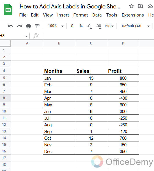
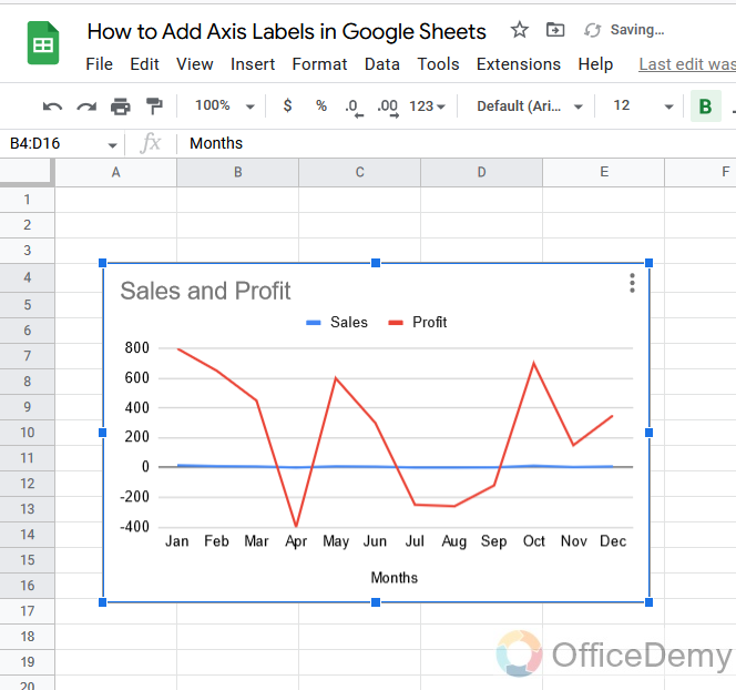
This is our characterized sample data in which there are sales of months with their different profits.
Step 2
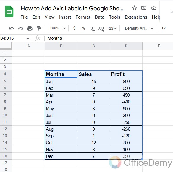
As we discussed first, we will have to insert a chart. so, to insert a chart select all the data.
Step 3
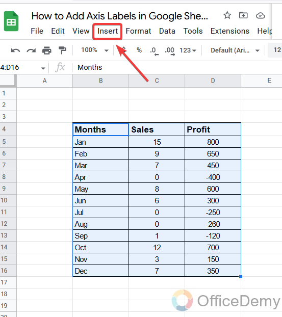
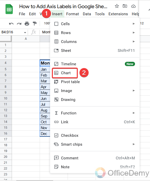
Then go into the Insert tab from the menu bar
Step 4
A drop-down menu will open, where you will find the chart option from where you can insert the chart with one click.
Step 5
As you can see below, a chart has been inserted.
Step 6
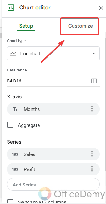
As the chart will be inserted, you will find the chart editor on the right side of the Google sheets window. You have to go into the customize tab.
Step 7
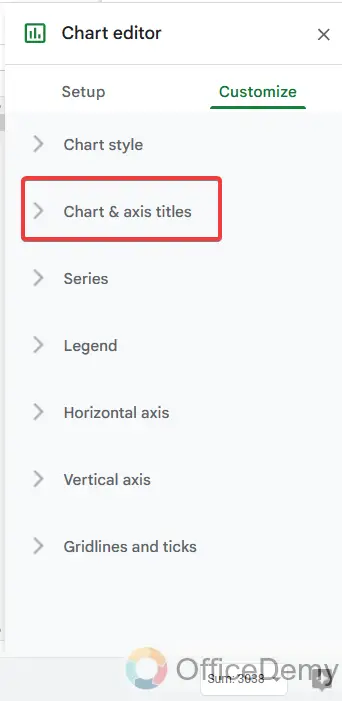
In the customize tab of the chart editor, you will find several options, Go into the “Chart & axis titles“.
Step 8
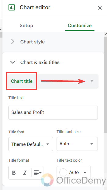
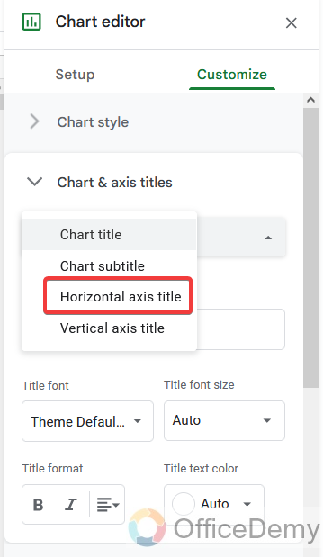
Here at first, you will find the titles name option click it to open to select the axis to give it a name or label.
Step 9
Here I am selecting the horizontal axis.
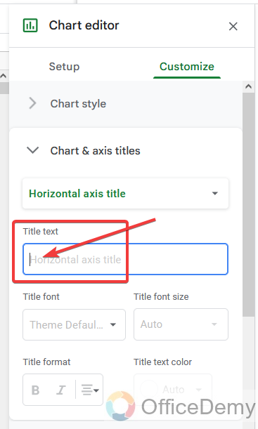
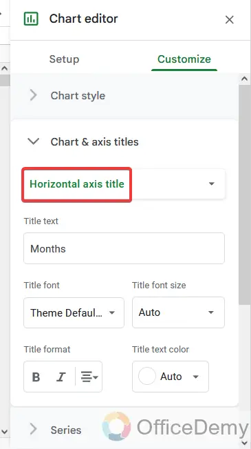
Step 10
Then in the next section, you can write the axis label or name in the text box.
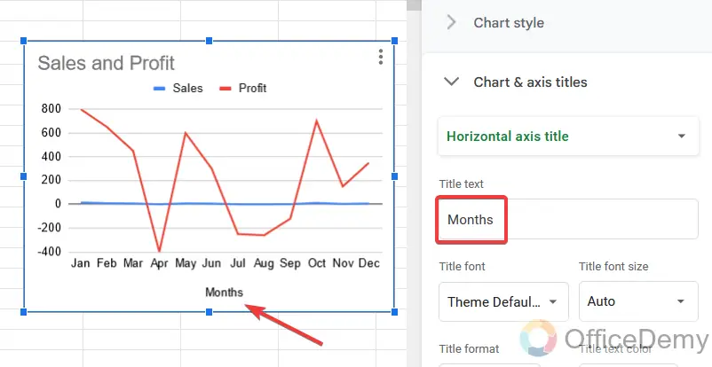
Step 11
As you can see, here I have written months in the text box, so it has been labeled as ‘months’ on the x-axis.
Step 12
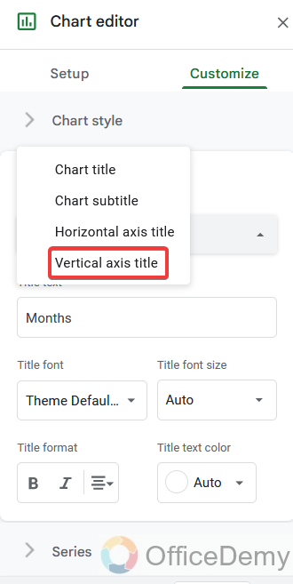
Now similarly for the Y-axis, first we will have to select the Y-axis from the title names.
Step 13
Here I am selecting the “vertical axis title”.
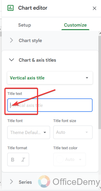
Step 14
Then here I will name the vertical axis by writing the text in the following text box.
Step 15
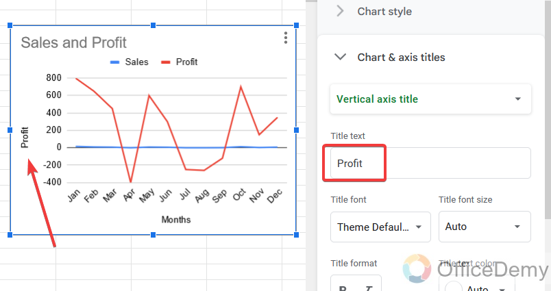
As you can see in the following picture, I have written “Profit” in the text box, so the y-axis has been labeled with the text “Profit“.
As we have covered our topic of adding axis labels in google sheets, we have learned about both axes’ labeling.
Step 16
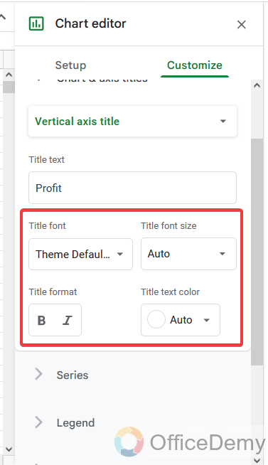
Here are some more formatting options you should know while adding axis labels in google sheets that you can also format your label or text by changing its style, color, its size and you can also format your labels by coloring them.
Frequently Asked Questions
Is Adding Axis Labels in Google Sheets Similar to Adding Error Bars and Data Labels to Charts?
Adding axis labels in Google Sheets is not the same as adding error bars and data labels to charts. While axis labels provide essential information about the values represented, like the x and y axes, adding data labels directly on a chart can help users understand specific data points, allowing for clearer data analysis.
Q: Why do we need to add axis labels in google sheets?
A: Once a chart has been created appropriate labels must be added to it so that it is clear what the chart shows. All charts need a title to state what the purpose of the chart is. If a chart has an axis then each axis should also have a label. The axis running along the bottom of the chart is the X axis and the axis running up the side of the chart is the Y axis. An axis label should clearly state what the axis measures and what units have been used on the scale. It helps the reader to read the chart so that the user can easily understand which axis has what values. Add axis labels is also necessary to give the impression of a complete well-defined chart, so therefore we need to add axis labels in google sheets.
Q: How can we separately download only a labeled chart in google Sheets?
A: Let’s suppose you are working on google sheets spreadsheet and dealing with some type of monthly or yearly progress data so to monitor the progress, you take charts in google sheets and then add labels to them. Sometimes you may need to download your labeled chart to present then what will you do? Will you download the whole file? No! you can download only a chart by the following steps:
Step 1
In google sheets when you insert the chart, you will always see the three dots option at the right top of the chart. When you click on it, it will show you several chart options where you can also find the download option.
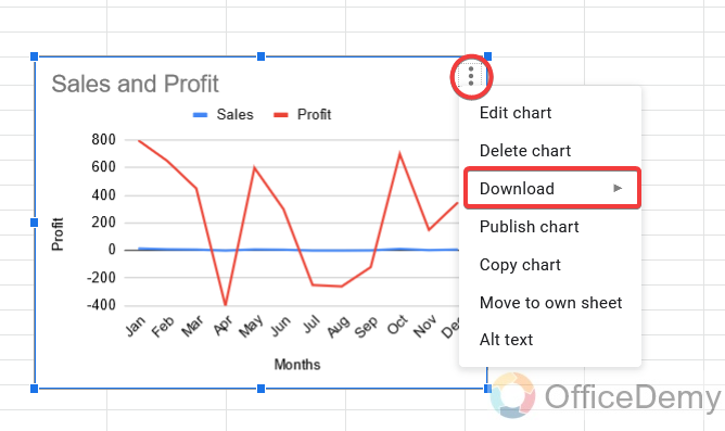
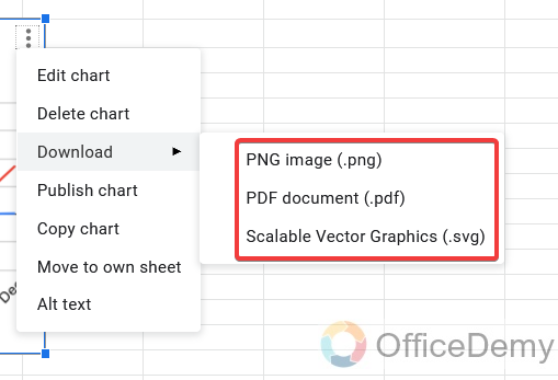
Step 2
Then click on the download button to expand for more options, where you will ask for the format of the file in which you have to download. If you want to download your chart as an image then you can select PNG format, if you want to download it in document format then you can choose pdf format. there is one more format of scalable vector graphics if you need it.
Step 3
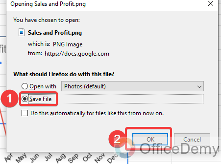
Then it will promptly ask to save a file, then click on the ok button. Your labeled chart will be downloaded.
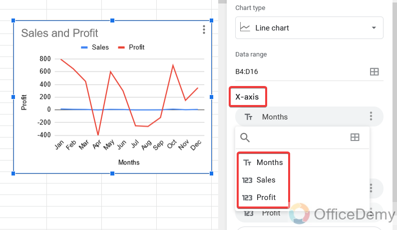
Q: Can we swap the X-axis data for the Y-axis data in google sheets?
A: Let’s suppose you have just inserted a chart to your data in Google sheets and you are adding axis labels in the chart. But if you notice that your chart axis does not have desired data and you want to swap data from X-axis to Y-axis then you can easily do so with the following example.
In the chart editor at the right side of the window, go into the chart setup where you will have the axis option it will be either x-axis or y-axis as here is the x-axis in the following picture. You can select your desired data in the following option and can easily swap the data from the x-axis to the y-axis
Conclusion
Today we learned how to add axis labels in Google Sheets. I tried to cover everything from scratch to the end. Axes are a vital part of most X-Y and some other chart types, providing a measure of scale or grouping to the other visual data and adding axis labels provide the information to identify the data along the chart. There are usually two axes in the chart, horizontal and vertical. A chart represents the characterized data on both axes graphically, but sometimes it may be difficult to know which data is shown on the x-axis and which is on the y-axis if there are some mutual values. So, in that case, adding axis labels plays an important role to get the reader to know the data shown in the axes. This tutorial describes how to display and customize axis labels in Google Sheets.
I hope this tutorial will help you to make an understood and attractive graph by labeling it. For more informative topics keep visiting Office Demy.


