
To Make a Bell Curve in Google Sheets
- Gather your data.
- Calculate the mean (average) of your data.
- Calculate the standard deviation of your data.
- Determine the low and high standard deviation values by subtracting and adding 3 times the standard deviation to the mean.
- Create a sequence of values between the low and high standard deviation values.
- Use the NORM.DIST function to find the normal distribution for all data points based on your sequence.
- Now, make a smooth line chart using the sequence and distribution data points.
- Select “Insert” > “Chart” and choose the “Smooth Line Chart” type.
- You’ll have a bell curve chart showing the normal distribution of your data.
Hi everyone. In this article, we will learn how to make a bell curve in google sheets.
A bell curve is a state in a graph that depicts the normal distribution. This means that the data points are near to each other and every data point is closer to the average. It helps us to understand the data by presenting closer data points closer. We can easily figure out in which state most of the data points are present, and how close they are.
Use cases of Bell Curve in Google Sheets
We frequently work with charts and graphs in google sheets, and in these days of data, we need to know how to manage larger data sets, and how to communicate with the data. Charts are the most essential type of presenting the data that takes less time and deliver the message accurately. We have already seen many charts in google sheets. Today, we will see how to make a bell curve, now bell curve is not a chart, it’s a state, it’s a position that acts like normal distribution of data.
The bell curve is highly used when it comes to forecasting, it helps us make good decisions by seeing the probabilities of different data points in a graph. It is used in real life to see the height of the students in 3rd standard, you can imagine there is no big difference in the height of 3rd standard student, so they all are very near to average height, we can easily forecast the age of a student in this classroom if we know the average. This is how bell curves work. We need to learn how to make a bell curve in google sheets to visualize the group data and represent it efficiently.
How to Make a Bell Curve in Google Sheets
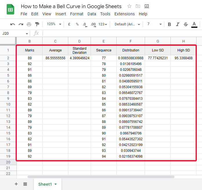
To learn how to make a bell curve in google sheets, we have sample data. To make a bell curve we need to have 5 things. We will drive all these from sample data, and then we will move on to making the bell curve using this data.
Let us move to the methods required to make a bell in google sheets.
How to Make a Bell Curve in Google Sheets – Required Values to Make a Bell Curve
The average (mean) value.
The standard deviation value
The +/- 3 standard deviation values of the average
A range sequence
The normal distribution for all data points
Step 1
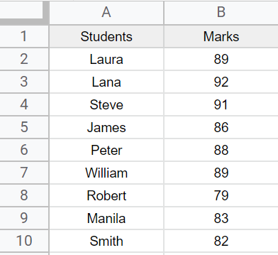
Sample data
Step 2
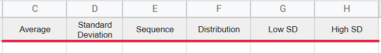
Adding Helping columns to find required values
Average, Standard Deviation, Sequence, Distribution, Low Standard Deviation, and High Standard Deviation
Step 3
Finding the Average
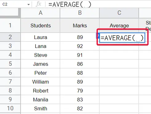
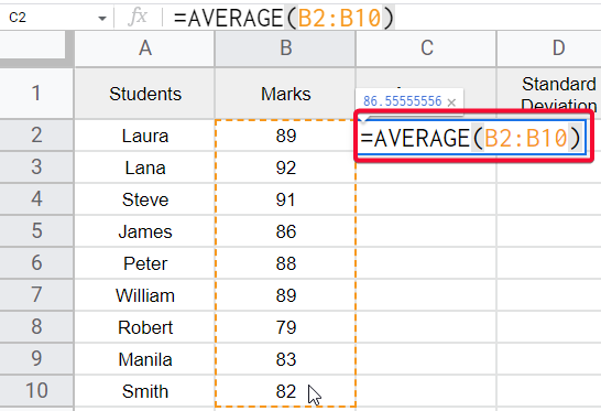
Formula =AVERAGE(B2:B10)
Step 4
Finding the Standard Deviation
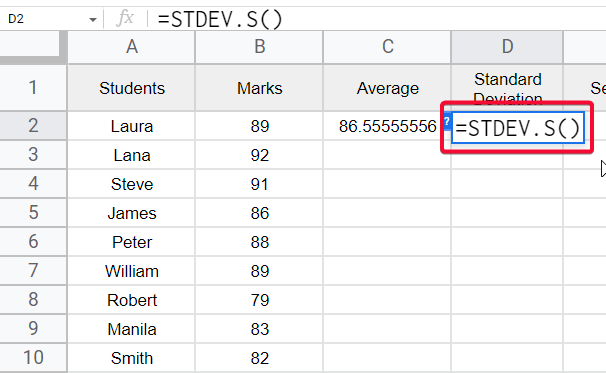
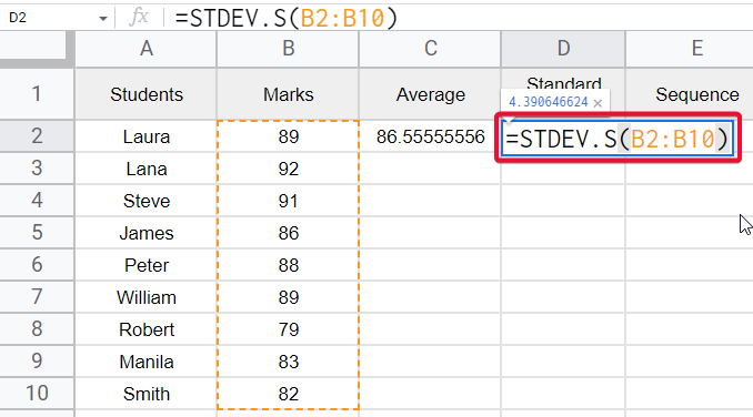
Formula
=STDEV.S(B2:B10)
Step 5
Finding the Sequence, using =SEQUENCE function
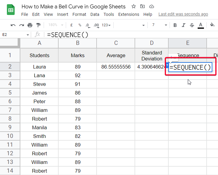
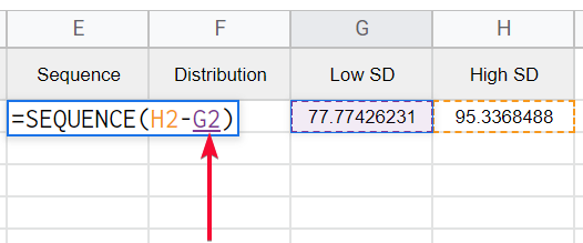
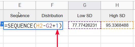
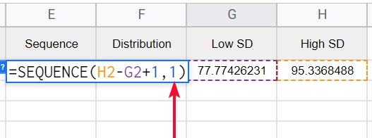
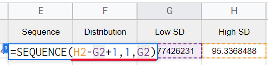
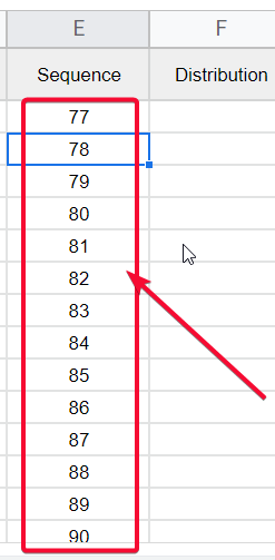
Formula
=SEQUENCE(H2-G2+1,1,G2)
=Sequence(High-Low+1,1,Low)
Step 6
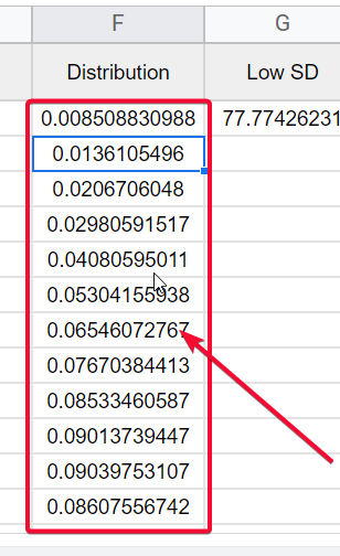
Finding the Distribution using the Array formula along with Norm.Dist (Normal Distribution)
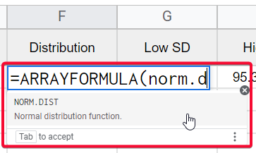
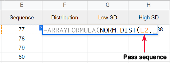
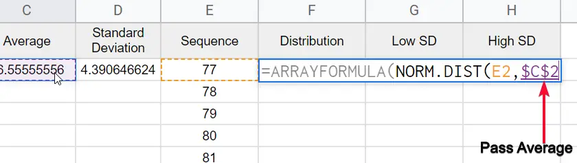
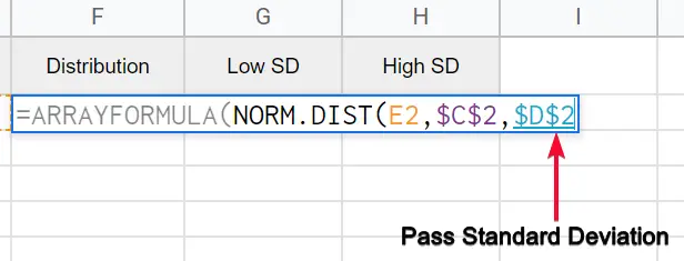
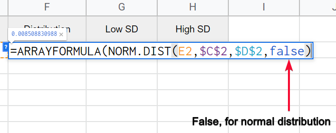
The overall formula syntax is
=ARRAYFORMULA(NORM.DIST(E2:E19,$C$2,$D$2,false))
Here, the normal distribution takes four parameters, first is the sequence column, second is average, third is standard deviation, and last is false (for distribution function) whereas, true is for (normal cumulative distribution function)
Step 7
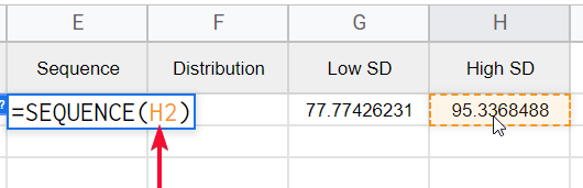
Finding a low Standard Deviation
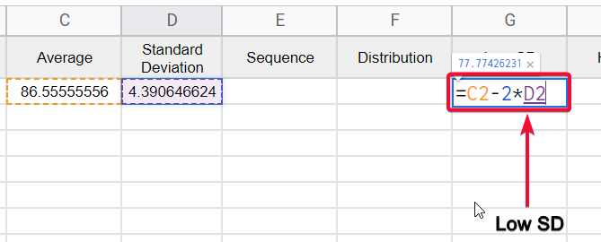
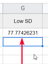
Formula =C2-3*D2
=Average – 3 * Standard Deviation
Step 8
Finding a high Standard Deviation
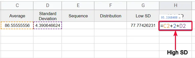
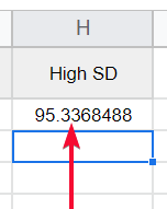
Formula =C2+3*D2
=Average + 3 * Standard Deviation
Here we have done finding all the required values for our data to make a bell curve.
Now we will see how to make a bell curve in google sheets using these data columns.
How to Make a Bell Curve in Google Sheets – Using Smooth Line Chart
Here in this section, we will see how to make a bell curve in google sheets using a smooth line chart. The smooth line chart is a variant of a line chart that gives us smooth rounded corners line unlike to line chart that gives edgy lines. Using this we will create a bell curve let’s make the bell curve.
Step 1
Since we have calculated all the required values, now it’s time to build the graph
Step 2
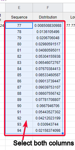
Select the Sequence and Distribution columns
Step 3
Go to Insert > Chart
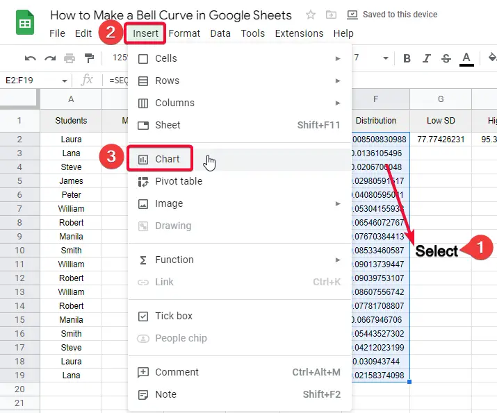
Step 4
Select the Smooth Line Chart from the “Chart type” dropdown menu under the setup tab.

Step 5
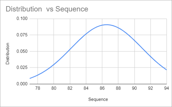
As all goes well, your chart will be added, and you will see a bell curve created by google sheets based on the provided data.
This is how you can make a bell curve in google sheets. Now bell curve is a popular normal distribution, and it has many uses. Let’s see some real-life examples and scenarios of the bell curve.
Real-life Example of Normal Distribution and Bell Curve
Student’s Average Report
The average marks of the students in the same standard are one example of a normal distribution or bell curve. All have near-to-average marks and very rare students will be to have extremely low or extremely high to the average.
Birth Weight
Similarly, the average weight of a newborn baby is between 5.5 pounds and 7.7 pounds, and all the babies weigh under this average. Few cases when babies have extremely low or extremely high weight to this average since this example also follows the normal distribution.
Shoe Size
Another example of the bell curve is shoe size. We don’t have a huge difference between the shoe size of two average persons. We have an average point in it and most people have near size to the average size.
Income Distribution
The income distribution is based on the population, not the sample, and the biggest part of the population is middle-class people. Not rich, but also not poor, they have average income and they can be calculated under normal distribution as well.
Tossing A Coin
Tossing a coin always has the same chances for either result head or tails, there is no factor behind it. There is no chance of any other result other than these two.
Download/Copy the free template to make Bell Curve in Google Sheets
Important Notes
- The Bell curve chart is directly not available in google sheets.
- We use a line chart to make it like a bell curve
- A Bell curve is a normal distribution and all type of population or sample data that follows normal distribution can be plotted using a bell curve.
- You can use all the customization features of the line chart in this bell curve
- You may need to change the background color, font, title text, line color, opacity, etc.
- For example, on a 1 to 10 rating system, most reviews lie around the 7, which defines the average value. Now, most of the reviews will be around seven little higher or a little lower is also considered as closer values. Alternatively, a batch of reviews that return a substantial number of outliers from the bell curve may not be considered reliable in this case.
- The rest of the values are for finding out the distribution and sequence
- Only two values are used in the chart; sequence on X-axis and distribution on Y-axis
- The bell curve can be slightly rightwards or leftwards, it depends on the data.
- By making appropriate changes in the data, you can make an exact curve of the bell curve
- Since we have got the bell curve in our chart, it’s not mainly important how to curve our bell curve, the purpose of this article is meant to teach you how to add it from scratch to end.
- For more articles about statistics and probability formulas in google sheets, you can comment below.
Frequently Asked Questions
How to make a Bell Curve in Google Sheets?
First, you need to find the mean and standard deviation. Then, calculate the standard deviation -3 and standard deviation +3. From there, you have to create a sequence and low standard deviation and high standard deviation for your data. then, find the distribution of the data. Once you calculated all these values from your data. You can simply add a chart for this data and use a line chart to display the bell curve in it.
How Can I Use Average, Mean, Mode, and Standard Deviation to Create a Bell Curve in Google Sheets?
Calculating statistical measures, such as average, mean, mode, and standard deviation, in Google Sheets allows you to construct a bell curve. By inputting your data in a spreadsheet, you can use formulas like AVERAGE, MEDIAN, and MODE to find the central tendency measures. Then, with the STDEV.P function, you can calculate the standard deviation. These values can be plotted on a graph to visualize the bell curve distribution.
How to construct a bell curve with all the required data?
If you have all the data values calculated already, now you don’t need to hustle. Simply select the sequence and distribution columns, and now click on Insert > Chart. Pick a chart “Smooth Line chart – it is recommended for bell curve”. then add it by clicking on it. That’s it. You have constructed a bell curve successfully in your google sheets file. Now see you may have a different level of the curve in your bell curve and someone has a slightly different level of the curve. It’s not a problem it depends on data.
Conclusion
So here we are finally, we have seen how to make a bell curve in google sheets. We have seen everything very specifically, from the required values, driving the required values, then plotting the data into the smooth line graph to finally make a bell curve in google sheets. I have discussed some real-life examples that follow the normal distribution method to make you understand more about the bell curve. This tutorial did not mean to teach the statistic rules, or some probability and distribution formula. Our goal is to teach you about google sheets, and all I taught you is under the google sheets context. The theoretical concepts about bell curves can be found and studied on the internet directly. This article was aimed to teach you how to make a bell curve in google sheets.
I hope you find this article helpful. Please share the words with your social networks and don’t forget to share and Subscribe to the Office Demy blog for more exciting updates regarding google sheets and other google office Suite software products.


