
To Make a Scatter Plot in Google Sheets
Basic Scatter Plot:
- Gather your data.
- Select the data.
- Go to “Insert” > “Chart“.
- Choose the “Scatter” chart type.
- Your scatter plot is ready.
Correlation Scatter Plot:
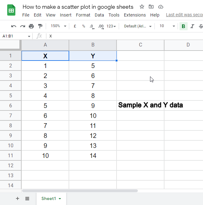
- Create two sets of data (X and Y).
- Insert a scatter plot.
- Calculate correlation using the formula =CORREL(A2:A11, B2:B11).
- The correlation value appears on the sheet.
Learn more in the Article below!
In this article, we will learn how to make a scatter plot in google sheets, why scatter plot?
A Scatter plot is a chart built-in google sheets, it is a data chart that visually represents the analysis of the data, its interpretation is easy, and it shows the graphical data, both linear and non-linear we will see how can we make a scatter plot with our data to see how it efficiently reflects our data.
Advantages of using Scatter Plot in Google Sheets
As we all know that we use tabular data in google sheets, most of the time need to have tables, and we want to represent long tabular data with the help of a pie chart, bar chart, line chart, and many common charts available free in google sheets. But here we want to see the linear growth of the sales, we want to track the sales and downscales for each phase so we can plan the marketing strategy accordingly for the liner and non-linear representation of the data we use scatter plot, it is very easily describes the up and down points on each phase and clarify the that what needs to be changed. So, this is the reason we are learning it, and we all should learn it to make our data more presentable and communicative.
How to Make a Scatter Plot in Google Sheets
Google sheets provide many built-in charts for data presentation and visualization, in a long list of charts we have a scatter chart, also known as a scatter plot, it makes a plot based on given data points and makes an understandable plot of points that we got during a phase of time. We can use it on already written data, so we must have data before we are going to use a scatter plot chart in google sheets, it takes the data as input and renders our given data into a scatter plot, and returns a complete scatter plot with all its feature. We will learn it with the help of dummy data and we will experiment with that data with it and see how it behaves. Follow the below steps with me to make your own scatter plot in google sheets
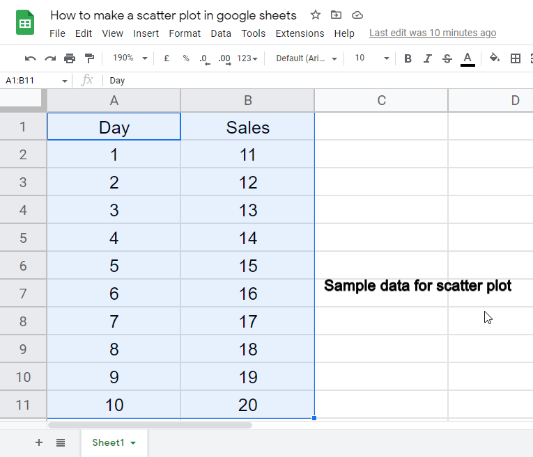
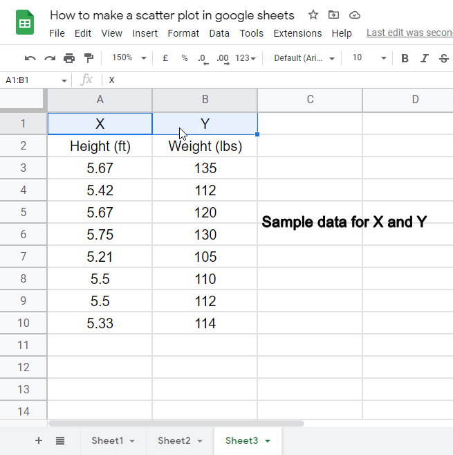
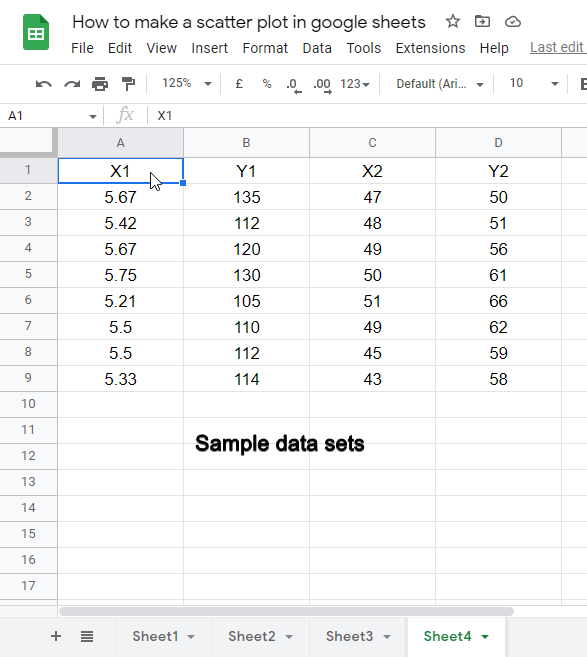
Step 1: Fetch some data
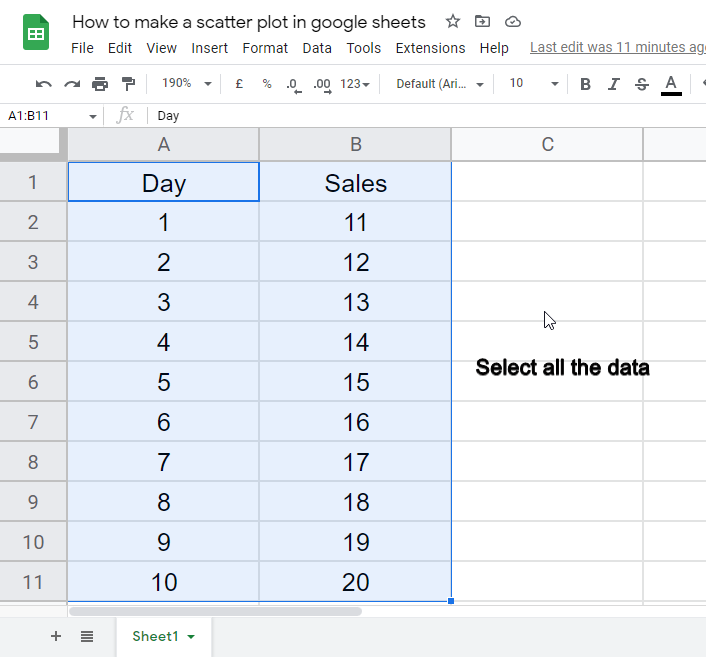
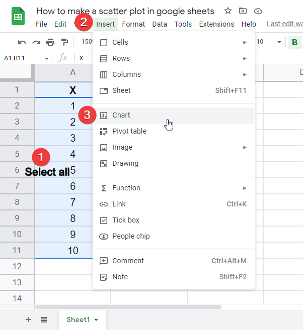
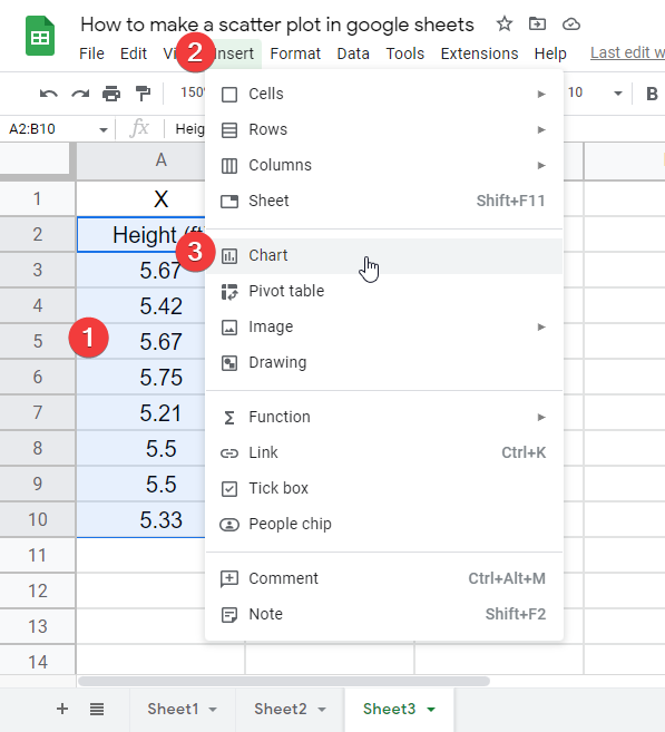
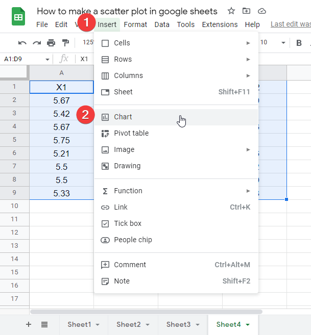
Step 2: Select all the data
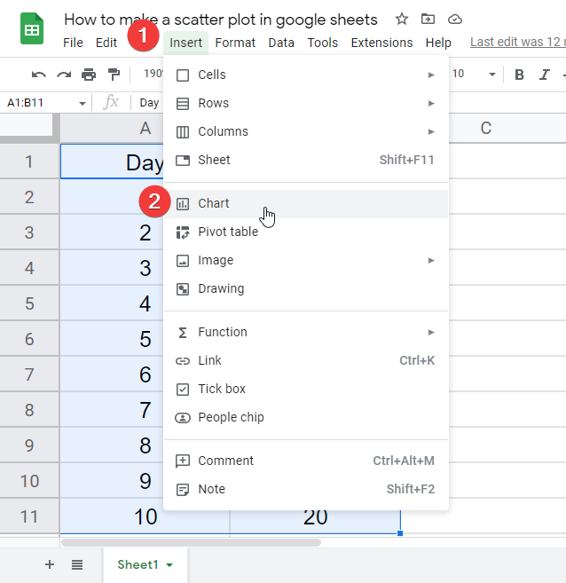
Step 3: Go to insert > Chart
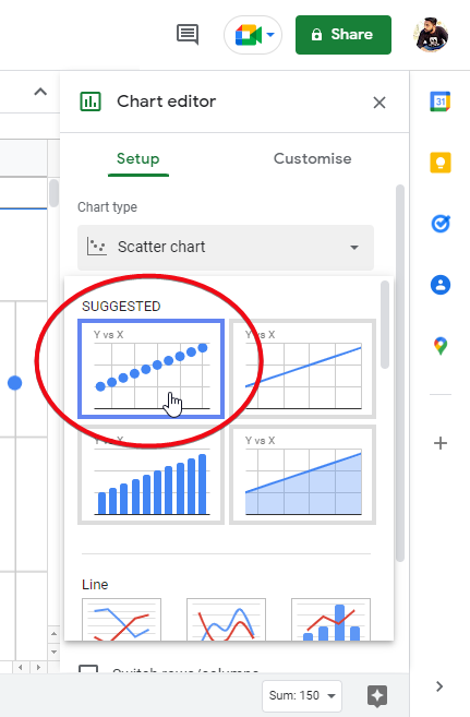
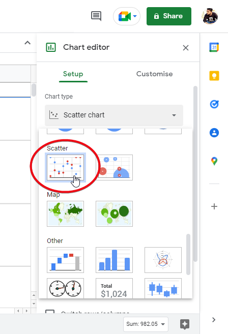
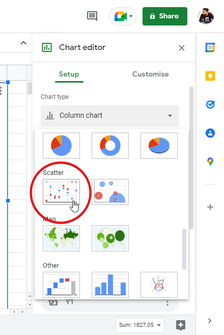
Step 4: Click on the drop-down icon at chart type
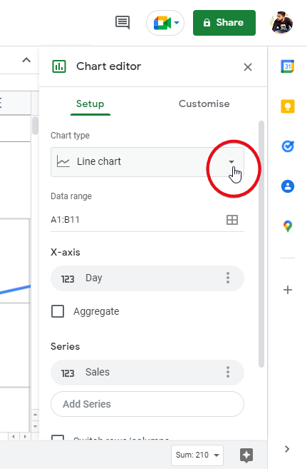
Step 5: Scroll down and click on the scatter chart
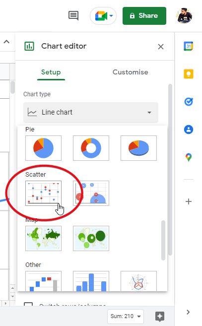
Step 6: Back to the sheet, the scatter plot is ready
This is how you can easily make a scatter plot in google sheets following 6 easy steps.
How to Make a Correlation Scatter Plot in Google Sheets
In this section, we will expand the previous section and will add the correlation function to our scatter plot, so will learn how to make a correlation scatter plot in google sheets.
For this, we will make X and Y data and find the correlation with scatter plots in google sheets. We will also talk about negative and positive correlations.
Step 1: Bring some demo data
Step 2: Select all and go to insert > Chart
Step 3: Select scatter chart
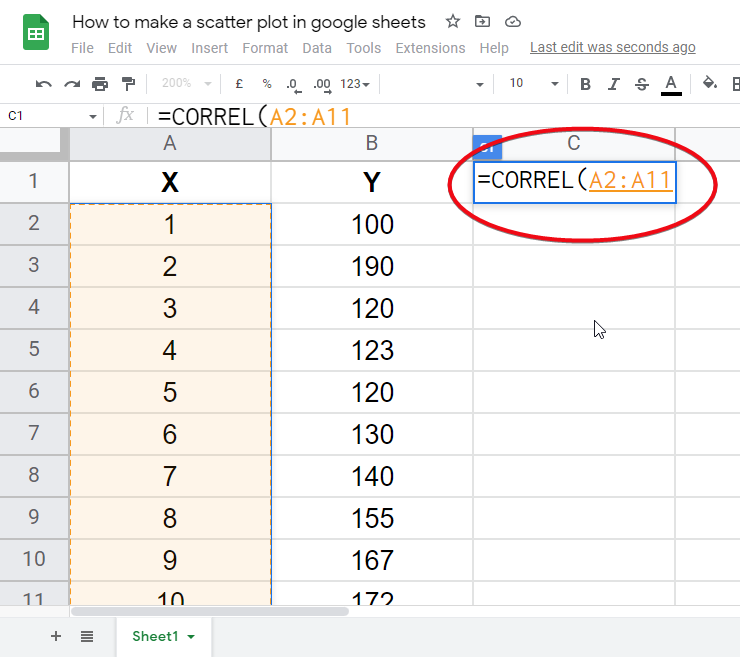
Step 4: In an empty cell, start writing the correlation formula.
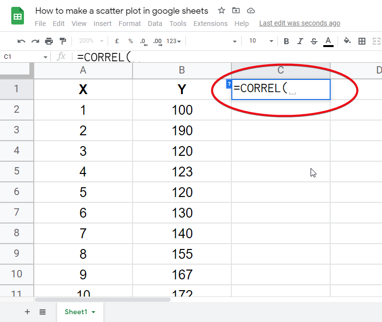
Correlation formula can be written as =CORREL(A2:A11,B2:B11)
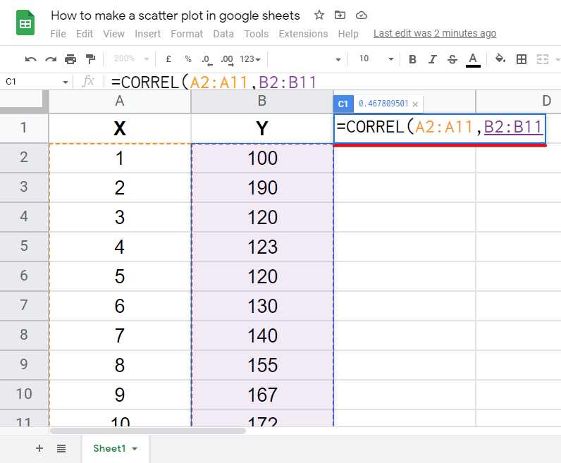
Step 5: Hit Enter, and you have the correlation value of the scatter plot chart
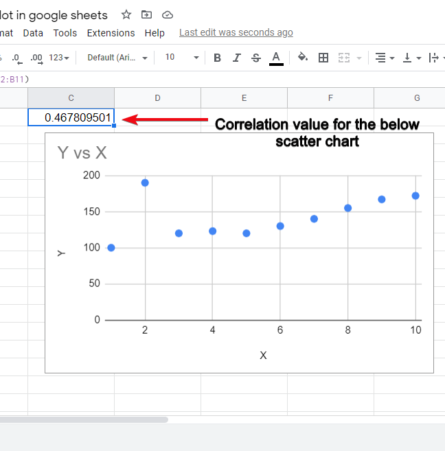
This is how easily you can get the correlation value for the scatter plot chart, you can change the data and see the changes in the scatter plot if the correlation value is positive then it’s a positive correlation, and if minus then the correlation is minus.
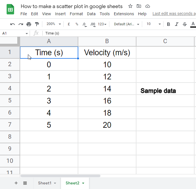
How to Make a Scientific Scatter Plot in Google Sheets
So, in this section, we will dive deeper and will learn how to make a scientific scatter plot in google sheets. We represent scientific calculations and notations with the help of a scatter plot, and this scatters plot can be said as a scientific scatter plot in google sheets.
We will learn step-by-step about scientific scatter plots in this section. Let’s move further and see how it works.
Step 1: Add a scientific data (time and velocity in this example)
Step 2: Select all and go to insert > Chart
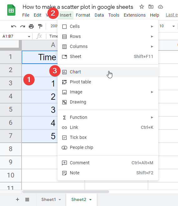
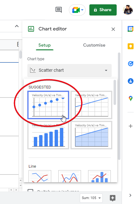
Step 3: Select scatter chart
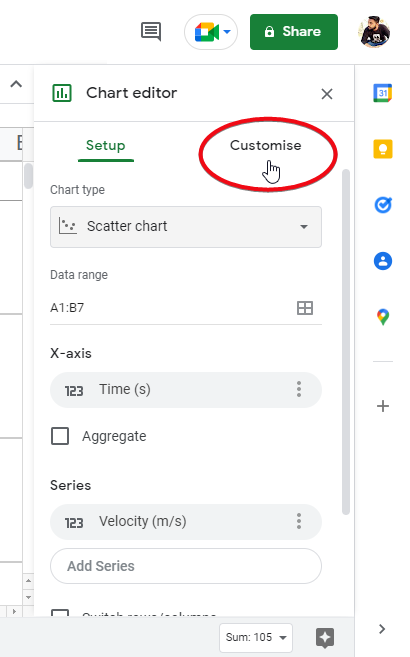
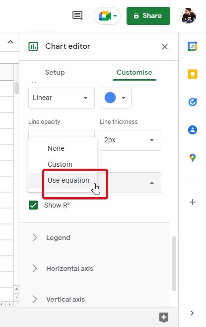
Step 4: In the chart editor, click on customize
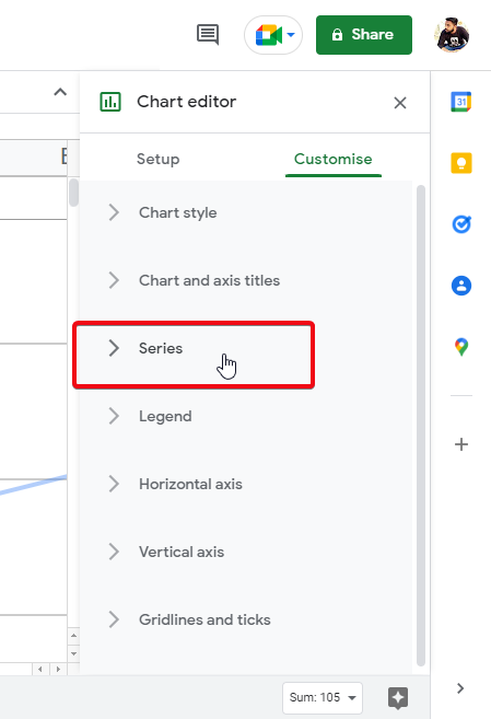
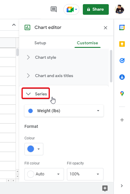
Step 5: Go to series
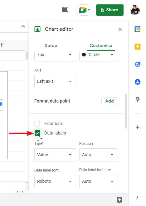
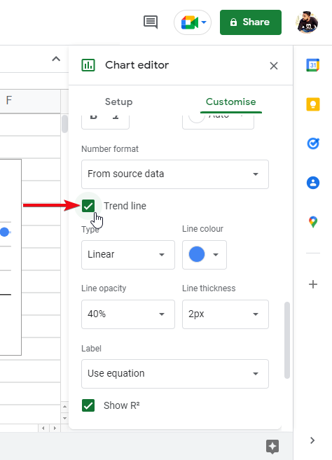
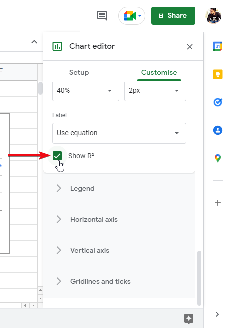
Step 6: Check on trendlines, and data tables
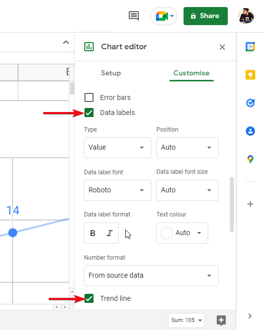
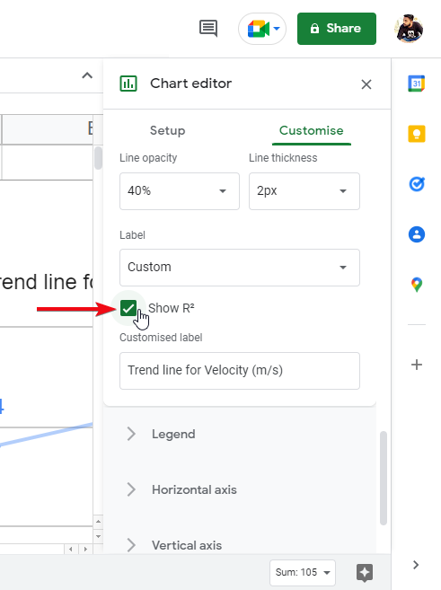
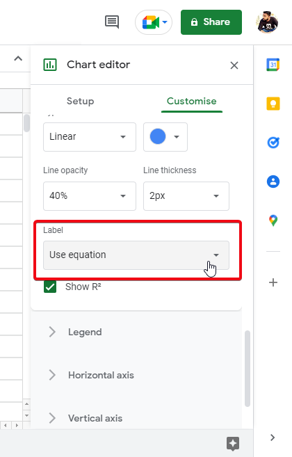
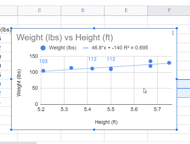
Step 7: Check on R2. Back to the sheet and you’re done.
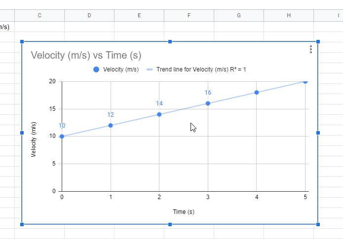
This is how you can make a scientific scatter plot chart using google sheets built-in charts, and also you can use the customization button to use some great features of scatter plot.
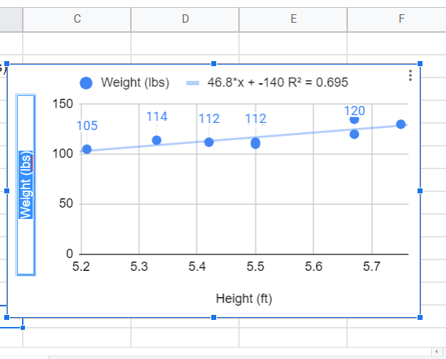
How to Make an XY Scatter Plot in Google Sheets
So, in this section, we will see how to make XY scatter plots in google Sheets, scatter plots with XY coordinates are most commonly used for comparison purposes the values of x and y vary and represent the linear relationship between x and y coordinates. For this, we need data for x and y coordinates. Let’s write some data and get started to work with it.
Step 1: Create X and Y data
Step 2: Select all and go to insert > Chart
Step 3: Select scatter chart
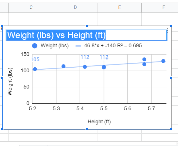
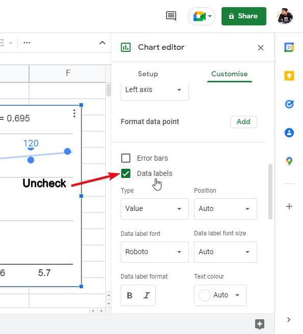
Step 4: Optional customization
Check mark on Data labels
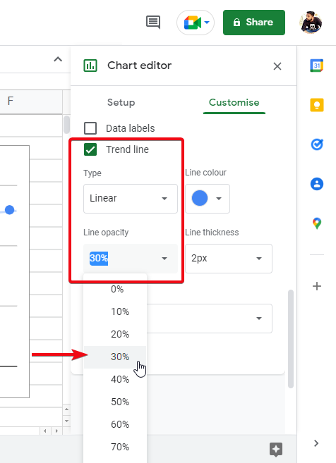
Also, check in Trend Lin
Step 5: Back to sheet, you’re done.
How to Make a Smooth Scatter Plot in Google Sheets
In this section we will talk about the smoothness of the scatter plot, so now we have made the scatter plot for different sorts of data from the scratch, in this section, we will only see how to make our scatter plot looks smoother, prettier, and clean.
Step 1: Remove chart title, and both axis title
Step 2: Remove data labels
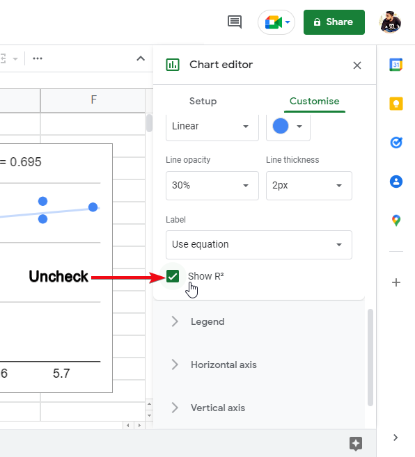
Step 3: Low down the opacity of the trendline keep it at 60%
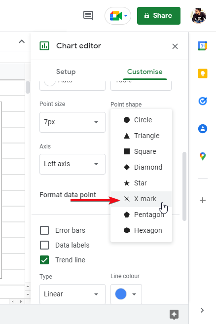
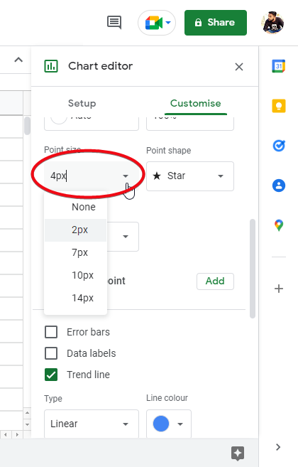
Step 4: Replace dots with x and low down the size to 4px – 5px

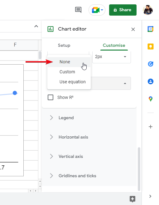
Step 5: Remove R2
After doing the above steps, now you have a clean and smooth scatter plot that looks pretty good, and still represents the data to be understandable.
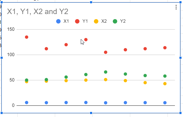
How to Make a Scatter Plot in Google Sheets with Two Sets of Data
In this section, we will see how to make a scatter plot in google sheets with two sets of data or more than one set of data, in this section, we will have to make two data sets for the demo and then we will see how our scatter plot build with two data sets, so start making your dummy data sets now.
Step 1: Make some dummy data (2 sets)
Step 2: Select all and insert > Chart
Step 3: Select scatter plot
Step 4: Your scatter plot is created, and you can see the four columns’ data points are represented with different colors.
Step 5(Optional): Use more customization features in your scatter plot
This is how to make a scatter plot in Google Sheets with two sets of data
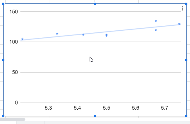
How to Add a Line to a Scatter Plot in Google Sheets
In this smaller section, we will see how to add a line to a scatter plot in google sheets, most of you have already got how to add this, but for those who did not get it, I will teach you how can you add a line.
Follow the easy steps below to add a line to a scatter plot in google sheets
Step 1:
Right-click on your scatter plot chart
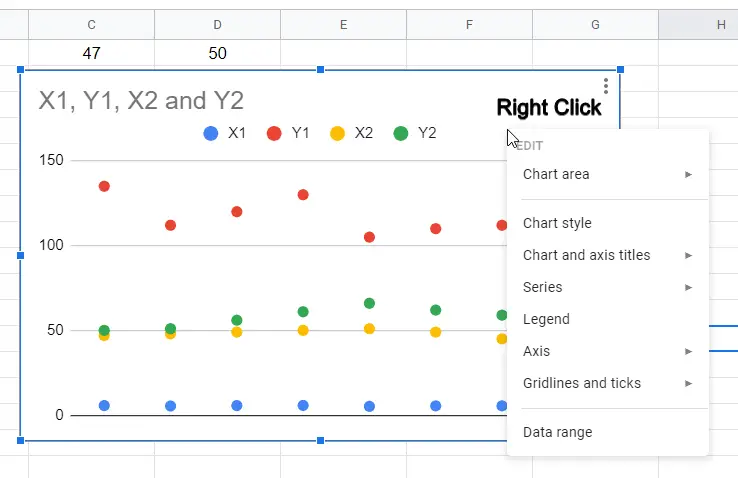
Step 2: Go to Series > and click on “Apply to all series”
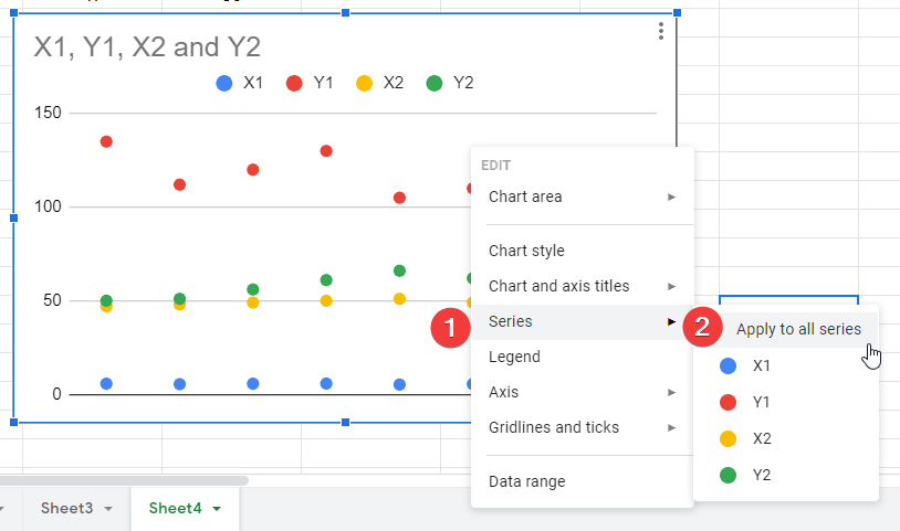
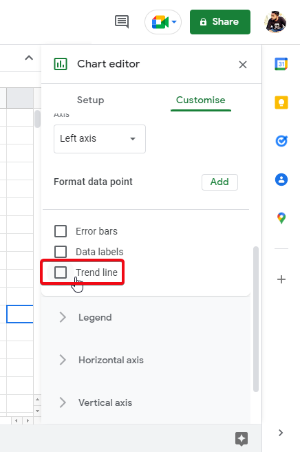
Step 3: Find the trendline checkbox and check on it, you can see the lines for each column have been added
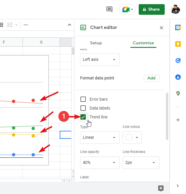
This is how you can simply add a line to a scatter plot in google sheets.
Important Notes
- A Scatter plot allows you to add as many data sets as you want, the only thing to keep in mind is the clarity and visibility. Make sure you don’t add too many data sets into one scatter plot chart.
- A Scatter plot can be used for the comparison of data, in the customization, you can enable the comparison mode.
- For a clean and more concise scatter plot chart, you can remove all the additional information and keep it simple with a light trendline and small data points.
- You can set a custom name for chart title, horizontal axis title, and vertical axis title.
- Always remember that scatter plots are used for visualities only you must have a data set ready to put into the scatter plot, you can’t create data directly with a scatter chart.
Frequently Asked Questions
Can I Add a Trendline to a Scatter Plot in Google Sheets?
Yes, you can easily add a trendline to a scatter plot in Google Sheets by following simple steps for creating trendline in sheets. This feature allows you to identify patterns and trends in your data. With just a few clicks, you can visually represent the relationship between variables and gain valuable insights.
Conclusion
So, if you’re here, I can surely say that you have learned a lot about scatter plots in google sheets from this comprehensive article, we tried to cover the most common methods and questions students have when they work with scatter plots in google sheets. We covered some most common use cases and also saw the customization of the scatter plot. I hope you have enjoyed the article and have learned a lot from this.
If yes, please share it with your buddies and let them learn some important tips and tricks regarding google sheets, for more updates please subscribe to our OfficeDemy blog. Thank you


