
How to Make Line Charts in Google Sheets
- Prepare a simple dataset with two columns.
- Select the dataset and go to “Insert” > “Chart“.
- In the chart options, choose the “Line Chart“.
- Customize the chart title, style, and other formatting options if needed.
OR
- Prepare a dataset with multiple columns.
- Select all the data > Go to “Insert” > “Chart”.
- Choose the “Line Chart“.
- The chart will automatically adjust to include all data columns.
- Customize chart title, style, and other formatting options.
OR
- Use the Setup Tab in the chart editor to select the chart type, data range, and axis options.
- Use the Customize Tab to adjust chart style, titles, series (line attributes), legend, axis labels, gridlines, and ticks.
In this article, we will learn how to make line charts in google sheets.
Charts are the most professional way to represent your data graphically. Google sheets offer various built-in charts in which line charts are the most commonly used. Line charts have three variations in google sheets. We will see all of them in this tutorial. Line charts are made of lines, and graphs, the lines are plotted on the graph that shows the variation of the data over time or any other comparison parameter. Line charts are simple and they beautifully display the graphical representation of your data that can be understood in a few seconds looking at line chart.
Let’s see how to make line charts in google sheets.
Why do we need to Make Line Charts in Google Sheets
We all like graphical representation, if a long text is written and next to it a beautiful chart is designed that’s representing the same data, then what will u prefer to read? Of course, we all read the chart. This is the best answer to the question – why do we need to learn how to make line charts in google sheets.
Many other charts can be used for data comparison and graphical representation, but the line charts are the most sophisticated because they are simple, they are classic, and they are less complicated, thus they are easy to read and understand.
How to Make Line Charts in Google Sheets
We will learn with the help of sample data, we will first see how to make line charts in google sheets using simple data (two columns), then we will learn how to make line charts in google sheets using multi-dimensional data (more columns). We will also learn how to customize line charts and how to set up them beautifully.
How to Make Line Charts in Google Sheets – Using Simple Dataset
In this first section, we will learn how to make line charts in google sheets using a sample dataset. Simple data set means two-columned data that can be simply compared in a line chart.
To practice this method, follow me with the below steps
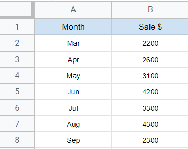
Step 1
Make a similar sample data to follow the example
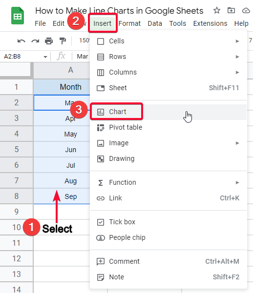
Step 2
Select the dataset and go to insert > Chart
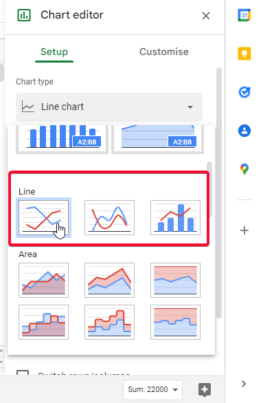
Step 3
Search for the line chart section and click a simple line chart
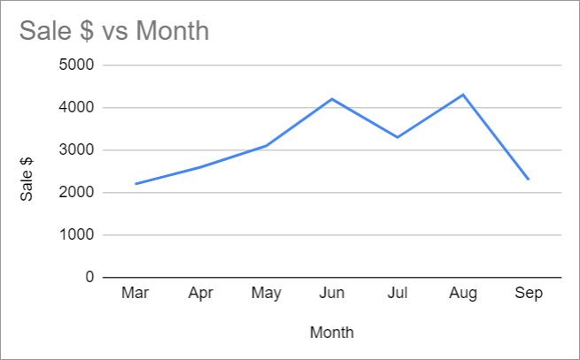
Step 4
Your selected data is added to the line chart
Step 5 (Optional steps)
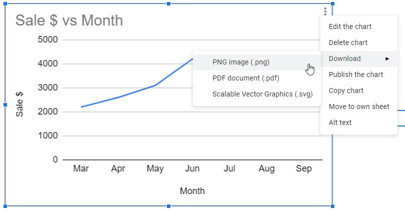
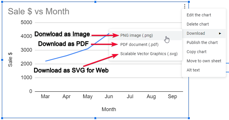
You can save the chart on your local computer
You can edit Chart Title
You can change the chart style
Other Variants of Line Chart on Same Data
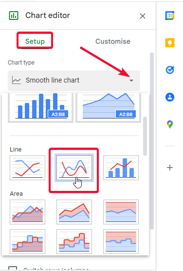
Smooth Line Chart
The Smooth line chart is another variant of a line chart that has no difference but the lines are not edgy. It has smooth lines with rounded corners and curves over data displacement.
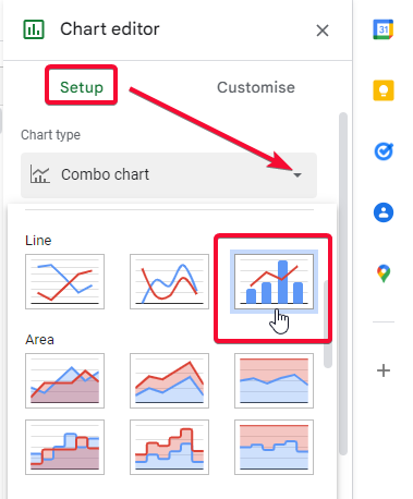
Combo Chart
The Combo chart is a combo of line and column chart, it represents both columns and lines having one data set. It’s a very unique line chart variant but not commonly used.
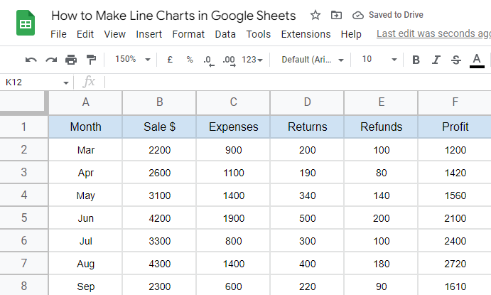
How to Make Line Charts in Google Sheets – Using Multi-Columned Dataset
In this section, how will learn how to line charts in google sheets using multi-columned data, in the above section example we had only one data that was the sale, now here in this section, we will add more data columns such as profit, returns, refunds, etc. All these columns will be handled by the line charts very easily and we will learn how to use them optimistically.
Step 1
Make similar data to follow the example
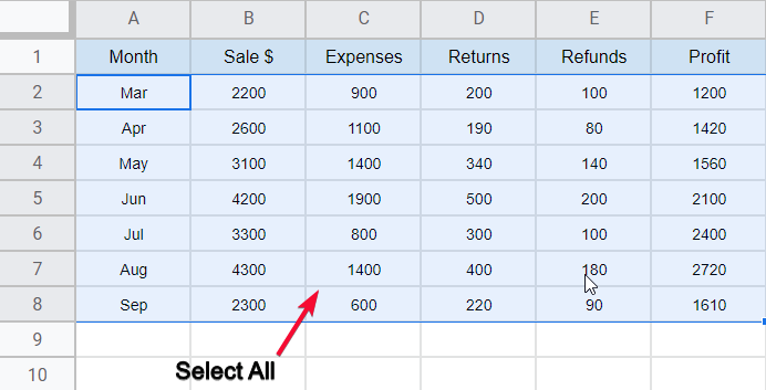
Step 2
Select all
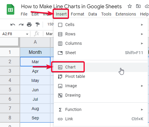
Step 3
Go to insert > Chart
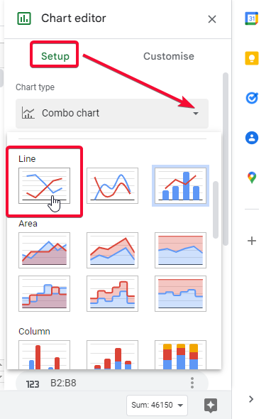
Step 4
Select line chart from the setup tab
Step 5
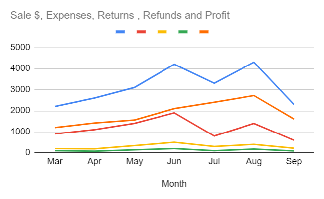
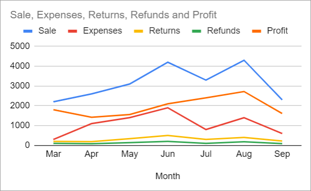
your chart is added and all data columns are auto-adjusted.
Step 6 (Optional steps)
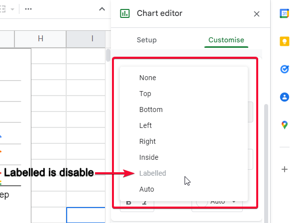
Enable “labeled legend”, if it’s disabled – then we will do it manually
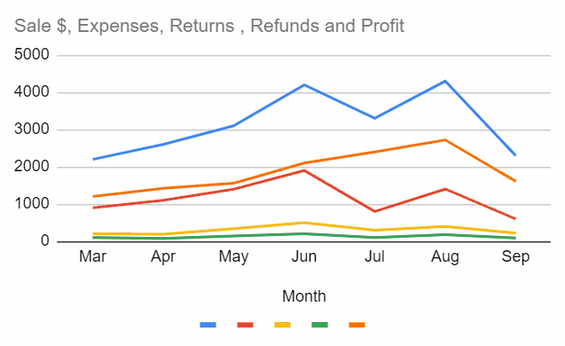
This is how the final chart will look like
Other Variants of Line Chart on Same Data
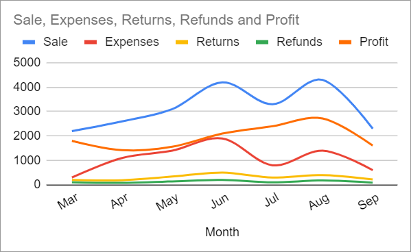
Smooth Line Chart
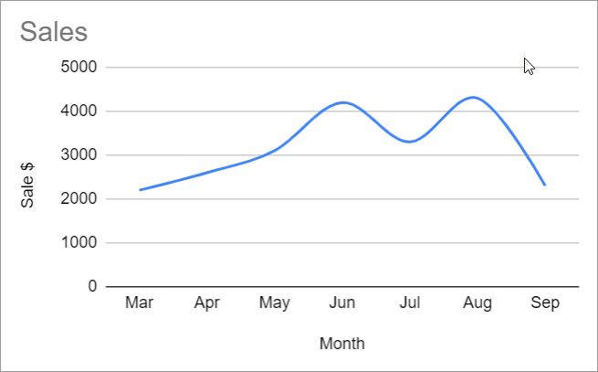
We will use the same five columned data on a smooth line chart, let’s see how it looks
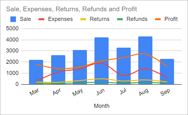
Combo Chart
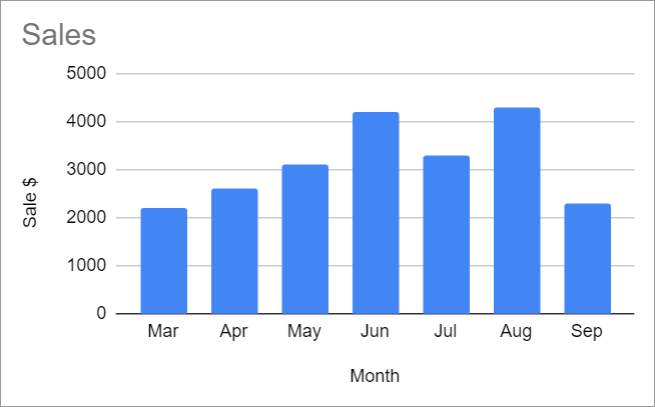
We also use the same five columned data on the combo chart, this will look like the below
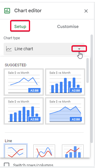
How to Make Line Charts in Google Sheets – The Setup Tab
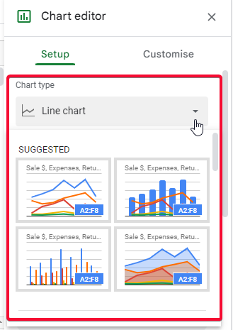
Here we will explore the Setup tab of the chart editor, lets’s discuss the options inside the setup tab
Chart Type
In this section we select the type of chart we want to use for our data
Data Range
Here we enter the complete date range we want to use with the chat we have selected above. This option is used when we did not already select the data, or we want to change the previous data range
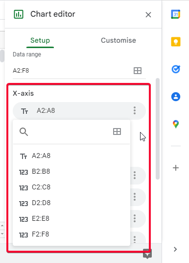
X-Axis
In this section, we have all the column’s data on X-axis, and we can change the data on X-axis separately (according to example; we can separately change the data range from (i.e. A2:A8) for the month, profit, sale, expenses, returns, and refunds columns. or we can add/remove any column if we need to.
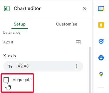
“Aggregate” checkbox
A checkbox to combine all the columned data on the x-axis (not recommended)
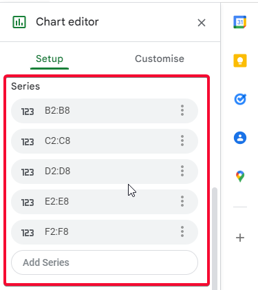
Series
For the series that has lines on the chart, all 5 columns other than a month, we can also add another one
“Switch rows/columns” checkbox
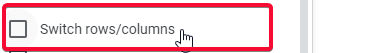
Switch rows to columns and columns to rows (not recommended in normal conditions)
“Use row 2 as header” checkbox
![]()
I will select the first row of data and make it a header (here it indicates row 2 because I selected only data, not the original header)
“Use column A as label” checkbox
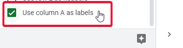
This will make column A (month in this case) a label, and it’s already checked.
How to Make Line Charts in Google Sheets – The Customise Tab
Here in this section, we will explore the customize tab of the chart editor, lets’s discuss the options inside this tab
Chart style
This is a chart body styling section. We have a background color for the chart body, font family for the chart, and chart border color. We use below checkboxes “smooth”, “maximize”, “plot null values”, “compare mode”. Smooth will turn the lines to smooth curves. Maximize will increase the overall width and height of the lines. Plot null values will also plot null (empty) values. And compare mode present the chart in a more comparison-like view.
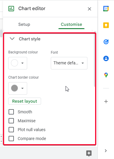
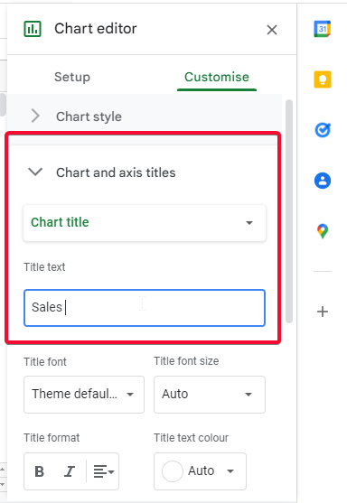
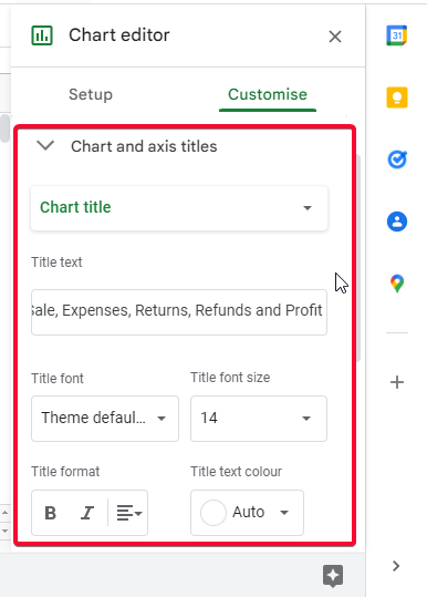
Chart and axis titles
In this section, we can simply add a chart title, edit the chart title, or remove the chart title. Similarly, we have some basic formatting options.
Series
In this section, we can customize the series. Series are the data lines, we can change line color, opacity, thickness, add a point shape where the data is changing, change font size, etc. also we can change the position of the axis; Axis is on the left side by default
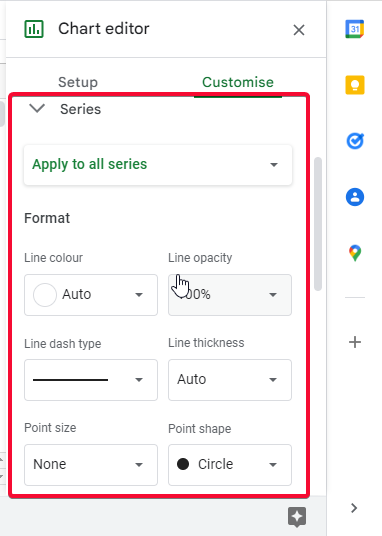
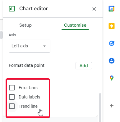
Below we have some checkboxes: Error bars, data labels, and trendline
Error bars: shows the possibility of an error on each data point
Data labels: shows the actual data value of each data point
Trendline: show a line for the trend of overall data
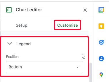
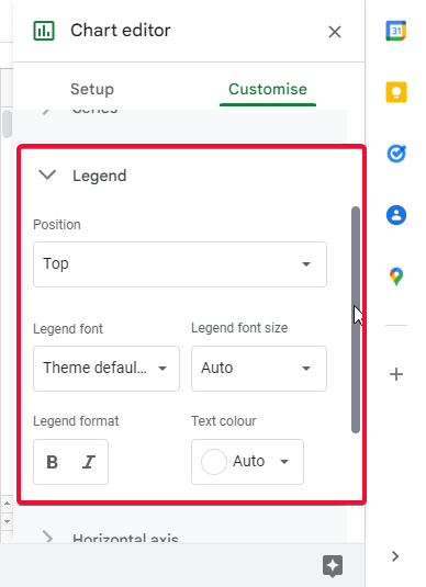
Legend
Shows each data label name with its respective color to make it easy for reading, we cant set the legend position and we have some basic formatting options as well.
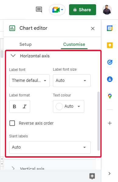
Horizontal axis
In this section, we have options to edit and customize the horizontal axis that has months. We have basic formatting options, and a dropdown menu for “slant label”, it slants the horizontal axis labels from 0 to 90 degrees (auto is recommended)
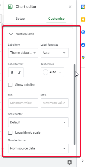
Vertical axis
Similarly, here we can edit the vertical axis that has values, we have basic formatting options and we can set min and max values, as well as we can adjust the scale; i.e., the difference between the scale values.
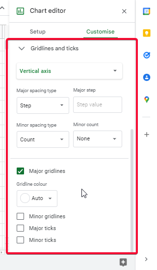
Gridlines and ticks
In this section, we can edit the setup of the gridlines of the chart and can use various ticks in our chart for both axes. We can set major and minor spacing types, and we can also set gridlines color. Below we have three checkboxes: Minor Gridlines, major ticks, and minor ticks.
Minor gridlines: shows the minor gridlines on the background of the chart body
Major ticks: shows the major ticks on your selected axis
Minor ticks: shows the minor ticks on the selected axes.
Tips
- Note that, customization is all your preferences, there are no mandatory customization features, and you can use what you prefer, and what your chart best suits with
- You need to set up your chart correctly while selecting the data, you can change it later but it’s good to select the correct data before adding a chart.
- Never use undersized and oversized charts, keep minimum colors, and small font.
- If you are using it in a business presentation or any of your projects. I suggest you use your brand colors instead of the default colors.
- Some features are strictly designed only for extremely rare cases, we use these charts normally with regular conditions, where we don’t need to have an extraordinary or unique requirement. Some features like I discussed above, such as the “Switch rows/columns” checkbox, are not normally used and are not recommended.
Frequently Asked Questions
Can I Use the Label Legend Feature to Customize Line Charts in Google Sheets?
Yes, you can use the label legend feature in Google Sheets to customize line charts. This feature allows you to add labels to the chart legend, making it easier to understand the data displayed. By using the google sheets label legend option, you can effectively customize and enhance your line charts in Google Sheets.
Can I Use the Same Steps to Make a Bell Curve in Google Sheets as I Would for Making Line Charts?
Yes, you can use the same steps for creating a bell curve in google sheets as you would for making line charts. Simply input your data, select the range, click on the Insert menu, go to Chart, and choose Line chart. Customize the chart to represent a bell curve by adjusting the data and formatting options.
Conclusion
Summarizing how to make line charts in google sheets. We have explored the line charts and all variants deeply, we have seen how to add them, how to set up, and how to customize them. We have discussed every section in the setup tab and the customization tab. This was a comprehensive guide, solely designed to teach you how to make line charts in google sheets. We have another article that teaches you about different charts in google sheets with screenshots, and suggestions + tips for each kind of chart, we didn’t explore any chart in this detail.
So that’s all from how to make line charts in google sheets. See you soon in the next article, I hope you find this article helpful. Don’t forget to share like and subscribe to our blog. Keep learning with Office Demy and keep exploring the new features of the Google office suite.


