
To Make a Chart in Microsoft Word
Pie Chart:
- Open Microsoft Word.
- Go to “Insert” > Click on “Chart” and choose a Pie Chart.
- Click “OK” to insert.
- An Excel file will open with sample data.
- Replace it with your data.
- Customize the chart as needed, and labels will be added automatically.
Sunburst Chart:
- Go to the “Insert” tab and click on “Chart“.
- Select “Sunburst” > Click “OK“.
- An Excel file with sample data will open.
- Modify the data to represent your hierarchical data.
- Customize the chart and labels as required.
Today we will learn how to make a chart in Microsoft Word. If you are working on any document in Microsoft Word and need visual details for any data set, record, or table, then you may need to make a chart in Microsoft Word. Making a chart in Microsoft Word is not a difficult task. Even if you are new to Microsoft Office, it has an easy-to-use interface and provides plenty of features.
Not only can you create documents with text and insert pictures into documents, but you can also create a chart or graph. You do not need to create or make a chart in Microsoft Word manually. There are already-made charts present in Microsoft Word, you just need to select your chart and your chart will be inserted automatically with just one click. Just wait for a while. I will show you how to make a chart in Microsoft word.
Why do we need to Learn to Make a Chart in Microsoft Word?
A chart is a pictorial representation of data, numbers, and values. It provides the simplest way to analyze and read data in your document.
As we know Microsoft word is document processing software in which we deal with large numbers of data and values as well which can consume lots of time and can cause an error while analyzing these data therefore charts provide the user with visual detail of this data and helps the user to analyze it perfectly and efficiently, therefore, learning how to make a chart in Microsoft word cannot be negligible.
How to Make a Chart in Microsoft Word
Let’s see the method to make a chart in Microsoft Word using the pre-built options only. Let’s first start with the most common pie chart.
Make a Chart in Microsoft Word – Pie Chart
Microsoft Word is the most familiar documentation application for users. You can access all essential things easily regarding your documents. Similarly, making a chart or inserting a chart is very easy as we discussed above, you don’t need to make it or draw it, just select your data and then you can insert premade charts with just a few clicks. Let me show you practically with the help of the following examples.
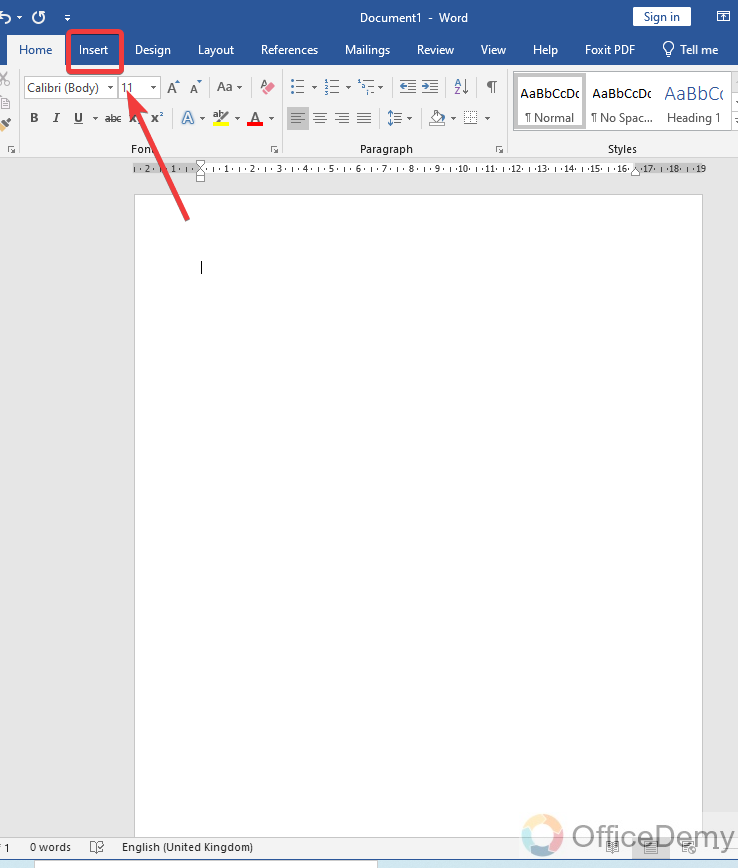
Step 1
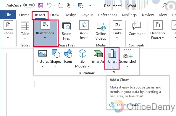
Open Microsoft Word, and then go into the “Insert” tab from the menu bar.
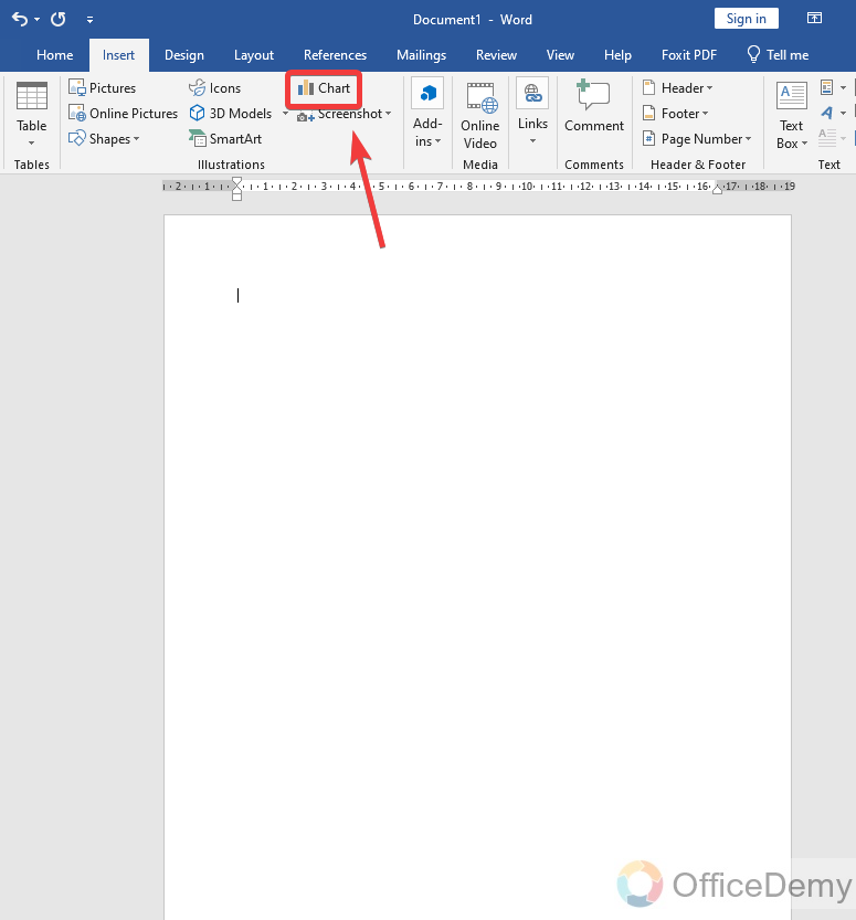
Step 2
In the insert tab, you will find the option for “Chart” at the front. Click on it.
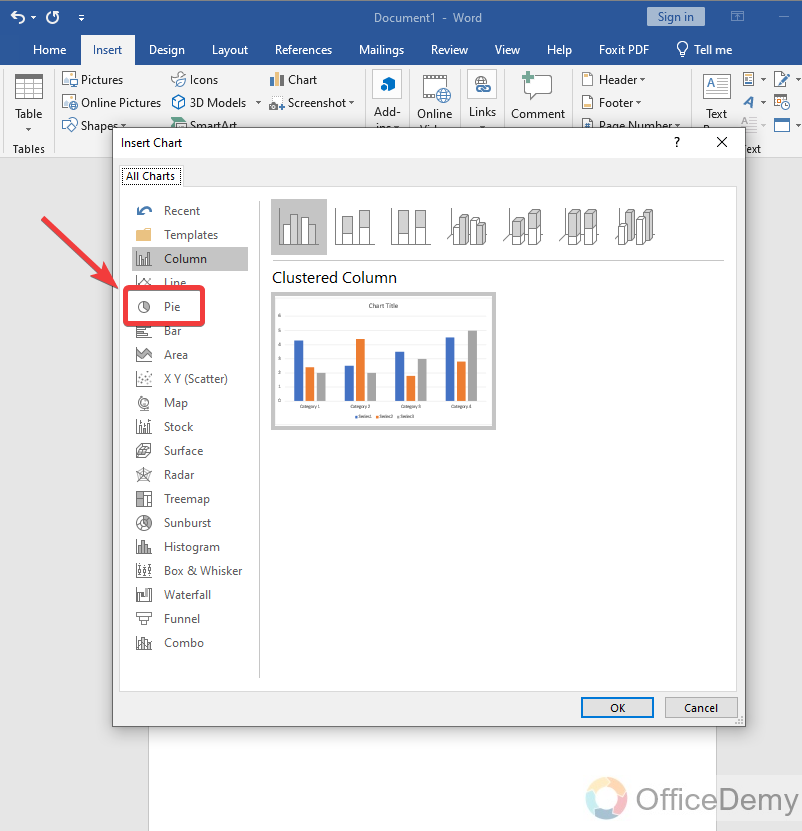
Step 3
When you click on this option, a new window will open in front of you select the pie chart from the categories as mentioned below.
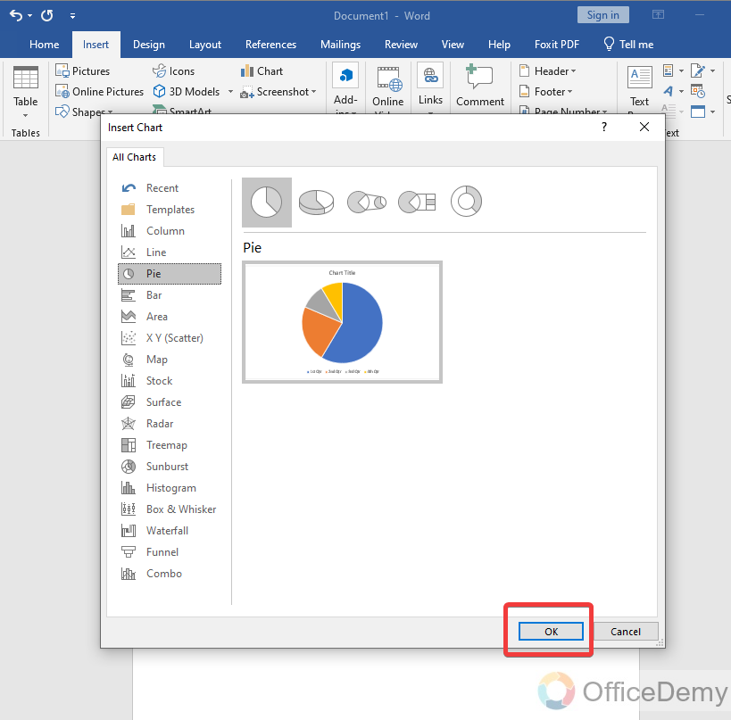
Step 4
Then simply click on the “Ok” button.
Step 5
As you can see, your Chart has been inserted and a new window file is also open with some data values and tables which are related to your chart.
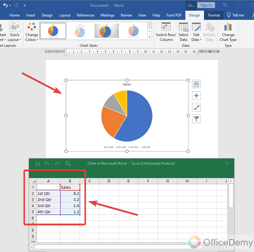
Step 6
These values were by default, but you change them and can put the values for which you want to analyze or make a chart. As I have entered some countries’ population (random) data in the following table.
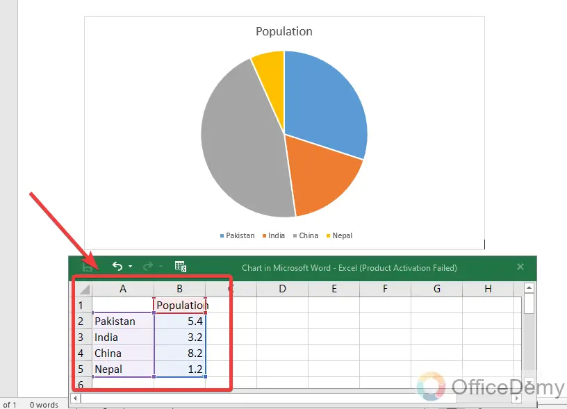
Step 7
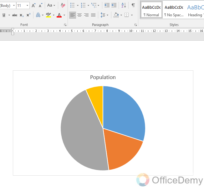
As you can see in the result, now our pie chart is displaying the population data.
Note: You cannot only insert charts in Microsoft, but you can also even edit them, format them, and customize them more according to your wish and need.
Make a Chart in Microsoft Word – Sunburst Chart
In this section, we will see how to make a chart in Microsoft Word. Here I will show you another useful chart in Microsoft Word which is called the “Sunburst” chart, named comes from the “burstiness” of the sun when it’s at its full potential. This is a little uncommon chart that we are going to explore now.
First, let’s understand what a sunburst chart is; A Sunburst chart in MS Word is a data visualization tool that displays hierarchical data in a circular format. It shows how the data is divided into categories and subcategories by using color-coded segments that radiate from the center of the circle. The outermost ring represents the main category, and each subsequent ring represents the subcategories within it. The size of each segment corresponds to the proportion of data it represents. This type of chart is useful for identifying patterns and trends in complex data sets.
Step 1
Go to insert Tab > Chart
Step 2
Select the Sunburst from the list its number six from bottom
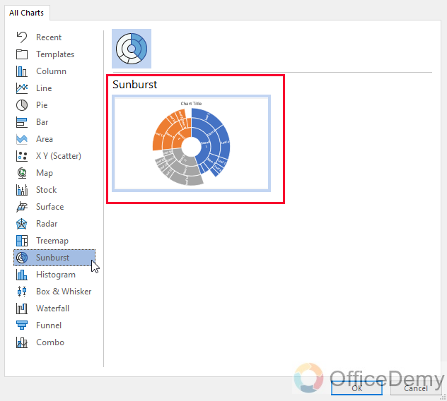
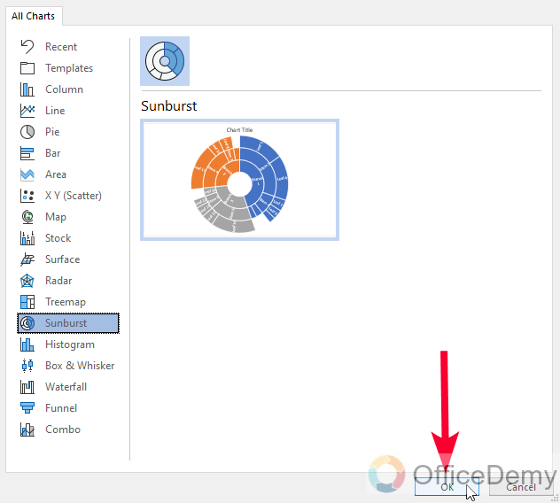
Step 3
Click on the Ok button to add the chart
Step 4
The chart is added with an excel file holding some data
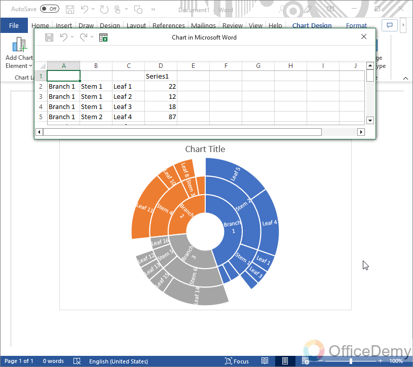
Step 5
Now you can edit this excel file and change data as per your need
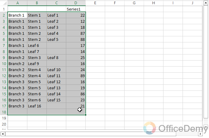
Step 6
You can see data, there are 3 branches, and so many leaves, this will help you understand the pattern of this chart.
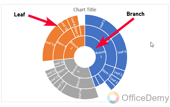
This is similar to a pie chart but more extended.
Important Notes
- A Pie chart is a circular chart divided into sectors, with each sector representing a proportion of the whole.
- It’s essential to choose the right data to represent using a pie chart, where the categories add up to 100%.
- Keep the number of categories to a minimum, ideally between 2-6, to avoid cluttering the chart.
- To make the chart more readable, it’s good to add labels to each segment, displaying the value or percentage of each category.
- You can use different colors or shading to differentiate between each segment.
- Use chart titles, axis labels, and legends to give context and clarity to the chart.
- A Sunburst chart is a data visualization tool that displays hierarchical data in a circular format.
- It shows how the data is divided into categories and subcategories by using color-coded segments that radiate from the center of the circle.
- The outermost ring represents the main category, and each subsequent ring represents the subcategories within it.
- The size of each segment corresponds to the proportion of data it represents.
- Sunburst charts are useful for identifying patterns and trends in complex data sets.
Frequently Asked Questions
Q: How to add data labels and legends to our chart in Microsoft Word?
A: Without legends or labels reading a chart is so difficult. If a chart has data labels or legends, then it’s easy to understand the chart. Therefore, Microsoft Word also provides the facility of adding data labels and legends to your chart. Below are the steps to add data labels and legends to the chart in Microsoft Word.
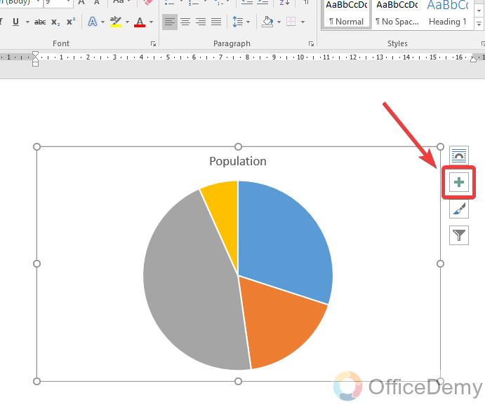
Step 1
To add data labels or legends to your chart, first select the chart in which you want to add data labels, where you will see a plus sign along the chart as shown in the following figure.
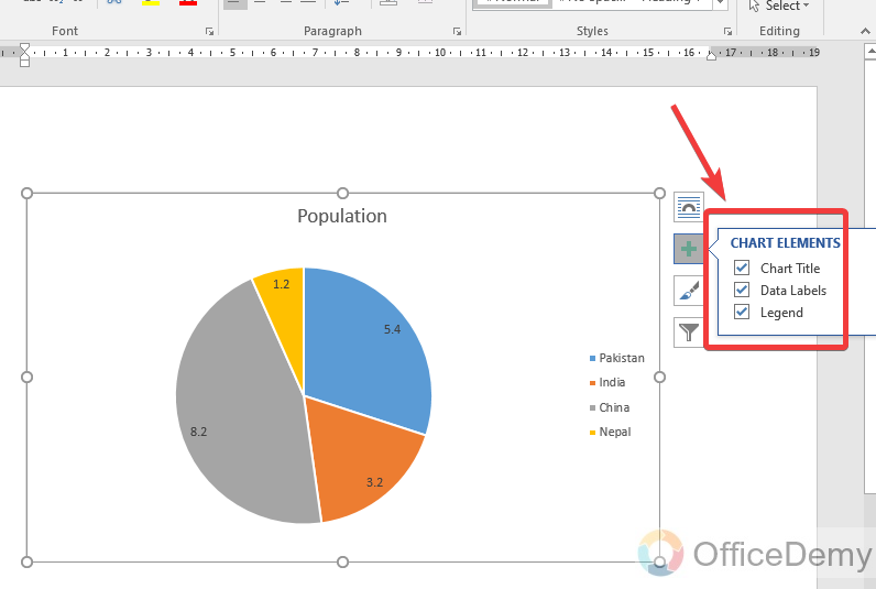
Step 2
When you click on this plus sign button a small dialogue box will open which will ask to show the data labels and legends. Check the marks which you want to display with your chart.
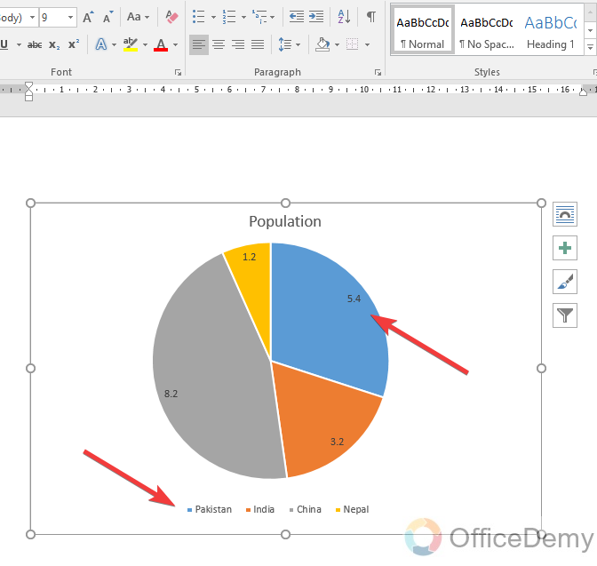
Step 3
You can see the result now; legends have been displayed.
Conclusion
So, this was all about how to make a chart in Microsoft Word. Hope the above article on how to make a chart in Microsoft Word would be helpful to you. Through this article, you can analyze a large amount of data and values in a few minutes with the help of visual detail like a chart. For more solutions keep connected with Office Demy. I will see you next time with another helpful tutorial.