
The best Top 3 FREE Community Visualization Apps in Google Data Studio:
- Sunburst Chart; By Supermetrics
- Animated Bar Chart; By Analytics Buddy
- Metric Funnel; By PowerMyAnalytics
Hi everyone. Welcome to another interesting tutorial of our Google Data Studio series. In this article, we will see the top 3 community visualization apps in Google Data Studio. As I have covered a few articles on some of the apps from the community gallery, you much have an understanding of what community visualization is and why it’s there in Data Studio. Well, If you use Google Docs, Slides, or Sheets, you must have seen or heard about add-ons. We access add-ons from the Extensions tab and then fins and app, then we install it to enhance the functionality of our documents. They can be said as external plug-ins or extensions can are installable and usable with Applications such as Sheets.
In Data Studio, we don’t have Extensions > add-ons, but we have Community Gallery, where we have some extensions that are created by community partners and are ready to be used by any user for free. So, today we will see the community Gallery and will talk about the top 3 Apps. So, let’s get started.
Why do we use Community Visualization Apps in Google Data Studio?
Well, we use external apps everywhere on the web. We use Google Sheets add-ons to enhance the functionality, we use them in Docs as well and also use WordPress plugins to increase functionality or add a completely new feature to our website. So, using external apps, and the third-party add-on is not new, we use them for almost any framework and platform to increase productivity by adding external features and installable plugins.
So, therefore, today we will explore the community Gallery, and will see some very good apps that will say you must have been missing for a long. so let’s get into it and see what we got.
Community Visualization Apps in Google Data Studio
We will first see all the available apps in the Community Gallery, and then I will give you my top 3 it. Your top 3 can be different, and it’s very normal. You can explore by yourself and can any from so many available apps.
Google Data Studio – Community Gallery
In this section, we will explore the community gallery, so after setting up a report, and connecting with a data source. Open a blank canvas and let’s get started
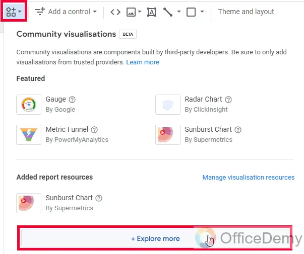
Step 1
Go to Community Visualization in the toolbar.
Click on the Explore more button.
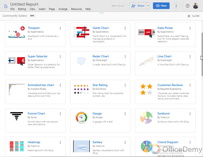
Step 2
Here, you have got a big list of apps, let’s check them out
Step 3
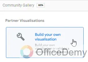
First, look at this “build your own visualization”, this is a custom button to create your own app, or get an app with a manifest path that is not available in this list
Sunburst Chart; By Supermetrics
A sunburst chart is used for making a doughnut-shaped, sunburst-like effect with multiple layers in each circle.
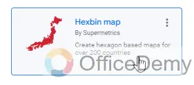
Hexbin Map; By Supermetrics
A Hexbin chart is used for making hexagons based on the world map\
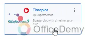
Timeplot; By Supermetrics
Timeplot is a type of scatter plot with a timeline as the x-axis
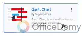
Gantt Chart; By Supermetrics
A Gantt chart is used for visualizing the project timeline, or the overall span of a campaign with all ups and downs
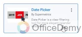
Date Picker; By Supermetrics
A date picker is just like a calendar ribbon that is used for date picking and then visualizing data as per the date ranges, you can say them as beautified data ranges.
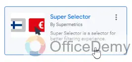
Super Selector; By Supermetrics
Super Selector is a powerful filtering tool that helps us with simple and complex filtering of data
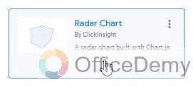
Radar Chart; By ClickInsight
A Radar Chart is used to represent multivariate data in the form of a two-dimensional graph of three or more quantitative variables.
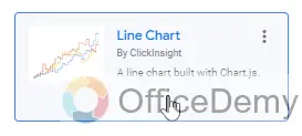
Line Chart; By ClickInsight
Line Chart is more than a simple line chart, it’s developed in JavaScript.
Animated Bar Chart; By Analytics Buddy
Animated Bar Chart is literally an animated bar chart that looks like a gif when playing, the bars keep shuffling and all those ups and downs are rendered in real-time.
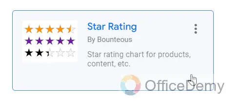
Star Rating; By Bounteous
Star Rating is a simple chart to show start ratings out of five
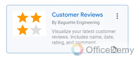
Customer Reviews; By Baguette Engineering
Custom Reviews is pretty similar to start rating, and it also used to visualize the customer reviews in start forms
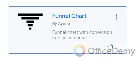
Funnel Chart; By Ayima
Funnel Chart is used to create a funnel based on data metrics
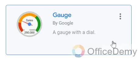
Gauge; By Google
A gauge is a simple gauge with a dial to represent single values with needles
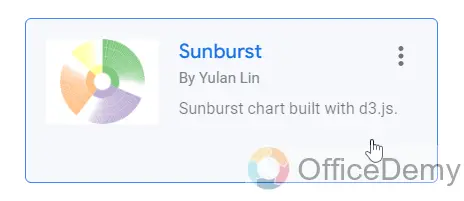
Sunburst; By Yulan Lin
Another Sunburst chart, but it’s based on JavaScript
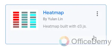
Heatmap; By Yulan Lin
Heatmap is used to show the data variations based on light and cool colors
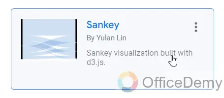
Sankey; By Yulan Lin
Sankey is a type of flow chart diagram in which the width of the arrows is proportional to the flow rate.
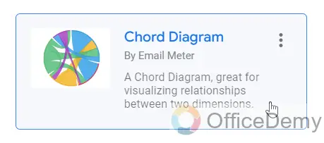
Chord Diagram; By Email Meter
A chord Diagram is normally used to make a comparison of data based on dimensions
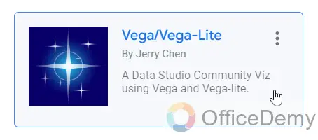
Vega/Vega-Lite; By Jerry Chen
Vega and Vega-Lite are visualization tools implementing a grammar of graphics, similar to ggplot2
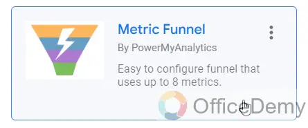
Metric Funnel; By PowerMyAnalytics
Metric Funnel is yet another Funnel chart diagram used to make interactive Funnels.
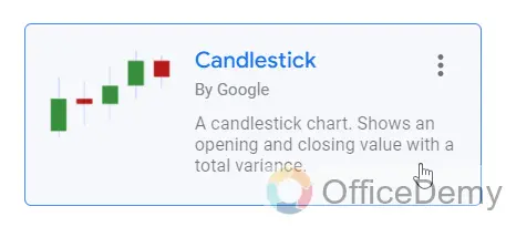
Candlestick; By Google
Candlestick shows opening and closing values with a total variance
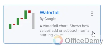
Waterfall; By Google
Waterfall shows the current value of variables over time, and calculates the difference with the initial values
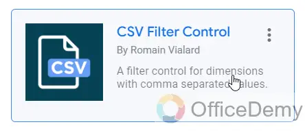
CSV Filter Control; By Romain Vialard
CSV Filter Control is a filter control for dimensions with comma-separated values.
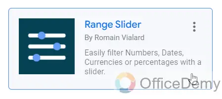
Range Slider; By Romain Vialard
Range Slider is used to easily filter Numbers, Dates, Currencies, or percentages with a slider.
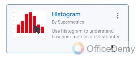
Histogram; By Supermetrics
The histogram is used to show the data distribution based on different categories
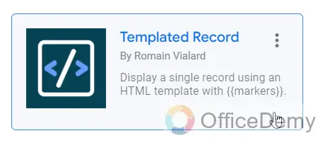
Templated Record; By Romain Vialard
Template Record is used to display the data using an HTML template with markers
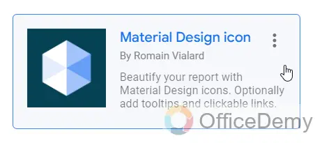
Material Design Icon; By Romain Vialard
Material Design Icon is used to visualize the data with the help of beautiful design icons and also allow users to add tooltips and clickable links
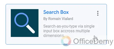
Search Box; By Romain Vialard
Search Box is used to search as you type via a single input box across multiple dimensions
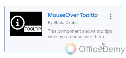
MouseOver Tooltip; By Shota Okabe
MouseOver Tooltip is used to add a tooltip and it shows the message when a user mouse over it.
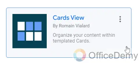
Cards View; By Romain Vialard
Card Views help to represent your data in the form of cards.
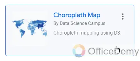
Choropleth Map; By Data Science Campus
Choropleth Map is a kind of map using D3.
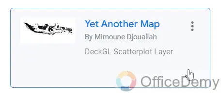
Yet Another Map; By Mimoune Djouallah
Yet Another Map is also a kind of map based on a scatter plot.
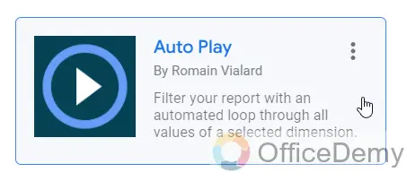
Auto Play; By Romain Vialard
Auto Play is used to filter the overall report with an automated loop through all values of a selected dimension
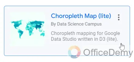
Choropleth Map (lite); By Data Science Campus
Choropleth Map lite is the lite version of the Choropleth Map based on D3.
Flight-Paths; By Data Science Campus
Flight -Paths is used for animated, and connected scatter plots using D3.

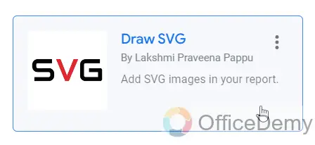
Draw SVG; By Lakshmi Praveena Pappu
Draw SVG is used to add SVG graphics/images to Data Studio reports
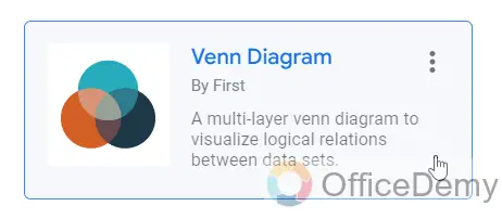
Venn Diagram; By First
Venn Diagram is used as a multi-layer Venn diagram to visualize logical relationships between data sets
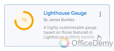
Lighthouse Guage; By James Buckley
Lighthouse Gauge is a highly customizable gauge base on those featured in lighthouse auditing reports.
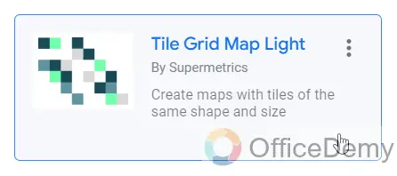
Tile Grid Map Grid; By Supermetrics
Tile Grid Map is used to create maps using tiles and shapes of the same size
Custom Table; By Thomas Langnau
Custom Table is used to create a more powerful table, they use CSS, Delta sort, and more.
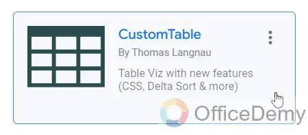
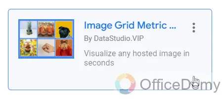
Image Grid Metric Grid; By DataStudio.VIP
Image Grid Metric Grid is a tool to visualize images in seconds that are already hosted.
Top 3 Community Visualization Apps in Google Data Studio
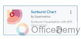
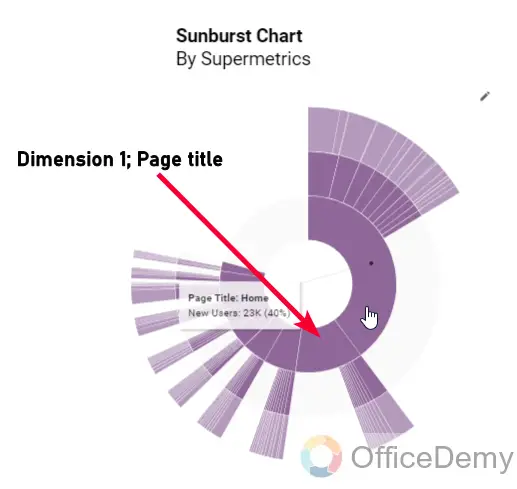
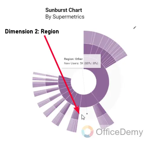
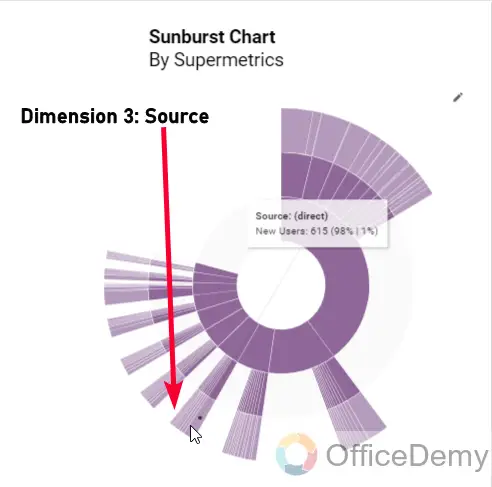
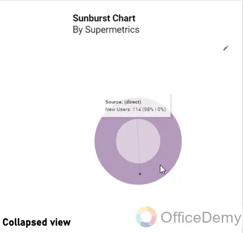
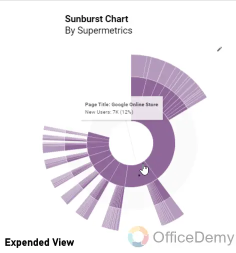
Sunburst Chart; By Supermetrics
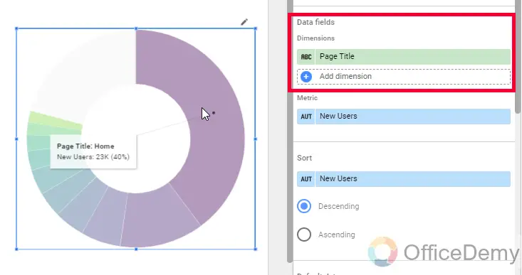
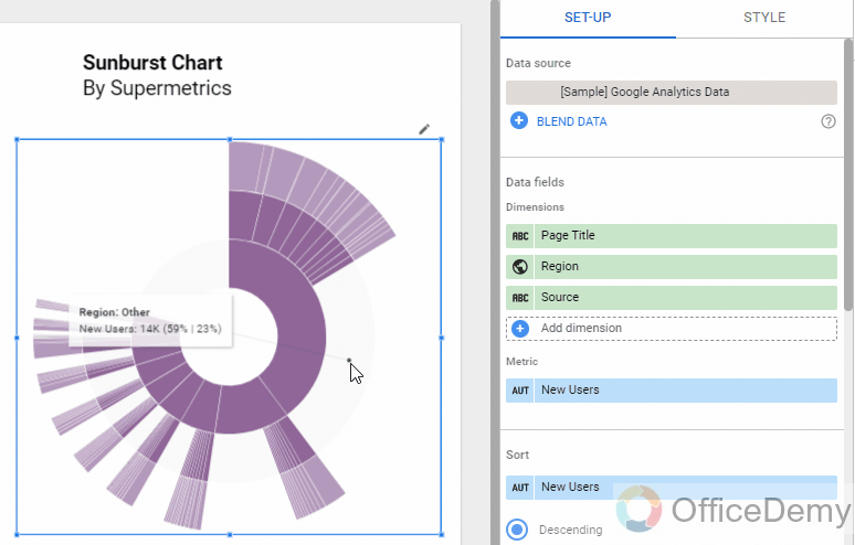
The sunburst chart is a kind of chart that shows the hierarchical data. It looks like a pie chart but there are some layers inside the Pies. Each level of the hierarchy is shown by one ring with the innermost circle at the top of the hierarchy. A sunburst chart will exactly look like a doughnut chart if there is no inside data in the circled layers. It takes multiple dimensions to use them as the layers of the circles, and a single metric to show the data.
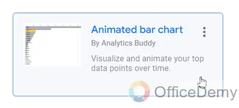
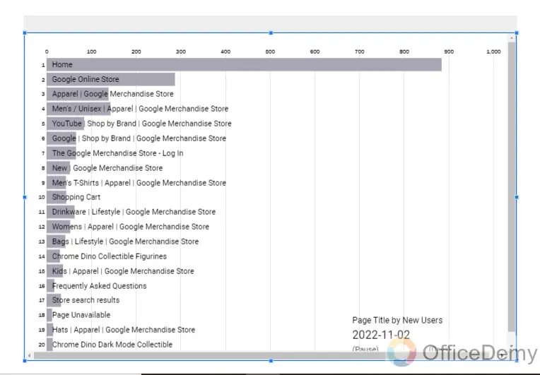
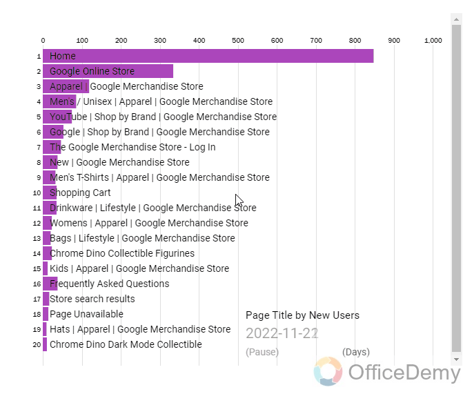
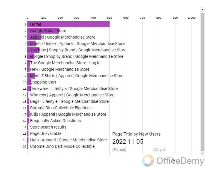
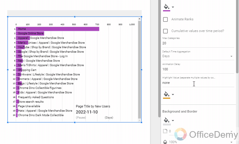
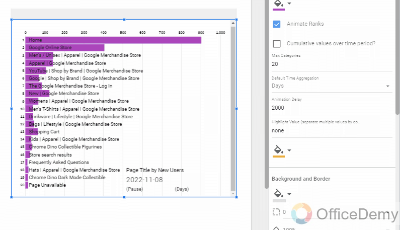
Animated Bar Chart; By Analytics Buddy
Animated Bar Chart is literally an animated bar chart that looks like a gif when playing, the bars keep shuffling and all those ups and downs are rendered in real-time. We use them to record videos with automated real-time changes in the rankings of the metrics based on values change over time, we can manually change time with a click and also stop the shuffling with a pause button.
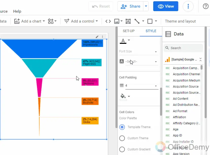
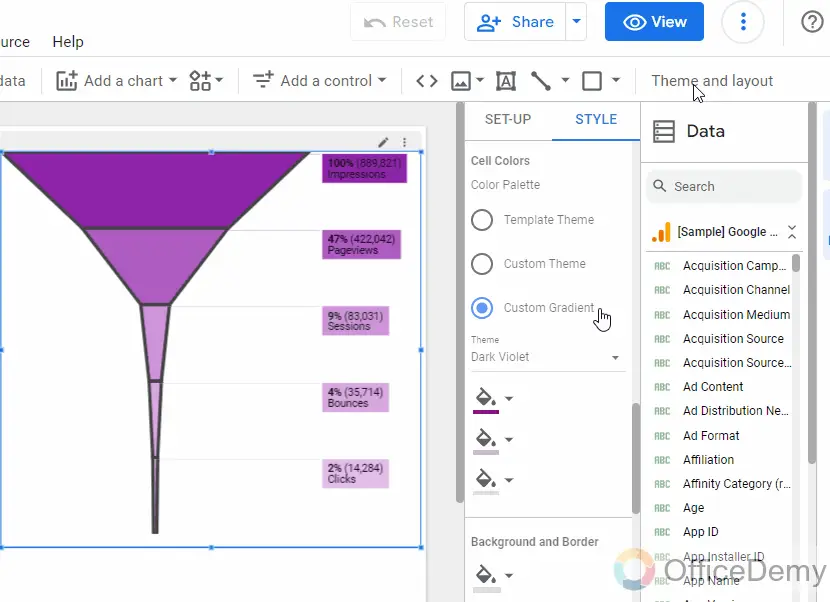
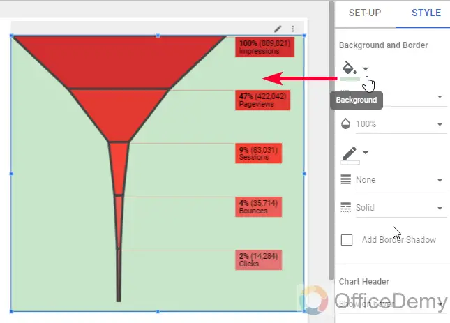
Metric Funnel; By PowerMyAnalytics
Metric Funnel is a Funnel chart diagram used to make interactive Funnels. We can create a connected funnel with multiple colors, and gradients. We can use it to show the process of a funnel and we can get useful insights to form it. Normally it’s used as the first metric on the top such as impressions, then clicks, then conversions, and lastly sales, and we see how many differences we are getting from impressions to sales, so we know what is out actual conversion rate and what else do we need to move to improve sales.
Conclusion
This was about the Top 3 Community visualization apps in Google Data Studio. I hope you have got an idea about the community gallery and you have seen all the apps available at a glance. I hope you find this article useful and that you have learned something new from it. I will see you soon with another useful guide. Keep learning with Office Demy.


