
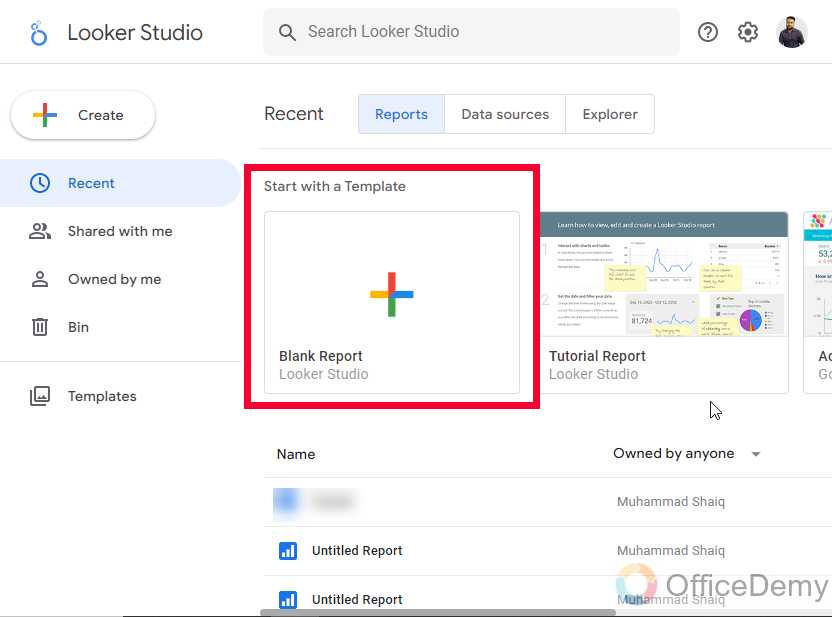
To Create a Funnel in Google Data Studio
- Go to Community Visualization and add a “Funnel chart“.
- Customize it.
- Choose a suitable funnel style, and set up colors, fonts, legends, and labels.
- Use the “Invert funnel” option to adjust the funnel’s orientation.
- Customize the color palette.
- Set the background and border options to enhance the funnel’s visual appeal.
Hi. Welcome to another tutorial of our Data Studio series. In this article, we will learn how to create a funnel in Google Data Studio. Normally a funnel is a chemistry lab item that is wide open from the top and narrow from the bottom, it’s mainly used to pass liquid or powder compounds to a small opening without wasting it. Having a similar concept, we have a data funnel, in the digital marketing funnel is a framework that is used to work like a funnel, it’s a multi-level process in which we try to carry a consumer throughout a funnel, and on the other side, we have our business.
An example is on the internet and we have made a funnel that is targeting a specific audience, now we want to take all those users into this funnel through ads, referrals, endorsement, or any marketing strategy, then we have some methods to continue taking the user from our key points to provide them value and make business through them. This process is called data funnel in Digital marketing, or Data Analytics.
Importance of a Funnel in Google Data Studio
A funnel is a complete group of methods and processes that are made after keeping a user in mind. A sales funnel is a common type of funnel that has different layers and different methods to capture a user and turn a lead into potential customers. Any funnel has two sides, one is the logical side and the other is the physical side. The logical side has all the logic in it that may include programming logic, some redirecting functions, some rollbacks, SEO, and backlinks as well. It depends on the purpose and goal behind creating it.
The physical side of the funnel is not for users, it’s only for the one who has created it. This is the physical appearance of the funnel you have created or are working on; it has a normal funnel-like shape but has some layers inside that are responsible for different things and only let pass a user to the next step when one is accomplished.
So this is what we called a funnel in Data. We can create funnels using Photoshop, and similar photo editing tools, but they won’t be logically functional so we need software or a tool that gives us both the physical design of the funnel and also the logical aspect of it. So, we use Google Data Studio for this, in Data Studio we can create beautiful funnels, and as well as we can add data to our funnels, and get useful insights within a single GUI. So, therefore, we need to learn how to create a funnel in Google Data Studio.
How to Create a Funnel in Google Data Studio?
Here in this section, we will learn how to create a funnel in Google Data Studio. We will start from scratch and gradually proceed to the next steps to finish making a beautiful funnel and also with the suitable data for it. We will use random data in our implementation to make you understand it properly. So, let’s get into it and start creating a funnel in Google Data Studio.
How to Create a Funnel in Google Data Studio – Funnel Chart
In this section, we will learn how to create a funnel in Google Data Studio using a Funnel chart. Now, there is no funnel chart available in Google Data Studio in the charts section. But we have a funnel chart in community visualization, so we will bring the funnel chart and will plot our data on it to create a funnel in Google Data Studio. So, let’s see how to get it and how to make it personalized by placing real data on it.
Step 1
Open your Google Data Studio report, or start with a blank report template
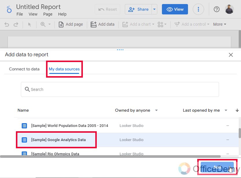
Step 2
Connect a data source (here I am using Google Analytics sample data so that everyone can use it)
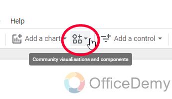
Step 3
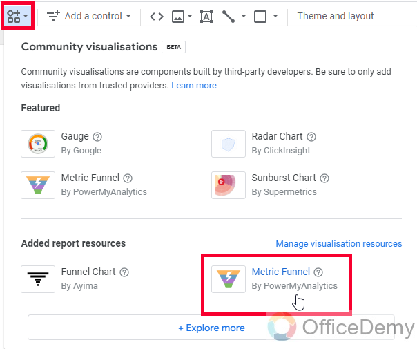
Go to Community Visualization in the toolbar
Step 4
Click on +Explore more
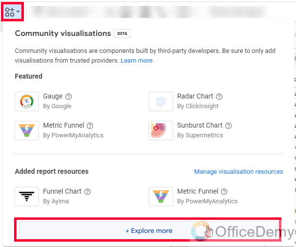
Step 5
Here, you will find an add-on with the name “Funnel chart”
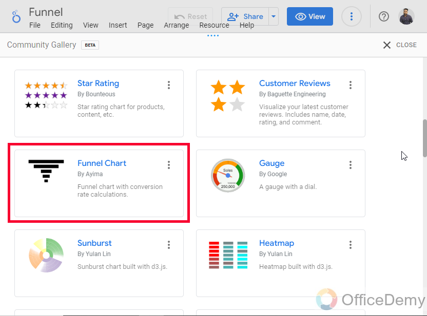
Step 6
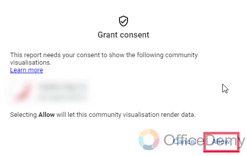
Click on it, and allow it to add to your Google Data Studio report
Step 7
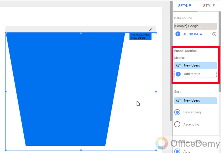
Now you can draw it on your canvas by mouse drag
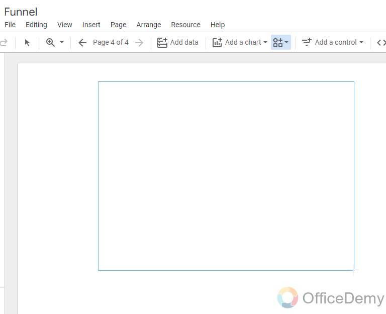
Step 8
The funnel is being created, now we will see how to add data to it.
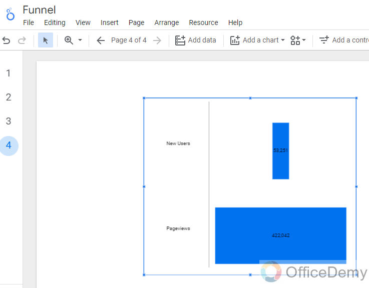
Step 9
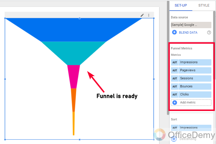
You can see in the chart’s sidebar Data tab, there is your chart name and metrics below it, you can add or remove metrics here to show in the funnel.
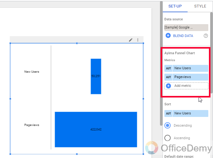
Step 10
Let’s say my funnel has these 5 elements, so I will add them to metrics and a complete funnel diagram will be shown on the canvas.
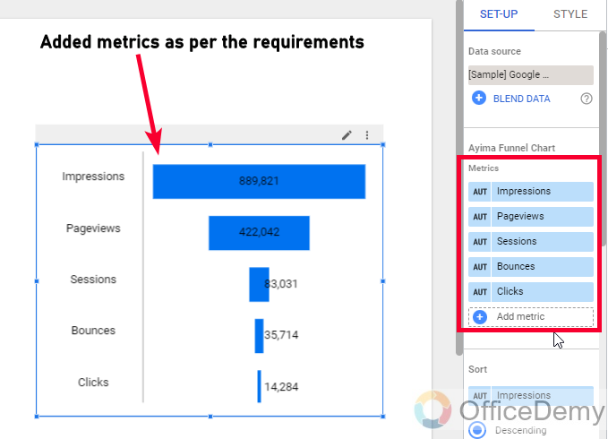
You can see my funnel is working fine, I have some users coming to the bottom. This is how to create a funnel in Google Data Studio.
Let’s see another method to create a funnel in Google Data Studio
How to Create a Funnel in Google Data Studio – Metric Funnel
In this section, we will learn how to create a funnel in Google Data Studio using Metric Funnel. Metric funnel is another third-party application from community visualization that is used to create a funnel in Google Data Studio. It is the same as the last funnel we created in terms of logic building, but different in design. So, let’s see how this design looks like on our data, and then we will see how to style these funnels within Google Data Studio.
Step 1
Add a Metric funnel from community visualization in your Google Data Studio report.
Step 2
Add metrics as we added in the funnel chart in the previous section.
Step 3
You can see your funnel is ready and it has a more unique design that is more attractive and more looks like a real funnel.
So, this is how to create a funnel in Google Data Studio using the metric funnel. These extensions are very accurate and user-friendly. I hope you have learned how to create a funnel in Google Data Studio.
How to Create a Funnel in Google Data Studio – Customizing Funnel Chart
As we have already learned how to create a funnel in Google Data Studio using two different third-party apps from community visualization, now it’s time to learn how to style and customize these funnels using the Style tab within the Google Data Studio chart’s sidebar. So, let’s get started with funnel styling.
Step 1
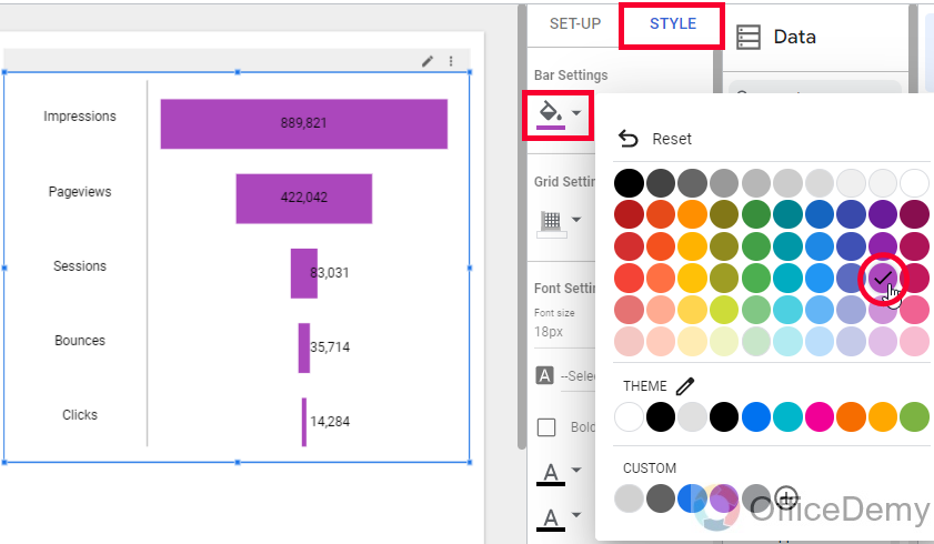
We can change the funnel parts’ colors. (Cannot change each layer color)
Step 2
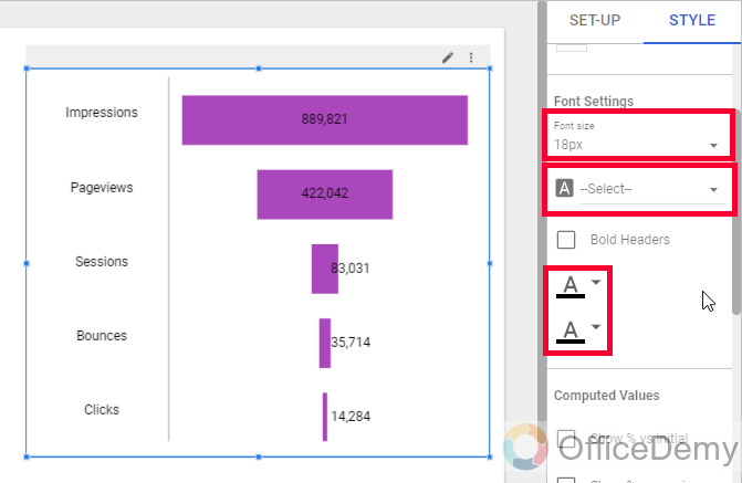
We can change font color, size, and family
Step 3
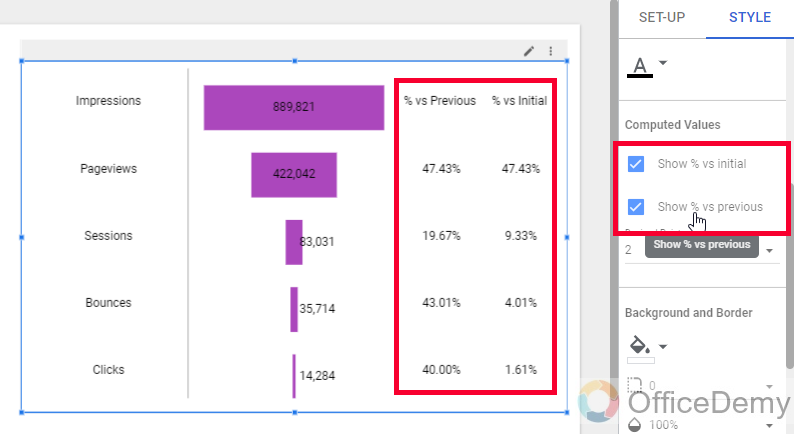
We can use checkboxes, “show % vs initial”, and “show % vs previous” for a better comparison of the data points through layers.
Step 4
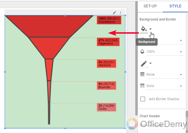
We can change the overall background color of your funnel chart
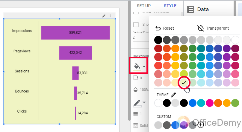
Step 5
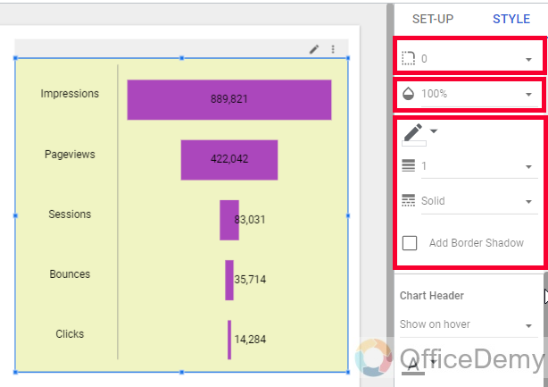
Here, we can add a border, with border style, border radius, border color, border weight, and border shadow.
Step 6
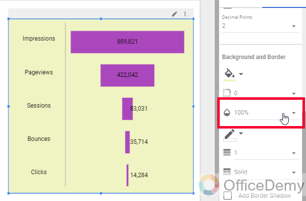
In the same section, you can also control the opacity level of your overall funnel diagram
So this is how to customize a funnel chart in Google Data Studio.
How to Create a Funnel in Google Data Studio – Customizing Metric Funnel
In this section, we will learn how to create a funnel in Google Data Studio, we have seen two funnels type and their creation and also the customization for one of them. Now, we will learn how to customize the metric funnel in Google Data Studio.
Step 1
Firstly, we can use the “Invert funnel” checkbox to invert its position.
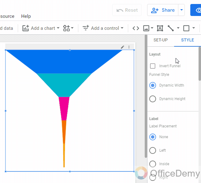
Step 2
We can use any of the given two styles, one is “Dynamic width“, and the second is “Dynamic Height“, for the funnel we mostly use “Dynamic width“, so it looks like a funnel, not like a triangle.

Step 3
Below, we can set the label placement for each layer of the funnel, currently is none, we can pick any other position to show them.

Step 4
Below, we can normally set font color, size, and family for the labels

Step 5
Now, we can add a legend to our funnel. By default, it’s none, but you can show it if you want to.
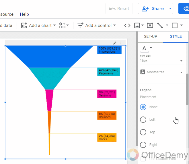
Step 6
Similarly, we can set font color, size, and family for the legend.
Step 7
In the cell padding drop-down, we can pick a number to define the padding between the funnel layers. By default, it’s none, but you can keep small padding between them to improve the design aesthetics.
Below is the color of the cell padding, it’s good to keep it white on a different color background.
Step 8
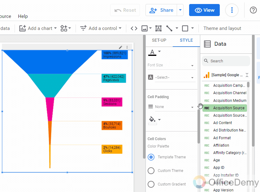
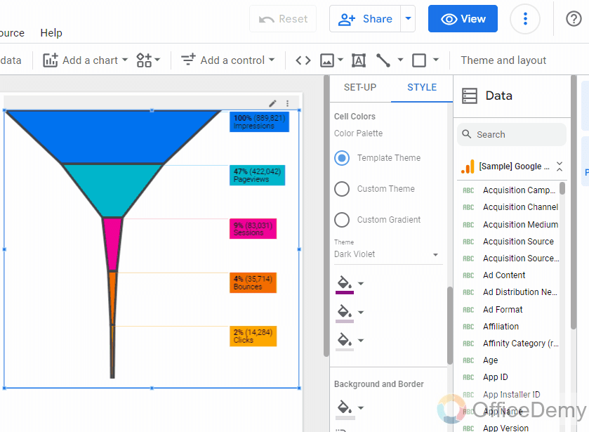
Color palettes. Here, we have three options to set the funnel colors
Template theme, Custom theme, and Custom gradient
In the template theme, you get colors based on your report themes.
In the custom theme, you will get dynamic theme colors
In custom gradient, you can set three colors and they will work as a gradient.
Step 9
Now we have the normal background and border options in the last.
So, you can see how easily we can customize a metric funnel in Google Data Studio. I hope you find this article helpful and that you have learned to create and customize funnel charts in Google Data Studio.
Get a Free Funnel template here
Frequently Asked Questions
Can I Connect Multiple Data Sources to Create a Funnel in Google Data Studio?
Yes, it is possible to connect multiple data sources to create a funnel in Google Data Studio. By integrating various sources such as Google Analytics, Google Ads, and social media platforms with Google Data Studio, you can gain a comprehensive view of your funnel. Utilizing the capabilities of google data studio data sources, you can analyze and measure the performance of your marketing efforts seamlessly.
Conclusion
So, this is all about how to create a funnel in Google Data Studio. I showed you two ways to create funnels, the methods are the same but the apps are different. Knowing that there is no funnel chart directly available in Google Data Studio, so we got these two from the community visualization, and I do not recommend using any other resources from external sources other than community visualization because they are recognized and approved by Google Data Studio to provide their services. I will see you soon with another useful guide. Keep learning with us.


