
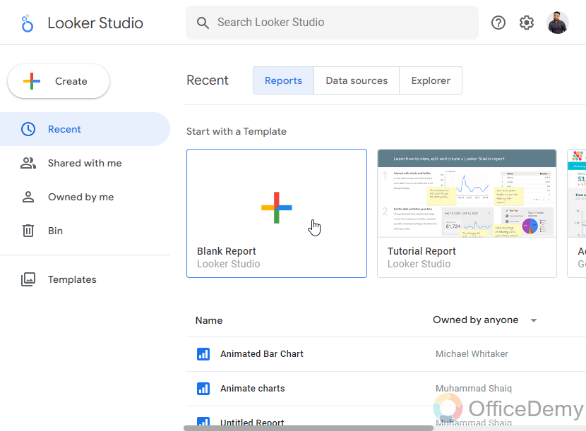
To Animate Charts in Google Data Studio
- Explore Community Visualizations.
- Search for “Animated bar chart“.
- Click on the extension and add the animated bar chart to your canvas.
- Understand the Animated Bar Chart Components.
- Add Dimension and metrics.
- Customize the Animation > Preview.
Hi. In this article, we will learn how to animate charts in Google Data Studio. We have already seen so many charts and graphs in Google Data Studio, Slides, Sheets, and Docs. But, it’s on Google Data Studio that allows you to make animated charts using some external resources which can be accessed within Data Studio. So, today we will learn how to make charts, then how to animate them using different data elements and other metrics.
Normally charts are enough to visualize the data in a graphical representation, but sometimes, for the most high-quality clients, we need to make it easier and quicker to deliver the message or some states through a diagram that is a graph. So, we can use animated charts, they look like a Gif or video file when played, and the data representation is 2 times better than static charts.
Also, note that cannot animate all the charts, there are some limitations to animating them, we have premade charts that can be animated and others cannot. So, make sure you make only animatable charts, and don’t try to animate any chart that is made manually in Google Data Studio or any other app.
Importance of using Animated Charts in Google Data Studio
Since today data is everything, and we are in the era of big data, we cannot manage million GBs of data using traditional techniques, that’s why we need to get smart with time. Only Google Data Studio allows you to animate charts. So, we can easily learn them to make animated charts that deliver the message 2 times faster.
We are often asked to make animated charts by our boss, or client. So, the need to make animated charts is increasing day by day, the retention time of an online internet user is getting low day by day and thus we need to present something unique and easy-to engage content to capture the attention. Static charts required some more time and more focus to understand them, but on the other side, dynamic or animated charts do not require much attention or focus they do everything by themselves and they display data in a manner that the user does not require to do anything just by watching they can be decoded in mind. So, these are the reasons we need to learn how to animate charts in Google Data Studio.
How to Animate Charts in Google Data Studio?
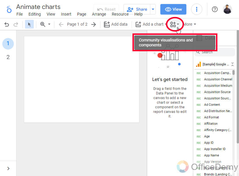
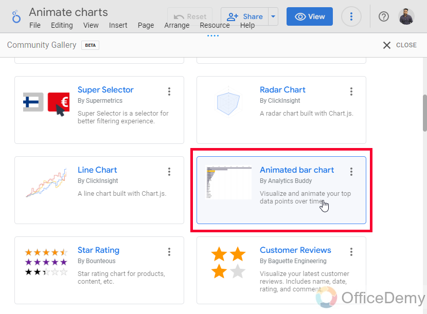
There is a “community visualization” tab in the Google Data Studio menu. You can use this as the add-on button in Google Sheets, Docs, and Slides. Here, we have some community-made tools and add-ons to increase the functionality of our work. Here, we have got some charts that are made for animations. Here, the main chart is the bar horizontal bar chart, there is much more to explore, let’s get into it and start making our first animated chart in Google Data Studio.
How to Animate Charts in Google Data Studio – Create an Animated Bar Chart
Community visualization is the section where we have so many extensions and plugins that can be imported to Data Studio and can be used to make cool charts and more functional graphics for free. Here we will find the animated charts and will take those into our canvas, and then we will edit and customize them according to our requirements. Let’s check out the tab and look for a bar chart.
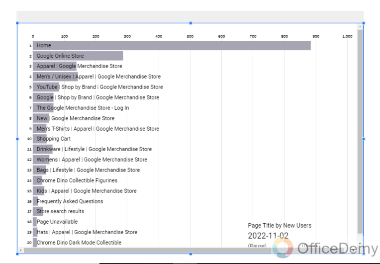
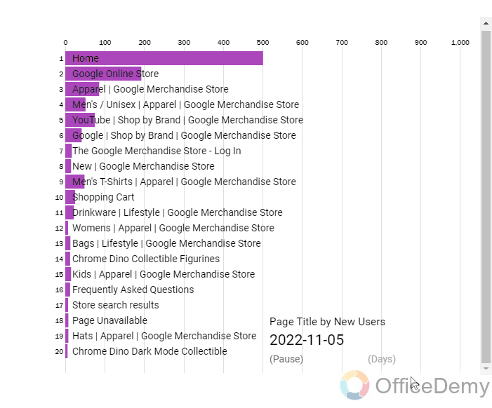
Animated bar charts are like normal bar charts but the period is very important. The animation is directly linked with the time, as the time changes the data values and category rank change, and they increase/decrease their bar sizes and shift their position upward or downward in the list. This makes a beautiful animation of the bar charts and it can be customized and set up manually as we need.
So firstly, we will learn how to add an animated bar chart, and then we will edit it, and lastly, we will make a final shareable animated bar chart that will be interactive and easy to understand.
Step 1
Open Google Data Studio, and create a blank report
Step 2
Go to the “Community visualization” tab in the main menu.
Step 3
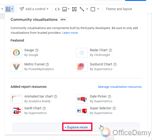
Click on explore more button
Step 4
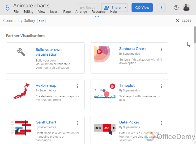
Here you can see so many third-party add-ons available, look for an animated bar chart
Step 5
Click on it, and then on your canvas, draw the chart like a normal chart
The animated bar chart is added, and you can see it’s moving at a specific animation delay, now let’s understand this chart so that we can control it as per the needs.
How to Animate Charts in Google Data Studio – Bar Chart Components
Here are so many components in this chart, some very obvious and some not fully visible, we need to understand all these components to understand the working on this chart, and then we will be able to control it, firstly you can see two link buttons below on the right side, and we have some editing options in the Style tab. Let’s see all of them.
Step 1
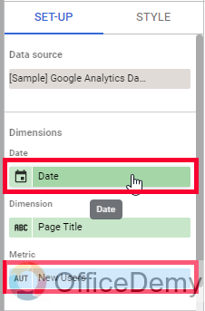
Firstly, you can set up the dimension and metrics for it the chart
Step 2
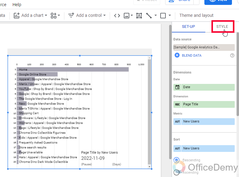
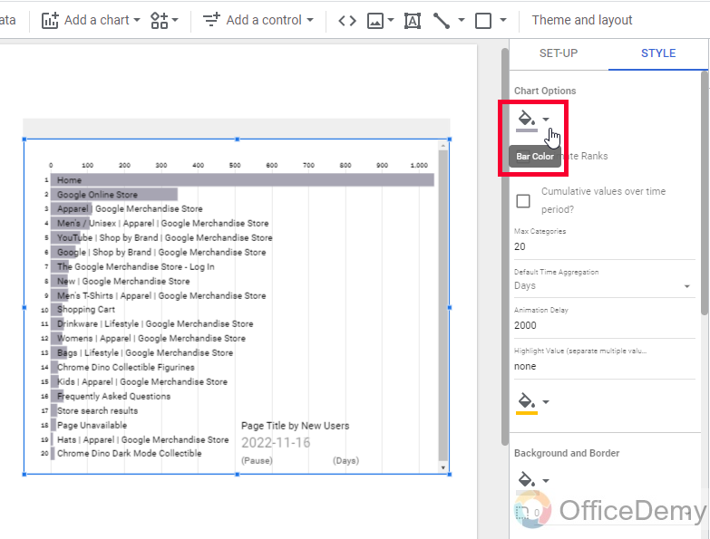
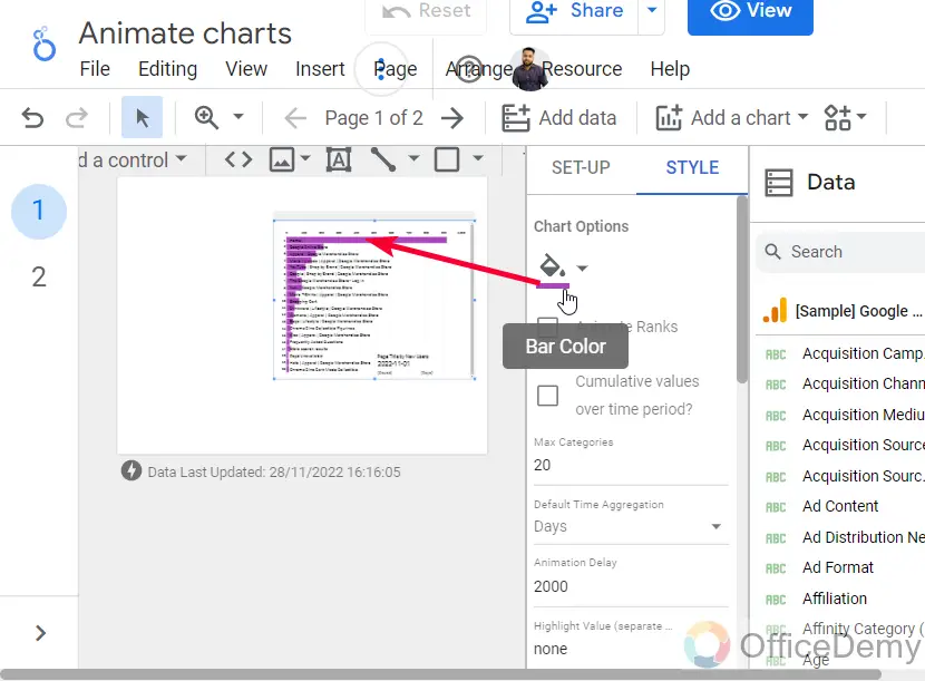
Go to Style in the chart’s sidebar for changing the colors, here we can change the background color, bar colors, and so on.
Step 3
You can click on the below pause button to stop the animation
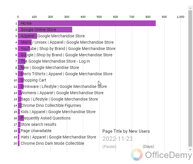
Step 4
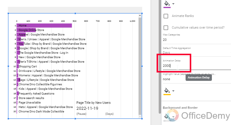
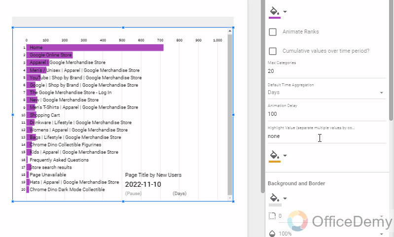
Clicking on the below date section will change the data each time, dates also change automatically over a fixed period of animation delay time. We will learn to change animation delay time in the below steps.
Step 5
You can change animation speed/animation delay in milliseconds from the Style tab in the chart’s sidebar, here 1000 means 1 second.
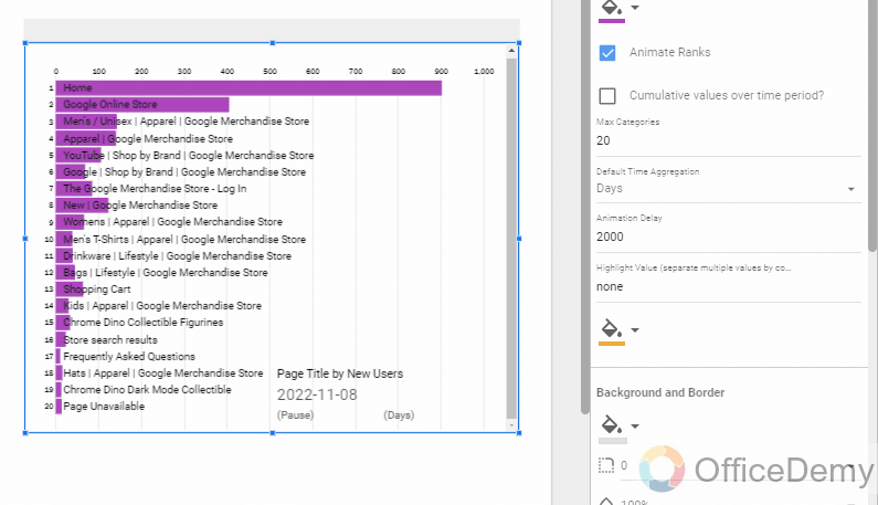
Step 6
You can use the “Animate rank” checkbox.
It is used for moving the categories as per their value, if a metric has got more value over time, then it will move to its rank i.e., rank#2, and others will move up and down based on their value.
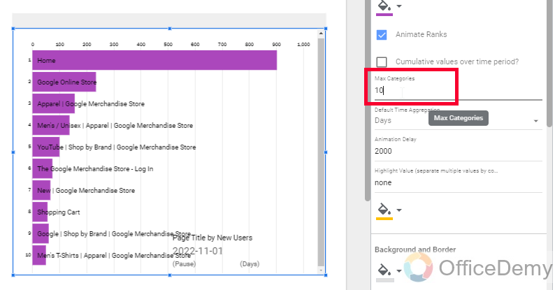
Step 7
You can also increase or decrease the number of categories in your bar chart, by default there are 20 categories, you can make it 10 or 30, and so on. It depends on the number of categories in your connected data source.
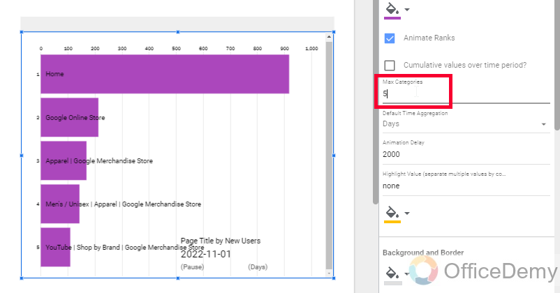
Step 8
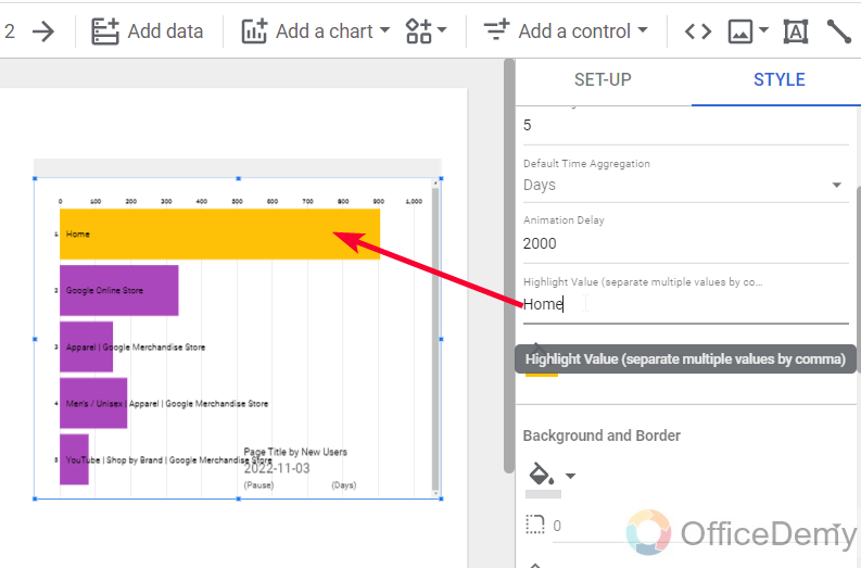
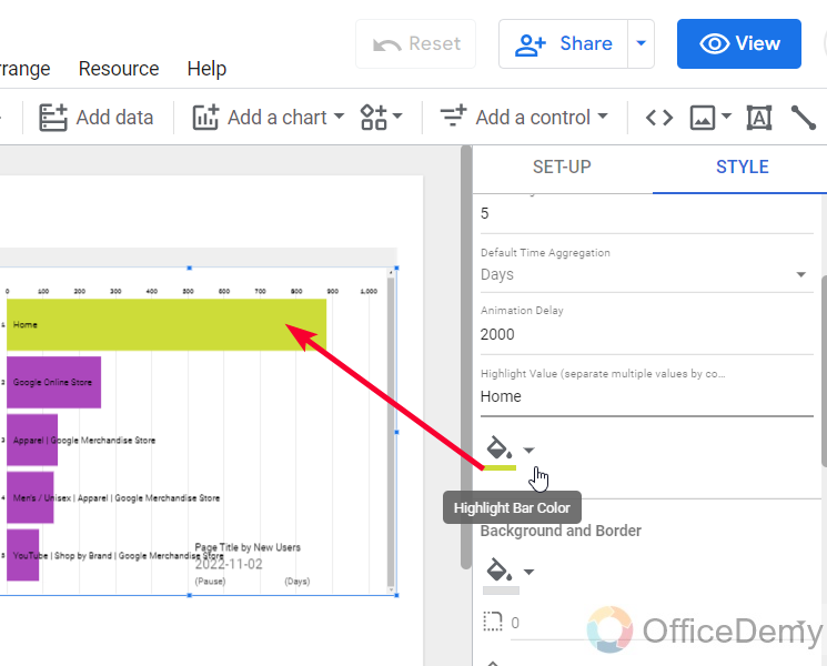
You can use the “Highlight category” feature to highlight some of the categories with a different color.
This feature is used when you are more interested in a few categories.
So, this is how we make an animated bar chart in Google Data Studio.
I hope you like the animated bar chart in Google Data Studio, and that you have learned how to animate charts in Google Data Studio.
Important Notes
- An Animated bar chart is an extension that is accessible in Google Data Studio, provided by a third party, and notes that they access your data to perform their functions.
- Adding a bar chart from the community visualizations cannot be changed to any other chart its a fixed bar chart and not recognized as a normal chart by Google Data Studio.
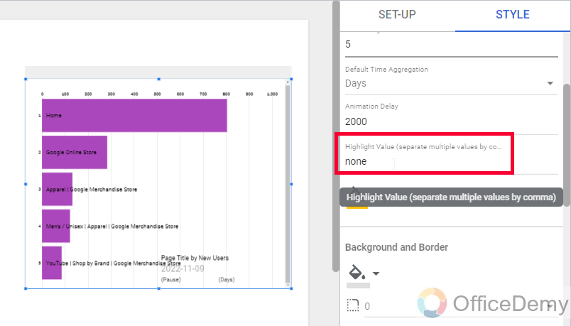
- You can set highlighted categories by giving their name in Comma separated values without any spaces in between, trailing, or leading.
- You can select as many categories as you want for highlighting.
- You can specify the rank positions if you want, you can control the categories’ movement in the row or you can keep them in a fixed position and only let bars show the changes over time.
- Charts from community visualizations cannot be linked with other charts
Frequently Asked Questions
Are any of the Community Visualization Apps in Google Data Studio capable of animating charts?
Yes, some of the visualization apps in google data studio have the capability to animate charts. These apps are designed to enhance data visualization and make the charts more dynamic and engaging. By incorporating animation, users can effectively present data trends and changes in a visually compelling way, making it easier for viewers to grasp the information.
Can we make pie charts using community visualization in Google Data Studio?
Currently, at the posting date of this article, we don’t have any visualization extension to animate a pie chart in Google Data Studio. But the list is increasing from time to time, and hopefully, in the future, we may see a similar add-on for the pie chart.
Can I Use Animation on the Leaderboard in Google Data Studio?
Yes, animation can be used on the leaderboard in Google Data Studio. By integrating dynamic elements and motion effects, such as transitions, fading, or sliding, the leaderboard can be brought to life. Implementing animation on the google data studio leaderboard enhances user engagement and makes data visualization more compelling and interactive.
How to animate a scorecard in Google Data Studio?
You cannot animate any chart directly in Google Data Studio. We have almost 20+ types of charts that are directly available in Google Data Studio. However they all are static charts that can work only to show static diagrams and graphical representations. The add-on we used to animate a bar chart is an external community visualization application that is only made to animate bar charts. We need a specific add-on (that is not available till the posting date of this article) in the community visualization to animate scorecards, and other add-ons to animate other charts.
How to animate a table in Google Data Studio?
There is no way to animate charts or tables in Google Data Studio. There is no animation feature so far, so we cannot animate tables. We can only customize them by using the built-in functionality to style the elements. However, there can be some external add-ons and extensions available (not in the community visualizations) that can be used (on your responsibility) to make any kind of animation with any chart and table in Google Data Studio. Well, I do not recommend using any externally available application other than community visualization add-ons, they are trusted and verified by Google Data Studio and safe to use.
Conclusion
This was the first article of the animation series of our Google Data Studio series of tutorials. We learned how to animate charts in Google Data Studio and we focused on bar charts from the community visualization in Google Data Studio. All the add-ons here are safe to use but you should note that they access your data to perform their tasks. So, I hope you like today’s article, and that you are excited to learn about more animation techniques in Google Data Studio. I will see you soon with another helpful guide. Keep learning with Office Demy.


