
To Make a Radial Bar Chart in Google Sheets
- Prepare data.
- Add and select the “helper” and “max value” columns.
- Click Insert > Chart > Doughnut Chart.
- Click Customize > Chart and axis titles.
- Add labels to circles.
- Select Chart Subtitle and customize.
- Stack all three charts to align centres.
This article will teach you how to create a radial bar chart in Google Sheets. Creating a Radial Bar Chart in Google Sheets allows you to visually represent data uniquely and engagingly. This type of chart is particularly effective for displaying data with multiple categories, showcasing each category’s contribution to the whole. This dynamic visualization will help your audience quickly grasp the relative proportions and trends within your dataset.
Why Must We Learn – How to Make a Radial Bar Chart in Google Sheets?
Learning how to make Radial Bar Charts in Google Sheets holds significant value. These charts offer a visually compelling way to present data, enhancing comprehension and engagement. They excel at depicting hierarchical or multi-dimensional data, providing a clear overview of relationships and proportions.
Proficiency in this skill improves one’s ability with data visualization tools, crucial in our data-driven era. It also facilitates effective communication, enabling individuals to convey information in a readily understandable format. Industries like marketing and finance benefit greatly from this technique, where organized and visually appealing data presentation is essential. Ultimately, this proficiency empowers individuals to leverage data visualization for informed decision-making and clearer communication in various contexts.
Step-by-Step Procedure – How to Make a Radial Bar Chart in Google Sheets
In this article, we will show you the complete Step-by-Step procedures of how to Make a Radial Bar Chart in Google Sheets.
Step 1
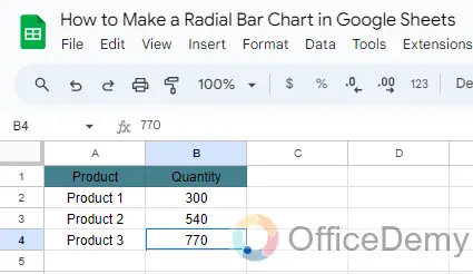
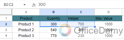
First, we will prepare the data as given below which shows three products along with their respective quantities.
Step 2
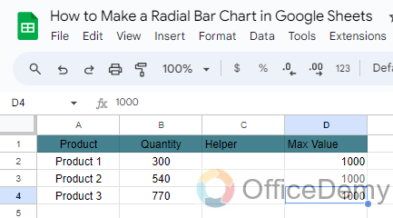
Next, we will add two more columns to the dataset- helper and max value. The max value column is the maximum quantity of a product and depicts the value of one full circular rotation.
Step 3
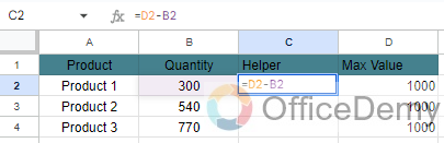
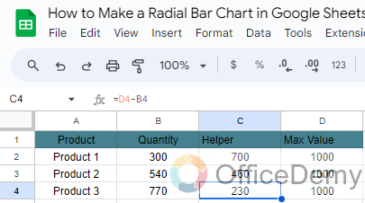
The helper column values are a difference of the Max value and Quantity. Moreover, these values depict the space in the Radial Bar Chart and are calculated using the following formula: =D2-B2
Our final dataset will look like this.
Step 4
Now let’s move on to creating the Radial Bar Chart.
Adding the inner circle
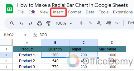
Select the “Quantity” and “Helper” columns from the first row of your dataset.
Step 5
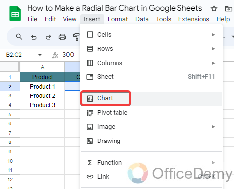
Click on Insert.
Step 6
Select Chart.
Step 7
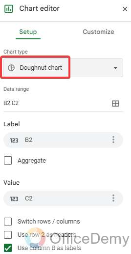
From the Chart Editor, select the Doughnut Chart.
Step 8
Now Click on the Customize tab.
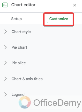
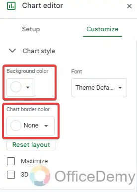
Step 9
Under the Chart Style section set the background color and chart border color to None
Step 10
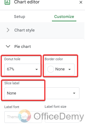
Under the Pie Chart section, set the Slice label and border color to None as well. Adjust the Doughnut hole size to 67%.
Step 11
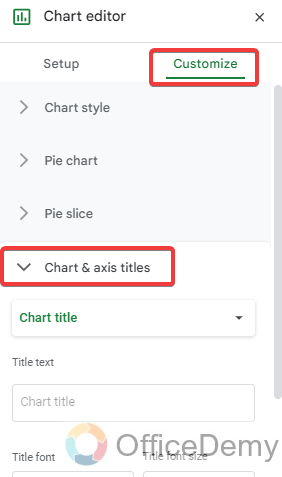
Under the Chart & axis titles, Remove the Chart title.
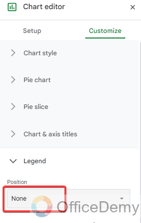
Step 12
In the Legend section, Set legend to None.
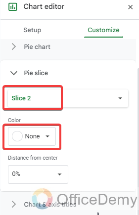
Step 13
Now go to the Pie slice section and Set the color of Slice 2 as None. The Slice 2 portion here depicts the helper value and needs to look transparent.
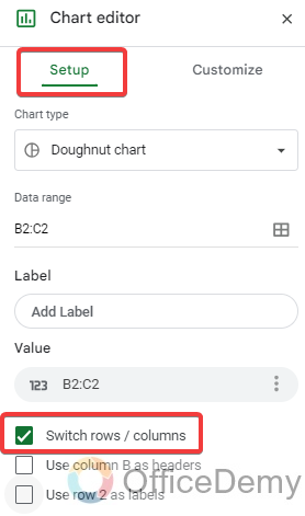
Step 14
Under the Setup tab ensure that the Switch rows/ columns option has been selected.
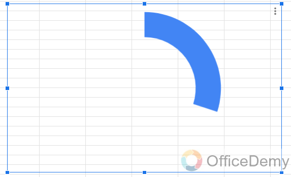
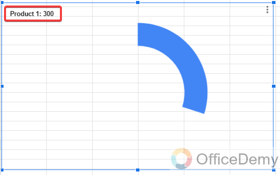
Your inner circle chart looks like this.
Step 15
Adding the middle circle
- To create the middle circle, select the data from the second row and follow the same steps as above.
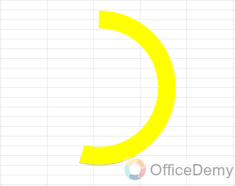
- The only difference here would be changing the chart color and Donut hole size. I have set these to Yellow and 77% respectively.
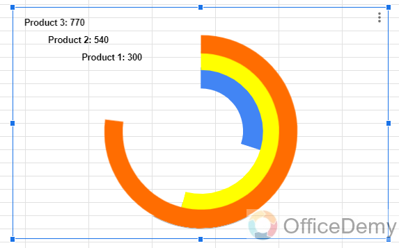
The chart now looks like this:
Step 16
Adding the outer circle
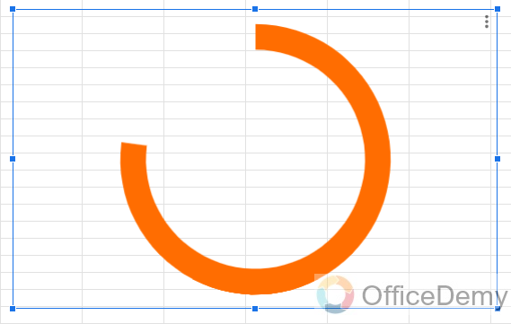
- Select the data from the third row and follow the steps.
- Changing the chart color and Donut hole size. Here, I have set these to Orange and 81% respectively.
The chart now looks like this:
Step 17
Adding labels to the circles
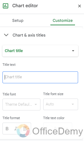
Click on Customize -> Chart and axis titles.
Step 18
Select Chart Subtitle. Type the label in the title text input box.
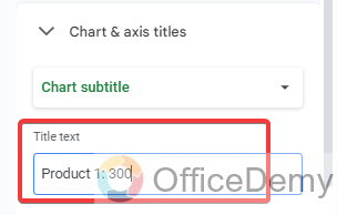
To demonstrate this I set the title format to Bold and changed the title text color to Black.
After following the above-mentioned steps, you can add data labels to the other circles as well.
Step 19
Stack all three charts and adjust them to have the same center.
Your Radial Bar Chart is now ready and looks like this.
How to Make a Radial Bar Chart in Google Sheets – FAQs
Q1: What is a Radial Bar Chart?
A: A Radial Bar Chart, also known as a Circular Bar Chart, is a data visualization that displays categorical data along a circular axis, making it easier to compare multiple categories at once.
Q2: Can I customize the appearance of the Radial Bar Chart?
A: Yes, you can customize various aspects such as colors, labels, and axis titles. Use the Chart Editor’s customization options to tailor the chart to your preferences.
Q3: What kind of data is suitable for a Radial Bar Chart?
A: Radial Bar Charts work well with categorical data, especially when you want to compare multiple categories in a visually engaging manner. They’re great for displaying proportions or distributions.
Q4: Can I add data labels to the Radial Bar Chart?
A: Yes, you can add data labels to the Radial Bar Chart to provide additional context or to display specific values associated with each category.
Q5: How can I edit or update the Radial Bar Chart after creating it?
A: Simply click on the chart to select it. You’ll see a small ‘Edit’ icon in the upper right corner. Clicking on it will allow you to make changes to the chart’s data, appearance, and settings.
Conclusion
So, learning how to make Radial Bar Charts in Google Sheets is a useful skill because it provides a visually compelling way to convey complex data, enhancing audience engagement and understanding. This chart type excels in representing hierarchical or multi-dimensional data, offering a clear overview of proportions and relationships. Industries like marketing and finance find this technique particularly valuable for organized and visually appealing data presentations. That’s all from this guide. Thanks for reading and keep learning with Office Demy.


