
To Create Dot Plots in Google Sheets
- Organize data in two columns (labels and quantities).
- Use the =SEQUENCE function to generate sequential numbers.
- Select the data range.
- Insert a chart (scatter plot type).
- customize your dot plot.
- The dot plot is ready.
Hello, welcome back. This article will show you how to create dot plots in Google Sheets, as we know it’s a flexible spreadsheet program that is widely available. An effective method for visualizing data distributions and spotting trends or outliers is the dot plot. A dot plot graph is essentially a chart that uses dots to represent a set of univariate data. It displays data that has values on the X- and Y-axes. The dot plot shows the distribution of numerical variables on a number line, with each dot on the line denoting a value.
Why We Need to Create Dot Plots in Google Sheets?
Learning how to create dot plots in Google Sheets holds significant importance in effectively presenting and understanding data. Dot plots provide a straightforward visual representation that helps us spot trends, unusual points, and overall patterns within a dataset. They simplify complex data, making it accessible even for those who may not have a strong background in data analysis.
Moreover, dot plots allow for a convenient comparison of multiple sets of data, revealing insights that may not be immediately apparent from looking at the raw numbers. Overall, becoming proficient in creating dot plots in Google Sheets is a valuable skill in today’s data-driven world. It equips you with the ability to explore, analyze, and communicate data effectively, contributing to informed decision-making and a deeper understanding of information.
How to Use Create Dot Plots in Google Sheets
In this guide, we will show you the step-by-step procedure of how to create dot plots in Google Sheets. Following are the steps.
STEP 1
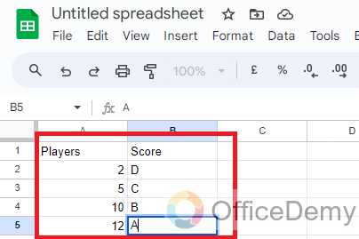
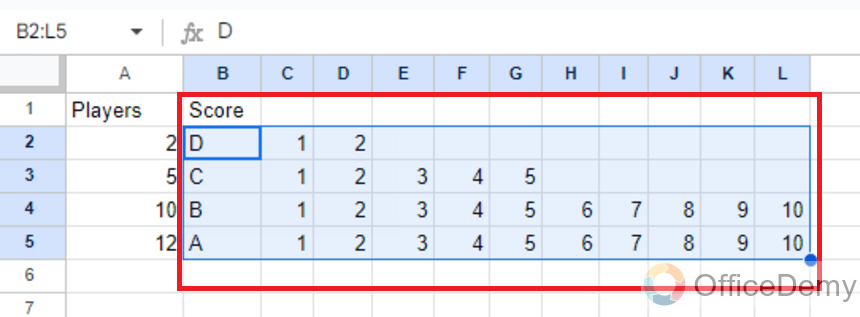
We’ll begin this tutorial with the data in two columns for the label and quantity.
STEP 2
This data must be altered to include cells of data that correspond to each of the dots in the frequency dot plot to be used.
Luckily, there is a simple formula we can use to accomplish this. In cell C2, write the following equation to the right of the first label: =SEQUENCE(1,A2)
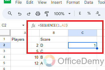
A grid of sequential numbers is produced using the SEQUENCE function with the supplied number of rows and columns. In this instance, we specify a single row and make use of the information in column
STEP 3
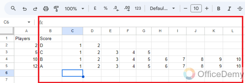
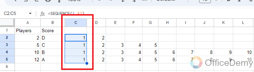
Copy the formula from the selected cell to all the rows of data.
STEP 4
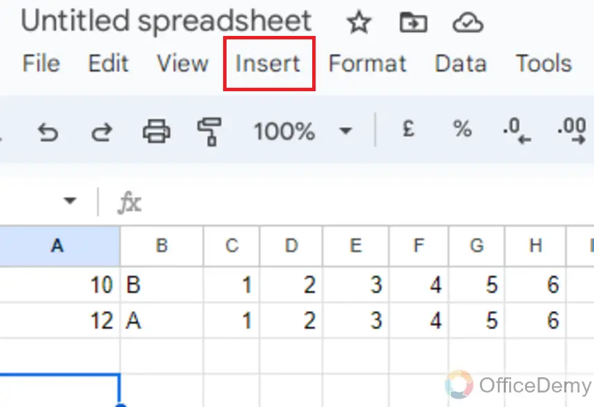
Choose the range containing every label value and each number produced by the SEQUENCE formula.
STEP 5
then select the Chart option from the Insert menu.
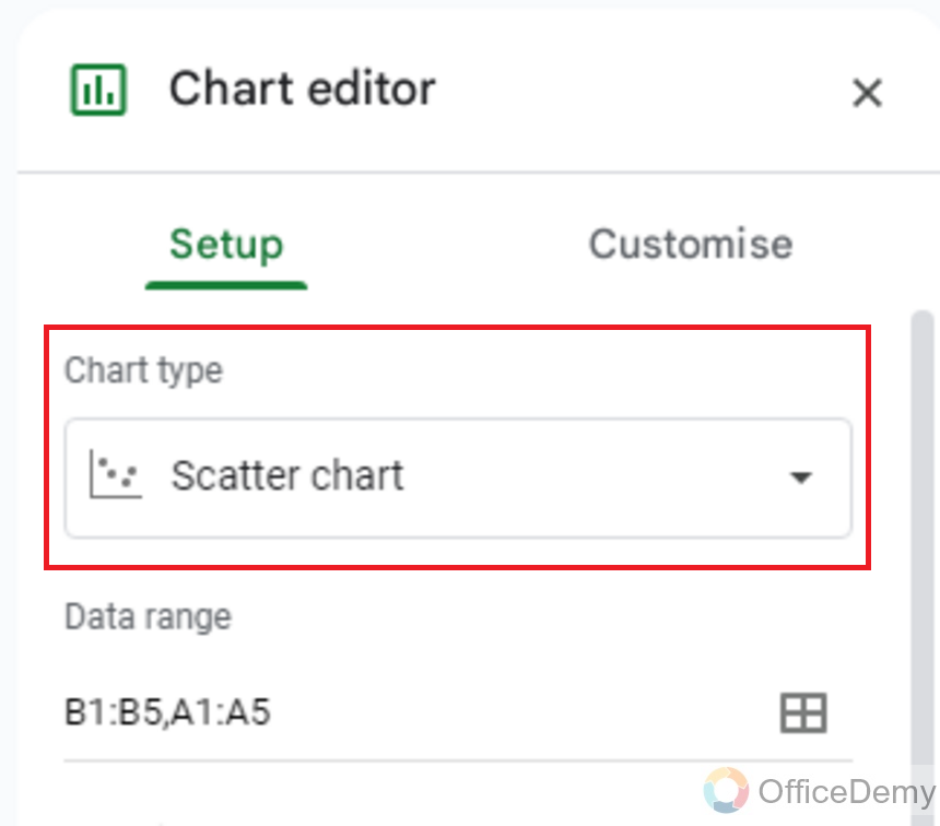
STEP 6
Select Scatter Plot from the Chart Type drop-down menu in the Chart Editor.
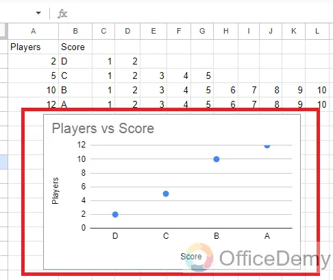
STEP 7
Now a dot plot will appear in the Google sheet.
Frequently Asked Questions
What is a dot plot?
A data visualization technique known as a “dot plot” shows distinct data points on a small scale. It helps display a dataset’s distribution and locate any potential trends or outliers.
Can I change the way the dots look?
The look of the dots can be changed, yes. There are options to alter the dot’s color, size, and shape in the Chart Editor’s “Customize” tab.
Is it possible to change the axes’ scale?
The scale of the axes can be changed, yes. You can choose the minimum and maximum values for the axes in the Chart Editor’s “Customize” tab.
In Google Sheets, how do I make a simple dot plot?
Follow these instructions to make a simple dot plot in Google Sheets:
- Put your information in a column.
- Decide on the data.
- Select “Insert” from the menu bar.
- Select “Chart“
- The “Chart type” option in the Chart Editor should be set to “Scatter chart“
How Should Data Points Be Labeled on a Dot Plot?
You may add a data label column to your spreadsheet and include labels for each data point to label data points on a dot plot in Google Sheets. Afterward, enable data labels in the Chart Editor while creating the scatter chart.
How to make a Grouped Dot Plot?
You can add a different series for each group of data points while making the scatter chart if you want to make a grouped dot plot (where dots are grouped depending on categories or criteria). Different colors and marker types can be used for each series.
Conclusion
In conclusion, today we learned how to create dot plots in Google Sheets by a simple process that can significantly improve data visualization. Users can effectively portray their information in a clear and comprehensible way by following the processes listed above, which comprise organizing the data, inserting a scatter plot, personalizing the chart, and fine-tuning the features. Dot plots are an important tool for analysis and presentation because they are particularly good for showing the distribution and frequency of data points. Anyone can simply build captivating dot plots to effectively communicate their data with Google Sheets’ easy-to-use interface and efficient charting features.


