
To Create a Bubble Chart in Google Sheets
- Select the data.
- Go into the Insert tab.
- Click on Chart.
- Open Chart Editor.
- Change the chart type to Bubble chart.
In today’s article. We will learn how to create a bubble chart in Google Sheets. To present data in a graphical and visual form is always an essential and beneficial way to read or analyze numerical data. Google Sheets makes it so easy with its Chart feature and when you have multiple values in your data set then you should go through with a bubble chart. A bubble chart can be represented by different-sized bubble shapes in the chart that vary according to the x-axis and y-axis.
If you also have two, three, or more values of the data set and want to create a bubble chart in Google Sheets, then you are right to the place where we will discuss how to create a bubble chart in Google Sheets.
Benefits of a Bubble Chart in Google Sheets
As we have discussed above, bubble charts can display multiple values of a data set in a well-mannered manner to make users easily understand or read the chart and analyze data. You can display three or more dimensional data sets on this chart which you can’t do with other charts.
Let’s move towards the next section of how to create a bubble chart in Google Sheets.
How to Create a Bubble Chart in Google Sheets
The procedure of creating a bubble chart is very fine and simple as we insert other charts in Google Sheets. But when we insert a chart in Google, you may find another type of simple chart by default, you just need to change its type to create a bubble chart. Let me show you practically in the following section with a step-by-step guide.
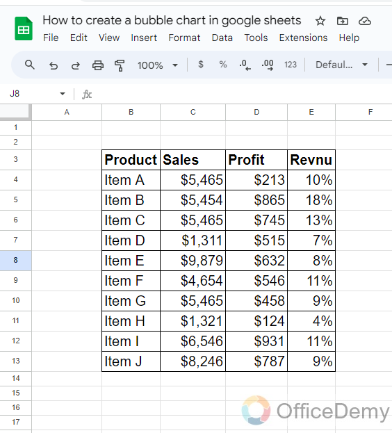
Step 1
As we all know, to make a bubble chat we need 3 to 4 different data values. In the following example, we see we have store data in which we have the values of sales, profit, and revenue of different products. Let’s create a bubble chat to analyze this data.
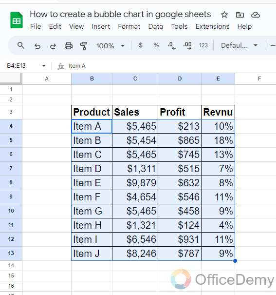
Step 2
To create a bubble chat the first thing you will need to do is to select all the data of which you are making a bubble chat as I have selected in the following picture.
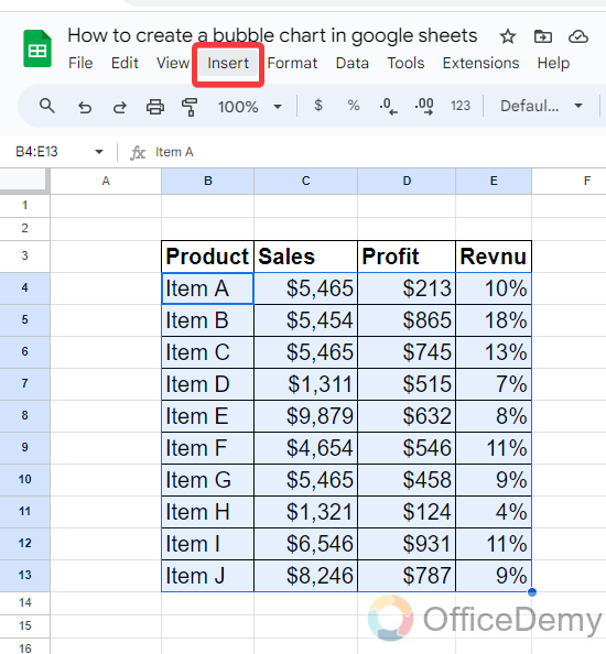
Step 3
Once you have selected the data, to create a chart go into the “Insert” tab from the menu bar of Google Sheets as highlighted in the following screenshot.
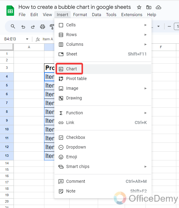
Step 4
When you click on the “Insert” tab of the menu bar, a drop-down menu will open where you will see a “Chart” option through which you can easily insert a chart in your Google Sheets.
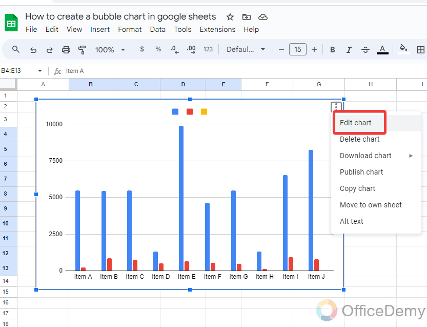
Step 5
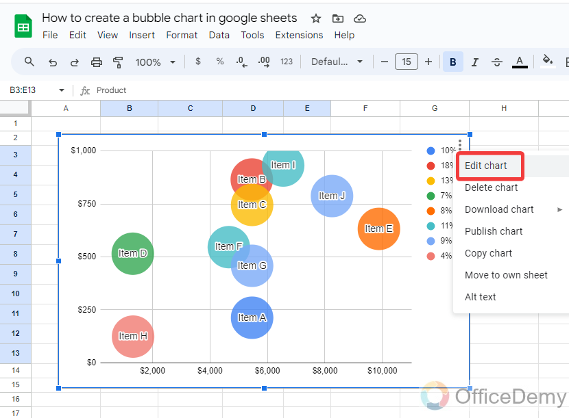
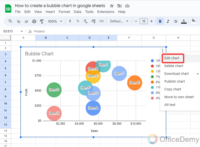
When you click on the “Chart” option, the chart will be inserted in your Google Sheets instantly, but if we see this is a bar chart. To change this into a bubble chart click on “Edit Chart” from the three dots option as directed below.
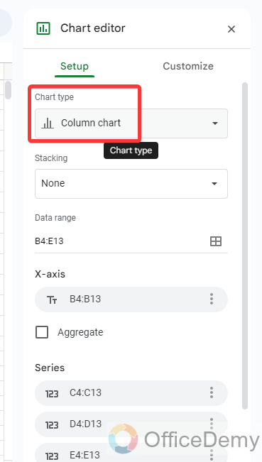
Step 6
When you click on the “Edit Chart” option an edit pane menu will open on the right side of the menu where you will see the “Chart type” option as highlighted in the following picture.
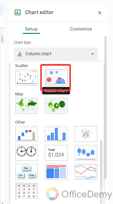
Step 7
Clicking on the “Chart type” option will give you many different types of charts in a drop-down menu, select a bubble chart from the following.
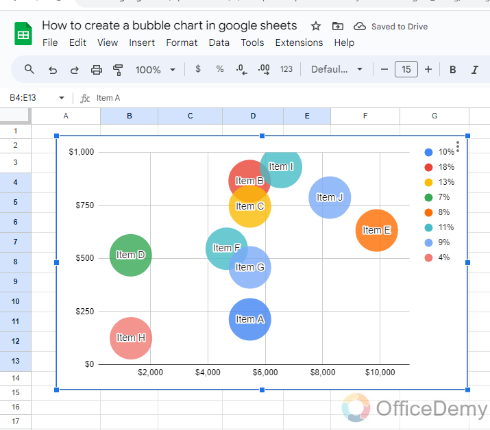
Step 8
You are all done with creating a bubble chart in your Google Sheets as you can see in the following picture a bubble chart has been made in front of you through which you can analyze data.
Frequently Asked Questions
How do you label a bubble chat in Google Sheets?
Charts are the best to analyze data with a visualization and it is very easy to insert them in Google Sheets but sometimes it becomes difficult to understand what exact value of data you have shown in the chart and on which axis as well. To make reading a chart easy, Google Sheets provides the features of labeling a chart to identify the data points in your chart, moreover, it also helps the user to easily read the chart. If you also want to add labels to your bubble chart, then below are the steps through which you can learn how to label a bubble chart in Google Sheets.
Step 1
Once you have created a bubble chart in Google Sheets, click on the three dots option at the right top corner of the window then click on the “Edit Chart” option from the drop-down menu.
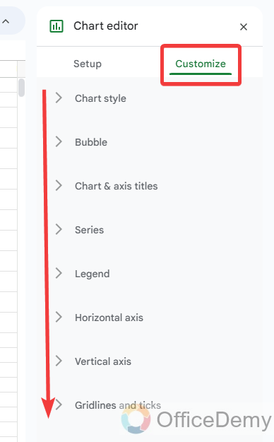
Step 2
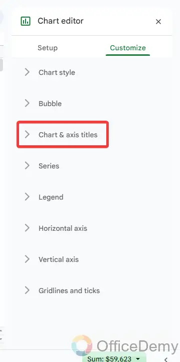
When you click on the “Edit Chart” option, a chart editor will open at the right side of the window, go into the “Customize” tab then click on “Chart & axis titles” as highlighted below.
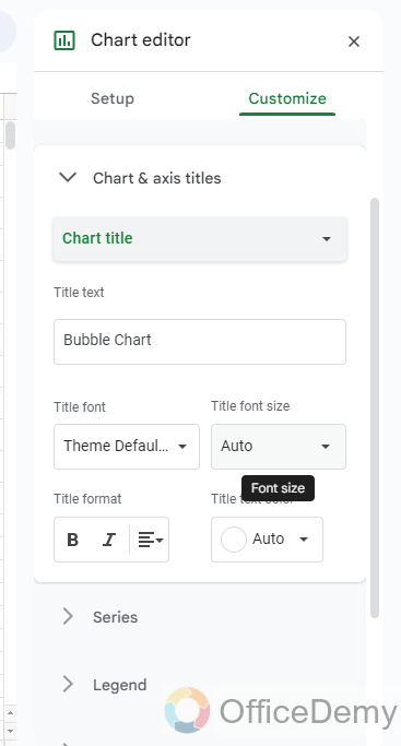
Step 3
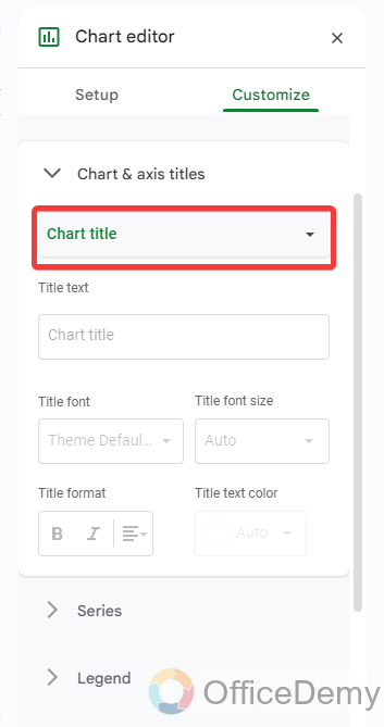
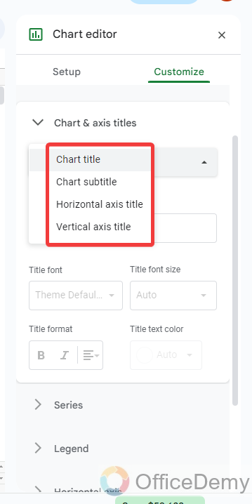
When you open “Chart & axis titles“, at first you will see a drop-listed menu through which you can select the axis & titles to which you want to give a label.
Step 4
As you can see in the following picture, select the menu from the highlighted options to label your chart in Google Sheets.
Step 5
As you select the chart & axis option, another text dialogue box will appear where you can type your label for your chart as I have written in the following picture.
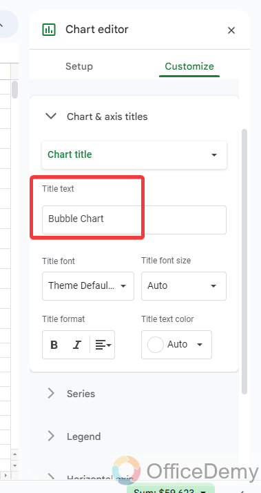
Step 6
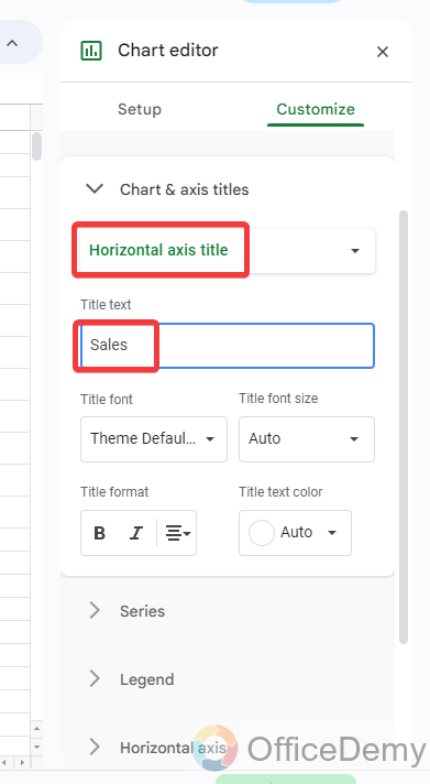
Similarly, if you want to label an axis, select the axis from the drop-down menu as I have selected “Horizontal axis” then write the name of the axis in the text box as highlighted below.
Step 7
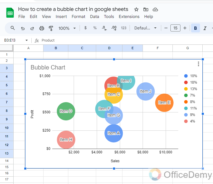
Here the result is in front of you, your chart has been completely labeled now as we required.
How do you customize a bubble chart in Google Sheets?
A: Google Sheets provides hundreds of features to customize a bubble chart, you can easily customize the layout, color, border, font, chart type, font color, legends, labels, axes, titles, and many more customization options appropriate to that visualization. Open Chart Editor and click on the Customize tab at the top. You will see several options for changing the appearance of your chart, each can be collapsed or expanded and varies plenty of options. These options vary depending on your chart type as we have a bubble chart, we will find the option accordingly. Let’s do a short overview of these options from the following steps.
Step 1
To customize a Bubble chart first, we will have to open the chart editor, to open the chart editor, click on the three dots option then click on the “Edit chart” option.
Step 2
A panel will open at the right side of the window, on this panel goes into the “Customize” chart through which you can easily customize your Chart in Google Sheets with the help of the following options.
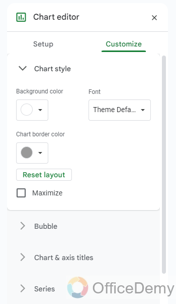
Step 3
In the Customize tab, the first option we will find is the “Chart style“, with this option you can change the background color of your chart, font chart border, etc.
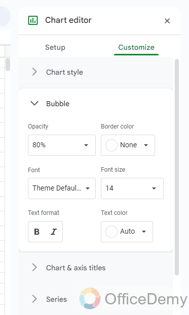
Step 4
After the Chart style, you will find the “Bubble” option through which you can customize your bubbles in the chart like, its color, border, capacity, font family, font color, etc. as can be seen below.
Step 5
Similarly, more options like Chart titles to change chart and axis titles.
In the same way, there are some more options like Series, legend, etc. through which you make a lot of customization with your bubble chart.
Can I Use the Budget Template in Google Sheets to Create a Bubble Chart?
Yes, it is possible to use the budget template in Google Sheets for creating a bubble chart. Budgeting with google sheets provides a user-friendly interface to input financial data and visualize it using various chart types, including bubble charts. This feature simplifies budget management and helps users gauge spending patterns at a glance.
Is Creating a Scatter Plot in Google Sheets Similar to Creating a Bubble Chart?
Creating a scatter plot in Google Sheets is different from creating a bubble chart. While a scatter plot shows the relationship between two sets of data points, a bubble chart adds a third variable, displayed as the size of the bubbles. Understanding this distinction is key to effectively visualizing data using google sheets scatter plot or bubble chart features.
How to format the legibility of Bubble charts in Google Sheets?
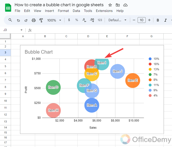
A: If you are also facing such a problem while creating a bubble chart in Google Sheets that your bubbles are off the chart that you want to bring into the chart to give a proper look then don’t worry about it just follow the following instructions, you will get the solution.
Step 1
As you can see in the following example, the bubble is going off the chart. Let’s see how we can sort it.
Step 2
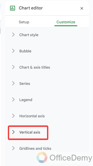
Open the chart editor, go into the “Customize” tab then click on “Vertical axis” as highlighted in the following picture.
Step 3
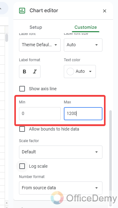
When you open the “Vertical axis“, you will see the minimum and maximum range values for the axis as highlighted below. Increase the maximum range of the vertical axis accordingly.
Step 4
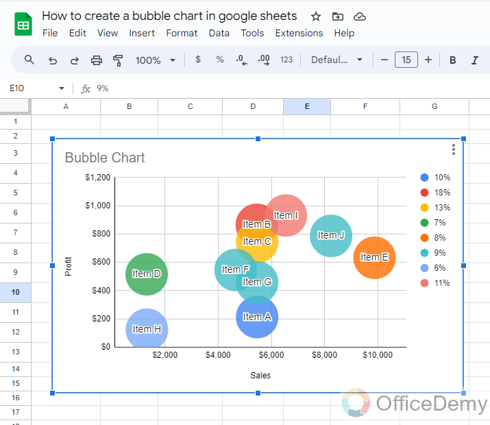
Your problem will be sorted out, as you can see in the following screenshot the bubble is on the chart as required.
Conclusion
That’s all from how to create a bubble chart in Google Sheets. A bubble chart facilitates you to organize your data point correctly between multiple values of the data set. If you have learned from the above article how to create a bubble chart in Google Sheets, then you will face no worries in creating a bubble chart.


