
To Use Conditional Formatting in Google Data Studio
- Create a table chart.
- Select the chart, and go to the “Style” tab.
- Click “Conditional formatting“.
- Click on the “Add” button.
- Choose “Single color” or “Color Scale” as the formatting type.
- Select the field.
- Choose a condition.
- Specify a value or compare it with another field.
- Click “Save” to apply the conditional formatting.
Hi. In this article, we will learn how to use Conditional Formatting in Google Data Studio, so if you have followed our google sheets series, you must have an idea of conditional formatting and how it is set up. In Google Data Studio, conditional formatting becomes more useful and important because everything here is in the form of tables, charts, and graphs. So, we might have some data to show to our customers, and based on some conditions we want to apply some formatting to it.
Let’s say, I am creating a table chart for an email marketing campaign I run for a client, my client’s maximum cost per click amount is $5, but here in the data, we have got some values where the CPC cost is exceeding from $5. Here, to highlight those figures, I will add conditional formatting and specify that where the cost is exceeding from 5, then change its color to red, or kind of formatting.
By doing this, we can make our charts more interactive, and more user-centric, the time consumption will be less and the users can focus on the key points directly.
Why use Conditional Formatting in Google Data Studio?
We can open endless opportunities for formatting and styling our data based on values or data points, conditional formatting is a very useful and very powerful feature in Data Studio. If you are seeing some reports created in Data Studio, there must be some conditional formatting applied on it to highlight key values, main points, and even irrelevant points when the ratio between relevant is irrelevant is very small.
So, we have two types of conditional formatting, one is by a single color, and the second is by the color scale. We can use both of them based on our data.
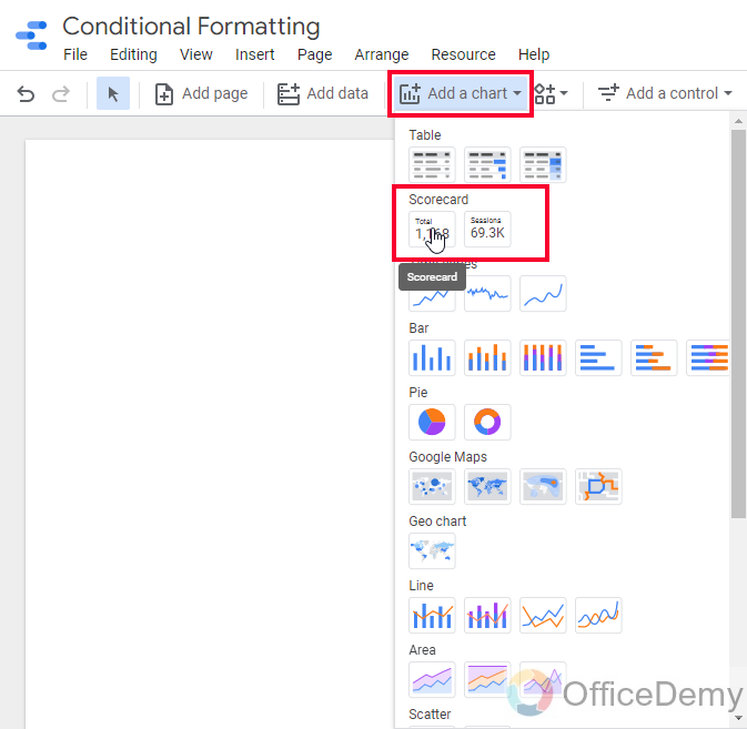
How to Use Conditional Formatting in Google Data Studio
We have only a few charts that have conditional formatting features, they are Table charts, scorecards, and pivot tables, rest of the charts do not have conditional formatting features. We will learn conditional formatting rules using multiple charts such as tables and scorecards, and I will try to teach you the effect of conditional formatting on different charts. Let’s first start with a table chart.
Conditional Formatting in Google Data Studio – Table Charts
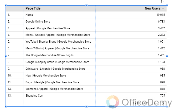
In this section we will learn to apply conditional formatting in Google Data Studio on table charts, we have three tables charts in Data Studio, and they all are the same, and we can customize each of them to make any type of chart, lets start with the simplest chart with some dummy data.
Step 1
Create a table chart
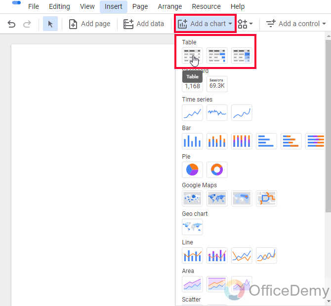
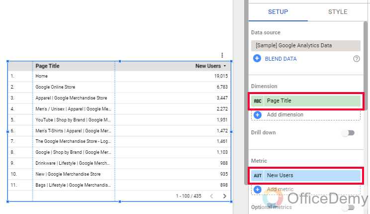
Step 2
Add some data points for dimension and metric
Step 3
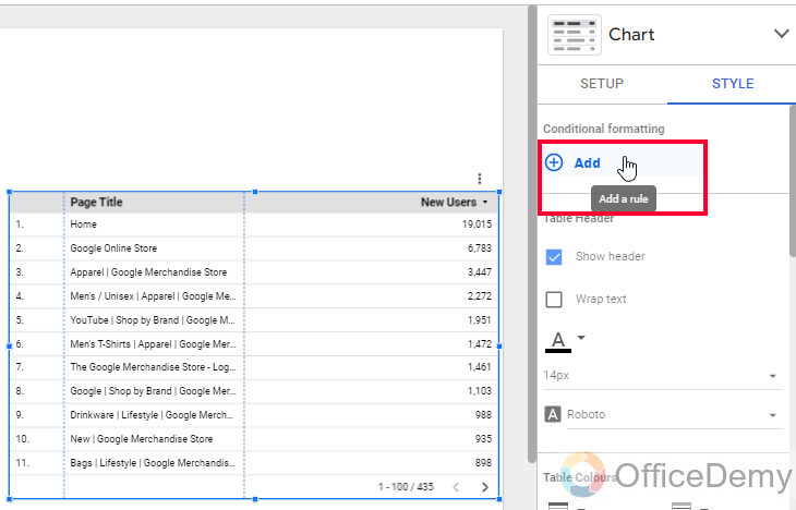
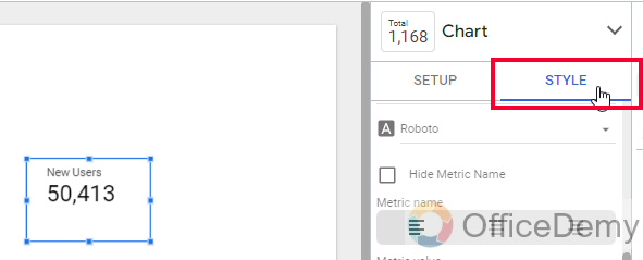
Select the chart and go to the Style tab
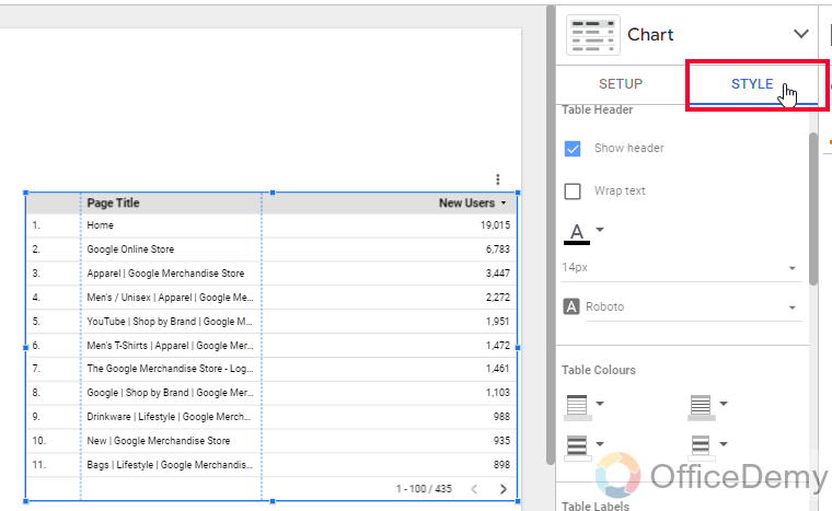
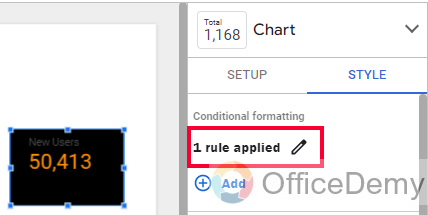
Step 4
Here the first option is “conditional formatting”
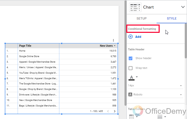
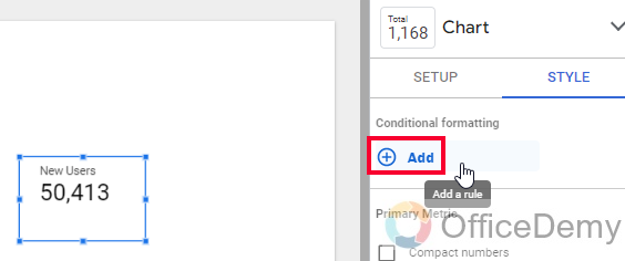
Step 5
Click on Add button
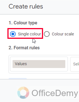
Step 6
you have a new tab, “Create rules”
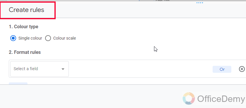
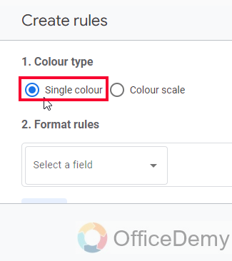
Step 7
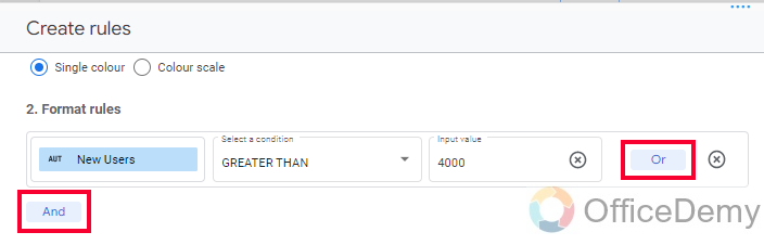
In the first section, Select Single color
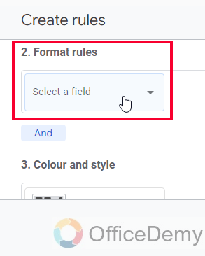
Step 8
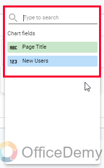
In the second section, from the “Format rules” drop-down, select your metric or dimension to apply conditional formatting (here, only the table metric and dimension will be shown, unlike filters) You can also click on select any field to let Data Studio selecting any of those, this option is not recommended.
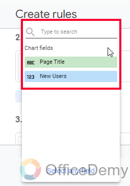
Step 9
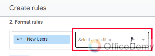
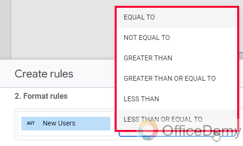
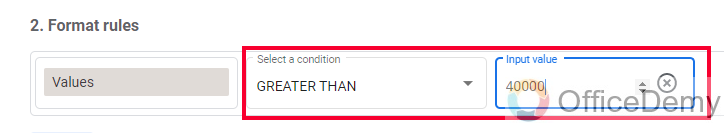
Select a condition (Select any condition from the drop-down, its similar to “Format rules” in Google sheet’s conditional formatting)
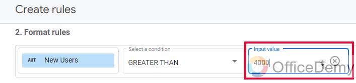
Step 10
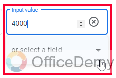
After the condition, you need to specify a value, or you can compare it with another field
Step 11
Now you have AND and OR buttons, to add in your condition, OR will be considered as true when any of the given conditions is true, and AND will only be true when both conditions are true
Step 12
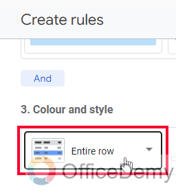
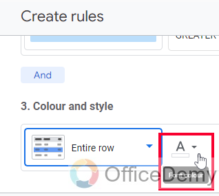
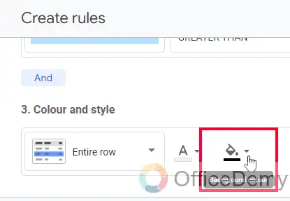
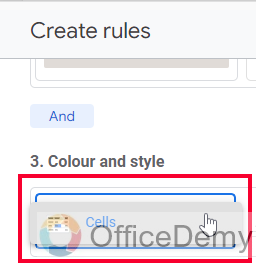
Below is the third section, you need to specify the color and style.
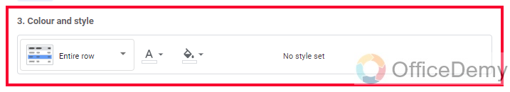
Step 13
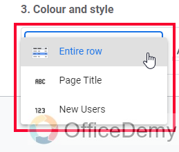
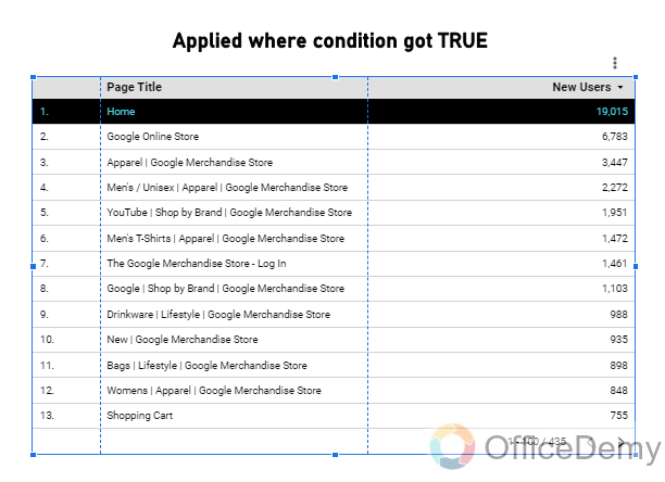
First, select any field from “Entire row” “Dimension (page title)”, and “Metric (new user)”. The formatting will only be applied to your selected field, we commonly select the Entire row.
Step 14
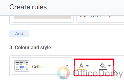
Select the font color
Step 15
Select the background color or fill color
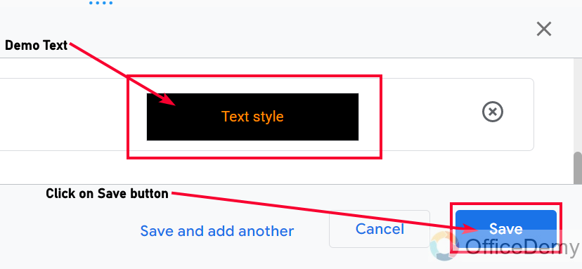
Step 16
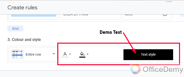
You can see how your text will look after formatting is applied, this demo helps a lot to select appropriate colors.
Step 17
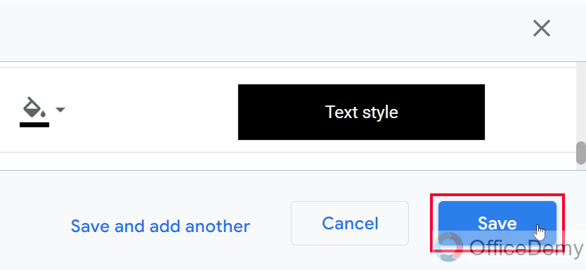
Click on the Save button, and here is your conditional formatting.
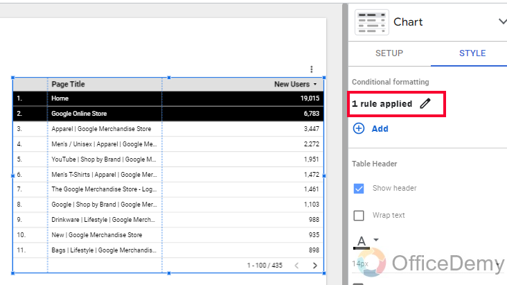
This is how we can apply conditional formatting in Google Data Studio on a table chart.
Conditional Formatting in Google Data Studio – Scorecards
In this section, we will learn how to apply conditional formatting in Google Data Studio on Scorecards. Now, as we know scorecards contain a very less amount of data, so applying conditional formatting on scorecards can be very easy, and yes, it is easy with minimum options, but still, we can use them to format our scorecards based on some conditions.
Step 1
Create a scorecard
Step 2
Select the scorecard, go to the Style table in the chart section
Step 3
Click on Add button in the conditional formatting section
Step 4
First, select a single color
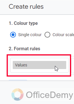
Step 5
In the format rules, the “Values” are already selected and locked. Yes, we cannot change it, we can only select a condition and then a value.
Step 6
Select a condition, and then a value
Note: You have AND and OR buttons here to use (we will see them below in the next section)
Step 7
Below you don’t have any option other than cells, you can only format the entire cells, select font, and background colors
Step 8
See the demo style for your selected colors, and then click on the Save button
This is how simply you can apply conditional formatting in Google Data Studio or Scorecards.
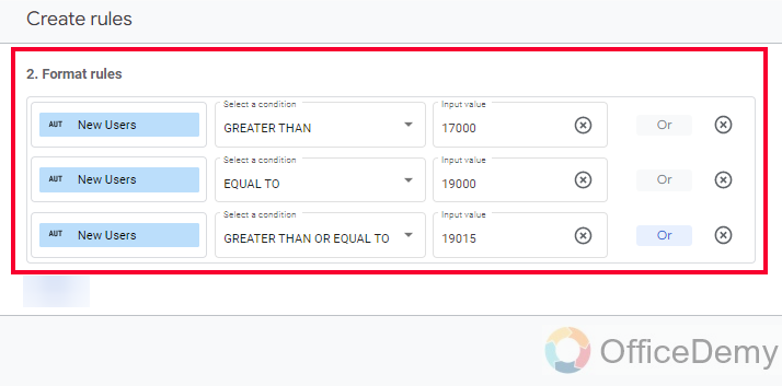
Conditional Formatting in Google Data Studio – OR Condition
Let’s see how the OR condition works with the conditional formatting rules.
I have a table in which I have pages, and their sessions, I will check two conditions by OR operation, I will check if the sessions are more than 4000 or less than 1000, and apply the formatting in either case.
Step 1
Required table and data
Step 2
OR condition in the conditional formatting rules
Step 3
The result
This is how you can use OR condition, also note that there is no limit of conditions you can specify in format rules; you can add more OR conditions as many as you need.
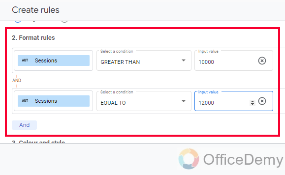
Conditional Formatting in Google Data Studio – AND Condition
AND condition is opposite to OR in a sense that, OR checks all the conditions and applies formatting on all of them if they are true, if they all are not true, OR applies formatting on those who are true, they are exclusive and do not depend on each other in the case of OR, while AND is a bounding condition, if two or more cases are to be checked with an AND condition, then all need to be true, otherwise formatting will not be applied.
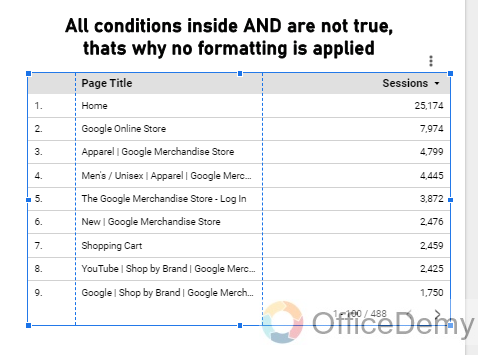
I will use here and create a scenario, where I will first check if the session value is more than 100000 and equal to 120000, both of these conditions going to be false so the AND will not apply formatting to any of the cells.
Step 1
AND condition inside Conditional formatting format rules
Step 2
The Result
I hope you have understood the difference between AND and OR, we have used these two operators so many times in our Google Sheets series, you can check them out to understand them in more detail.
Important Notes
- There is no conditional formatting features with Pie charts, line charts, bar charts, Google charts, Geo charts, gauge charts, area charts, bullets, and scatter charts.
- You can use a color scale or single color for conditional formatting just like Google Sheets
- It is possible to apply conditional formatting on Pivot tables
- You can use as many OR and AND conditions as you need.
- We can add as many rules as we want, as we did in Google Sheets, a single chart have multiple formatting rules
Frequently Asked Questions
Where can I find conditional formatting in Google Data Studio?
Unlike Google Sheets, we don’t have any direct button or icon for conditional formatting, we first need to have a chart (a chart that has conditional formatting feature, they are only pivot tables, tables, and scorecards), then select your chart and go to Chart box > Style tab, and in the first section you have conditional formatting, and below is an Add button to add formatting rules to your selected chart.
Can we copy and paste conditional formatting only in Google Data Studio?
Yes, we can copy and paste the conditional formatting in Google Data Studio, that too on different charts. I can copy the conditional formatting of a scorecard and can paste it onto a table. Yes, logically it can be wrong or maybe partially invalid, but we can copy and paste it as format only. To copy conditional formatting, select your chart > right click > Copy, then go to the chart on which you want to paste this conditional formatting, right-click > Paste special > Paste Style only. Paste style only refers to conditional formatting.
Conclusion
So, this was all about conditional formatting in Google Data Studio. We have learned conditional formatting on tables and scorecards, rest type charts don’t support conditional formatting, and logically it cannot be applied on those, other than a pivot table because that is also a table. So, I hope you understood conditional formatting in Google Data Studio, and you also got an understanding of OR and AND operators in the format rules section.
I will see you soon with another helpful tutorial. Keep learning with Office Demy.


