
To use Color Scale in Google Data Studio
Using Color Scale Pre-sets:
- Open Google Data Studio.
- Create a table chart.
- Go to the Style tab.
- Add conditional formatting.
- Choose color scale.
- Select a field.
- Pick a color scale.
- Set color values > Save.
Customizing Color Scale:
- Click on the chart.
- Go to the Style tab.
- Click “1 rule applied“.
- Click “Edit rules“.
- Edit color scale.
- Save changes.
Hi, in this article, we will learn how to use Color Scale in Google Data Studio. But, before that another question may entangle your mind what is a color scale, and why do we need it? Well, it’s a color scale or color reference chart, that has many different shades of a single color, but not ideally. We can use the concept of color scale having all five colors different. They can be available as a single-page chart, or in the form of swatch books or color-matching fans.
We primarily use a color scale to show the progress, levels, significance, or anything similar to these. Let’s say we have a green color in a darker level, and the value of the object is let’s say 100, then we have another object that has the value of 80, then we will use a slightly lighter shade, then so on for lesser values. This process can be reverted as well, which means lighter shades for larger values and dark shades for lesser. This helps us understand the data more in a visualization manner.
The color scale helps us when we have a big dataset and lesser time to see the values every time, so we need to only glance at the intensity of the color, the shades should be common in one data set, or at least in a similar sheet.
When to use Color Scale in Google Data Studio?
We don’t always need colors to beautify our content. Colors are more than words sometimes, and the concept of color scale proves it. In Google Sheets, we used color scales and we learned how to use them for different purposes. As Google Sheets and Studio are both developed by Google, we can use the color scales similarly in Data Studio too.
So, knowing the features and additional functions that come with pie charts is very important to create interactive and communicative pie charts. This article is meant to teach you everything about a pie chart inside the scope of Google Data Studio, having that said. I hope you understand why we need to learn how to customize pie charts in Google Data Studio.
How to use Color Scale in Google Data Studio
There is only one way of using color scales in Google Data Studio which is using conditional formatting. We cannot use the color scale directly, we need to add a conditional formatting rule on a chart, or any other data, and then we select a color and define values for those colors. So, we will learn how to add conditional formatting, and then how to use color scales. We have some color scales having different contrast colors already available in Google Data Studio, and for a custom scale, we can create our new color scales. Let’s see how to use color scale in Google Data Studio.
How to use Color Scale in Google Data Studio – Using Color Scale Pre-sets
In this section, we will learn how to use color scale in Google Data Studio and will learn how to use color scale presets with conditional formatting rules. As I have already told you that color scale can only be used with conditional formatting rules in Google Data Studio, so to learn a color scale, we need to have some basic understanding of Conditional formatting in Google Data Studio, we will add a rule and for colors, we will use color scale instead of solid color. We will use already available pre-sets which are mainly a combination of three different colors. Let’s see the complete procedure in the steps below.
Step 1
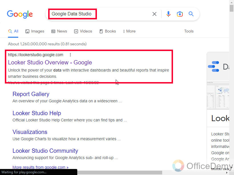
Open Google Data Studio (Looker Studio)
Step 2
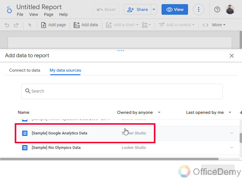
Connect to a data source
Step 3
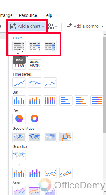
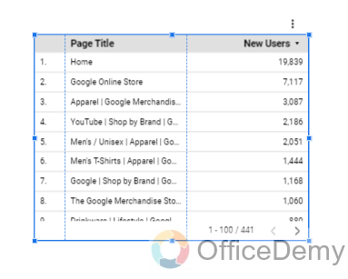
Create a table chart (it suits best for color scale)
Step 4
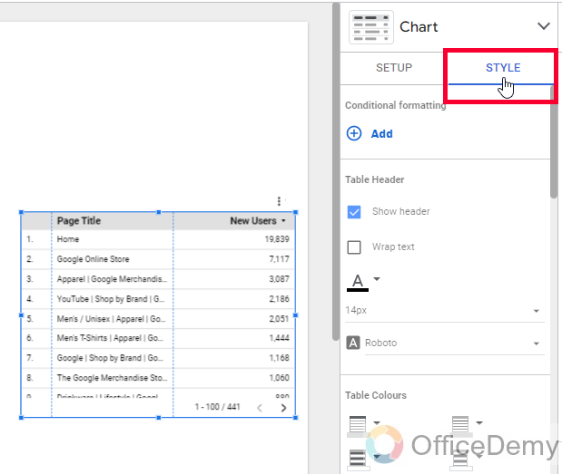
Select the table, and go to the Style tab in the chart sidebar
Step 5
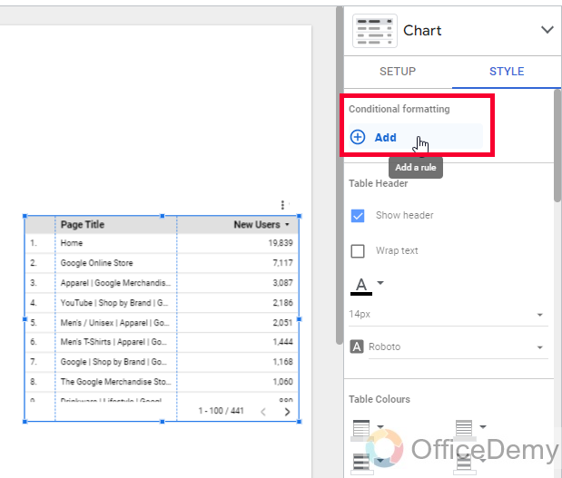
Click on the add button in the conditional formatting section
Step 6
The select color scale from the Color type radio button
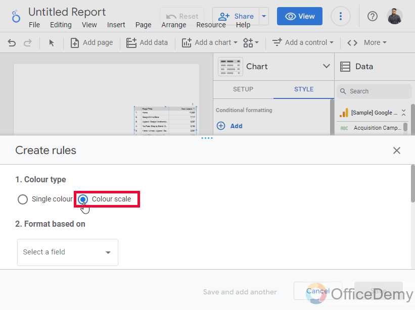
Step 7
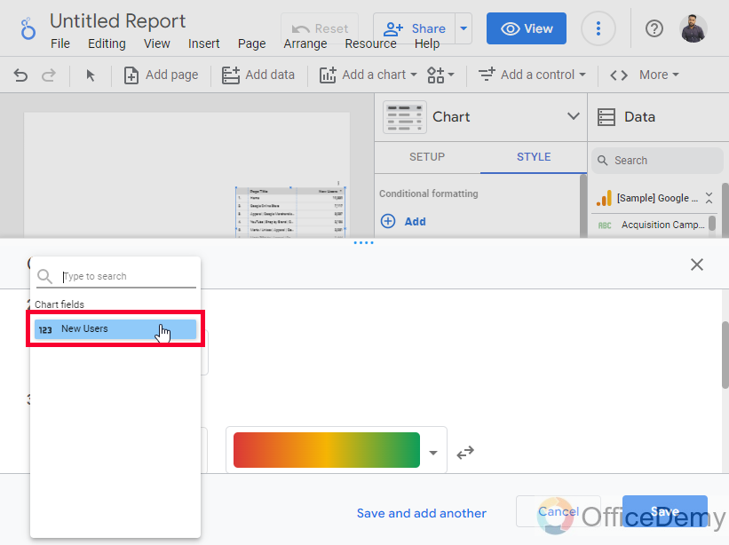
In Format rules, select a field
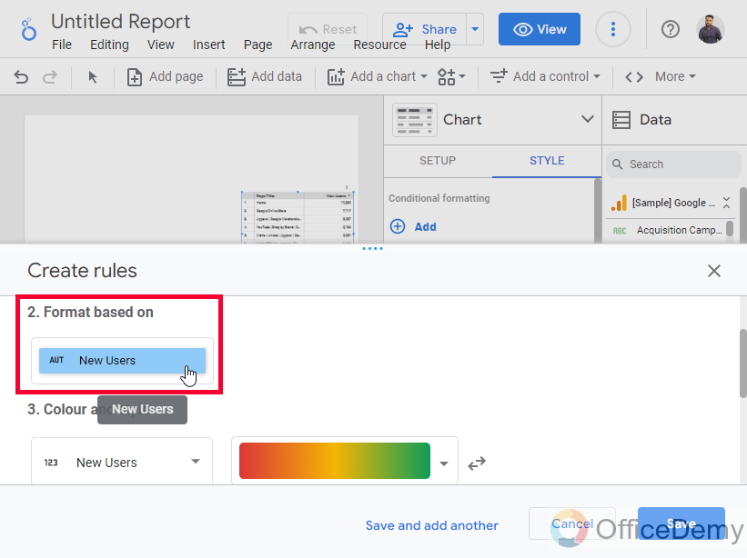
Step 8
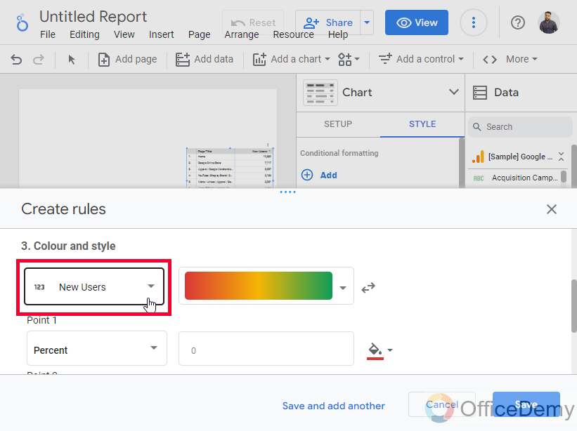
In the color and style section, Select Entire row, Page title, or New user
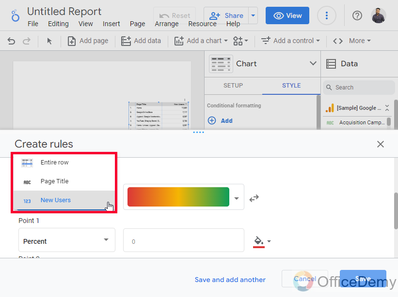
Step 9
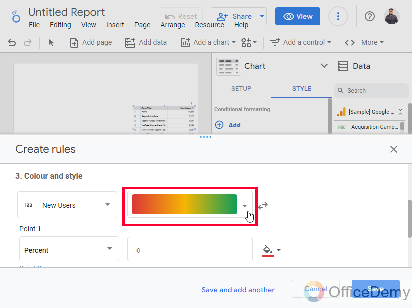
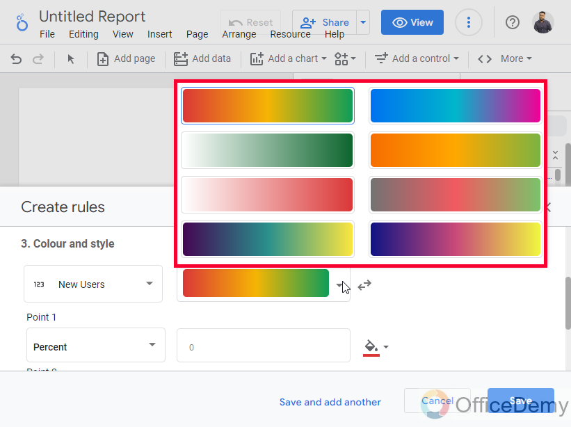
Select a color scale from the given dropdown
These are the pre-sets available in Google Data Studio, they are made up of three uneven colors. We can use any of them, and also, we can change colors, one two, or all.
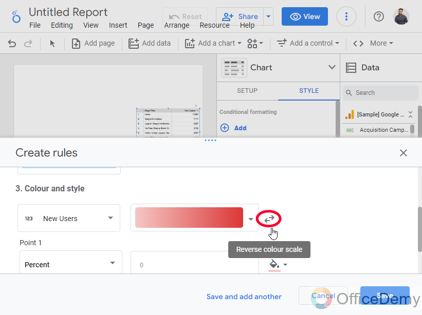
Tip: A button after the color scale drop-down “Reverse color scale”, this button can be used to reverse the color scale, which means that the starting color will go to the end, and ending color will come to the start, and the middle color will remain same.
Step 10
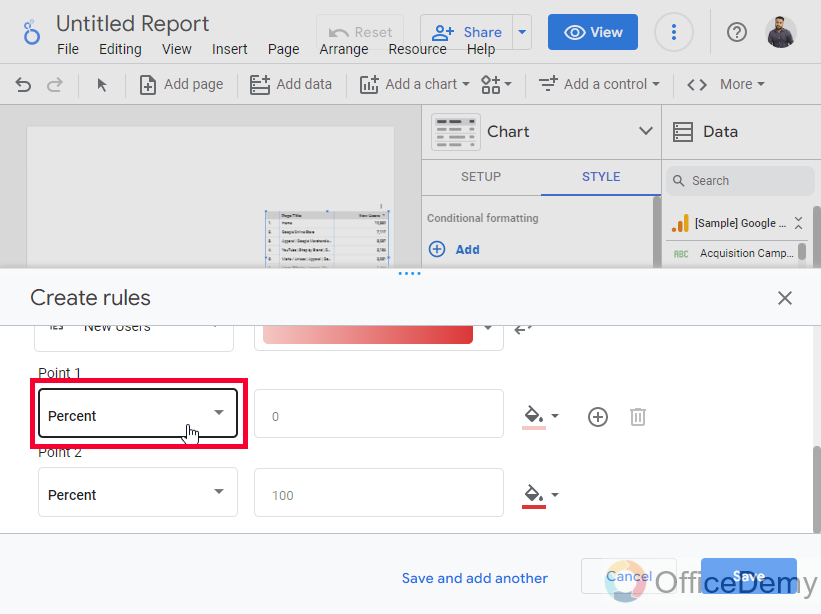
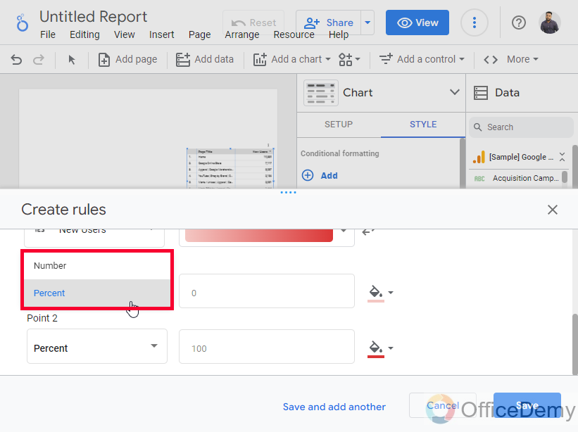
Set the values for each color, here you can set values as percentages or numbers, by default the values are 0, 50, and 100 in percentage for each color.
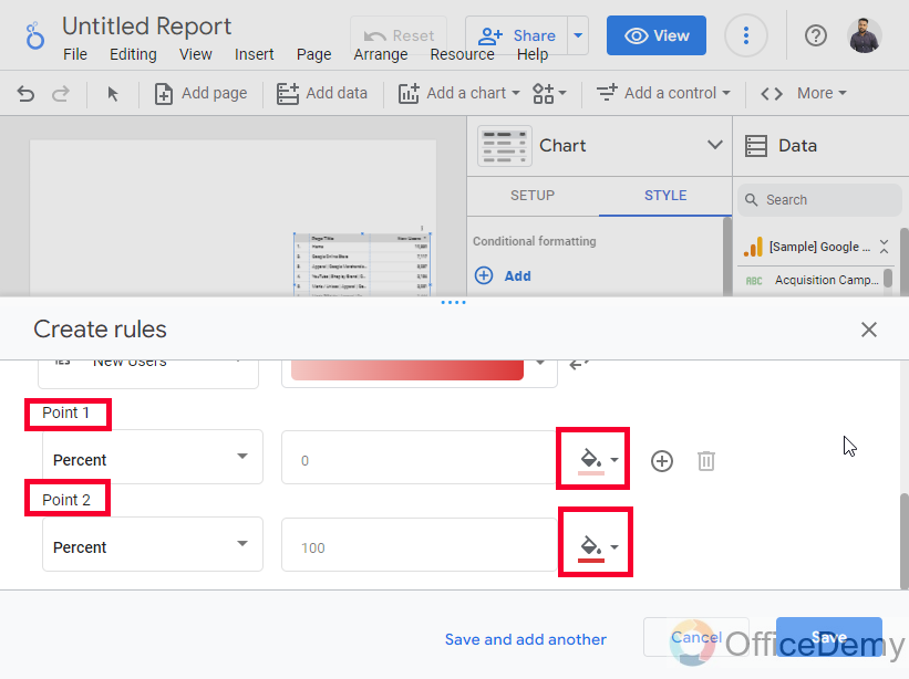
Tip: You can also add more colors, along with more values for them, here default color scales have three colors, we can add more colors, and breakdown the values into four parts instead of three, we can add a maximum of five colors in a single-color scale and values as we want, there is a limit of five colors to add colors in your color scale preset.
Step 11
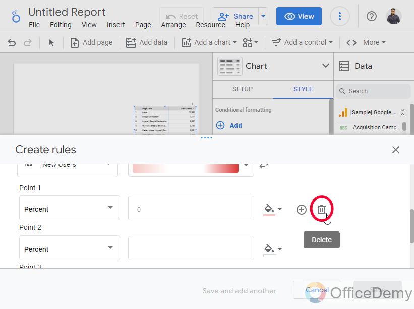
To delete a color, you can use the trash icon after every color, and a plus icon as well to add a color.
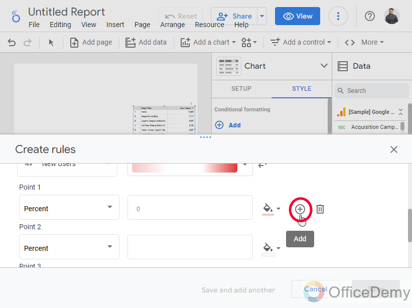
Note: You can use any colors in your color scale, you can make any combinations of darker, lighter, or mix colors. You can use the same color shades for lesser and greater values, or different colors as well, as you like.
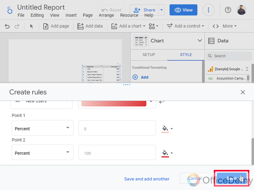
Step 12
As you’re done with it, click on the Save button
Step 13
Here is your table after the color scale using conditional formatting.
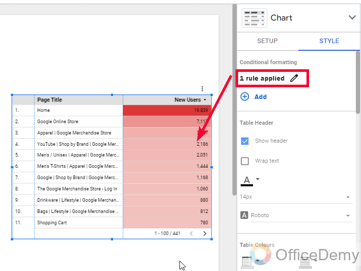
Note: You may notice that some colors are not present here, yes, it’s because the values for those colors do not exist.
So, this is all about color scales in Google Data Studio. This is how to use color scale in Google Data Studio. I hope you have understood the entire concept of color scale in Google Data Studio.
Important Notes
- Color scales can only be used with conditional formatting
- The color scale can have a minimum of two colors and a maximum of five colors.
- We can select a color scale pre-set and change all its colors to make a custom color scale.
- Conditional formatting is not available for all the charts in Google Data Studio. We can only use them with tables, and scorecards only
- You can set color values as percentages or numbers
- Select the right metric from the Format Rules section to apply the color scale.
Frequently Asked Questions
Can I Use the Color Scale Feature in Google Data Studio the Same Way as in Google Sheets?
The color scale feature in Google Sheets allows users to visually represent data based on a set of predefined colors. However, in Google Data Studio, there is no direct equivalent feature that replicates using color scale in sheets. Therefore, it is not possible to use the color scale feature in Google Data Studio the same way as in Google Sheets.
Can I Customize Tables in Google Data Studio to Include Color Scale?
Yes, you can customize tables in Google Data Studio to include a color scale for optimizing table design in data studio. The color scale feature allows you to apply different colors to the cells based on their values, enabling you to visualize data patterns effectively. This customization option enhances data presentation and readability, making it easier to analyze and interpret information in your reports.
How to use a color scale on Pie charts in Google Data Studio?
You cannot use the color scale on pie charts, because there is no conditional formatting option with this chart. Color scales are only found inside the conditional formatting rules, and thus without conditional formatting, you cannot use a color scale on any chart. Conditional formatting is only available and valid for tables, and scorecards and the rest of the charts inside Data Studio do not make a valid connection with conditional formatting, so you can only use a color scale with scorecards, and tables.
Can I save my custom color scale in Google Data Studio?
No, there is no way to save your color scales inside Google Data Studio, you can only take pre-sets color scales, and change their colors to make a new color scale, but they are only saved within the scope of this conditional formatting rule, you can save them with a name to use later or with any other similar data.
A workaround to save your color scale in Google Data Studio is that make a dummy data similar to your actual data and keep it in small size on an empty unused page, just to save it
How can I copy the conditional formatting to paste it on other tables?
It’s very easy to copy the conditional formatting to paste on other tables, simply right-click on the chart on which you have conditional formatting already applied, and then click on the copy button. Now, go to the other chart on which you want to apply the copied conditional formatting and right-click, then look for the paste special option, and then click on paste style only. Your conditional formatting has been pasted to the new table you can check it by going to the Style tab in the Table chart sidebar.
How to edit color scale in Google Data Studio
Once you have saved the format rules with the color scale, and now you feel like the colors in the color scale combination are looking nice, you need to change them. You can do it by editing your colors. Click on the chart, and go to the Style tab on the Chart sidebar, here you will see 1 rule applied button under the conditional formatting section. An Edit rules alert will appear when you mouse over on the button, click on it, then in a new window, click on the pencil icon, then you can change anything, its the same as the previous window we had when we were applying color scale inside conditional formatting for the first time. Make the required changes and click on the Save button. This way you can edit the color scale in Google Data Studio
Conclusion
This was all about how to use color scale in Google Data Studio. We have seen what is color scales, why we need them, and how to use them, we talked about so many editing features while using a color scale inside conditional formatting. I also tried to answer all possible questions related to our color scale topic in the FAQ section, I hope you find this guide helpful. I will see you soon with another useful tutorial. Take care and keep learning with Office Demy for free. Thank you


