
To Make a Gantt Chart in Google Sheets
- Create a table with the Task Name, Start Date, and Finish Date.
- Copy tasks from the first table to the second.
- Use formulas to calculate days and task duration.
OR
- Select the second table.
- Insert a Stacked Bar Chart.
- Customize the chart: hide the start date and remove the legend.
OR
- Access Google Sheets templates.
- Choose a project management template with a Gantt chart.
- Customize it for your project.
This article will teach us how to make a Gantt chart in Google Sheets.
Gannt charts plot tasks and project data in a timeline mode to track the project progress and expected competition. It’s highly used by project managers to track the project distribution, assignment of tasks, and conclude the expected delivery of the project. It helps to break down the project into smaller tasks and then easy progress tracking into days and weeks. This chart is taught in project management courses, but every tech student or practitioner must know how to use it and how to make it on google sheets.
Use Case of Gantt Chart in Google Sheets
We often have multiple ongoing projects, even if you are not a project manager, you may still need to track your work, and you must know the current progress and how to tell your boss when they ask you about the project status, Gannt chart helps you make different tasks, starting and ending date, the current percentage of the progress, expected completion date, helps you to find it if you need more resources to complete the project before ending data and much more. Everyone needs to learn how to make a Gantt chart in google sheets, and we also need to learn how to read it and how customize it.
How to Make a Gantt Chart in Google Sheets
To step-by-step learn how to make a Gantt chart in google sheets, we need some data, we need some formulas, and of course, we need a chart. We will use all these things to make our Gantt chart in google sheets in the below methods.
Gantt charts include
- Tasks
- The time interval for each task
- Start date
- End date
Let’s move to on the methods required to make a Gantt chart in google sheets.
How to Make a Gantt Chart in Google Sheets – Setting up the Required Project data
We need some data from our project to make a Gantt chart, now this data can be different for different projects, I am taking sample data that most projects have.
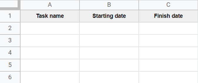
We need Tasks Name, Starting data of the task, and the finish date of the task
We will plot these columns in google sheets.
Step 1
Plot the data columns in the google sheets file
Step 2
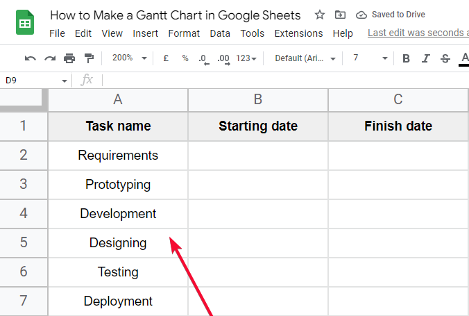
Write down the tasks name
Step 3
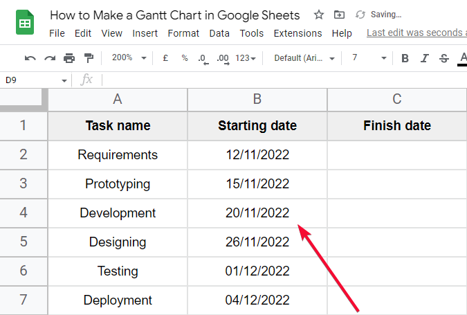
Write down starting dates for tasks
Step 4
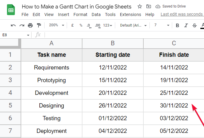
Write down finish dates for tasks
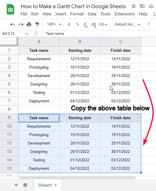
Step 5
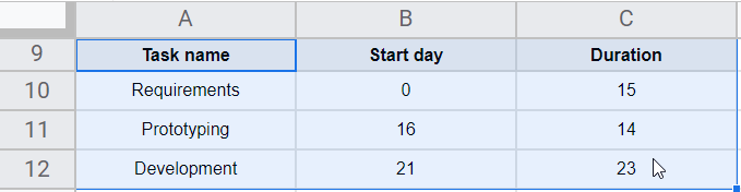
Make another similar table below the above table
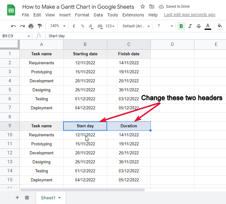
Step 6
Change the headers
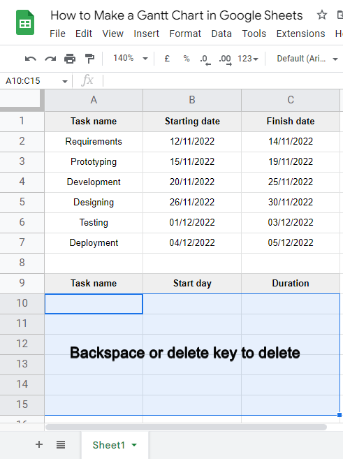
Step 7
Delete the data (select all the data and press “backspace key”, or “delete key”)
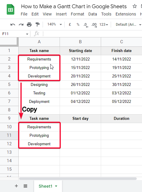
Step 8
Copy some tasks from above (you can select some or all)
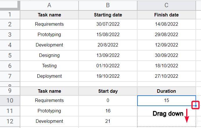
Step 9
Use the INT formula in column B (to calculate days for each task)
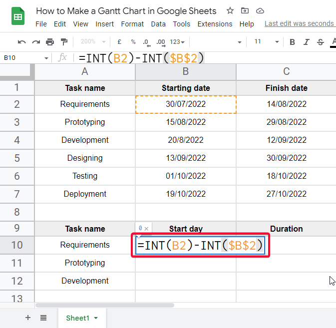
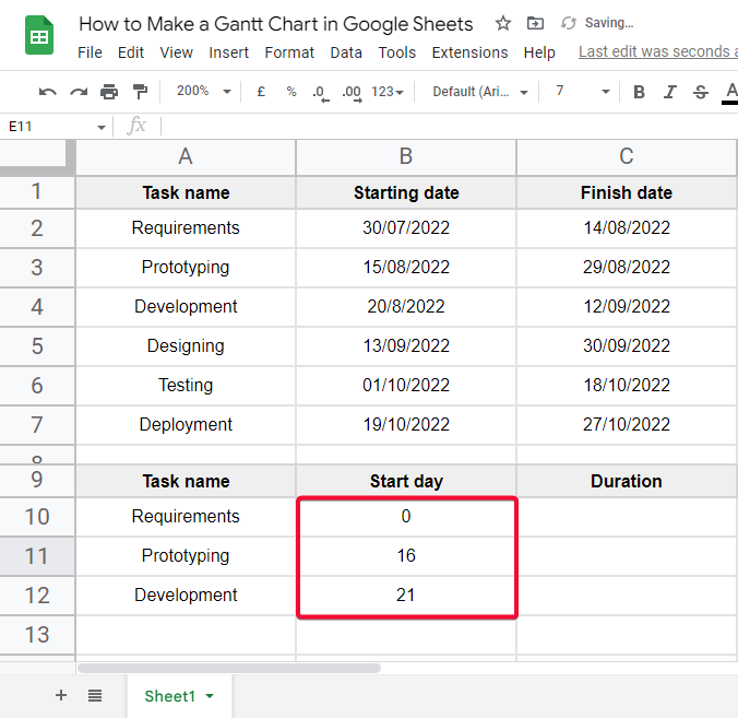
Step 10
Use simple subtraction formula in column C (to calculate the duration of each task)
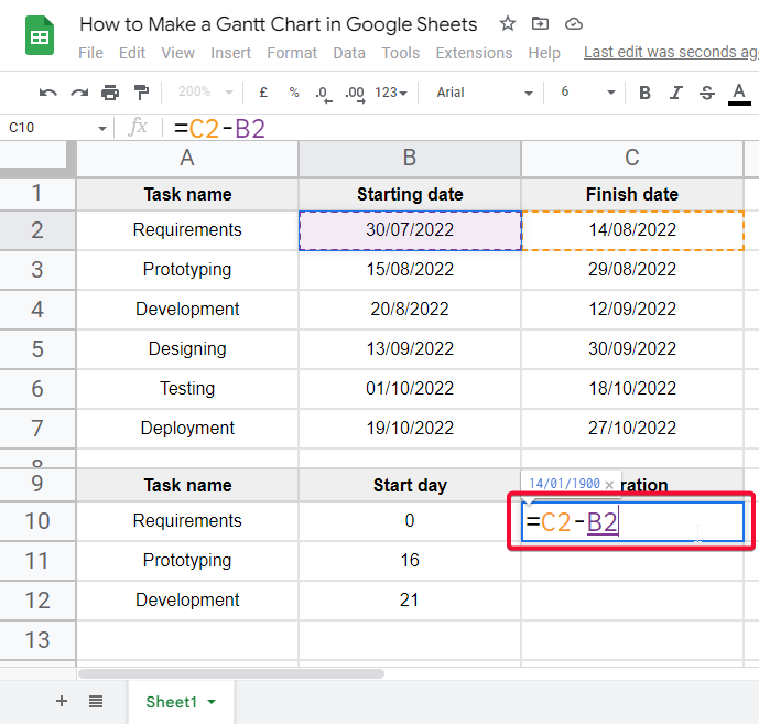
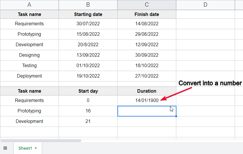
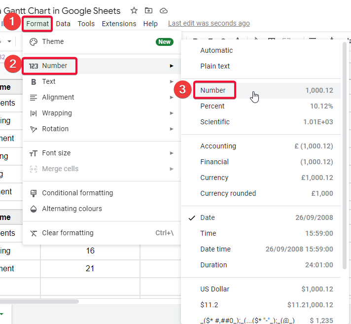
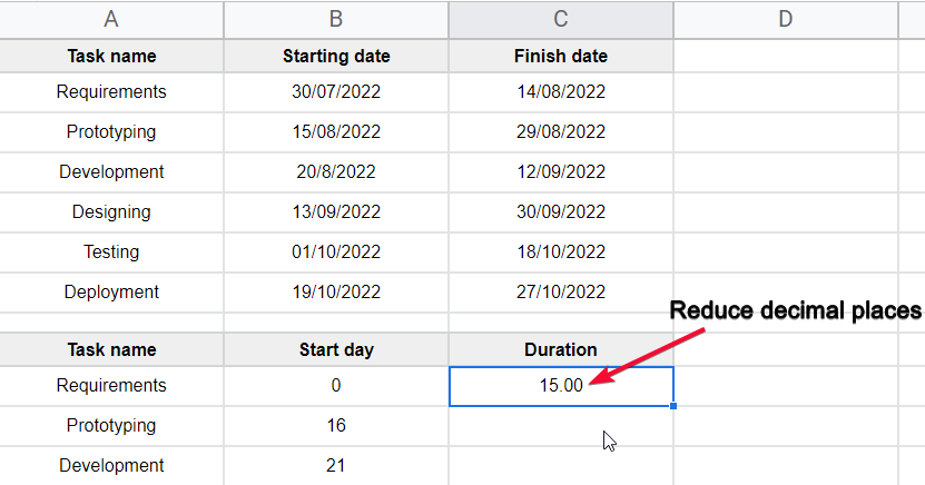
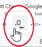
Click on the following icon to reduce decimal places.
Step 11
Now your data is ready to make a chart
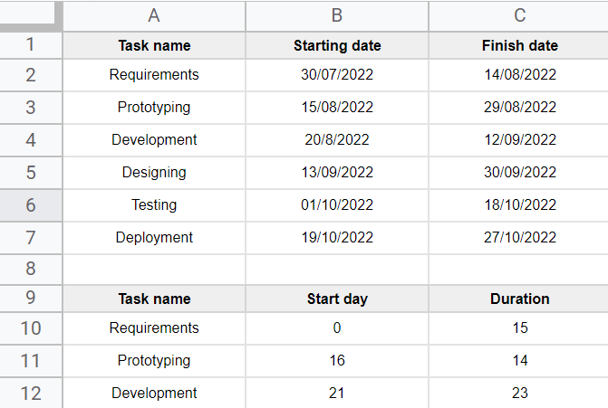
Sample Projects data for your reference
How to Make a Gantt Chart in Google Sheets
How to Make a Gantt Chart in Google Sheets – Making Gantt Chart Using a Built-in Chart
Now we will make the chart using the data (second table)
Step 1
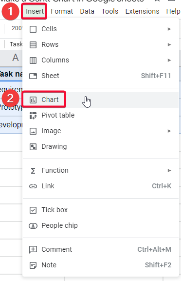
Select the second table that we made.
Step 2
Go to insert > Chart
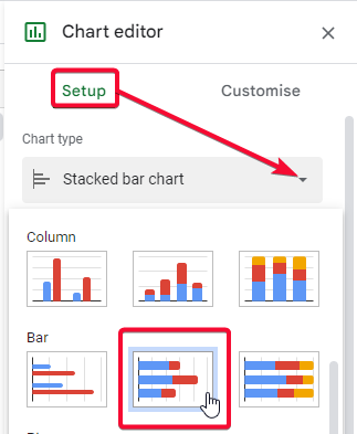
Step 3
Select and insert the “Stacked Bar Chart”.
Step 4
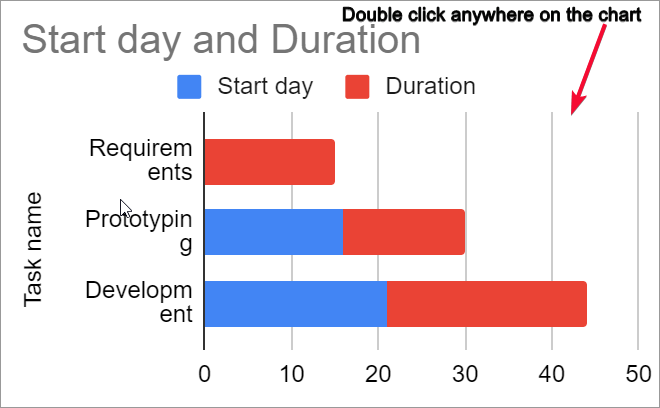
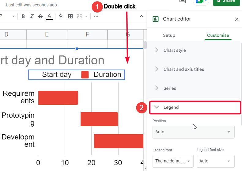
To customize it, double-click anywhere on the chart
Step 5
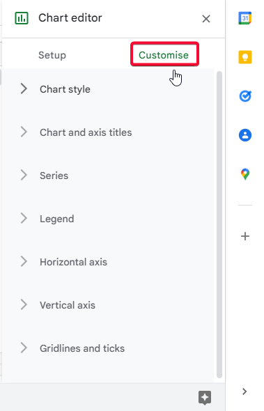
Go to customize tab of the chart editor box
Step 6
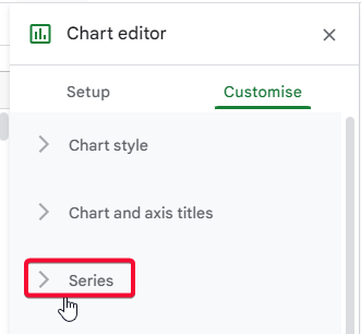
In the Series section, select only “start the day” instead of “apply to all sheets”
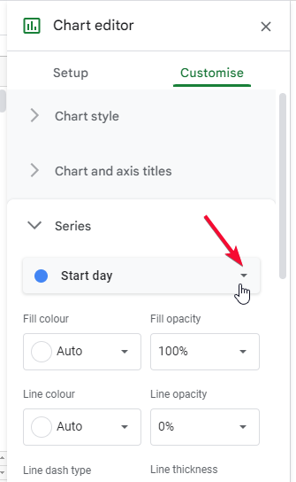
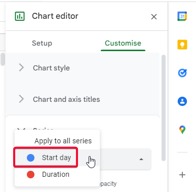
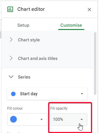
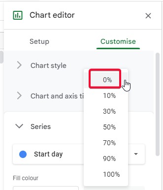
Step 7
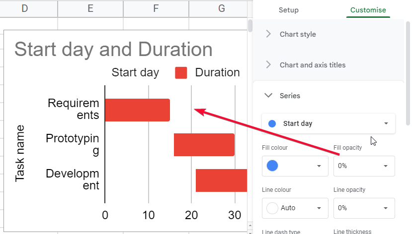
Reduce to opacity to 0% to hide the “start day”: from the chart
Step 8
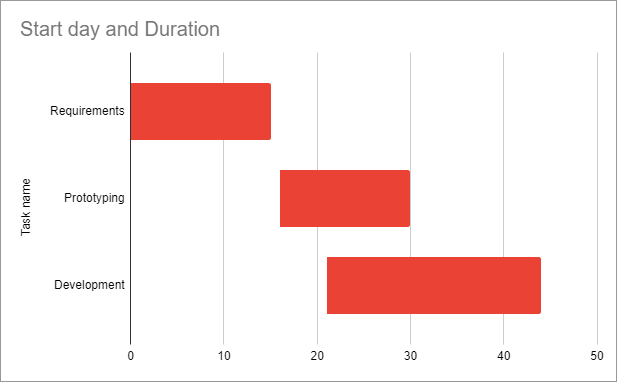
Now your bar chart will look like a Gantt chart, as the start day is hidden and only the duration is visible
Step 9
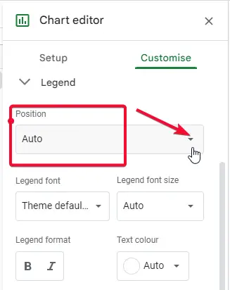
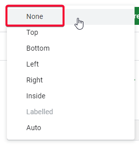
Remove the legend from the Gantt chart (because the Gantt chart doesn’t have a legend).
Step 10
You’re done, the chart is ready.
How to Make a Gantt Chart in Google Sheets – Using Google Sheets Built-in Templates
Now we will see how to use google sheets’ built-in Gantt chart templates to make a Gantt chart for our project’s data.
To find free google sheets built-in templates, open google sheets and go to the template gallery.
Follow the below step-by-step procedure to learn how to add a free Gantt chart template.
Step 1
Go to Google search google sheets
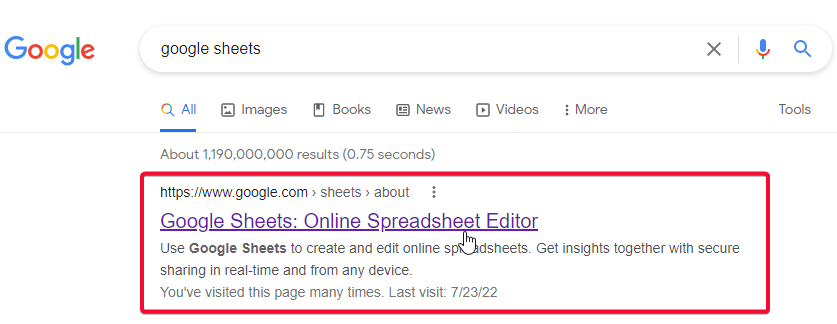
Step 2
Click on the first link

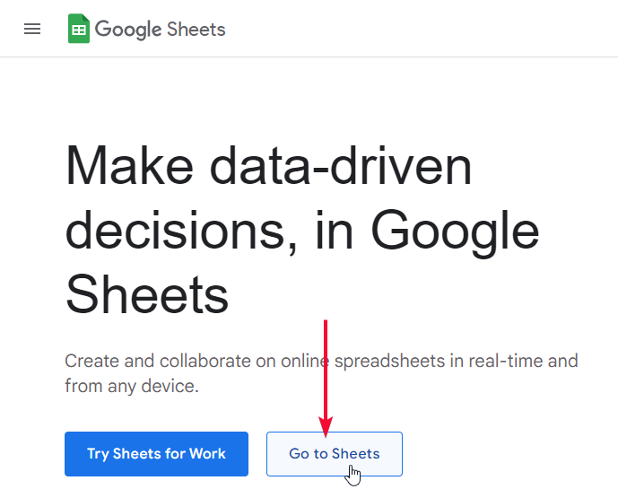
Step 3
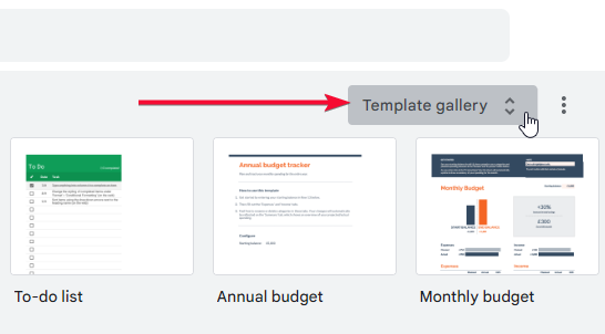
On the google sheets home page, find the google sheets Template Gallery
Step 4
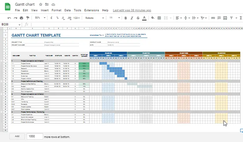
Scroll down, in the project management section select the first template.
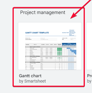
Step 5
Your template is added you can work around, add your requirements and remove all the unnecessary columns and rows. This template is very detailed-oriented, so you will have to remove many things.
This is how using these two methods is taught with every detail, you can make Gantt charts in google charts, and also you see how to import the free template from the google sheets template gallery.
Recap
In this specific article, we learned how to make a Gantt chart in google sheets. From the very basic, in the first method, I covered the data required to make a Gantt chart, I made the data very simply using hypothetical project tasks. then we moved on and plot a stacked bar chart and used our same data to make a stacked bar chart, then by keeping the opacity level of the start day as zero, we removed it from the chart and kept visible only the duration visible to make it look like a Gantt chart, in last we also saw how to remove legend from the stacked bar chart, because in Gantt chart we don’t have a legend. So, we removed the legend from the chart and finalized our Gantt chart
Notes
- Gannt chart is highly used in project management, project tracking, timelining the tasks, and many similar types of data
- Gannt chart has a populizer and it represents the current status of the project or tasks
- Gantt charts can be used to add dates, important deadlines, soft and hard deadlines, project owners, task responsible names, etc.
- Gantt charts are very useful because they show the activities and progress of the project.
- They show when and how the work will be done
- Gantt charts are highly used by project managers to track the potential problems, hurdles, and obstacles that may come during the work
- Gannt charts are also used to forecast the estimated ending data, similarly, project managers can estimate completion dates for smaller tasks starting and ending dates, this is how they make deadlines.
- When the obstacles and problems are more, then the deadlines are tight, or else the deadlines can be soft
- Gantt charts have bars and a waterfall-like stack that represents the overall progress and current status of the project.
FAQs
How to make a Gantt chart in google sheets?
First, you need to have the data, the data is not general, you should have perfectly written data that has the columns that Gantt charts do require. We have the then we don’t pull this data into a chart, now Gantt chart is itself a chart, but in google sheets, we don’t have Gantt chart available directly in the pre-defined charts. So the closely related chart is the bar chart, we pick stacked bar chart after selecting our data and generate it on our data. After that we have to remove the legend because Gantt chart doesn’t have a legend.
And then we have to hide (by reducing the opacity level of start day), doing this will keep its data into the chart but the main chart body would not display the bar for start day and also the color of the start day will disappear now have only one color of bars that is for the duration, and this is how our Gantt charts logic works. Using this way we can easily make a Gantt chart in google sheets using a stacked bar chart.
Is the Process of Making a Waterfall Chart in Google Sheets Similar to Making a Gantt Chart?
The process of making a waterfall chart in Google Sheets is not similar to making a Gantt chart. While both types of charts are used for data visualization, a waterfall chart focuses on illustrating changes in values over time or different categories, whereas a Gantt chart displays timelines and project schedules. The distinct functionalities of google sheets waterfall chart and Gantt chart make them distinct tools for different data analysis purposes.
Can I Use the Free Project Management Templates in Google Sheets to Make a Gantt Chart?
Yes, you can utilize the google sheets project management templates to create a Gantt chart. By accessing the free project management templates available in Google Sheets, you can efficiently organize and visualize your project timeline in the form of a Gantt chart.
Why do we need to use a Gantt chart?
Gantt charts are used to keep the columns into a chart to display an overall project data, it is used to make a project timeline plotted on the chart with starting and finish date, along with task names, task responsible persons, tasks deadlines, tasks contributors, the overall bar is raised when a smaller task is accomplished, we make breakdown the project into many smaller tasks and the tasks can be assigned to multiple people and ta duration can be set to complete the particular set of tasks, this entire data is plotted on the Gantt chart and it gives you an overview of the overall project progress. Gantt charts are used by 100% of the project managers, project managers plot the overall story on the Gantt chart, and it works like assistance it gives you various insights into the project details, it tells you how much progress is required, it helps you forecast how much time will it take to complete the project, and by using these insights a project manager can easily make plans, allocate tasks, set deadlines, and promise clients to deliver the project within the specified date.
Conclusion
Wrapping up, how to make a Gantt chart in google sheets, we have learned everything with simple steps and with practical examples using screenshots, this article is mainly divided into two sections, one was how to make a Gantt chart using a similar chart that is built in the google sheets, we used a stacked bar chart to make it similar to a Gantt chart, we removed legend and disappear the other column to make it a singular stacked bar chart that looks like a simple Gantt chart. In the second method, we saw how to use the free google sheets provided a template for a Gantt chart, it can be found in the template gallery of google sheets under the project management section. We also talked about the data in every detail, we saw what kind of data we require to make a Gantt chart, that’s all for today’s article.
I hope you find this article helpful. I will see you next time, till then take care, keep learning with Office Demy, and don’t forget to like share, and subscribe to our blog. Thank you!

