
To Make a Graph in Google Slides
- Go to Insert > Chart.
- Select any bar chart.
- Click on the “Open source” option to access the data source.
- Replace the dummy data with your data.
- Go back to Slides and click “Update” to see the changes.
- You can further Edit the Chart under the Sheets Tab.
Hello, and welcome to another article from our Google Slides series. In this article, we will learn how to make a graph in Google Slides. Now don’t worry about the word “Graph”, it’s the same as you call chars in Docs, Sheets, and Slides. So, we will learn how to make a graph in Google Slides using the built-in methods and will see how many ways are there to make a graph and then customize it and change its elements to make a more personalized version of it.
A graph and a chart can be identified by the axes. A graph must have axes, the x and y axes are mandatory and the z-axis is optional so that the bar chart can be a graph, and the line chart can also be a graph, but a pie chart is not a graph because it does not have any axis, similarly there are more charts available in the Sheets, Slides, and Docs, but not all of them are graph, I hope you understand the basic difference between chart and graph.
Mostly we use built-in chart templates to build our charts in Google Apps. But we can also use pre-made templates, now it’s up to you if you trust the template provider or the source from where you are importing that template. Well, I will only use the built-in graphs in this tutorial to make this tutorial useful for everyone.
Importance of using Graph in Google Slides
It’s important to make graphs to represent your data more convincingly. A graph is easy to understand and takes less time to deliver the message, while textual or statical data can take more time and effort to read and then draw insight from it. So, everyone prefers using a graph over written content to make it efficient and time-saving for everyone. It primarily helps a creator or a presenter to boost the overall quality of the presentation, and helps to enhance user experience, because your audience is going to be more focused on the graph you will show them rather than the text, and no one will read that out. So, these are reasons why graphs are powerful and can help you deliver your message more quickly and to more people in less time.
A graph can deliver the message in a single view without any double meaning, or mental conflict. Even, when the presenter is away a presentation having some graphs over written content can be very convincing and engaging to the audience. So, these are some reasons we need to learn how to make a graph in Google Slides.
How to Make a Graph in Google Slides
There are three sections involved in this entire topic. We will first learn how to make a graph in Google Slides, then we will see how to alter the data and make it a more personalized version for ourselves or our company, and lastly, we will learn how to customize the graph, we will use selected colors, font, theme, etc.
How to Make a Graph in Google Slides – Create a Graph
In this section, we will learn how to make a graph in Google Slides, we will learn how to add a graph to slides. It’s a pretty easy section, and you only need a few steps to do it. So, let’s go to our Slides presentation and perform it.
Step 1
Go to Insert > Chart > Select any chart other than Pie
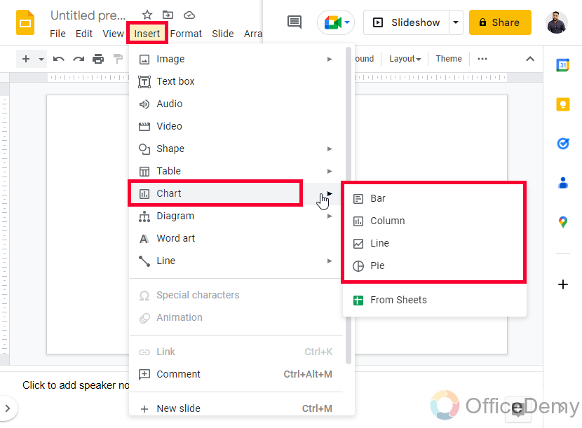
Step 2
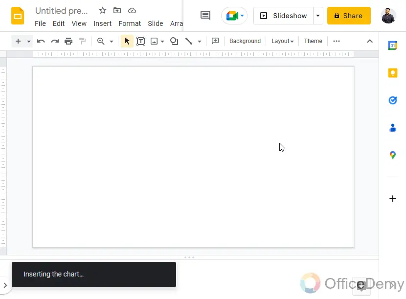
As you click on the chart, it will automatically be added to your active slide.
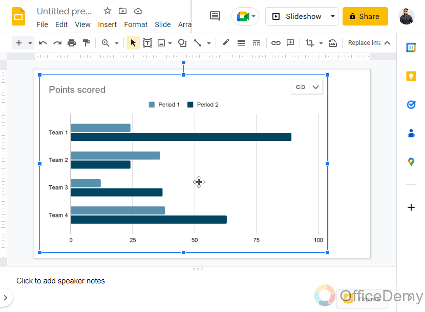
Step 3
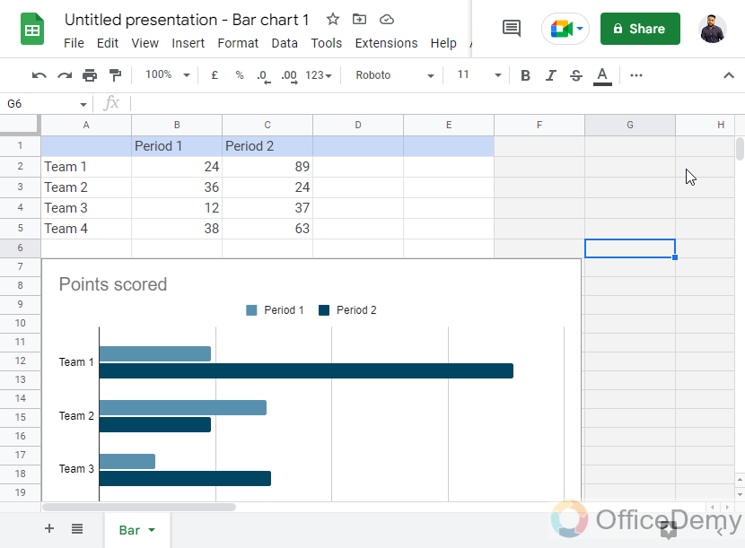
Here is your graph, you can see a graph has two mandatory axes, the x-axis, and the y-axis
Now, you can see this chart has taken dummy data to visualize, now we need to change this data to plot our original data into it.
Step 4
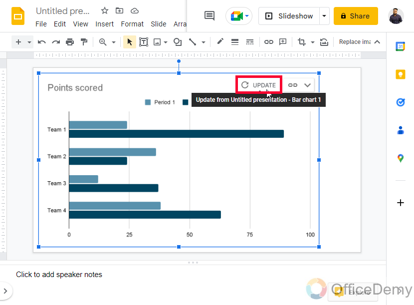
On the top-right corner of the graph, you can see a drop-down icon, and then an “Open source” option, click on it to open the source of this graph
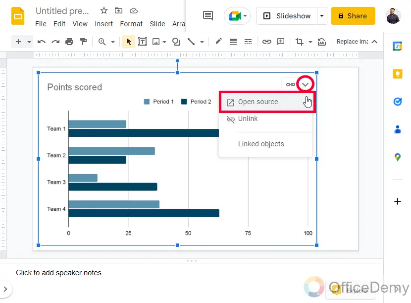
The source is the location of the data which is plotted on the graph.
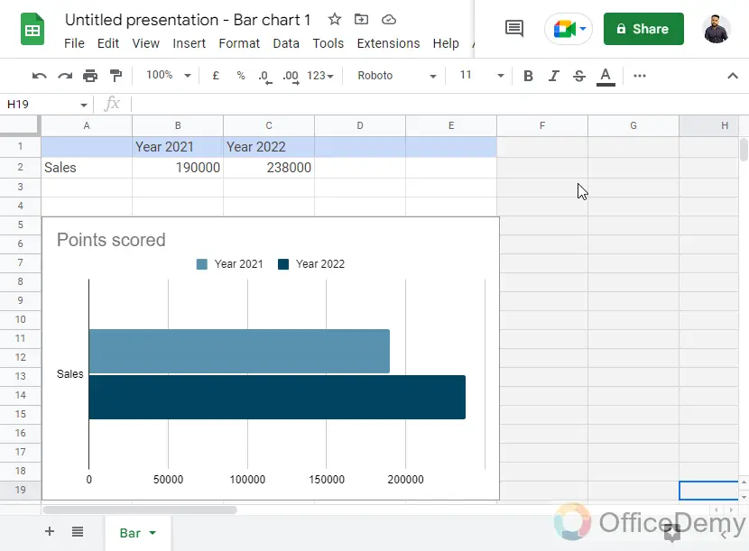
As you click on the Open-source button, a new tab will be opened and a Google Sheets file will auto-generated in which you will have your chart and the data that is being inside it.
The sheets files are only visible to you and associated with this Slides file
How to Make a Graph in Google Slides – Setup the Graph Data
In this section, we will learn how to make a graph in Google Slides and then set up the graph data. As I told you about the associated Sheets file you get with your original Slides, or Doc’s file whenever you make a graph or chart on it. Now in this section, we will work only in the Sheets file to change the data, and it will be reflected in our Google Slides chart, so let’s do it.
Step 1
Open the associated Sheets File
Step 2
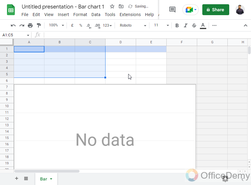
It’s an editable file, you can first remove all the textual data from the sheets, and the graph will be empty.
Step 3
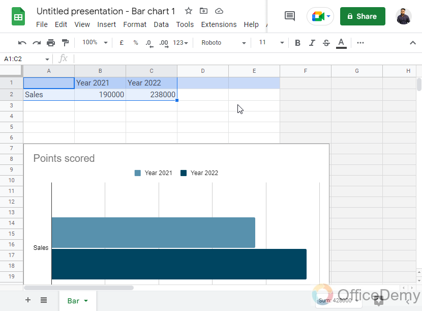
Now start writing your data, or bring it from any source, and paste it here.
Step 4
As you make changes, you can see the real-time changes in the graph.
Step 5
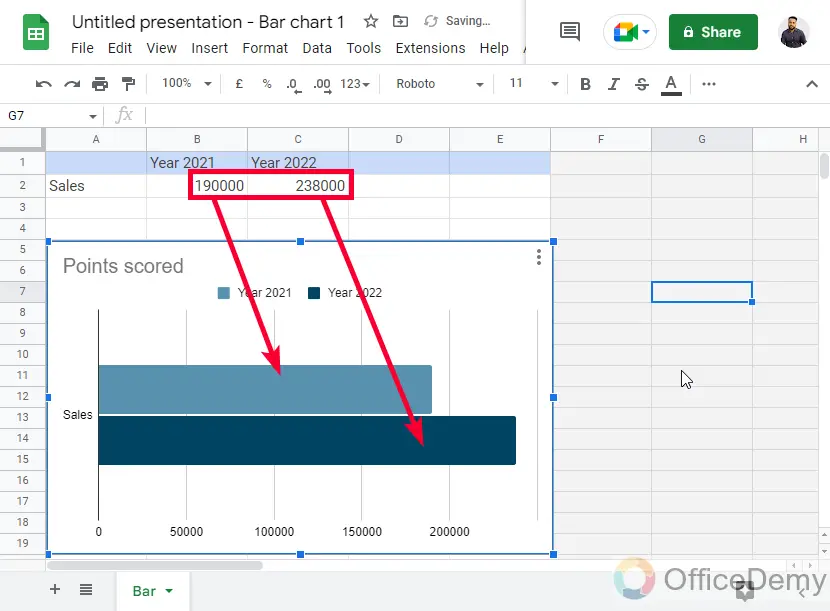
Once you’re done changing the data, go back to the Slides file, and on the graph’s top-right corner you can see an update button appearing, click on it to update the changes to this graph.
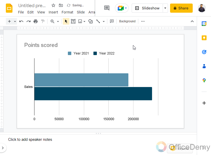
Step 6
the graph is updated. This is how simply you can make a graph in Google Slides, and then set up the graph’s data.
So far, we have learned how to add a graph to slides, and also how to manipulate its data very easily using an associated Sheets file. Now, let’s move to some further customization features.
How to Make a Graph in Google Slides – Customize a Graph
In this section, we will learn how to make a graph in Google Slides, and how to customize it in Google Sheets. Note that there are no chart/graph customization features in Google Slides or Docs. Yeah, you can format the graph as an image in Slides, and Docs, but it’s only for visualizing the overall graph, and not its components. So, we will use Google Sheets to customize our graph.
Step 1
Click on the Open-source button in your Graph to go to your Sheets file
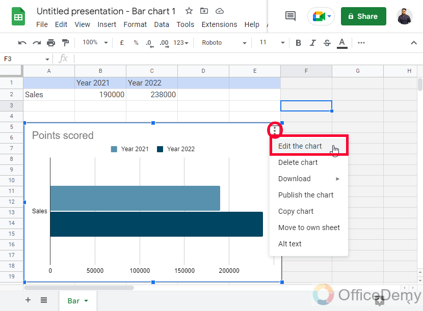
Step 2
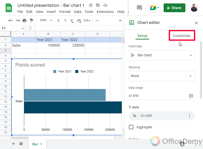
Click on the three dots in the graph’s top right corner, then select Edit the Chart.
Step 3
Here you have a Setup and a customized tab, click on the customize tab
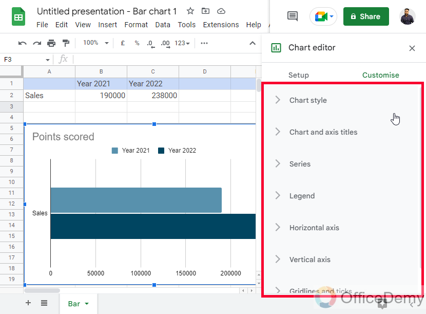
Step 4
Here you have all the customization features for your chart within Google Sheets. You can do anything with the graph and it will be updated in the Slides as you click on the update button
Step 5
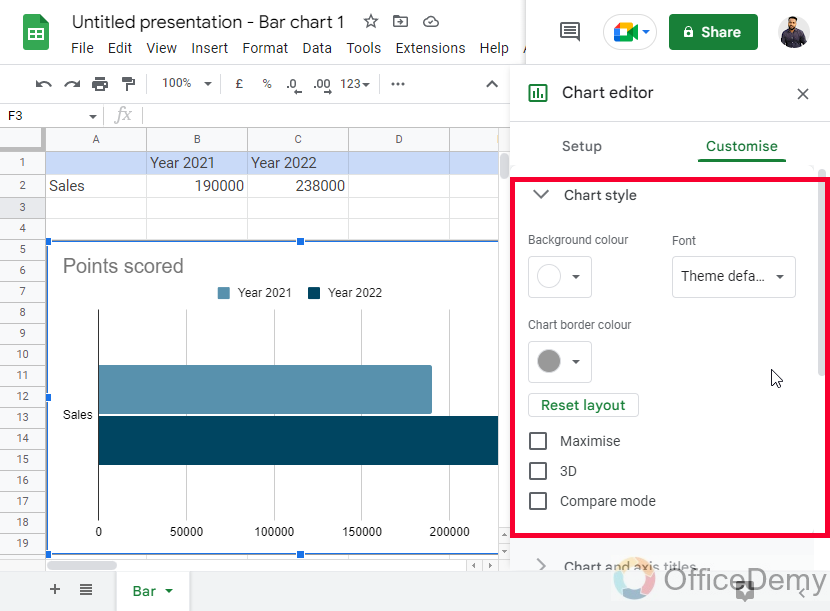
Chart Style
In the first dropdown, you can customize the overall chart style
Step 6
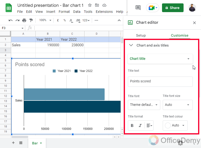
Chart and axis titles
Here you can customize the axis titles of the chart and the main title as well.
Step 7
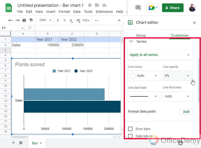
Series
Here you can customize the series. Series means the bars that are raising high and low for the data points
Step 8
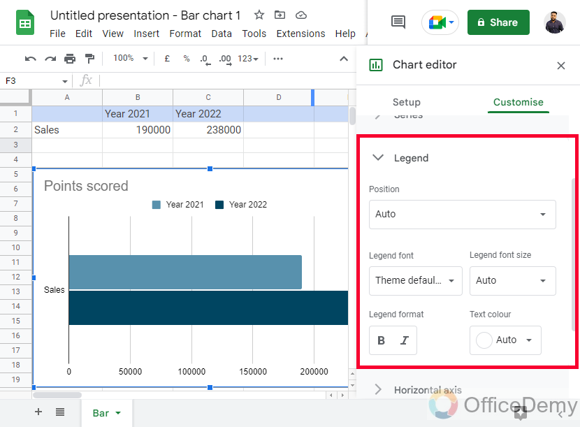
Legend
Here you can work with a legend. Legend means identity, as the bars are concluded in a nutshell showing you how to identify the bars with colors.
Step 9
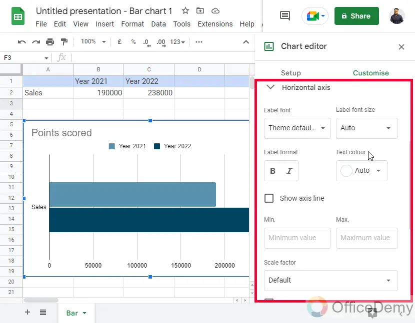
Horizontal axis
Here you can further customize the horizontal axis
Step 10
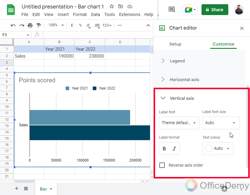
Vertical axis
Similar options are above, just for the vertical side axis
Step 11
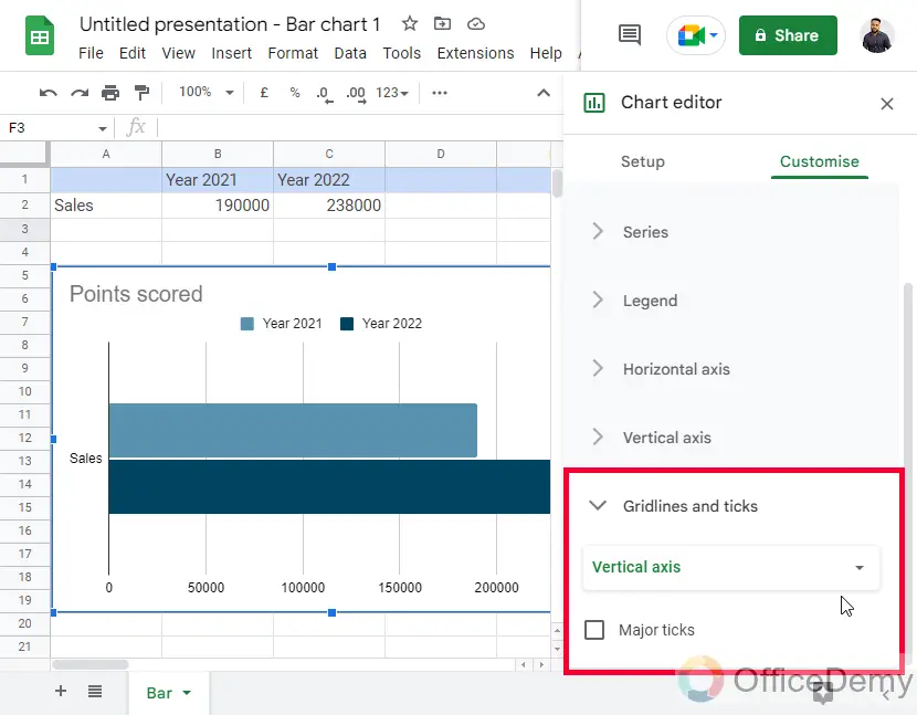
Gridlines and ticks
Here you can control the gridlines and the ticks on your graph. Gridlines are the background lines that help you show the overall page layout, such as the Sheets file layout.
Important Notes
- The graph must have x and y axes otherwise they can’t be said a graph
- Google Apps do not keep any difference between charts and graphs and named both of them as charts
- We can also import a pre-made graph from sheets in Slides and Docs.
- There are only three Graphs available in Google Slides, they are bar, line, and column
- You can link or unlink a chart imported from sheets to keep it updated or static every time even the changes are made in the original data.
Frequently Asked Questions
Can we make a scatter chart in Google Slides?
No, there is no direct feature inside Google Slides to make a scatter chart or graph. We have only four major charts available to directly draw within Google Slides without using Google Sheets. But we can use Google Sheets to make all types of charts, there are 30+ charts available in Google Sheets that can be easily imported and customized after importing to Slides, and yes Scatter chart is also available in Google Sheets.
Are the Steps for Making a Pie Chart in Google Slides Similar to Making a Graph in Google Slides?
Yes, the steps for creating pie charts in google slides are indeed similar to making a graph in Google Slides. Both require selecting the data and choosing the chart type. However, pie charts specifically represent proportional values, while graphs can display various types of data relationships.
What is the difference between a chart and a graph?
There is a major difference in the axes between charts and graphs. A graph must have an x-axis and a y-axis, and the chart may or may not have axes.
Examples of Charts: Pie Chart, Geo Chart, Gauge Chart
Examples of Graphs: Bar Charts, Column Chart, Bubble Chart
Note: Charts are Graphs both are called “Charts” in Google Apps
Conclusion
Graphs and charts are always more powerful than static data. Today, we learned how to make a graph in Google Slides. I broke down this topic into three sections to make you understand and differentiate all the sub-topics that are covered in this topic and should be learned to understand the concept of the graph in Google Slides. I hope you find this article helpful and that you have learned something new from it. I will see you soon with another useful guide till then take care, and have a nice day. Keep learning with OfficeDemy.

