
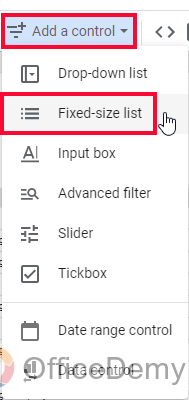
To Add Controls in Google Data Studio
- Click “Add a Control“.
- Select “Drop-down list“.
- Place on canvas.
- Choose the control field in “Control” sidebar.
- Use the drop-down to select/unselect items for chart manipulation.
OR
- Click “Add a Control“.
- Select “Fixed-size list“.
- Place on canvas.
- Select the control field.
- Directly select/unselect items within the control.
OR
- Click “Add a Control“.
- Select “Input box“.
- Place on canvas.
- Choose control field.
- Use the search box for exact matches.
OR
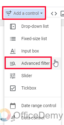
- Click “Add a Control“.
- Select “Advanced filter“.
- Place on canvas.
- Select the control field.
- Choose from options (contains, starts with, etc.) in the control dropdown.
- Use search box for advanced filtering based on control field.
Hi. In this article, we will learn how to add controls in Google Data Studio. By default, we have so many controls available in Data Studio. Knowing that each control has its metric and dimension requirement, and only works with its required ones. So, there are some common controls like input field, and a dropdown that is commonly used for any kind of data, we will learn to add and use different types of controls in Data Studio.
Controls are here to add functionalities to the charts, the charts can be associated with controls and can be used with so many combinations and comparisons of data.
Let’s continue with the same Google Analytics example we have been using in this series.
Importance of Adding Controls in Google Data Studio
We can easily create charts and graphs using a simple “Add a Chart” button or adding it from the Insert menu. But what’s next?
Is Data Studio only limited to creating charts?
No, we can perform functionalities on the charts, on any chart time series, scorecards, pies, etc. We have so many controls directly available in the toolbar to be added and used to control our data. These are functional buttons that change the charts every time we try to manipulate them using the control we have just added. These controls contain drop downs, filters, input boxes, date range control, and some more.
So, for example, I have a chart that is showing previous quarter data of the sales of my company, I share this file with my boss and gave him the right to edit it. Now I had added control for them to change the data and get insights into different time durations, they can change the dimension (time, or can be any dimension based on data), and can see the last day, last week, last month, and so on. These controls empower users and viewers to only see the data but also manipulate its controls. The controls do not overwrite any data in the existing original data source we have connected. They simply tweak the dimensions to draw useful insights.
Controls are very important as I have told you above, therefore, we need to learn how to add controls in Google Data Studio.
How to Add Controls in Google Data Studio?
So we have so many controls right here in the “Add a control” button in the toolbar, we will see them and will learn how to use the functionality of these controls and change the charts data.
Add Controls in Google Data Studio – Drop-down List
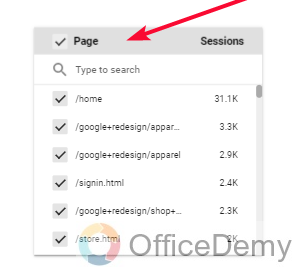
The drop-down list is a common control we have used in our day-to-day life, it’s mostly used as a list of items and we pick any of the item(s), and then the original data will be manipulated based on our selection. The drop-down list needs to have a control field, the control field works like a dimension, and we have any kind of list here by selecting from the control field tab.
Now when we will select different items from the list the data underlying these dimensions and having a relatable metric will be automatically manipulated.
Tip: If you don’t want to change only the selected chart with these controls, it can be done using filters, conditionals, regular expressions, and queries, we will learn them later in this series.
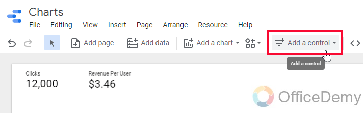
Step 1
Click on the “Add a control” button
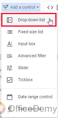
Step 2
From the list click on the first option “Drop-down list”
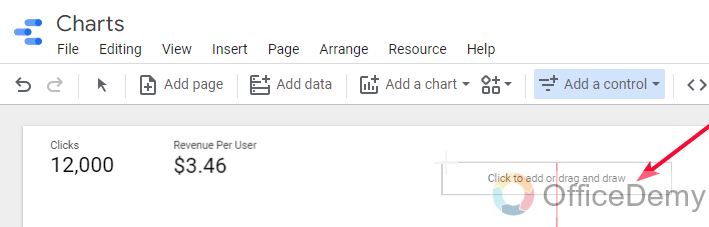
Step 3
A Sticky element will be floating with your cursor leave it anywhere to place it on the canvas
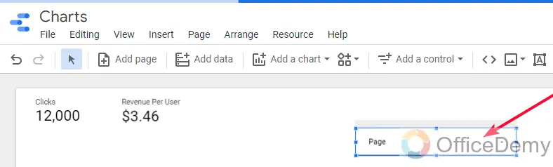
Step 4
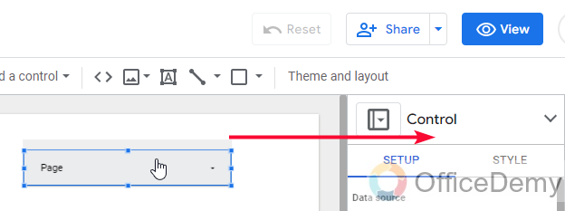
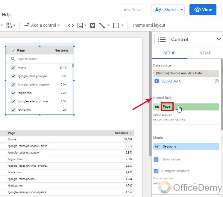
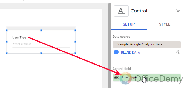
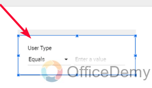
Now it has been added, with a default control field, click on it to change the control field.
Step 5
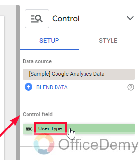
While selecting the control, you will have the “Control” sidebar opened on your right side
Step 6
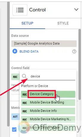
Here, the most important thing is the control field
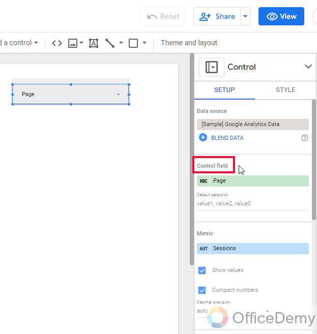
Step 7
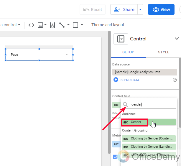
You can select any item from the list, just like we used to select dimensions to work on
Step 8
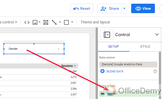
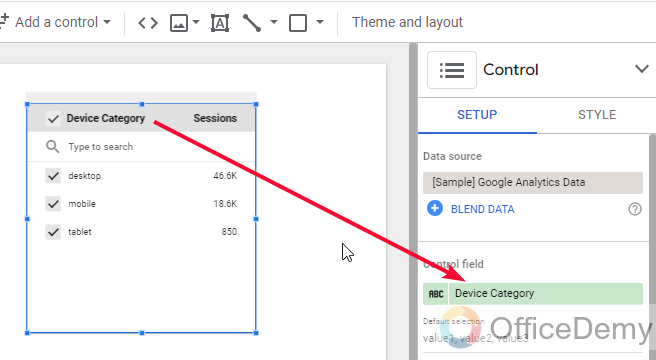
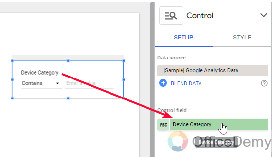
As you select the control field, it will be reflected in your control body.
Step 9
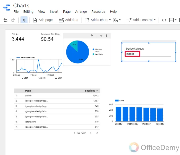
Now you can use the drop-down icon to open the list and check/uncheck your required items to see them in the charts
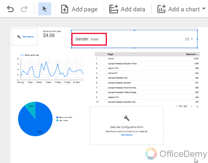
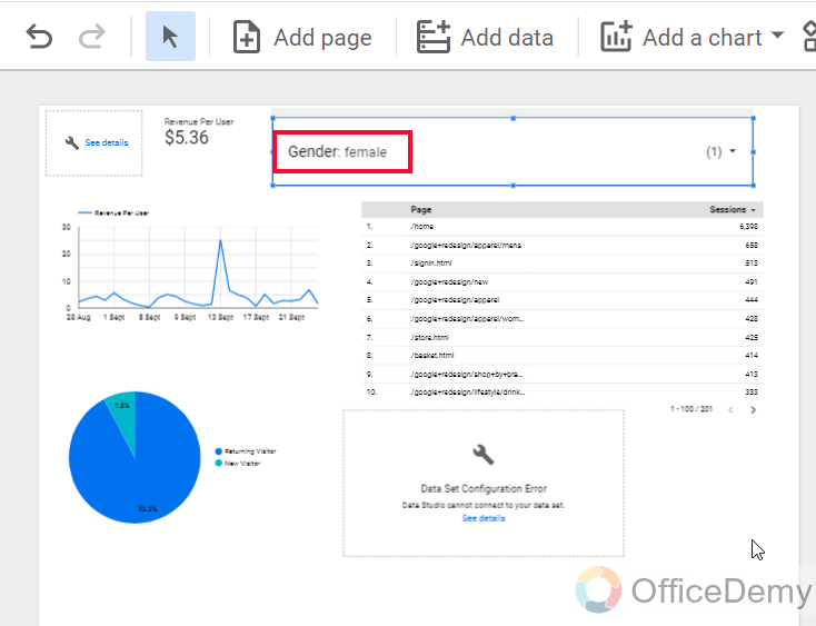
This is how you and anyone you shared the file with can work with a drop-down list to see different visualization based on the control field and can draw useful insights.
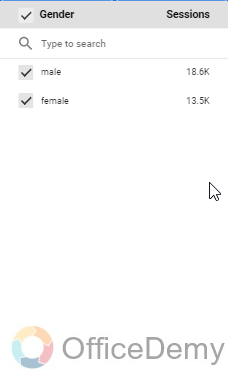
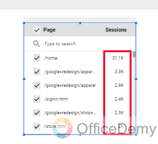
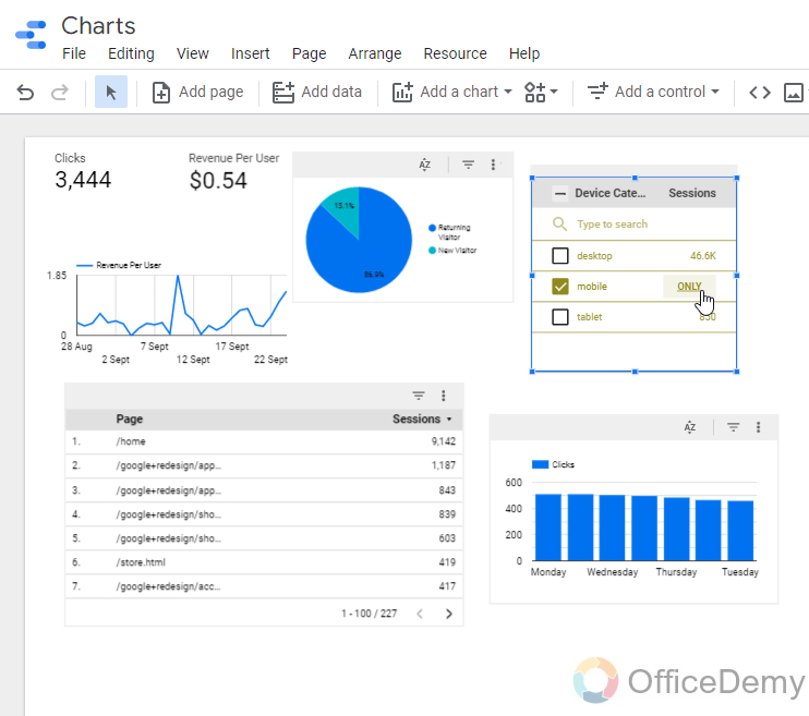
Add Controls in Google Data Studio – Fixed-size List
This is another kind of control in Data Studio, this is a fixed-size list. Here we don’t have any dropdown, the list is always expanded (opened) by default. We can similarly have the control field here, from which we can control our charts data according
We can manipulate more than one category or any number of categories, even all categories, there are no limitations, to choosing only one at once. Similarly, we can exclude one or more categories and get the data values for all other than a few of them. These works are similar to the drop-down list but it’s always expanded.
Tip: We can directly see the quality or value of each category within the control body, so we have an idea of each category, even without manipulating the charts.
Step 1
Go to “Add a Control”, click on the fixed-size list, and drop it anywhere on your canvas
Step 2
Select any control field to visualize data accordingly
Step 3
You can see the values are displaying in front of every item
Step 4
You can select or unselect multiple items at once
Tip: You can see some charts are going empty when we apply some control over them, it’s because they are having some different kind of metrics and dimensions that is not logically correct for this control.
This is an exemplary data set, when we work on real datasets, this kind of problem doesn’t occur mostly.
So this is how we can work with a fixed-size list, the difference is only the view, expanded here, and collapsed in the drop-down list.
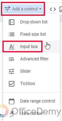
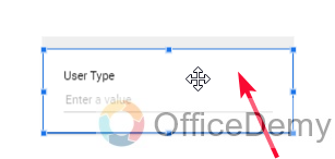
Add Controls in Google Data Studio – Input Box
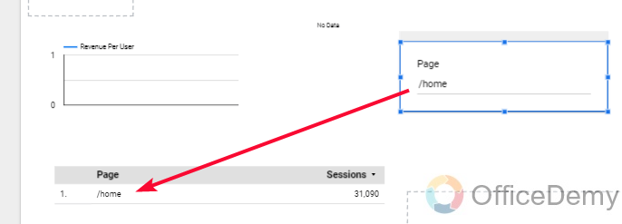
In this section, we will learn about the input box, another kind of control that is not commonly used. It is like a search box you have seen on websites, but the search always returns only the exact match, so it can be less interactive for some reasons, if I search a term “About“, and the data has “/About“, so it will not return the nearing match of “About“, because it only searches for the exact matches.
Similarly, like all the controls we can select the control field from the Control sidebar on the right side.
Tip: The input box is not highly used and not recommended other than in some very rare cases, instead we have another searching control that has additional functionalities to ease down the search process. We will learn that below
Step 1
Go to “Add a Control”, click on the input box” and drop anywhere on your canvas
Step 2
Select a control field
Step 3
Now search in the search box
Step 4
You can see only exact matches are returned
Add Controls in Google Data Studio – Advanced Filter
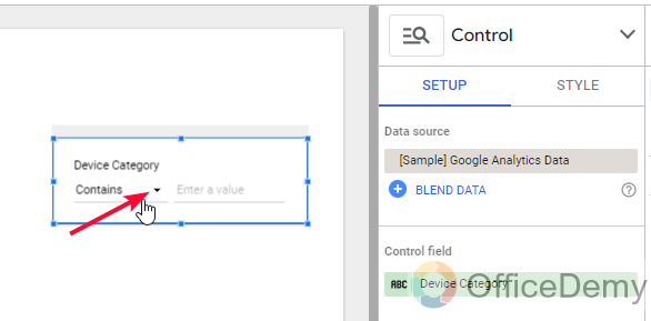
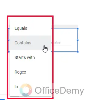
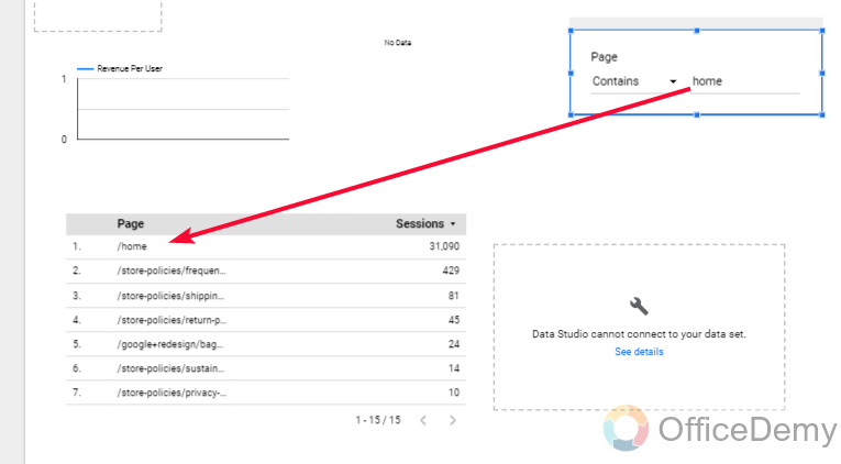
In this section, we will learn how to add controls in Google Data Studio and will see the Advanced filter, now advanced is similar to the input box in nature, they both are searching controls. The advanced filter has a built-in dropdown that precise our queries, we can select a control field, and based on the type of the control field we will have some options in the drop-down.
Options like contains, starts with, ends with, REGEX, and so on. These options help us to precise our search process, If I search “About”, but there is no “About” in the data, but it has “About us”, I can use the drop-down list and can select the “contains” option, so it will give me “About us” because it contains “About“. I hope you have understood the built-in drop-down feature in the Advanced filter control, and rest it works very similar to a search box-like an input box.
Step 1
Add the “advanced filter” control as we have added in previous sections
Step 2
Select the control field
Step 3
Select any option from the dropdown to precise your search
Step 4
Now search and get the results
This is how it works, it’s an advanced version of the input box.
These are the most common and useful controls in Google Data Studio, we will see the rest of them in some other tutorials. I hope you find this article helpful and that you have learned how to add controls in Google Data Studio.
Important Notes
- Controls are used for manipulating the data in the charts only for visualization, they never change the original data
- Data Studio Controls can be added one or more in the same report
- Controls are also fully customized, we can change colors, Styles, fonts, background color, etc.
- Some controls are limited to a data type, such as a slider that can only take a control field with a data type of number.
- The tickbox can only treat Boolean data types, it will not work if the data type in the specified control field is not Boolean.
Frequently Asked Questions
Can a viewer work with controls to manipulate the visualization of the data in the charts?
Of course, yes, that’s why the controls are useful and they don’t change the data, there is no effect of control on the data, if a control has changed the data, you can delete the control or reset it. When you share your reports with people using the Data Studio Share button, there are two accesses to share, one is “edit“, and the other is “view“, in the view permission a viewer can work with controls but can do add/remove charts or any element.
Can I Use Controls to Manipulate Data in the Google Data Studio Charts?
Yes, controls in the google data studio charts allow users to manipulate data. With controls, users can filter, sort, and segment data dynamically within the charts. This feature in Google Data Studio Charts provides flexibility and customization options, enabling users to analyze and visualize data in a more interactive and personalized way.
Are Controls customizable?
Yes, similarly to charts. Controls are flexible, you can adjust their size, and padding, and also you can work with styling. There is a style tab next to the setup tab in which you have everything you need to customize your controls, you can change color, fonts, background color, line thickness, opacity, and many more.
Conclusion
So, this was how to add controls in Google Data Studio. We have learned what are controls why we need them and how they help us increase the functionalities of our charts and take more control over the visualization aspect. I hope you find this article helpful and that you have learned to work with controls in Data Studio. That’s all from how to add controls in Google Data Studio. I will see you soon with another helpful tutorial, till then take care and keep learning with Office Demy.


