
To Create Charts in Google Data Studio
Creating Scorecards:
- Click “Add a chart“.
- Select a scorecard.
- Place the scorecard on the canvas.
- A default metric appears; click it to change.
- Search and add the desired metric(s).
Creating Time Series Charts:
- Click “Add a chart“.
- Choose a time series chart.
- Place the chart on the canvas.
- By default, it shows “New user” as the metric; change it.
- In the Dimension section, configure time settings, such as starting and ending dates or specific time categories.
Creating a Pie Chart:
- Click “Add a chart” > Select a pie chart > Place the chart on the canvas > Set the appropriate dimension to categorize your data, e.g., gender, device category, or user type.
In this article, we will learn how to create charts in google data studio. We have already learned how to connect data sources in Data Studio. In this article, we will use a sample Google Analytics data source to make beautiful visualizations and will start filling up our empty canvas.
We will see why visualization is important and what kind of problems Google Data Studio solves using its charts and graphs concept.
I am talking about Google Analytics data because it has so many metrics to visualize. and it’s the most common internet data that can be used for visualization, you can use any data that suits you, I am going to use a Google Analytics sample so that anyone not having a website or google analytics account can also relate with the examples.
Importance of Charts in Google Data Studio
Google Data Studio is based on charts and graphs, we have nothing but so many varieties of charts, and graphs that are used for beautiful and functional visualization using any kind of data source. We must know how to set up and style the charts using the built-in tools, there are so many features we will explore about the charts, but first, we must know how to create a basic chart, unlike google sheets or google docs, creating a chart can be little tricky in Data Studio.
So we must have all the things we need, and we must set up everything perfectly to go with it. This article is meant to teach you how to set up and structure a basic chart then we will further learn about editing, customization, custom fields, calculated fields, metrics, data blending, and so on. The first and most important thing is to set up your chart therefore, we need to learn how to create charts in Google data studio.
How to Create Charts in Google Data Studio?
We will start by creating the chart, we have already learned to connect data. Here, we will begin creating beautiful charts and solve real-world problems.
Create Charts in Google Data Studio – Simple Scorecard
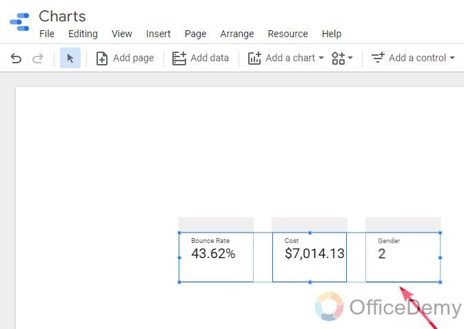
The scorecard is a kind of visualization chart that shows nothing but a total of anything, for example in your report you need to show the total profit, total cost, and total bounce rate, here the scorecard is the best kind of visual element that can show the total. As we are using a sample google analytics data source, we have some metrics that can be used to display in a scorecard such as bounce rate, cost, etc. To add a scorecard you can follow the below steps after connecting a data source.
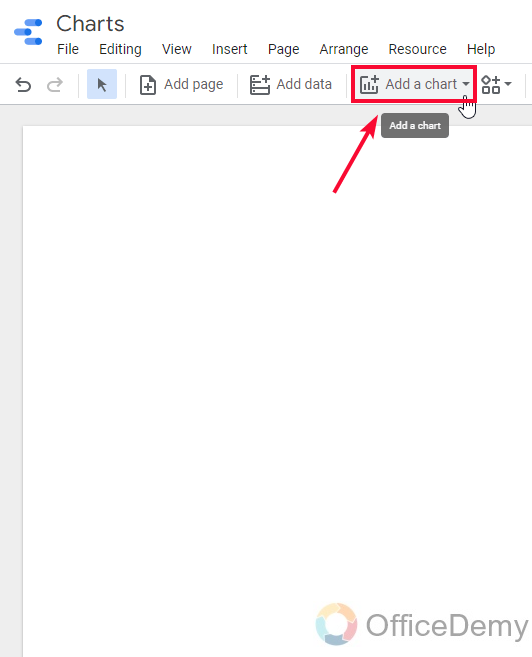
Step 1
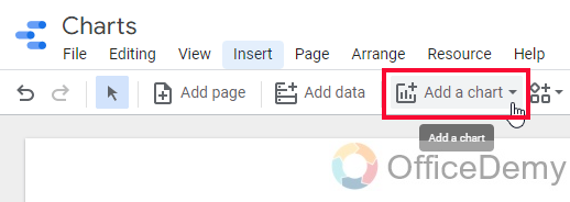
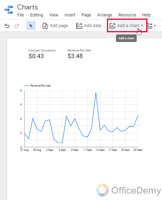
Click on “Add a chart”
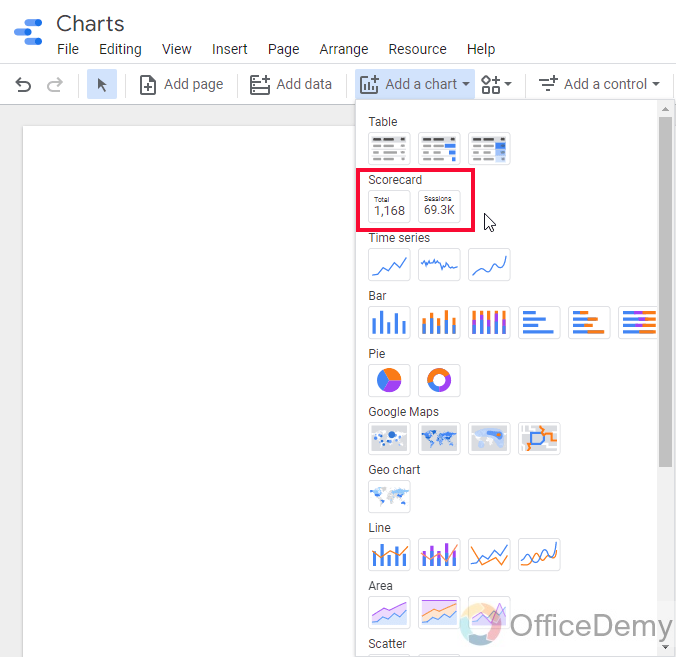
Step 2
From the Scorecard, section pick any scorecard, and click to add
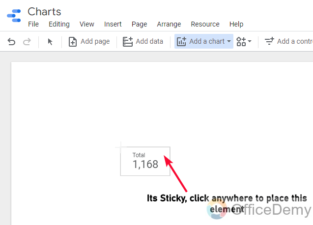
Step 3
A sticky element will be floating with your mouse cursor, simply click anywhere to place the scorecard.
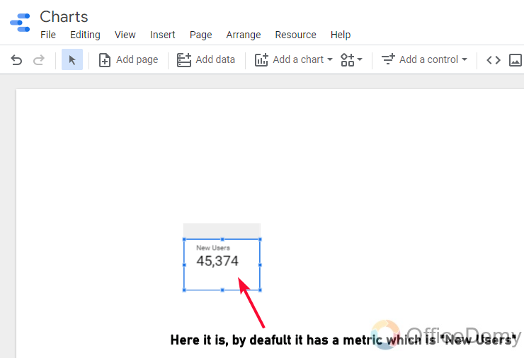
Step 4
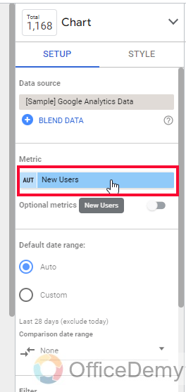
A scorecard has been added, you can see a default metric is here with the scorecard.
Step 5
Now you can add any metric here in the scorecard, to change it simply click on the metric name in the Metric section inside the Chart editor box.
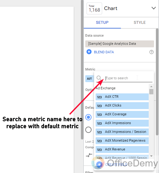
Step 6
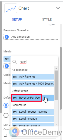
Search a metric name to add
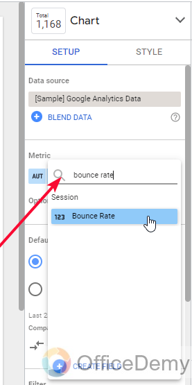
Step 7
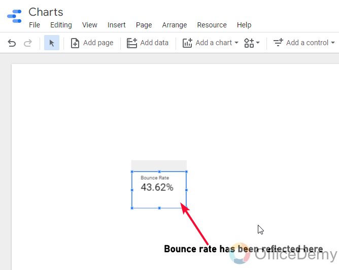
Metric has been added
Step 8
Similarly, you can add more like this.
Step 9 (Optional)
Another way to add a scorecard
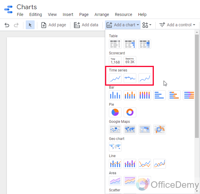
How to Create Charts in Google Data Studio – Time Series Chart
In this section, we will learn how to plan and set up a time series chart in Google Data Studio.
it is line charts that visualize data over time. These are highly used and very important to learn in the scope of this tutorial. So, as we have some Google Analytics data sources, let’s see how we can use time series or time series charts.
Step 1
Go to “Add a Chart”
Step 2
From the time series section, pick any chart
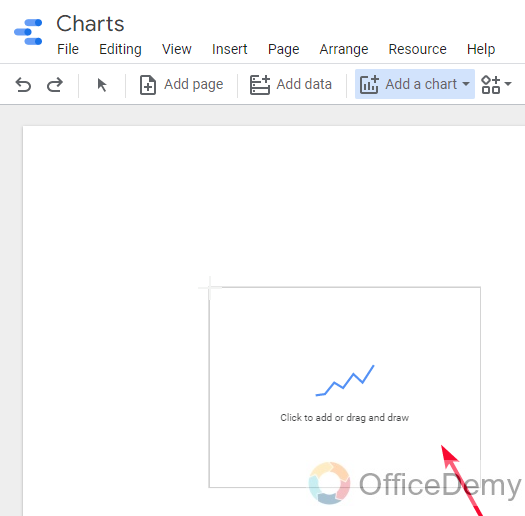
Step 3
Drop the chart anywhere on the canvas to place it
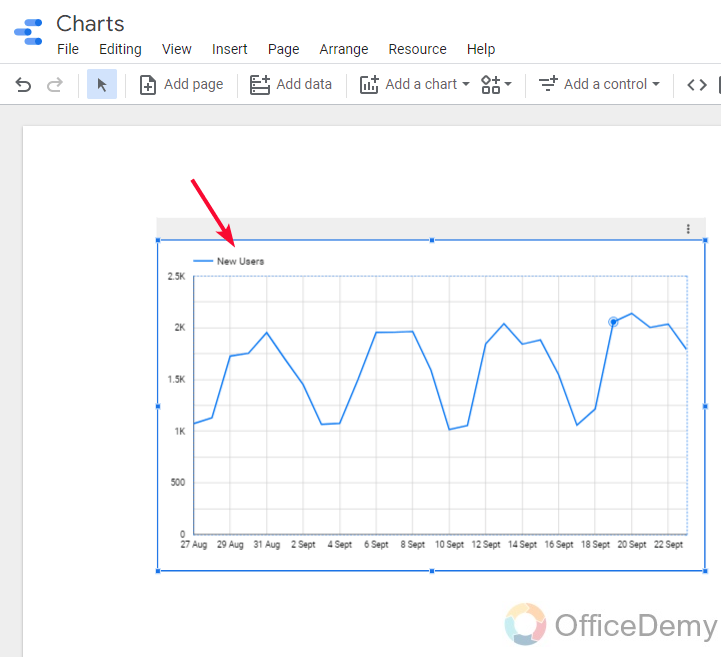
Step 4
Now, you can see the default value is “New user”, of course, we can change it and also can do many other things
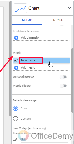
Step 5
First, let’s change the metric
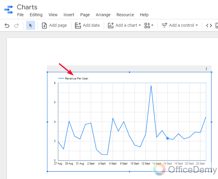
Step 6
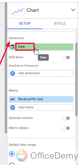
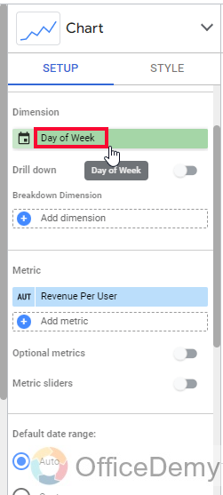
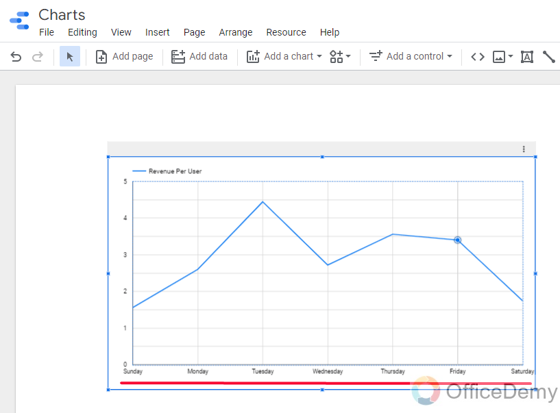
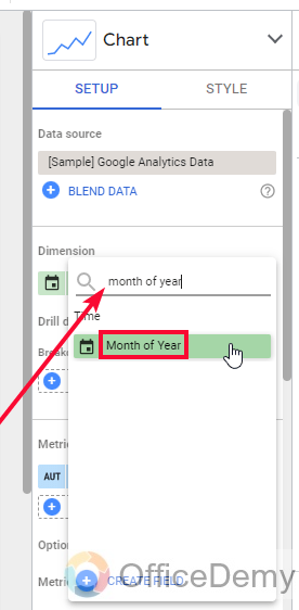
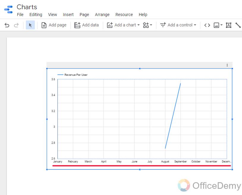
Now here, in the Dimension, we can do so many things with time, we can set starting and ending dates, we can select a day of the week, day of the month, month of Year, and so many combinations like these in the date button under dimensions section.
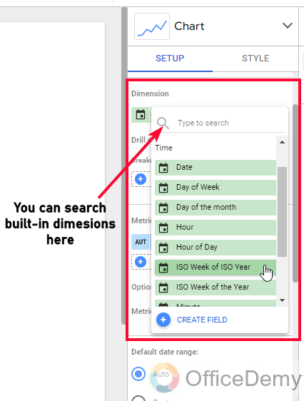
Day of week
It will show all seven days data of the data, which means only days are compared with each other
Month of Year
It will show the monthly based data and will compare months with each other.
So this is how we use time series charts for data visualization, these are still some basic concepts about the charts, soon we will learn about custom fields, calculated fields, filters, queries, conditionals, blending, regular expressions, and more.
I hope you found the time series very easy and you will surely practice it.
How to Create Charts in Google Data Studio – Pie Chart
In this section, we will learn how to create charts in google data studio and that too from a pie section. Pie charts are very useful to break down the data based on multiple categories, here we can use pie charts to see the gender breakdown of our website visitors and so many use cases like this.
Step 1
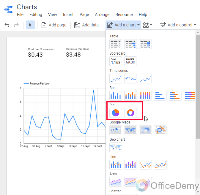
To add a pie chart simply go to “Add a Chart”
Step 2
Select any variant of the pie chart from the Pie section
Step 3
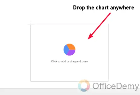
Drop chart anywhere on the canvas, and the chart is here
Step 4
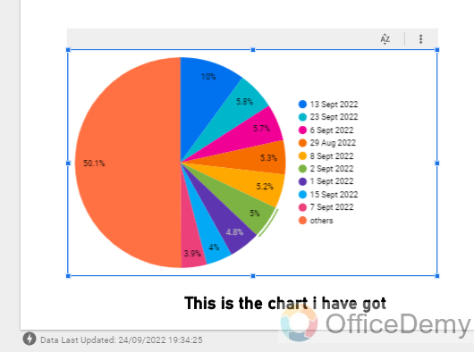
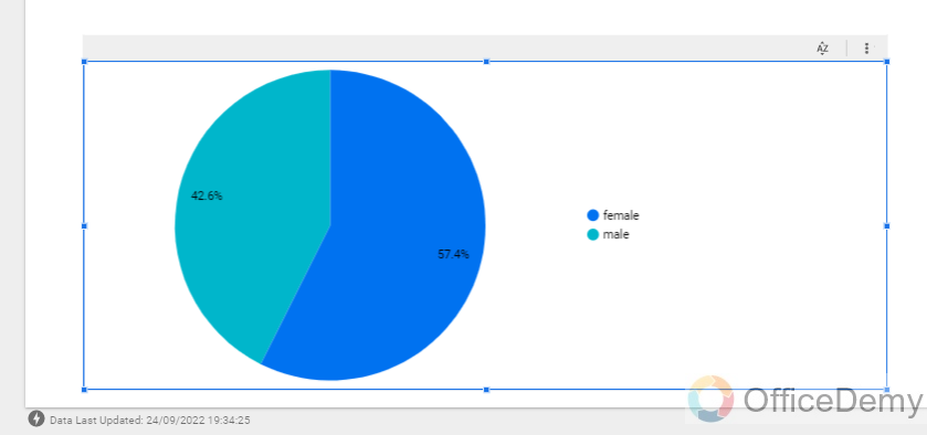
I dont need a date dimension here, what I need is gender so I will change the dimension from date to gender.
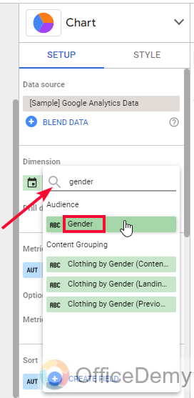
Step 5
Here it is, now it looks very clean when we accurately selected the dimension
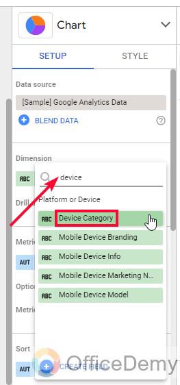
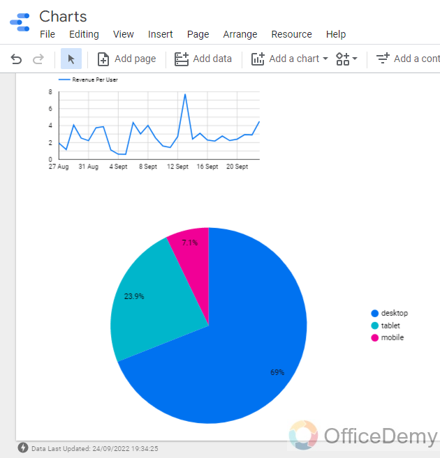
Step 6
We can have more kinds of distribution here, like a breakdown of devices our users have while accessing our website, this can be done by changing the dimension from gender to device category.
Similarly, you can see the breakdown of user type in a pie chart, it’s divided into the new visitors and returning visitors. I hope you have understood how to create charts in Google Data Studio and how to assign data to them.
I recommend you explore more dimensions for all three types of charts we have covered today in this tutorial. There is a lot to explore.
So, you see how we use the basic charts for visualization of our data in Google Data Studio. This was a basic beginner’s guide on how to create charts in google data studio. We will learn how to improve these charts and take them to perfection using advanced techniques and functions in Google Data Studio.
Useful Notes
- All the charts have already selected dimensions of data when we create them from scratch
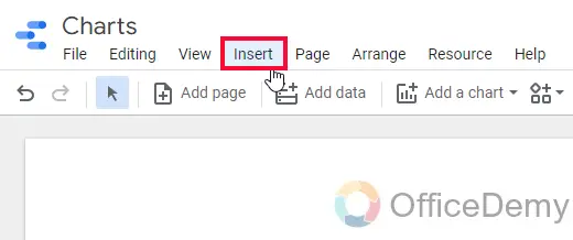
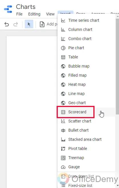
- Charts can also be added from Insert Tab
- Charts are fully customizable and editable with color schemes, fonts, sizes, background color, line thickness, opacity, and so many things. We will cover these in the styling tutorial later in this series.
- Don’t forget the difference between a dimension and a metric.
Frequently Asked Questions
Can I Animate Scorecard, Time Series, and Pie Charts in Google Data Studio?
Google Data Studio offers a range of interactive charts, including scorecards, time series, and pie charts. With these interactive charts in google data studio, you can animate and bring your data to life, enabling you to gain valuable insights at a glance. Customizable and user-friendly, these charts enhance data visualization and make it easy to interpret and share information effectively.
How can we create a heat map in Google Data Studio?
Simply, just like we created three common charts in this article, we can add a heatmap as well. A heatmap is available in the charts drop-down under the Google maps section. You can also add it by going to Insert Tab and then find Heatmap and click on it to add.
How to customize charts in Google Data Studio?
Just like Google Sheets, we have a similar interface for chart styling. The first tab is the setup tab in which we worked in this article, and next to it we have a Style tab in which all the styling, editing, and customization is. We will explore this tab later in this series.
How to add custom date ranges in a time series chart?
In the setup tab of the chart editor box, scroll down to the “Default date range” section and select the radio button “custom“, then below is the date picker to select starting and ending dates, this section can be different based on the dimension you have selected above.
Conclusion
Wrapping up how to create charts in Google Data Studio. We have learned the basics of the charts and have seen three popular chart types in Data Studio we have seen basic scorecards, then time series charts, and then a pie chart. I hope you have understood these charts and you now know what else is required to create charts in google data studio. The metric and the dimension are two important things to know when working with Charts in Data Studio.
I hope you find this article helpful and have learned something new. I will see you with another helpful tutorial soon. Take care and Keep learning with Office Demy


