
To Add Error Bars and Data Labels to Charts in Google Sheets
- Double-click on the chart.
- In the Chart Editor Box, go to Customize.
- Click on Series.
- Activate Error Bars by checking the checkbox.
- Configure error bars by choosing the type (e.g., percentage) and specifying the value.
- Enable Data Labels by checking the checkbox.
- Click Apply to add error bars to your chart.
In this article, we will learn how to add error bars and data labels to charts and graphs in google sheets.
We many times work with charts and graphical data in google sheets. We normally use column graphs, histogram charts, pie charts, scatter plots, and many more in our day-to-day tasks, there are excellent features that come along with these charts and graphs that can be used to enhance the chart and make it more communicative and easier to understand. For this, we have this tutorial in which we will learn two major features of chart error bars and data labels, how to add them, why should we use them, and they help the readers.
Use Cases of adding error bars and data labels to charts in Google Sheets
When working with graphical data we need many things like charts, plots, percentages, values, trendlines, etc. to show to make our graphical data more sophisticated and communicative to our readers. for the same purpose, we need to learn about error bars and data labels in google sheets. We know that both of them are the attributes of our charts, we have already covered an article in which we talked about charts, so I will not emphasize charts more I will talk about the attributes error bars, and data labels. We need to learn them to make our charts and graphs more interactive, responsive, and communicative.
How to add error bars and data labels to charts in Google Sheets
To learn these step by step, we have some examples and some sample data.
Let’s understand both of the first from the scratch.
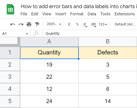
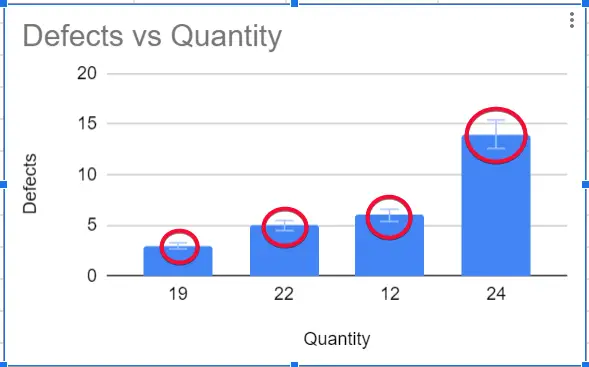
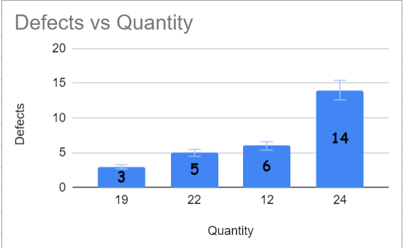
I have an example data set that has the quantity and the defects, first, we will generate a chart for the data, and then we will see how error bars and data labels are added to our chart.
Making a simple column chart in Google Sheets
In this first section, we are going to make a simple column chart so let us get started.
Step 1
Add some sample data to your google sheet.
Step 2
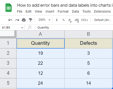
Select the data with headers
Step 3
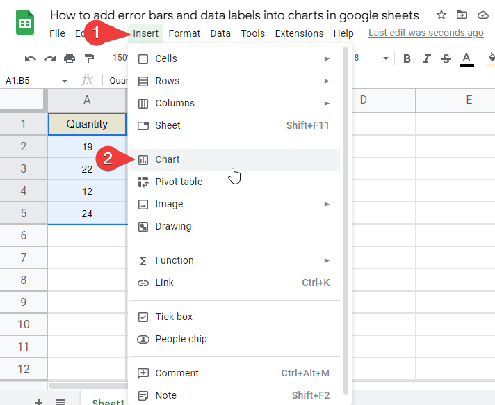
Go to insert > charts
Step 4
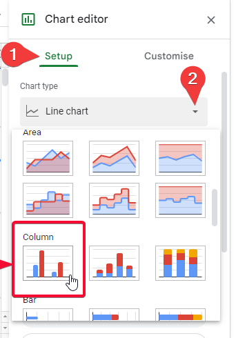
Pick a simple column chart (or you can pick any chart)
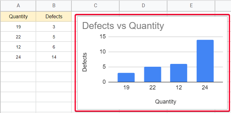
Now you have a simple column chart, now we can add error bars and data labels to it.
Let’s have a quick look at both of these.
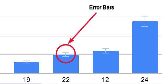
Custom Error Bars in Google Sheets
Defines the possibility of the error or we can say it defined the deviation of the data, how much the data can deviate. They can be used or not used; they are not compulsory but suggested to use.
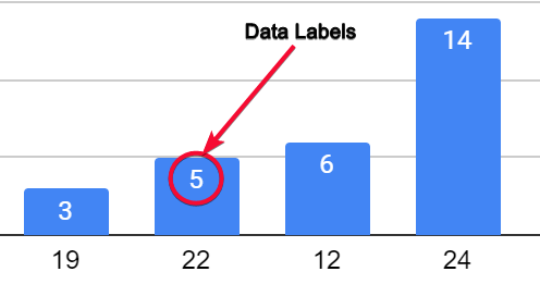
Data Labels in Google Sheets
Shows the actual value of the specific data point on the chart, in a simple column chart, shows the actual value on the top of the bar. There are many editing and customizing options available for data labels, not options for editing the error bars, but data labels can be customized, the position can be defined as top, bottom, center, etc. but I would recommend auto position settings.
How to add custom error bars to chart in Google Sheets
As we have already seen how to create a graph with some data table, we will not create it again in any method below.
We will see how to add error bars into charts in google sheets directly
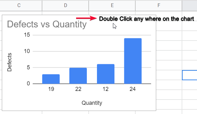
Step 1
double click anywhere on the chart
Step 2
In the Chart Editor Box > Customise
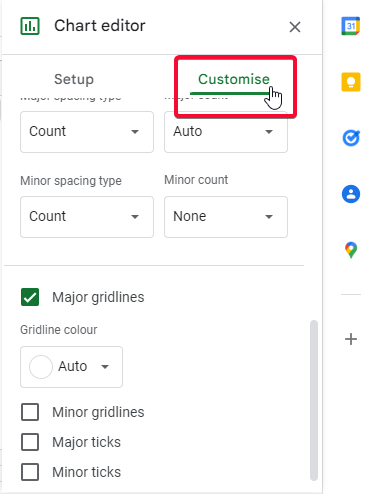
Step 3
Go to Series
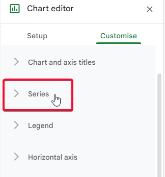
Step 4
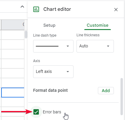
Here you can see a checkbox for error bars, tick the checkbox
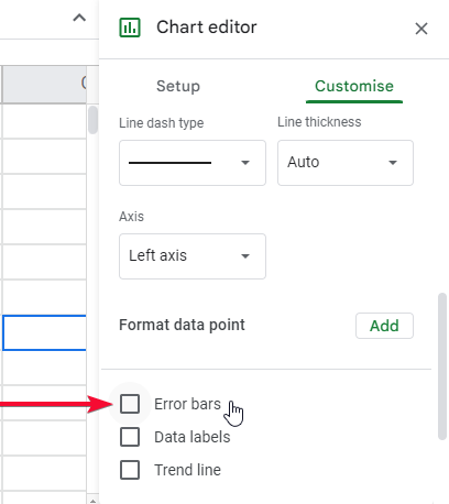
Activate Error bars option by clicking it.
Step 5
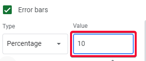
Below you will see further options, type, and value.
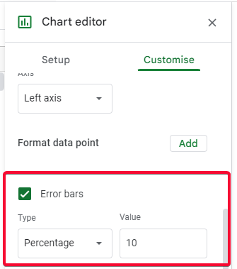
Step 6
for type choose a value (e.g., percentage), and for the value add 10 (which is there already by default)
Step 7
Now you can see your chart has got bars on the data points.
How to add data labels to charts in Google Sheets
Step 1
Repeat steps 1, 2 and 3 from above.
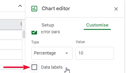
Step 2
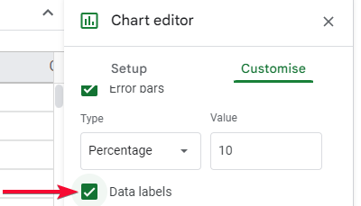
Below the error bars’ checkbox, you can see another checkbox named data labels, tick the checkbox
Step 3
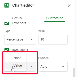
Below you will have further options.
Type: select value
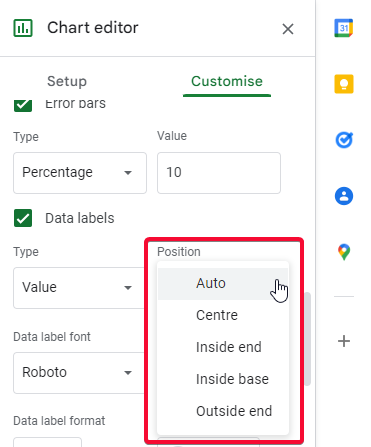
Position: select any given position (auto is recommended)
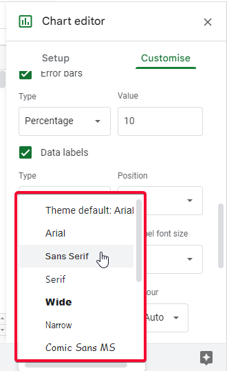
Data label font: you can use any available font of your choice
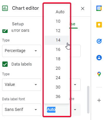
Data label font size: you can select any font size (auto is recommended)
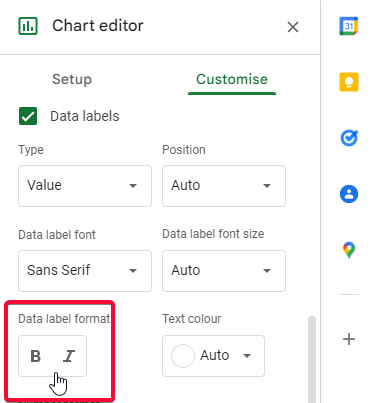
Data label format: you can bold or italic the data label
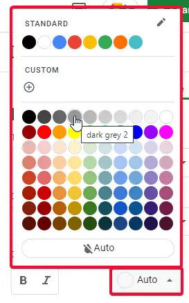
Text color: you can pick any text color (make sure the text is visible)
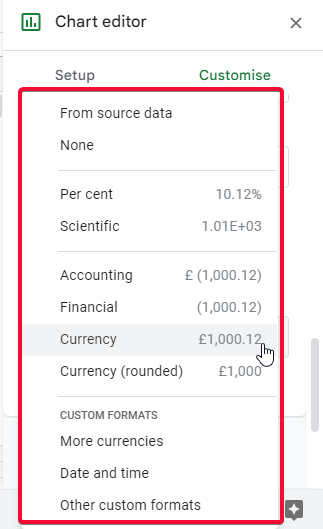
Number Format: you can use any number format (From source data is recommended)
This is what your chart looks like after adding data labels and error bars.
Notes
- Remember that the error bars cannot be 100% right.
- Keep in mind that data labels only show the actual data, there is a possibility of changing the data
- You can use a lot of editing and customization features within the data labels checkbox
- Always try to use contrast color data labels to make them visible to readers.
- Error bars cannot be edited or customized.
- Error bars are static and they don’t have any editing features with them. If you want to change color, you can’t. Similarly, you can’t increase the line height, line width, change the overall opacity, etc.
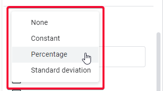
- Don’t get confused among the three types of error bars.
- The percentage will show in percentage, that specific value will be shown as 10%, or if you choose any other number like 15, it will show the upper and lower range concerning the value 15. (i.e., 85%-115%)
- Constant is self-explanatory, it will show the error bar when the value is not variable, it should be a fixed value. if I say 50, then it will show the error bars for +/50 only
- Standard Deviation will show the error bars from the center point of the value you specified, SD will not keep the range like percentage, nor the fixed value like the constant, hence it will show the error bar from the center of that data point e.g., the value is 0.1 so it will show the error bars from the center of it.
- The fourth option is “none”, it will simply uncheck the checkbox of error bars, so don’t use it in any other means.
FAQs
What are error bars in google sheets?
Error bars are the graphical indication into a data chart that shows the possibility of error in the specific data point, the error bar can be high or low which can specify that the deviation of this data point is high or low.
What are data labels in google sheets?
Data labels are nothing but the value of the specific data, for example, you made a graph using data and the graph bar goes high within the graph sheet, to quickly get the value of the specific bar inside the graph sheet you can add a data label into that bar that will show the actual value of that data point.
How to add error bars to Histogram Chart?
Double click on your histogram chart > A chart editor will appear, select customize> go to Series, then scroll down and a checkbox named error bars will be there, tick on that checkbox, and in the below option select any unit like percentage, constant, standard deviation (there is another option “none”, don’t select none, it will remove the error bars).
How to add data labels to a Pie Chart?
Double click on your pie chart > A chart editor will appear on the right side, click on the customize option and then scroll down and click on the Series dropdown button, now scroll down and you will see a checkbox named data labels, tick the checkbox and you will see the data labels will be added to your pie chart, you can edit by using below options, you can change text color, font style, font size, and many things to design your data labels.
Why should I use data labels in charts?
They show the spectrum of the error probability, you should use them when working with data that contains some forecasting, like rain forecasting, sales forecasting, and any data that have some consideration of the future.
What is Number Format inside data labels in the google sheets Chart?
Number format inside data labels in google sheets chart, is the same number format outside the scope of the chart, it means that if you have data that is formatted to a specific number format i.e. currency, and now you’re using that data into a chart, so you still have chance to use that currency formatted data with another format of data let say plain text. This will not change your original data formatting and you can use the same data with multiple formats each within a single chart and another format for the global scope.
Conclusion
I hope you guys enjoyed this tutorial, I have seen many beginners face difficulties when started working with charts and they don’t know what are error bars and are data labels and how useful features they are. This article covered how to add error bars and data labels to charts in google sheets. I tried to emphasize only these two features in this particular tutorial.
I know you guys want more on the charts. I will soon cover the rest of the chart’s features and attributes in another article(s). Till then have a good day, and keep learning google sheets, google docs, google slides, and much other productivity software with Office Demy. See you soon with another article. Thank you.


