
To Create a Geo Chart in Google Data Studio
- Open a blank Google Data Studio file.
- Add a chart dropdown.
- Select “Geo chart“.
- Place the chart on your canvas.
- Working with Dimensions and Metrics.
- Add dimensions and metrics as required for your visualization.
In this article, we will learn how to create a geo chart in Google Data Studio. We have already learned so many charts in Google Data Studio and Google Sheets. Today, it’s time for the Geo charts. Geo charts are built on the world map and used to visualize geographical data. They are useful when you want to show the data based on the region, country, continent, city, or even a very specific region. It directly tells a value when mouseover into a location. You can use a full world map or a specific region such as only Europe. You must have seen these geo charts on several websites. Geo Maps in Google Data Studio are a type of visual chart which are used to display data that is location-based.
Normally, we use GEO Maps to show traffic, sources, sales, conversion rate, leads, revenue, ad spent, and other metrics based on where the end user is. It can tell you answers to the questions such as where my website is getting the most users. Or, which city has the highest PPC rate? and so on, so everything is located based.
Advantages of using Geo Chart in Google Data Studio
Since GEO maps are designed to display and visualize location-based data in Google Data Studio, here the dimensions and metrics are very minimal and become very important because they are already very limited and they are only key data points that are valid when added to Geo charts. The dimensions that we can show in GEO charts are only location-based, such as country, continent, city, region, state, etc.
Unlike metrics. Metrics can be anything with a value corresponding to the above-described dimensions, you can represent anything in a city, but you cannot show a date in GEO maps, because the date does not have a place in GEO charts everything is location based in dimension, and several percentages based in metrics.
We use GEO charts to make them easier and more understandable for the users. An entire map can easily show the overall targeting, and the result of that targeting when working on a digital marketing campaign.
If you are a small business owner, you will go with s specific city or maybe a state, so for small business owners, and startups Geo charts can be used with dimensions like city and state, but if you are Google, Microsoft, Facebook, Amazon, or any big tech company, then you will go worldwide, and you will use the maximum map with continent and sub-continent as your dimensions. You can get and show all the data within a map and that’s 5 times better than typed or written data in plain language. So, these are some reasons we need to learn how to create a Geo chart in Google Data Studio.
How to Create a Geo Chart in Google Data Studio?
This tutorial is divided into two main parts. The first part will cover the creation of the GEO chart, and the second is for the designing and customizations. So, from this section, we will learn how to create a Geo chart in Google Data Studio. Concerning the data source? I am using Google Analytics sample data for this example, and it gives you good dimensions and metrics to be used with GEO charts, so let’s get started.
Create a Geo Chart in Google Data Studio
In this first section, we will learn how to create a Geo Chart in Google Data Studio. I am using Google Analytics sample data; you can also use it for free. Let’s connect the sample data and start creating a Geo chart in Google Data Studio.
Step 1
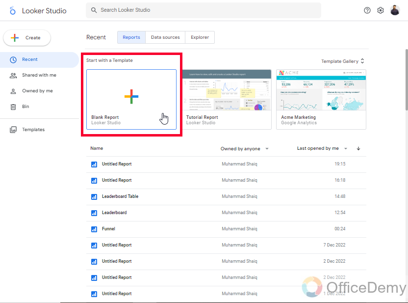
Open a blank Google Data Studio file with the blank starter template
Step 2
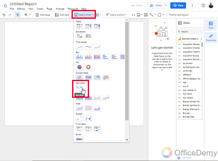
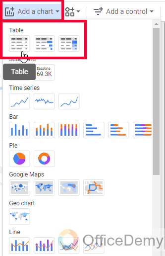
Go to the “Add a chart” dropdown, and choose the Geo chart from the list
Step 3
Draw the chart on your canvas, and here it is
Step 4
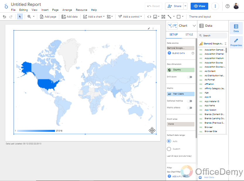
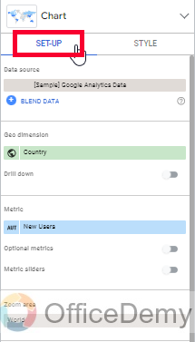
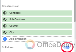
Now the actual thing is to work with dimensions, add a dimension as per your requirements, go to the chart setup tab
Step 5
You can add more dimensions if you want using drill down
Step 6
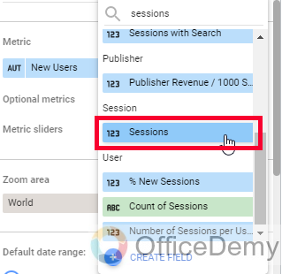
Now, add your required metrics from the available list
Step 7
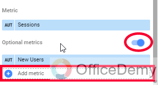
You can use the optional metrics toggle button to add multiple metrics in one chart
Step 8
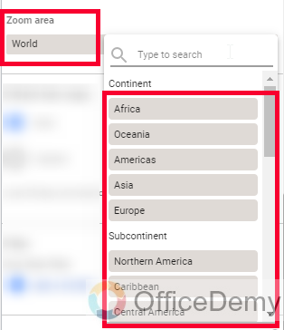
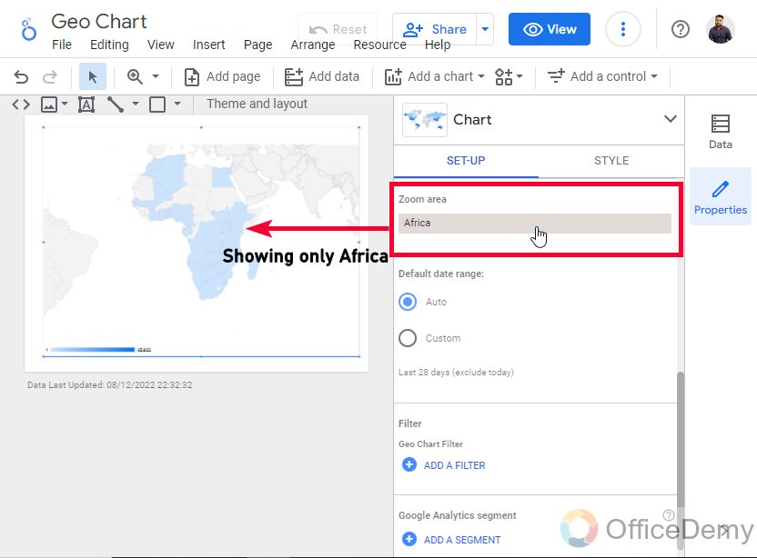
Below you can see the zoom area, here you can zoom to a specific location so the chart will only show that particular region.
Step 9
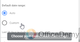
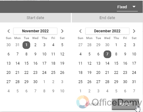
You can set the default date range, or custom date range for the entire data
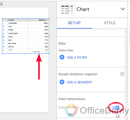
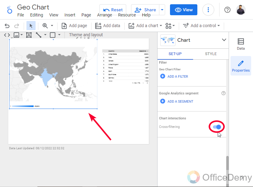
Create a Geo Chart in Google Data Studio – Using Cross Filtering
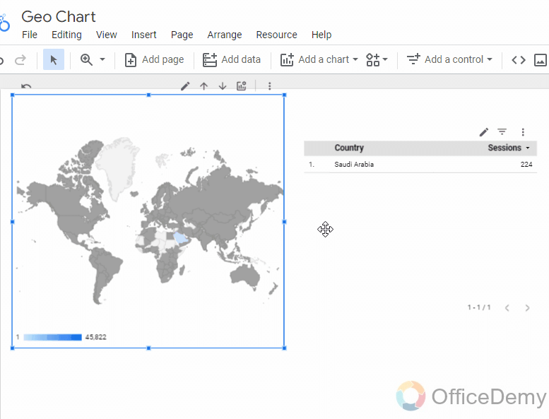
In this section, we will learn how to create a Geo chart in Google Data Studio, and then how to use cross-filtering with it using a table chart. Cross filtering means connecting a chart with another and when you change the visualization point for one chart, it will depict in the other chart as well. Here, for example, if I click on the Geo chart Asia region, then the table chart that I have created will show me the data only of the Asian continent, this is how we make it easy for users to see what they want to see very specifically and the numbers will be shown in a table for better understanding and clarity. We can use other charts as well, other than tables, we can use pie charts, line charts, column charts, bar charts, etc.
Step 1
Create a table chart
Step 2
In the Table chart’s Set-up tab, scroll down and look for the cross-filtering toggle button.
Toggle-on this button
Step 3
Do the same for the Geo chart as well
Step 4
Now, try clicking on any specific region such as Europe, and you will see it will also change the table chart data accordingly.
Create a Geo Chart in Google Data Studio – Customize a Geo Chart
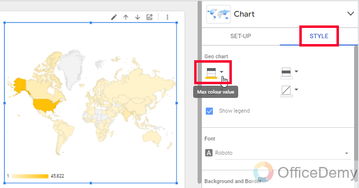
In this section, we will learn how to customize a Geo chart in Google Data Studio. Since we have already learned to create a Geo chart and also seen a useful functionality which is cross-filtering. Now, it’s time to beautify a Geo chart in Google Data Studio using the built-in customization features inside the chart’s sidebar Style tab. Let’s see what we can do to style a Geo chart.
Step 1
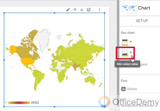
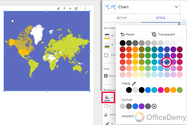
In the very first section of the style tab, we get some color boxes.
We can change the color of the Max value
Then we can change the color of the Mid value
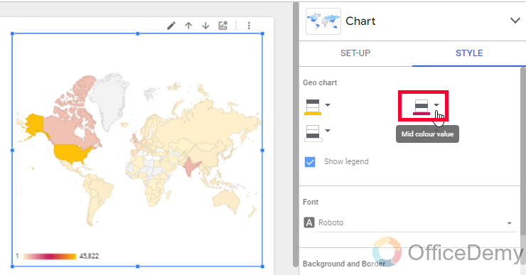
After that, we can change the color of the Mid value
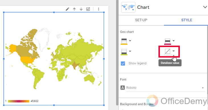
And, below we can set a color for dateless values, which means empty values.
Step 2
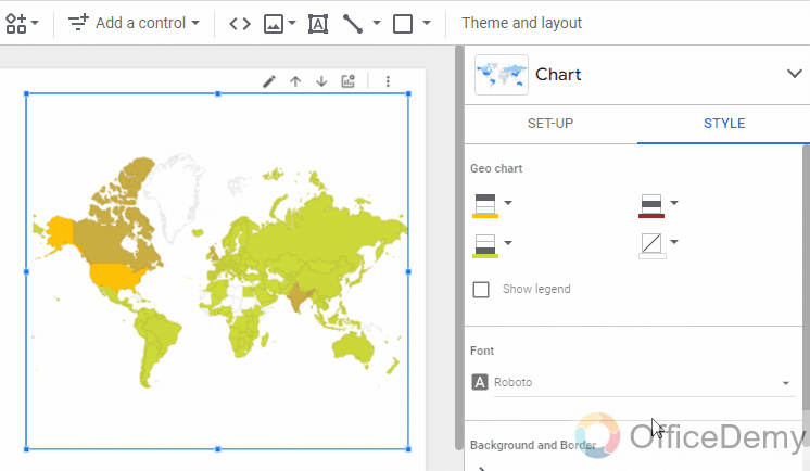
We can use a checkbox for showing/hiding the legend
Step 3
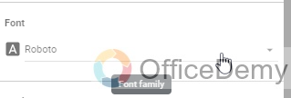
Here, we can change the Font family of the overall Geo Chart
Step 4
We can add a background color to the overall Geo chart
Step 5
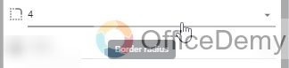
We can set the border radius for the overall chart
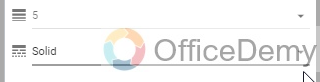
Step 6
Here, we can set and control the opacity level of the overall chart
![]()
Step 7
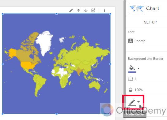
Then we have a color dropdown, from where we can select a border color
Step 8
Then we can set the border weight and the border style
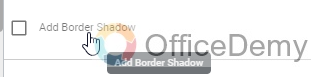
Step 9
We can use a checkbox named “Add border shadow”, it gives a slightly parallel shadow to our overall outer border
Step 10
Then we can set “When to show the header”, we can pick a value from the dropdown.
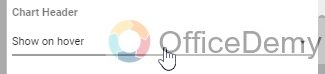
Do not show
Always Show
Show on Hover
Step 11
Here last, we can set the font color for the header content.

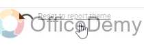
Step 12
The last option is the reset button “Reset to report theme”, we can use it to restore all the default customization values for this chart.
So, this is an easy customization guide for Geo charts in Google Data Studio. I hope you have got all the key points and you have learned how to create a geo chart in Google Data Studio, how to use cross filtering with geo charts, and how to customize a geo chart.
Important Notes
- A Geo chart has limited numbers of dimensions, you cannot use name, age, quantity, or even a date in the dimension section of a geo chart.
- Unlike metrics. Metrics can be used without any limitations, you can use anything like impressions, clicks, PPC, revenue, ROI, bounce rate, new users, sessions, bounces, and so many more metrics with the Geo charts
- Cross filtering is a universal function in Google Data Studio, it’s not limited to Geo charts or table charts, you can use this function with any other chart(s).
Frequently Asked Questions
How to Make a Geo chart for Asia in Google Data Studio?
To make a specific Geo chat for a region or continent, you can define it in the dimension, and then you can scroll down below and look for an option “Zoom area“, click on it and select your region from it such as Asia, Africa, Europe and so on. It will now show only the Asian region in your Geo chart, another thing you can do is, go to the Style tab, and here are four color boxes, for the last color box “Dataless values” pick a white color instead of grey so the irrelevant areas look more faded.
Conclusion
Today you learned how to create a Geo chart in Google Data Studio. I tried to break this entire topic into three sections, from which two are pretty important and one can be used as an additional resource. So, firstly we learned how to create a Geo chart in Google Data Studio, then we saw how to use cross filtering with your Geo charts and any other chart, and I showed you how useful this function is, then finally we learned how to customize a Geo chart in Google Data Studio, and I hope you have learned all the things pretty good, I am closing this article here. See you soon, and have a nice day! Keep learning with Office Demy.


