
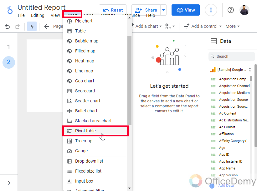
To use Pivot Tables in Google Data Studio
- Navigate to “Insert” and select “Pivot table,” or click “Add a Chart” and choose “Pivot table“.
- Drag the table onto your canvas, and it’s created with default dimensions and metrics.
- Define dimensions for rows and columns.
- Select a metric.
- View the table in view mode.
Hi. In this article, we will learn about Pivot tables in Google Data Studio. What are Pivot tables? Pivot tables are the most interactive type of normal tables. In Google Sheets, we used pivot tables to increase the functionality and we saw how pivot tables help us add calculated fields, and get so many built-in aggregated functions. Pivot tables in Google Data Studio are used for the same kind of purpose, we use them to make more improvised versions of our tables to help users easily interact with them. In technical terms, we use Pivot tables over normal tables to have 2 contiguous dimensions for a single piece of data. We have three variants of pivot tables in Google Data Studio. We will see all the variants and will try to understand the benefit of using pivot tables over normal tables in Google Data Studio
Importance of using Pivot tables in Google Data Studio
We use Google Data Studio to use better visualization for our raw data. We don’t have any other reason to use it other than the visualization. And, for better visualization pivot tables are created. Pivot tables are mainly designed to improve message delivery, and to make more communicative data, a user sees the pivot table, they should instantly understand what the data is saying.
Pivot tables in Google Data Studio allow us to be more specific and deeper to information, for example, if you want to show the traffic of a website from various sources, the normal table will only tell you the numbers for each page. While, a pivot table will let you show all the pages, and their traffic numbers from all the sources, it will make a multi-column table automatically to show all these insights very precisely. We will see all these comparisons in this article later. So, these are a few reasons we need to learn Pivot tables in Google Data Studio.
How to use Pivot Tables in Google Data Studio
From here, we will learn pivot tables in Google Data Studio step by step. We will first see how to create a simple pivot table, then we will create a normal table, and we will see the difference in visualization in both of them, then we will see how pivot tables look in the editing mode, which means when we share these pivot tables with someone, and lastly, we will see how to use the other available variants of pivot tables such as pivot tables with heat map and pivot tables with bars. So, let’s get started.
How to Create Pivot tables in Google Data Studio
In this section, we will see how to quickly create a pivot table in Google Data Studio. I am starting this tutorial from the main page of Data Studio; I have connected a sample data source (Google Analytics sample data) for this tutorial. You can use any data source, sample, or your own.
Step 1
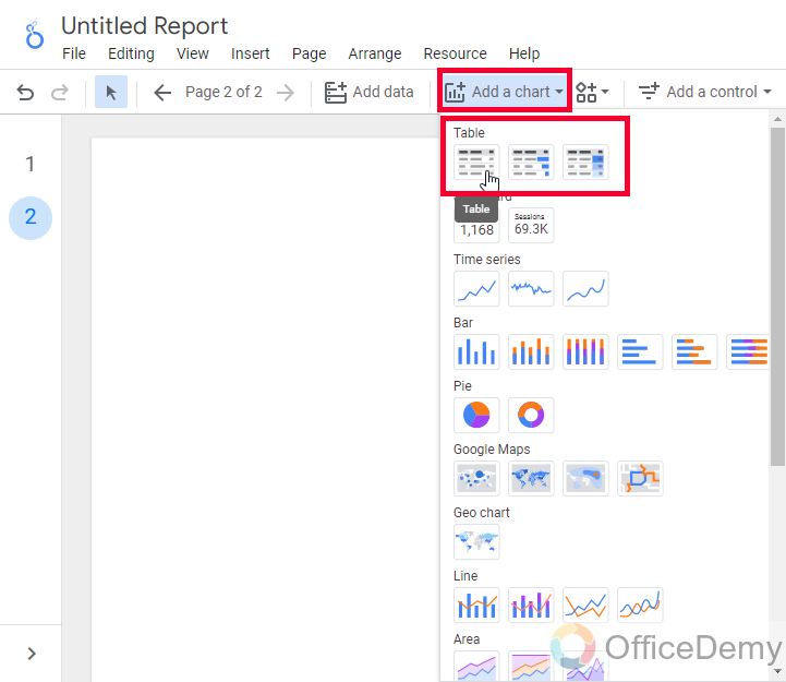
Go to insert, and click on Pivot table
OR
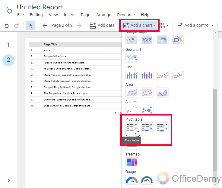
Click on Add a Chart, and then select a Pivot table
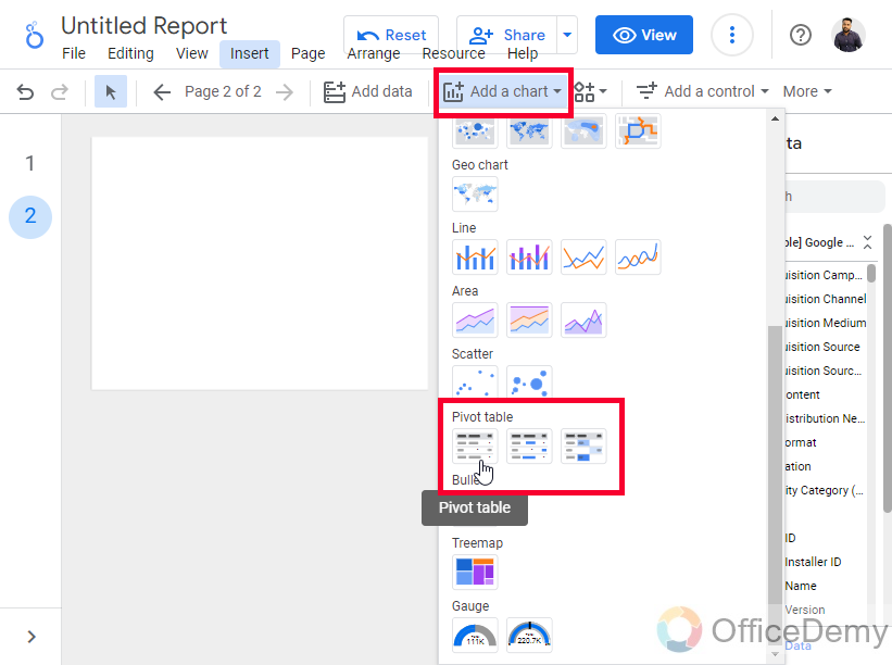
Step 2
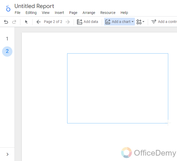
Draw the table on your canvas by using mouse drag, and your pivot table is created with the default dimension and metric
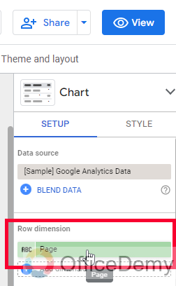
Step 3
Now a dimension for rows
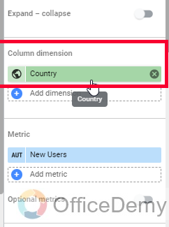
Step 4
Select a different dimension for columns
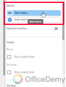
Step 5
Now select a metric
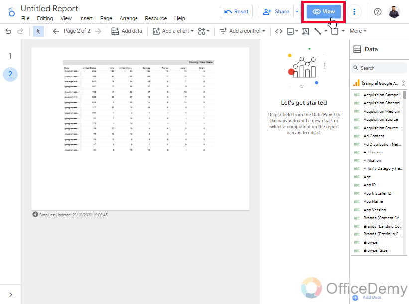
Step 6
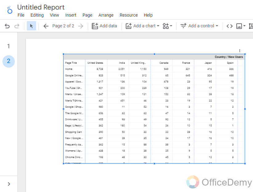
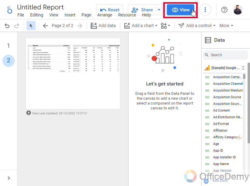
Now view this table in the view mode
Click on the View button in the right corner of the report.
So, this is how you simply you can create pivot tables in Google Data Studio
For a better understanding of pivot tables, let’s now create a simple table to see the difference in visualization between these two.
Pivot tables in Google Data Studio – Pivot Tables Vs Tables
In this section, we will learn pivot tables of two types in Google Data Studio, we have three normal tables, and three pivot tables inside Google Data Studio, so in this section, let’s see and compare two same variants of the pivot table and normal table
Step 1
Create a table, add some data
Go to “Add a chart” and click on the table
Step 2
Create a pivot table, and add similar data (if you can’t have the same dimension and metric for the table and pivot table, then don’t worry. It’s a functionality difference between both of these tables, pivot tables can’t show all the dimensions and metrics like a normal table can show)
Go to “Add a chart” and click on the pivot table
Step 3
Open the report in view mode to see the difference very clearly.
Click on the View button in the top right side
Step 4
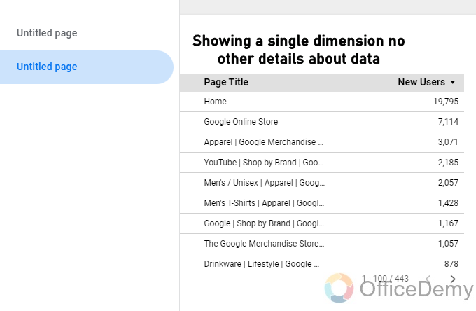
Now you can see the table showing static data for the dimension and metric we added.
Step 5
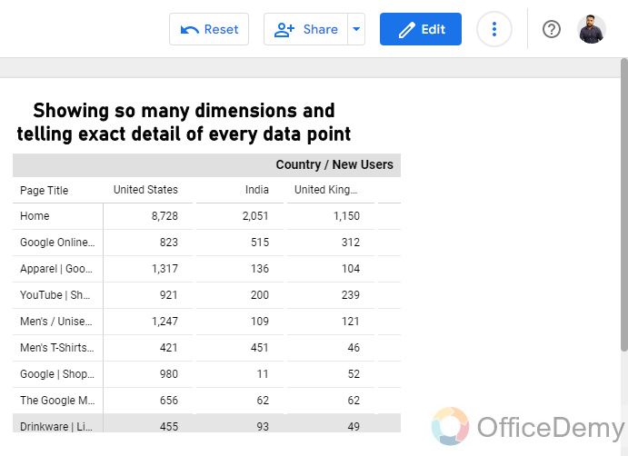
Whereas the pivot table is showing some additional data which is telling a story, answers a complete question, and makes it very clear for a user to understand it.
Step 6
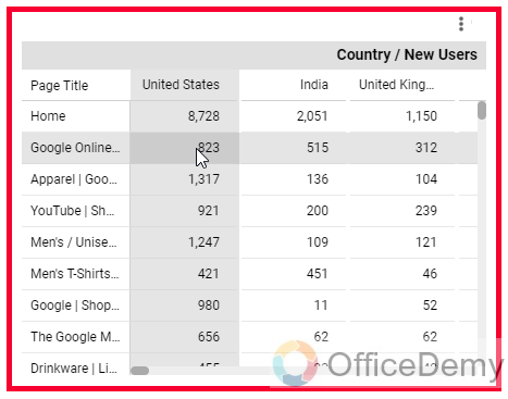
You can see a highlight over the area we hover in our pivot table, it’s making a table-like grey area to more precisely show the actual figures. The columns in the pivot table are automatically created by the pivot functionality, we didn’t use optional metrics, drill down, or multiple metrics with it.
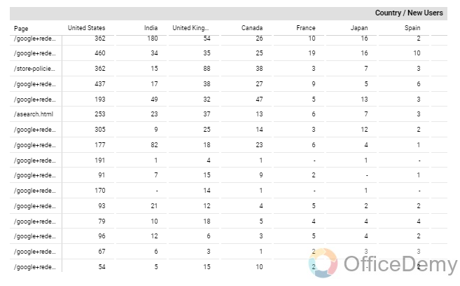
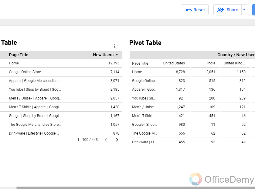
So, the story is that a normal table is only showing the number of new users coming on the website on a single page. For example, a viewer can see that the home page is getting 200 new users, a blog page is getting 100 new users, and so on.
But, in a pivot table using the same data and metric dimensions, we can see that table is representing the new users on the pages along with their sources. For example, a viewer can easily see that the home page is getting 400 visitors from an organic source, 100 from paid sources, 50 from direct searches, 100 from google, and so on
Did you get the difference? When using pivot tables we have more control over our data, and now a viewer who is viewing this report can easily understand the data that this number of users is coming on these pages from these sources. While in a normal table we can’t get multiple metrics like this (other than the optional metric feature which is different from this)
Now, let’s see the variants of pivot tables we have in Google Data Studio
Variants of Pivot tables in Google Data Studio
In this section, we will see the variants of pivot tables in Google Data Studio. We mainly have three types of pivot tables, 1. Pivot table, 2. Pivot table with bars, 3. Pivot table with heatmap. Now let’s understand how these features can improve the quality of delivery of our table. We will check both of these variants on the same data.
Step 1
Go to “Add a Chart” and click on the Pivot table with bars
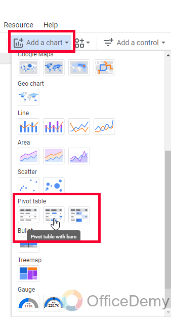
Step 2
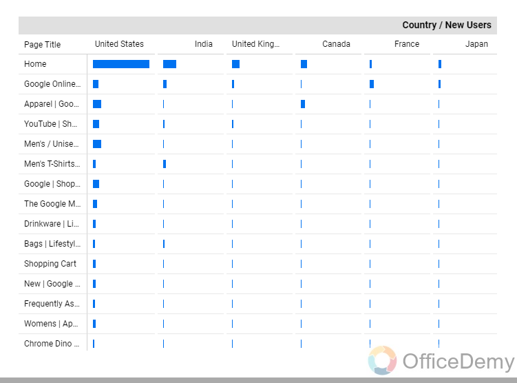
Here it is. You saw how it represents the data. A pivot table with bars means, it will not show numeric values, instead, it will show a bar to represent the value.
Now, we can customize these bars, like colors, expand, border color, thickness, and so on, but we will see it in some customization tutorials later.
Now let’s check out the next variant.
Step 1
Click on the “Add a Chart” button and then click on the Pivot table with heatmap
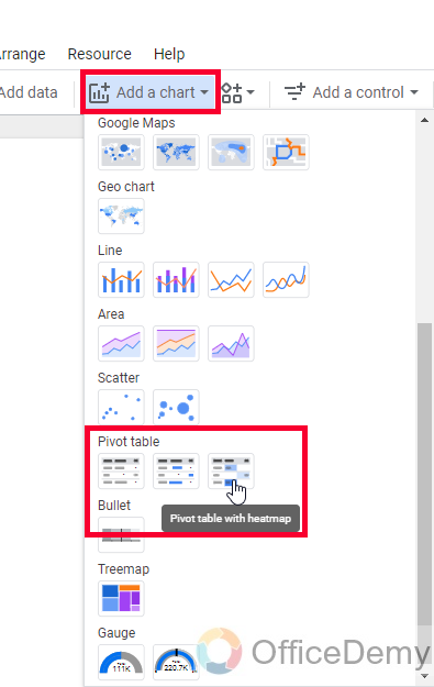
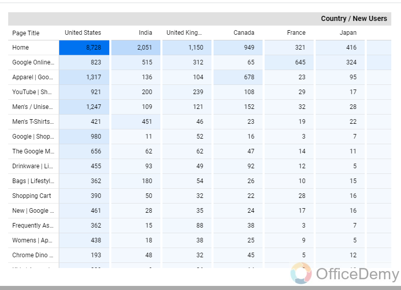
Step 2
Here you go, now here the values are present but the overall table has been converted into a heatmap which is representing the table values with colors. The darker color box has higher values, and the lighter one has the lowest values.
So, this is how these two variants of Pivot tables work. I hope you find the pivot table and these two types of it useful.
Now you can also customize the color scale and so many things regarding the Pivot table with heatmap, but again this is not a customization tutorial, so we will surely see the customization features in coming articles in this Google Data Studio series.
Important Notes
- You may encounter a problem that is not a problem itself, the dimension and metrics are not the same for tables, and pivot tables mean you may find a dimension named “User” in the table, but it may not be available when you try to find it for a pivot table. It’s very normal, a pivot table can only visualize the dimensions that must have more than one possible metric because a pivot table automatically creates multiple metrics to visualize data more deeply compared to a normal table.
- A pivot table with bars and a pivot table with a heatmap are just two different ways to visualize data values, heatmap show values and also makes a heatmap for the values, and bars remove the numeric values and add meters like horizontal bars to show in place of values
- These two variants are also available for normal tables
- You can use a “Expand – Collapse” toggle button to expand or collapse your pivot table data in the Chart’s sidebar.
- You can use a “Show grand total” checkbox inside the Rows section to show the grand total of row values at the bottom of your pivot table, and another checkbox “Show grand total” inside the column section to show the grand total of column values at the right side.
- You can also use radio buttons to specify Sort Ascending or Descending
- We have two dimensions and one metric (other than optional metrics and drill-down feature) in pivot tables.
Conclusion
Wrapping up Pivot tables in Google Data Studio, we have learned what are pivot tables and why we use them. We saw how to create pivot tables, and how a user would be able to get more useful insights and more in-depth information about the data, we talked about the variants of pivot tables such as pivot tables with bars, and pivot tables with heatmaps. I also made a comparison between a normal table and a pivot table to explain why we need to use pivot tables. I hope you have gone through the entire article, and have learned pivot tables in Google Data Studio. Thank you and keep learning with Office Demy.


