
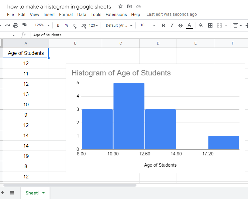
To Make a Histogram in Google Sheets
- Select your data.
- Go to “Insert” > “Chart“.
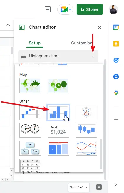
- Choose “Histogram” from the chart types.
- The histogram chart is inserted into your sheet.
In this article we will learn about how to make and customize a histogram in google sheets.
When it comes to data visualization and representation, we need some quick graphs and charts to analyze the data and make it more understandable. In this article, we will see how to make a histogram and google sheets, as in our normal practice we have many sections in this article in the first section we will see how to make a histogram, and then we will see its customization and designing in later sections.
The histogram is mainly designed for separating the related data and making it easier for the reader to understand the data quickly by observing the graph created by the histogram. We can say it makes smaller chunks of similar data and keep them inside a “bucket” it helps understanding data by providing related segmentation of the data.
Benefits of using histogram in google sheets
We are living in a big data age; we are surrounded by trillions of Giga bytes and it’s increasing every millisecond. We work with data in our day-to-day life, and most probably we use software products like google sheets to manage, manipulate, and share the data, when it comes to the representation of a large data most of us don’t know how to deal with it, how to pitch a large data in front of the client. We need a highly professional level of data representation to present our data that takes less time to understand. fortunately, we have many built-in graphs and charts that help us quickly transform our data into a chart, they are highly used in modern data presentation and liked by high-end clients. We need to learn to use them in our large data and even for smaller data sets to make them more appealing and communicative to our clients or maybe our boss.
How to Make a Histogram in Google Sheets
I expect you guys now understand that histogram is nothing but a pre-defined chart. It’s a popular chart also offered by Microsoft products and other products of Google. We can make a histogram for data, by selecting the data and inserting the histogram directly from the insert > chart > histogram.
Now we will learn how to make a histogram in google sheets from scratch. We will use example data to implement it. you can copy the data from anywhere for practice purposes.
How to make histogram from scratch in google sheets
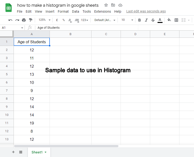
First, you need to know the type of data to use the histogram, let me tell you some examples, data that is varying from a starting and an ending point can be used to make a histogram, for example, marks of students out of 100, the age of the employees, earnings of family members, you can the data is somehow related and also be very closer to each other. This kind of data is very common, so ultimately, we need a histogram for such datasets.
Step 1
Make some random data
Step 2
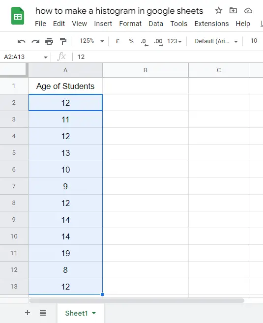
Select all data
Step 3
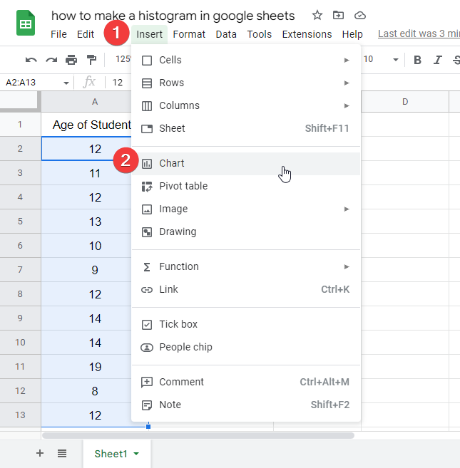
Go to Insert > Charts and select Histogram
Step 4
The chart is inserted into your data successfully.
Now what? you have made and inserted the histogram in your data but it’s not sufficient, you need customization and editing to make it more elegant and presentable.
So, now in the next sections, we will see some customization and make our histogram more elegant and more communicative.
We will see all the sections inside the chart editor box.
Before that let’s have a look at the frequency histogram
How to make a frequency histogram in google sheets
A simple way to make a frequency histogram is to set the custom bucket size, it will help to set the frequency of the data points as per your need. We will see it below in the editing section.
How to make a relative frequency histogram in google sheets
Similarly, for relative frequency histogram, we will use bucket size and outlier percentile, this will be defined and discussed deeply in the below histogram customization section.
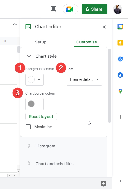
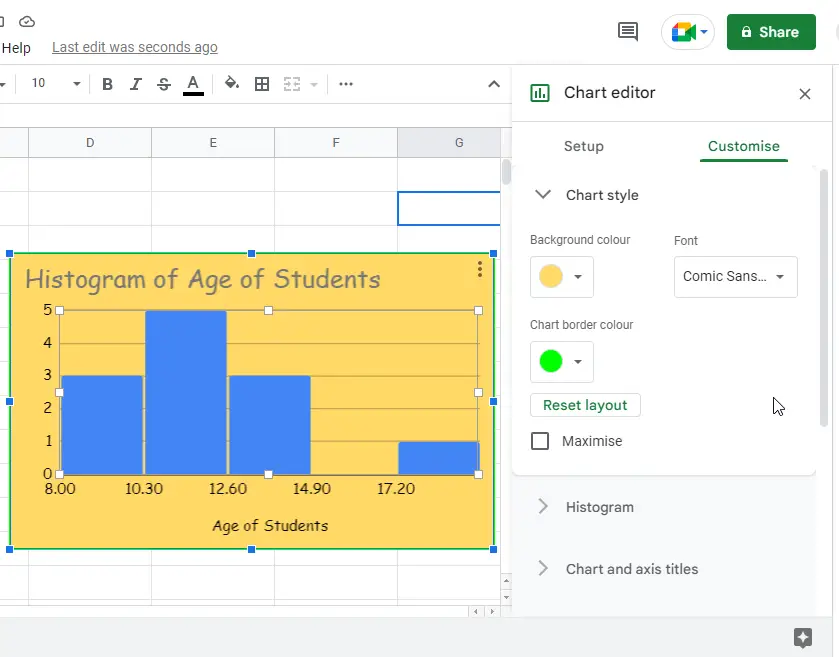
How to customize histogram – Chart style
In Chart style, you can customize the basic color and font of your histogram, you mainly have three options here
- background-color
- font
- chart border-color
You can also check on maximizing checkbox to see the maximum chart body inside the chat box, but it is not recommended.
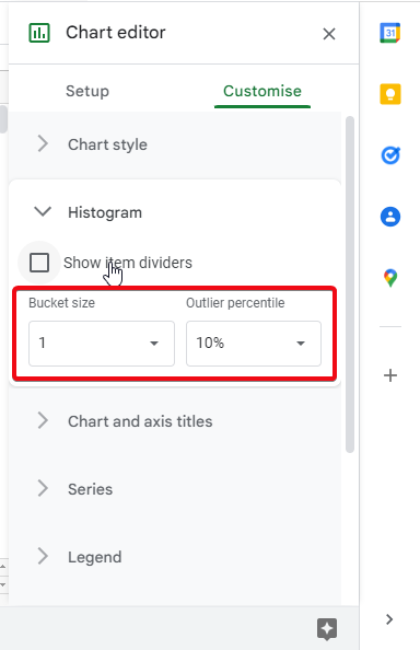
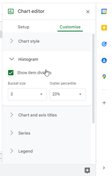
How to customize histogram – Histogram
In Histogram, we have three options histograms, here we can set the percentile of an outlier, and also, we can set the bucket size.
The bucket size is very important, either we want our histogram to keep 3 related values in one bar, or 4 or maybe 5, this number is called bucket size, and here we can set the bucket size from 1 to any number.
By checking on the “show item dividers” we can enable the dividers in our data bars.
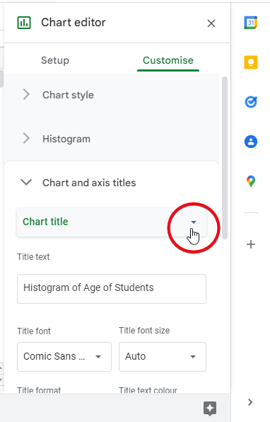
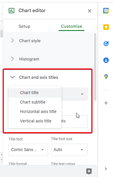
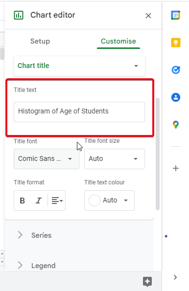
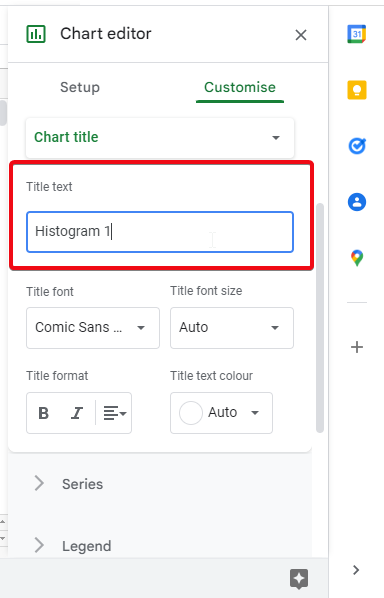
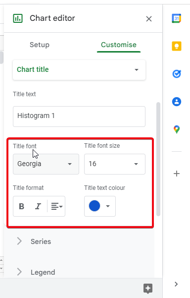
How to customize histogram – Chart and axis titles
In chart axis and titles, we have all the options to customize chart axis and titles, firstly we can set our heading as chart title, chart subtitle, horizontal axis title, or vertical axis title. After this, we have a text box where we can edit our main heading’s text. after this we have some basic formatting options for our title, we can set title font, title font size, and title text format like bold, italic, and title text color.
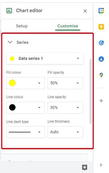
How to customize histogram – Series
Now in this section, we have a Series. here we can select data series (in this case we have only one), we can set the fill color for the data series, and we can set opacity, line color, line opacity, line border type, and thickness as well. So, you see there are so many small details we can edit. This is why we are learning to make more professional histograms in google sheets. After the Series, let’s move on to explore other options.
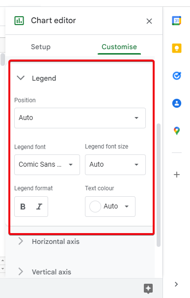
How to customize histogram – Legend
In this section, we have some more editing options, firstly we can set the count position inside the histogram boundary, (it’s hidden by default). but if you unhide it, then you have many other options below like font size, font weight, text color, etc. But it’s normally hidden (none).
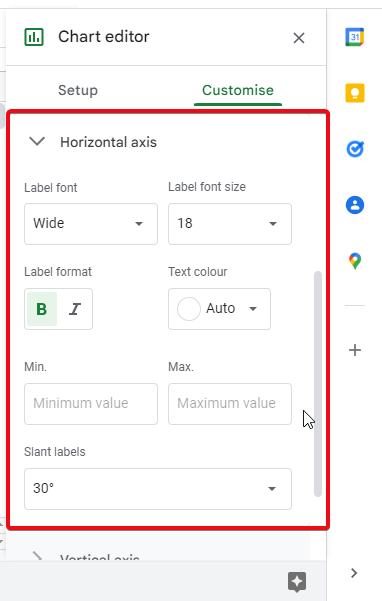
How to customize histogram – Horizontal axis
Now we have a horizontal axis, here we have options to edit the horizontal axis values, firstly we can change the font of label text, and its font size, then we have its format and text color, below we have two text fields for max and min value, it’s empty by default. You can add two values here after this we have an option called “slant labels” it’s nothing but it changes the degree of the text in the horizontal axis you can try max slanted when you have less space.
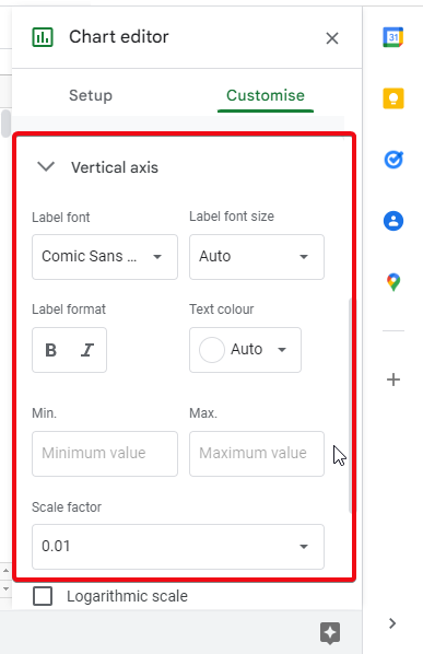
How to customize histogram – Vertical axis
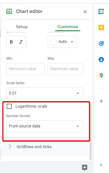
Similarly, we have a vertical axis with the same options. some options are additional here, firstly the scale factor, where we can adjust the scale of a vertical axis, we can use the checkbox “logarithmic format” to auto transform the vertical axis. After that, we have another useful feature that is the Number format, here we have all the options of number formatting as we have in google sheets, for an exception if we want to change the number format from the original format we can change it here, and it’s non-mutable, means it will not change the original number format.
You can experiment with all these options to understand them more, I will suggest using minimal editing and light colors to make your histogram more professional and cleaner.
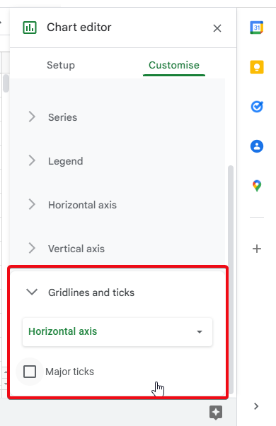
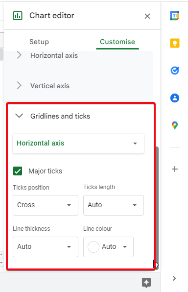
How to customize histogram – Gridlines and ticks
In this last section, we have some editing options regarding lines and ticks, let’s explore this section. we have a checkbox name “major ticks” we can check to see major ticks on our histogram grid. after checking it, we have further options to edit the ticks, we can set tick positions, tick length, line thickness for ticks, and ticks line color.
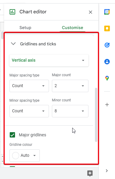
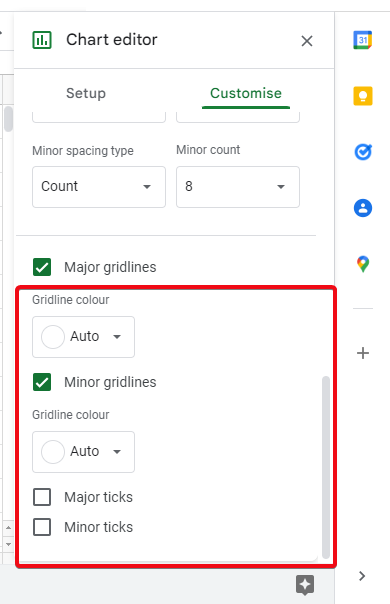
Now we can select the vertical axis and use these options for that, we can set major spacing type, and major count, and similar for minor spacing type and minor count. below we can check on the “major gridlines” checkbox and set gridline color, for minor gridline checkbox, also we can set gridline color. so, we have plenty of options here, but it’s not recommended to use every feature, it depends on your need.
below we can further use two checkboxes “major ticks” and “minor ticks“.
So, this was a comprehensive editing tutorial for histogram charts. I hope you have understood the editing part.
Notes
- Always keep in mind that the less is great, do not overdo with your chart.
- Use minimal and clean editing, and remove unnecessary elements.
- Use black and white colors, if you need more, use blue color
Frequently Asked Questions
What is a histogram?
The histogram is a chart type and it’s built-in in google sheets. It’s used for data comparison, the main idea behind histogram is to divide the data points into a bucket, bucket size can be customized, and it helps to represent the data and make it easier to understand.
is a histogram the same as a bar graph?
No, a bar graph does not use the bucket concept, and a bar graph is ideal only for fewer data points, while a histogram can be used for bigger data sets and data points can be grouped inside a bucket size.
When should I use a histogram?
For any data size, you should use the histogram, it’s easy to make, and it represents the data very accurately.
Conclusion
Wrapping up the entire discussion here, we learned how to make a histogram in google sheets, we also discussed its basic components and data required to make a histogram, in the first section we created a simple histogram, and then we covered different sections to cover each option regarding editing and customization of the histogram. We discuss each option we have in each section of our histogram chart and we implemented every option. I recommend you all experiment with the options to learn and understand its feature.
I hope you guys liked today’s article and have learned new things about histograms and charts in Google Sheets, I will suggest your guys subscribe to our newsletter, and don’t forget to share the article with your buddies. Thank you take care and keep learning with Office Demy.


