
To Use Sparkline in Google Sheets
- Start the function.
- Give the data range.
- Specify the color if needed.
- Press the Enter key.
OR
- Start the function.
- Give the data range.
- Specify the chart type.
- Give the min. & max. Range.
- Specify the color of the bar.
- Press the Enter key.
OR
- Start the function.
- Give the data range.
- Specify the chart type.
- Give the min. Y-axis value.
- Specify the color of the columns.
- Press the Enter key.
OR
- Start the function.
- Give the data range.
- Specify the chart type.
- Specify the negcolor.
- Specify the color.
- Press the Enter key.
Welcome to this tutorial. In this guide, you will learn how to use Sparkline in Google Sheets. If you are a Google Sheets user and are looking for the finest way to represent your data without getting into the complexity of a full chart, you can use the SPARKLINE function in Google Sheets. Sparkline creates miniature charts in Google Sheets that you cannot download as an image or PDF, advance customization or handling large-scale data by more beneficial when having little data and wanting to quickly show a trend, seasonal increase, or decrease.
Here we are with the complete guide on how to use Sparkline in Google Sheets.
Benefits of Sparkline in Google Sheets
The Sparkline function of Google Sheets allows you to create a miniature chart of the cell instead of a big image chart. They are helpful when you are creating a dashboard and want to show a trend, seasonal increase or decrease, or outliers visually.
It varies in different conditions as well, you can not only show a sparkline in Google Sheets with the Sparkline function but also create a bar chart, column chart, and win & loss chart.
How to Use Sparkline in Google Sheets
The Sparkline function can be used in various conditions as you can create a Sparkline, bar chart, column chart, and Win & loss chart with the help of the Sparkline function. It depends on your criteria and which condition you want to use with the Sparkline function. Here we will discuss all of them in the following tutorial.
- Create a Sparkline using the Sparkline function
- Create a Bar chart using the Sparkline function
- Create a Column chart using the Sparkline function
- Create a Win & Loss using the Sparkline function
1. Create a Sparkline using the Sparkline Function
Sparkline or a Line chart is mostly useful to display data that changes over consistent time intervals. If you want to insert a Sparkline into the Google Sheets cell, then you can make it possible with the Sparkline function.
Step 1
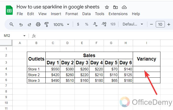
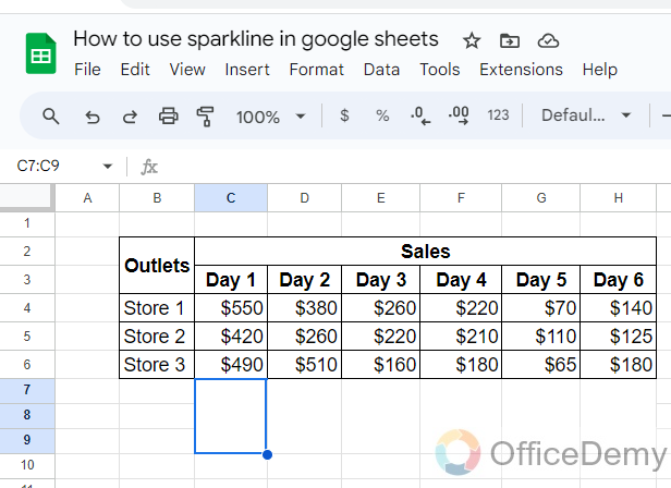
Here, we see in the following example, that we have data on sales on different days in different stores. Now, I want to analyze the variance in the sales of all days.
Step 2
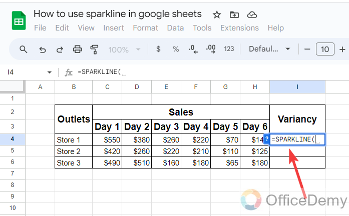
Let’s put the Sparkline in the cell to monitor the variance of the sales per day. To put Sparkline in Google Sheets, here we will use the Sparkline function. To run the function, we just need to write the Sparkline with an equal sign.
Step 3
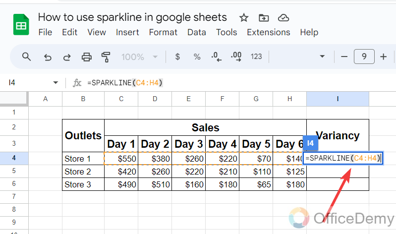
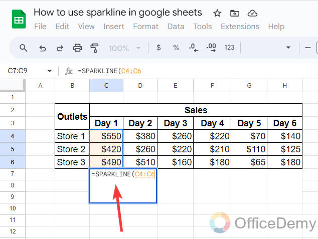
If you want to display a simple Sparkline in the cell then there is only one argument, just give the data range of sales per day as I have given below.
Step 4
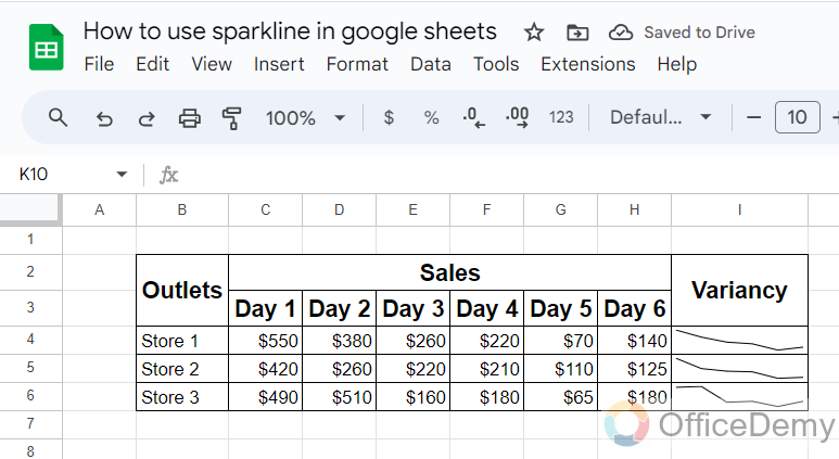
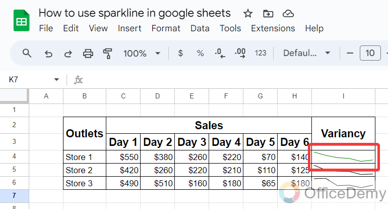
The result is in front of you, the Sparkline has been inserted easily in the cell through which you can analyze the ups and downs of the sales per day.
Step 5
If you look at the above cell, there is a simple Sparkline in black but if you want to display any colorful Sparkline then you can also add the condition in the Sparkline syntax in the following manner.
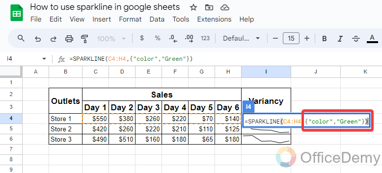
=Sparkline (C4:H4{“color”,”Green”})
Note: We will use the curly brackets to add the condition in the syntax.
Step 6
Here, you can see now, that you have gotten the Sparkline in Green.
Step 7
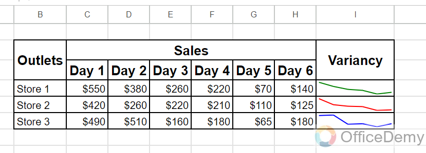
In the same way, you can add any color of the Sparkline in Google Sheets as can be seen in the following example.
2. Create a Bar chart using the Sparkline Function
In the example of the Sparkline function, we will learn to make a bar chart in Google Sheets with the help of using the Sparkline function.
Step 1
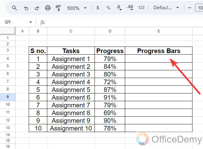
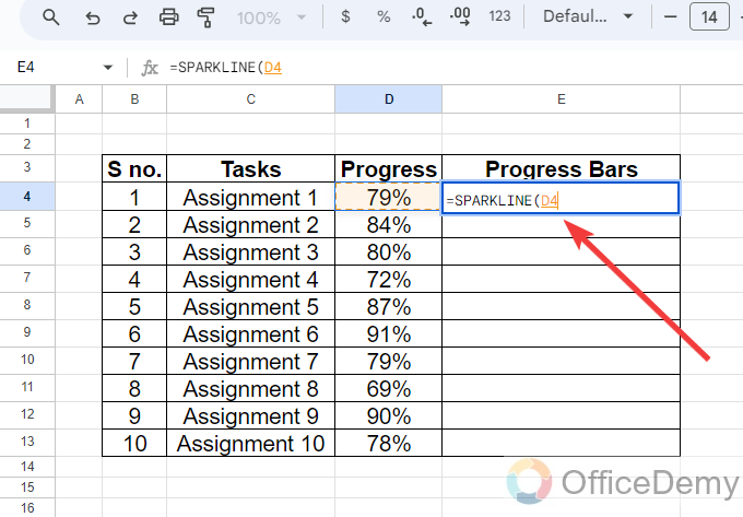
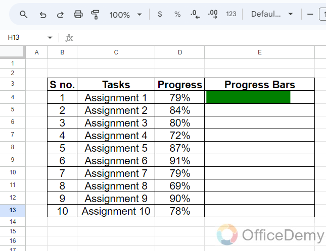
If we look at the data in the following example, we have a progress report for several assignments for which we will create progress bars with the help of the Sparkline function.
Step 2
First, we will run the function by just writing the Sparkline with an equal sign then we will give the range of data value of that we are making progress bar as I have given in the following picture.
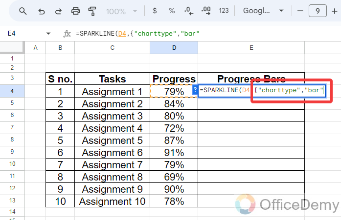
Step 3
After giving the data value, we will have to specify chart type, as we need to create a bar chart, so here we will write in the following pattern, “Chart type“,” Bar” as written in the following picture.
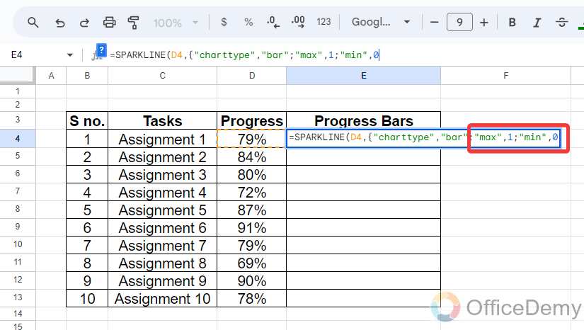
Step 4
After specifying the chart type, in the next argument, we will have to give the maximum and minimum range values where for the maximum value we will use “1” and for the minimum “0“.
Step 5
You can also add another argument in the syntax to specify the color of the Bar. The pattern to specify the color will be “Color“, or “Green“. You can select any color instead of green according to your preference.
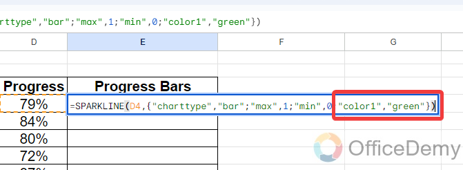
Final Formula
=SPARKLINE(D4, {“charttype”,”bar”;”max”,1;”min”,0; “color1″,”green”})
Step 6
Now, with just one click to go, by just pressing the Enter key, we will get the progress bar in the Google Sheets cell with the hell of the Sparkline function.
Step 7
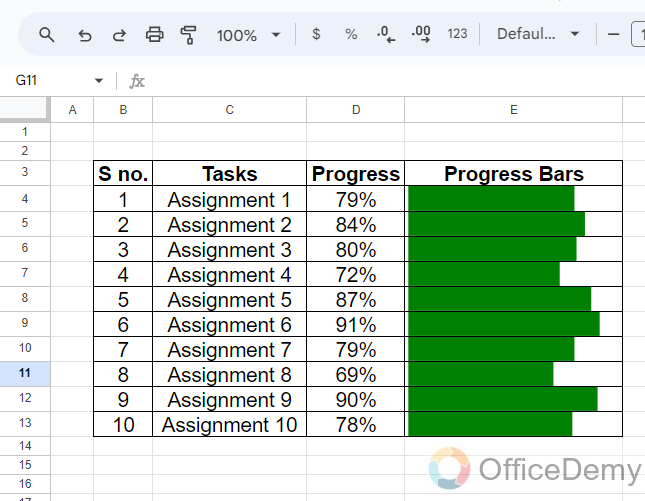
Just drag the formula over to the other cell so you can easily analyze the progress of any project or assignment.
3. Create a Column chart using the Sparkline Function
In the example of the Sparkline function, we will learn to make a column chart in Google Sheets with the help of the Sparkline function.
Step 1
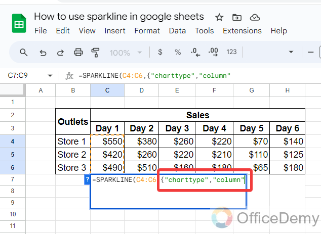
In the following example, we have the same data on sales on different days by different stores. Now, I am going to analyze the sales per day. Let’s create a column chart with the help of the Sparkline function to analyze data.
Step 2
First, we will write the Sparkline with an equal sign into the cell to start the function, and then we will give the data range that we are analyzing in the following data as written below.
Step 3
Similarly, as above, after giving the data range the next argument of the Sparkline syntax will be the specification of chart type, as we are creating a “Column Chart” we will write the chart type “Column” in the following pattern.
Step 4
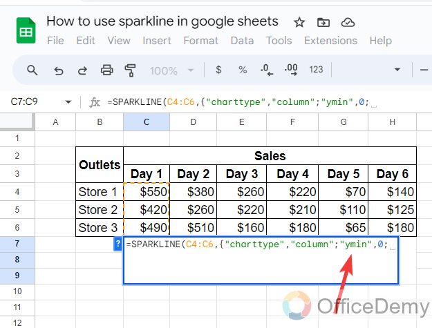
In the Sparkline function, while creating a column chart, we need to tell the initial value of the y-axis. As in the following example, we have written “ymin:0”.
Step 5
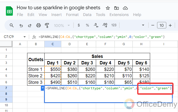
Now, just tell the color of the column that you want to display in the cell. Here I have described “Green” as highlighted below.
Final Formula
=SPARKLINE(C4:C6), {“charttype”,”column”;”ymin”,0;”color”,”green”}
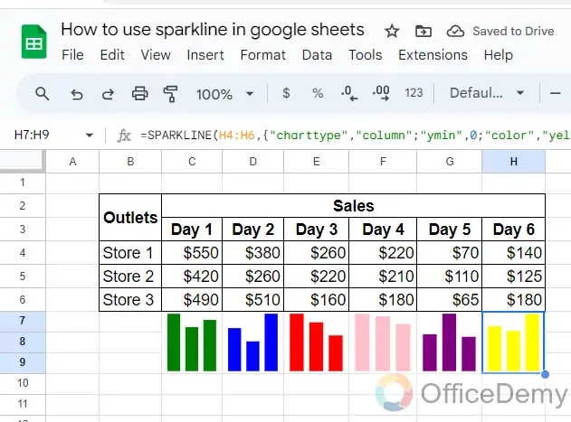
Step 6
In the same, you can create any color of column chart by the Sparkline function as can be seen below, and can easily analyze monitor data.
4. Create a Win & Loss using the Sparkline Function
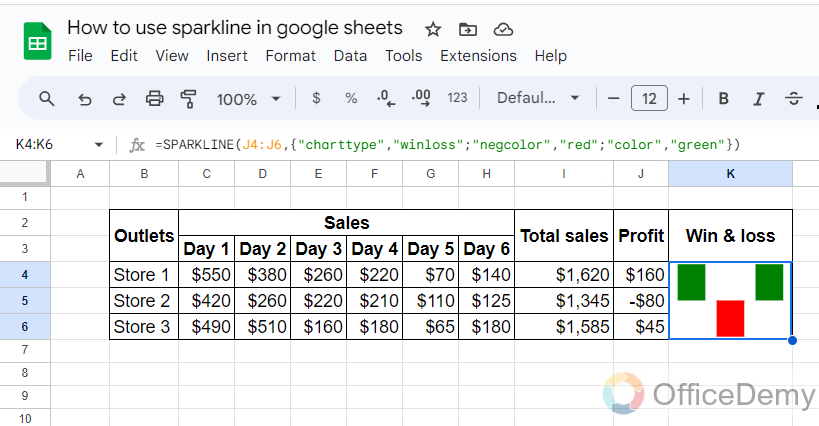
If you need to compare a series of values against each other, then using the SPARKLINE function to draw a win & loss chart, like the one below and one up, is the best option.
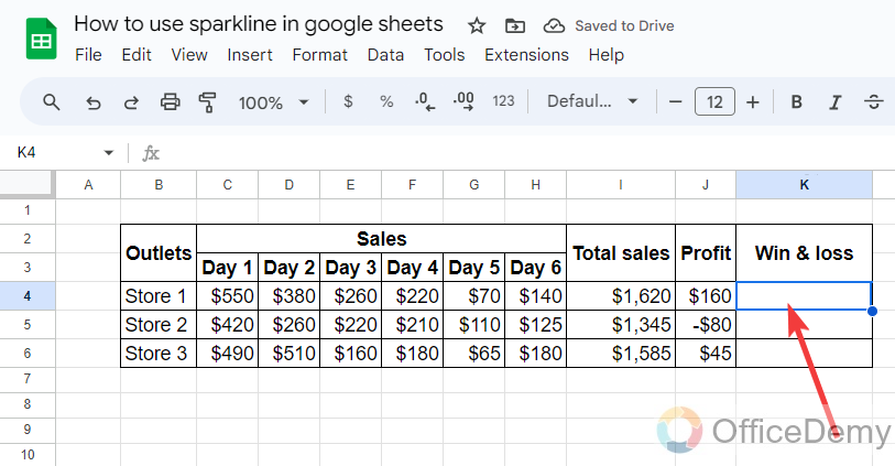
Step 1
Here we have this type of data where we have the values of profit from total sales. Let’s see how we can analyze win & loss by the Sparkline function.
Step 2
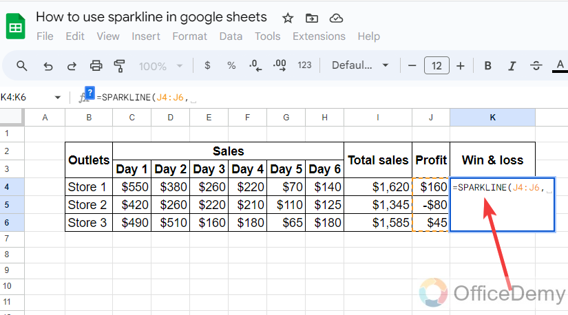
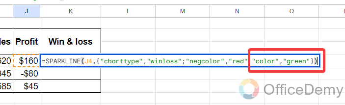
Start the Sparkline function and give the data reference here we are looking at win & loss for profit, so we have provided the cell address of Profit
Step 3
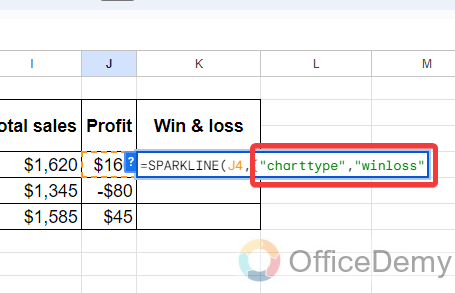
In the next step, we will specify the chart type, I have written the chart type “win-loss“.
Step 4
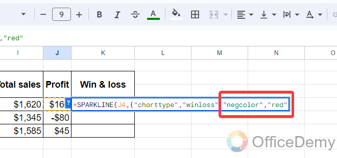
When you get the result, you may find two different criteria win or lose, to differentiate these values, we will specify them by different colors. So here, we will write “negcolor”, “red” to display the loss value in red.
Step 5
Similarly, the profit value to green as highlighted in the following picture.
Step 6
You will get the following result as can be seen in the following picture through which you can easily analyze the win-loss from your data.
Final Formula:
=SPARKLINE(J4:J6), {“charttype”,”winloss”;”negcolor”,”red”;”color”,”green”})
Frequently Asked Questions
Are Sparkline and DAYS function related in Google Sheets?
Yes, Sparkline and DAYS function are related in Google Sheets. Using the days function in google sheets allows you to calculate the number of days between two dates. This functionality can be useful when creating Sparklines, which are data visualizations that condense numerical trends into small charts. By utilizing the DAYS function, you can accurately analyze and display time-based data in your Sparkline charts.
Conclusion
I hope you have understood the Sparkline function of Google Sheets with the above article on how to use Sparkline in Google Sheets. If you want to learn more about Google Sheets, then go through our site and find more exciting tutorials.


