
To Create a Dashboard in Google Sheets
- Prepare Data.
- Create a pivot table for your data.
- Customize the pivot table with data categories.
- Organize data into groups like “Year-Month“.
- Insert a title using WordArt.
- Add Charts.
- Customize chart types.
- Add slicers for filtering data.
- Analyze Data.
In this article, we are going to learn how to create a dashboard in Google Sheets. Google Sheets is a great tool to store and organize your data. However, using Spreadsheets in business could also get you a company’s specific KPIs or metrics promptly. Because searching for your desired information in the sea of raw data seems impossible, we will create a dashboard in Google Sheets to resolve this issue.
The purpose of using dashboards is to store data in a visual format that allows you to instantly pull up the required information. Different categories include project dashboards, company-wide dashboards, team-specific dashboards (Marketing, Sales, HR, etc.), executive dashboards, and many others.
So, the reason for this write-up is to help you learn how to create a dashboard in Google Sheets. In this article, we will take you through the step-by-step procedure which makes things easier to understand and you can create a dashboard so you can help your coworkers, employees, and stakeholders go over any kind of information very frequently. Keep on reading this article and follow the given instructions carefully to learn and create a dashboard in Google Sheets.
Why Create a Dashboard in Google Sheets?
In Google Sheets, dashboards make it easy to acquire a quick overview of the key metrics and KPIs of your company by turning dry data into an understandable form. In dashboards, we can include graphs, charts, and tables that are extremely engaging for the readers to comprehend the essential information and utilize it to drive important decisions in a better way.
Moreover, you can impress your viewers by putting a little more emphasis on visuals to give your dashboard both a beautiful and professional look. These days, companies are making a pretty much standard practice to create and use dashboards. So, to keep everyone in the loop, generate better-motivated teams, allow high-ranked members to make quick decisions, and identify problematic areas, we need to learn how to create a dashboard in Google Sheets.
After realizing the significance of dashboards and knowing how important they can be, we are moving forward to have a step-by-step procedure that would be helpful to understand how to create a dashboard in Google Sheets. Let’s have a look at these steps.
How to Create a Dashboard in Google Sheets
There are different kinds of dashboards, it depends on your data which type of dashboard you may need, or what data is in it. Mostly dashboards are used to analyze the purchase and sales. Here we also have an example of the dashboard of sales records. Let me show you how to create a dashboard in Google Sheets.
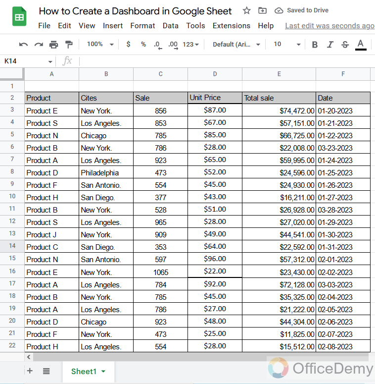
Step 1
Let’s suppose the data set of some products listed below in the picture with their price, total sale, and city in which the product was sold.
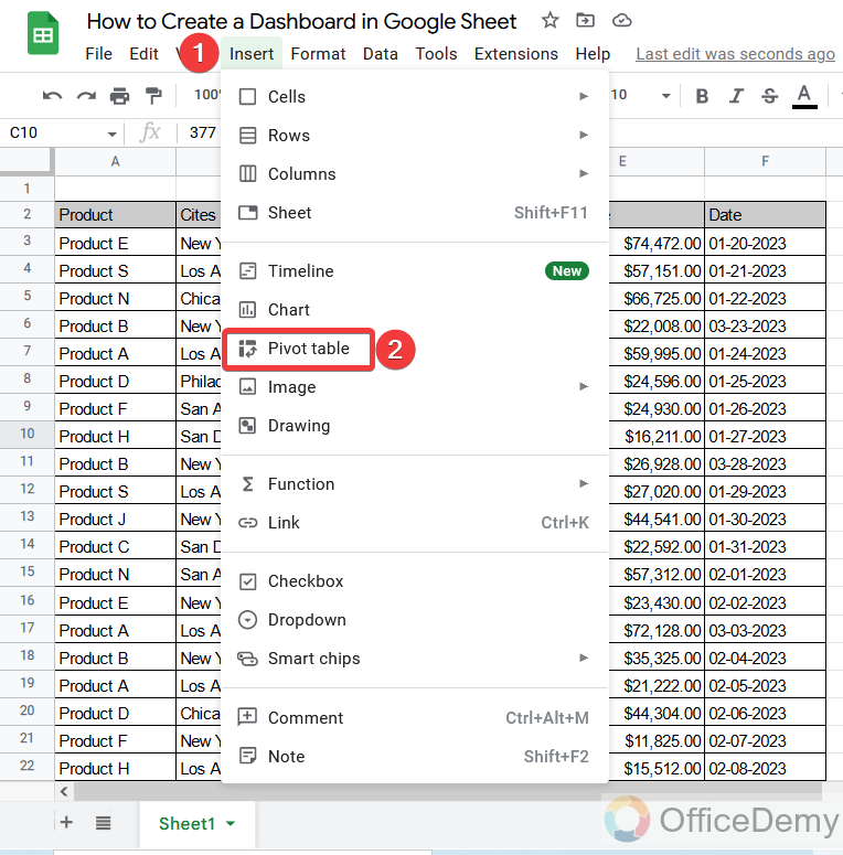
Step 2
The pivot table makes it very easy to characterize the values which will help to make a dashboard in Google Sheets.
To insert a pivot table in Google Sheets, go into the “Insert” tab of the menu bar where you can access the pivot table in Google Sheets.
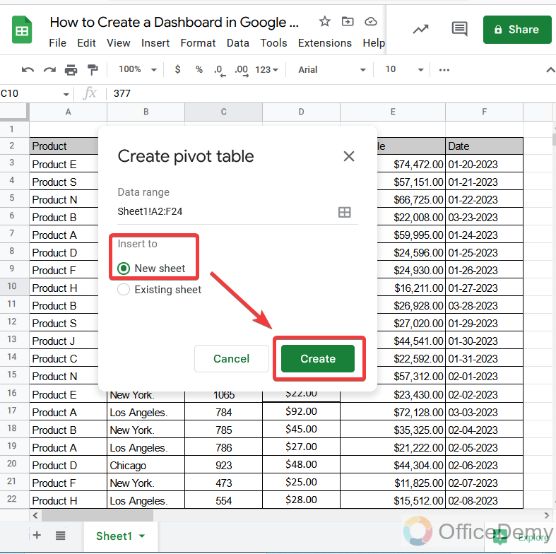
Step 3
When you click on “Pivot table“, a pop-up window will appear which will ask you to make a pivot table on a “new sheet” or “existing sheet“. As we have to make a dashboard as well so here we are going to select the “new sheet” option.
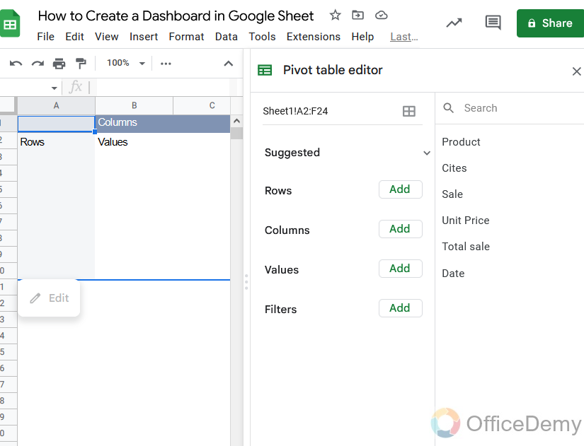
Step 4
This is the output in the following picture, our pivot table has been inserted. Now we will add values to it according to the pattern.
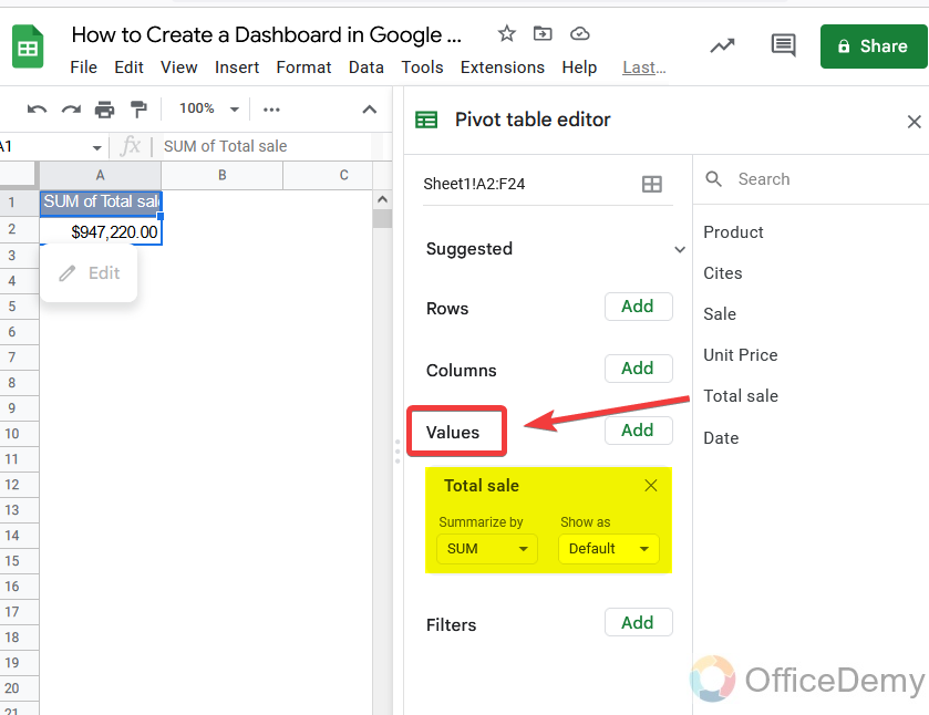
Step 5
As we know sum values in the form of profit, total sales, etc. are inserted in values in the pivot table. So here we will first insert our “total sales” into “values“.
Step 6
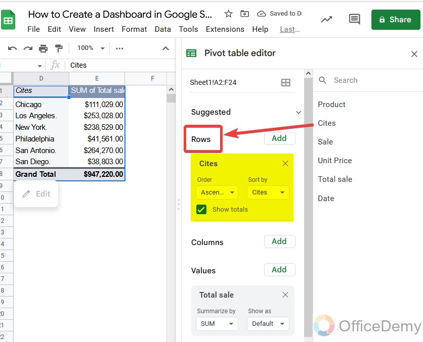
Then we will insert the rest of the data one by one, as we need data in rows to display so here we will insert our data in rows one by one. The product has been inserted as shown below.
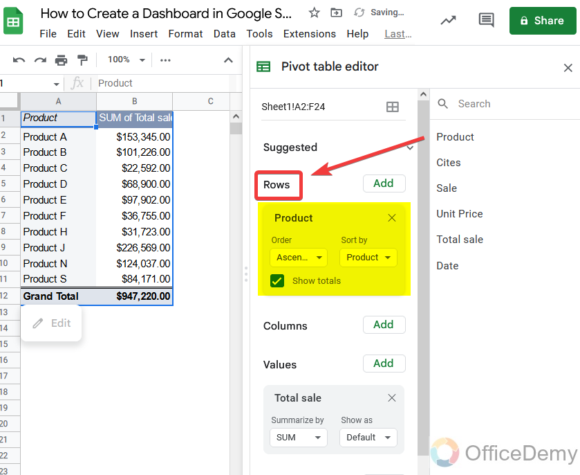
Step 7
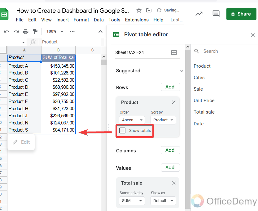
In this section, we don’t need of subtotal which can be removed as well from the following option.
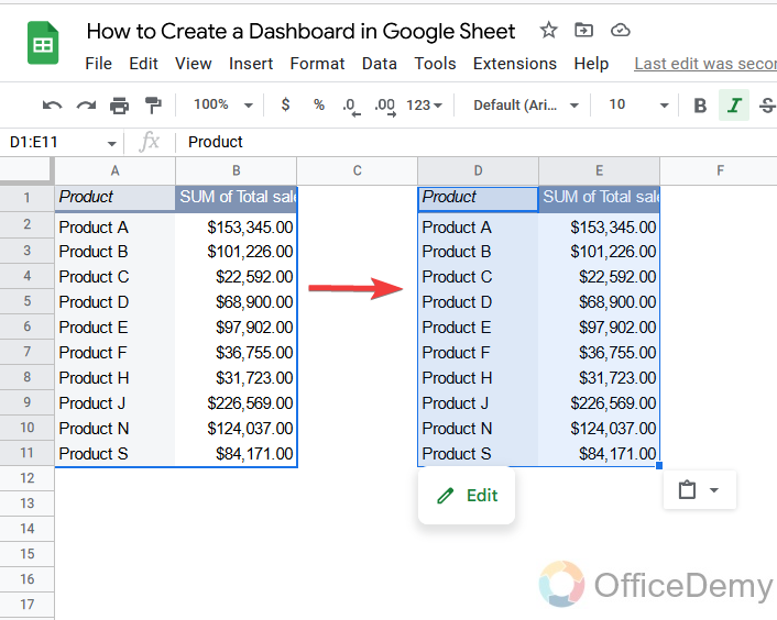
Step 8
Now to add other values, copy the same table just next to the first one.
Step 9
Then click on this table, and the side pane menu will appear from where change the table values product with cities. As you can see in the following picture. Also, remove the total of this table as well.
Step 10
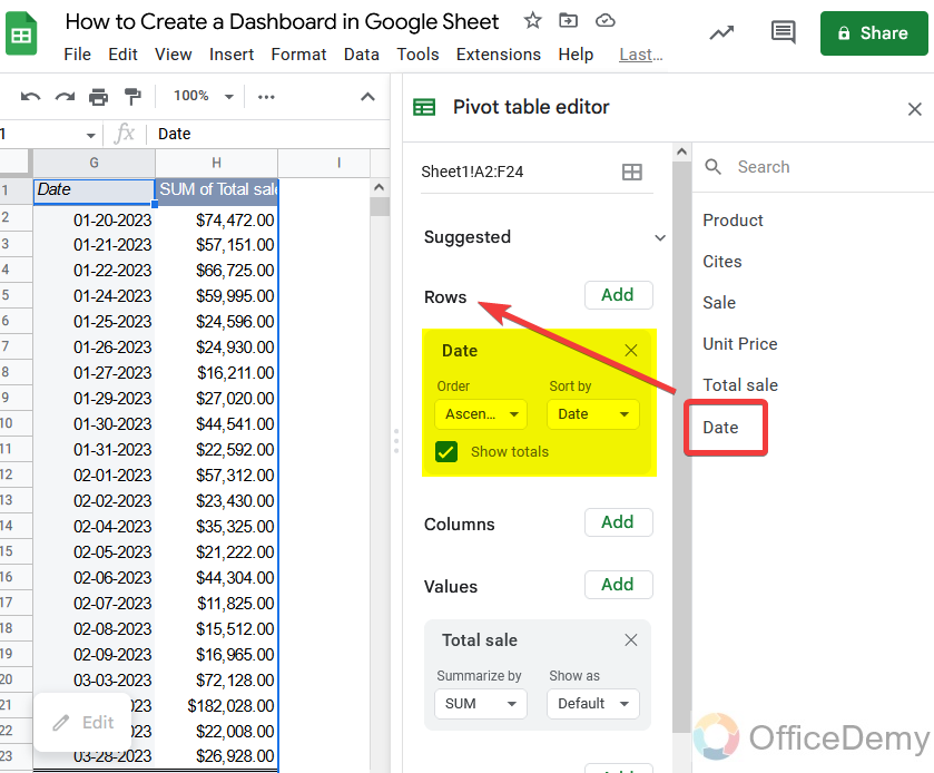
Similarly, copy and paste again the same table and change it with the last one “Dates“.
To make a dashboard we don’t need sale quantity or unit price.
Step 11
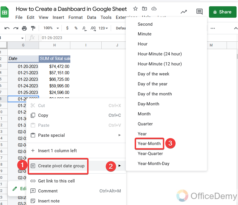
Tables for dates are extended in many rows, so here we will characterize them into months and years.
Right-click on the table and click on “create pivot data group“. You find different domains, where I am selecting “Year-month“.
Step 12
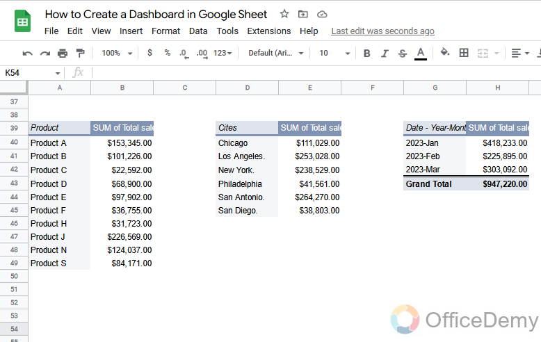
As you can see below, we have all three tables with the values in them. Which we will use to make a dashboard in Google Sheets.
Step 13
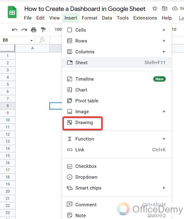
Before making a dashboard in Google Sheets, let’s add a word art to make a title of the dashboard.
To insert WordArt, go into the Google Sheets drawing tool from the insert tab of the menu bar.
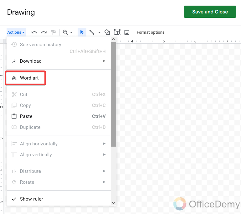
Step 14
In the drawing tool, look at the left top corner of the window, here you will find an “Action” options, where you will find “Word art“.
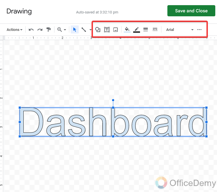
Step 15
Write the title in word art, as I have written below. You can also format your text from the following highlighted options. By changing text color, size, etc.
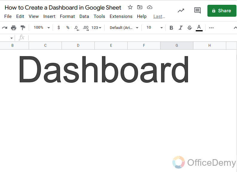
Step 16
Here is the title for the dashboard that has been inserted. Let’s move ahead to make a dashboard in Google Sheets.
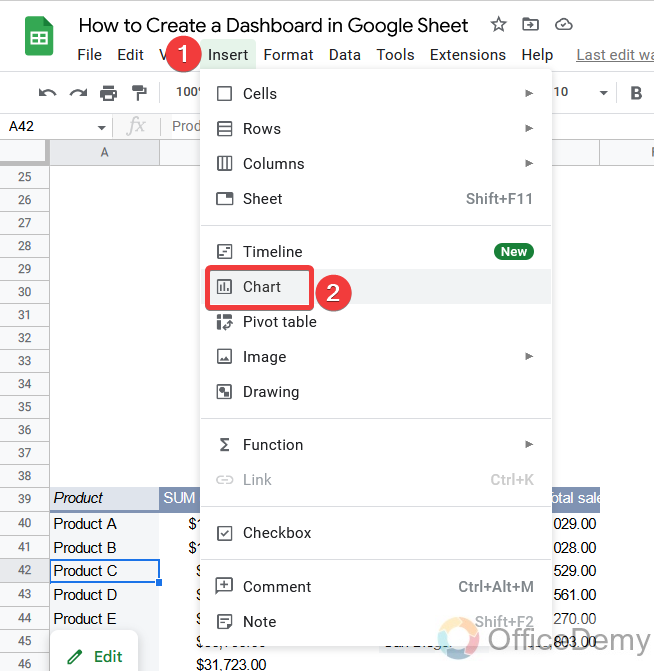
Step 17
Place your cursor on the first table for products, then go into the “Insert” tab of the menu bar of Google Sheets and click on the “Chart” option to insert a chart for your data.
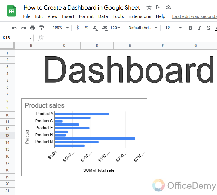
Step 18
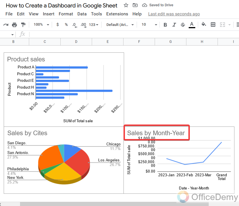
As you can see the chart has been inserted through which you can easily monitor which product is producing more revenue.
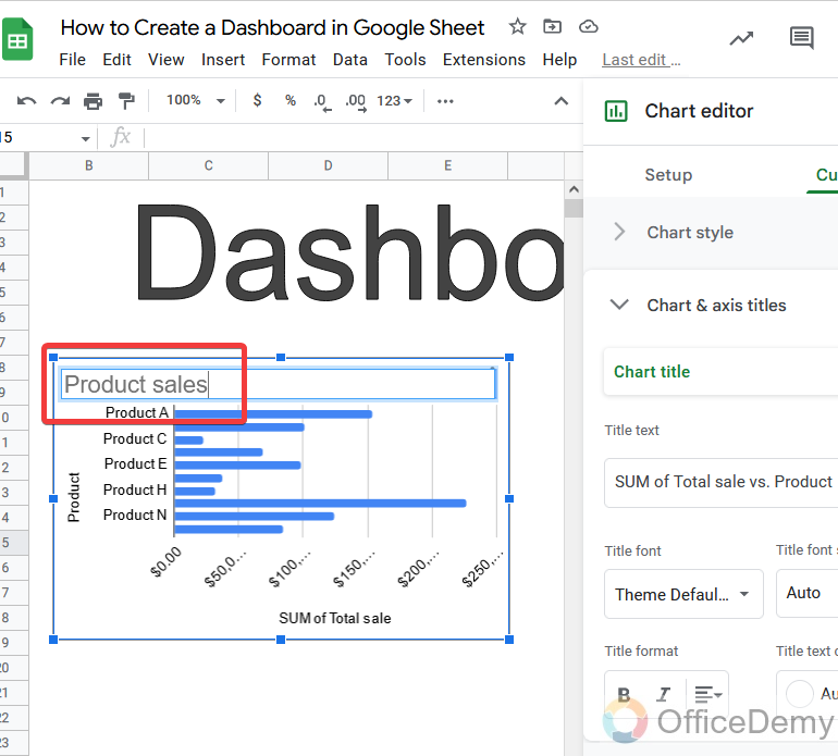
Step 19
While inserting a chart in Google Sheets, Google Sheets name the chart automatically, if you want to change it you can change it by clicking on the name as shown below.
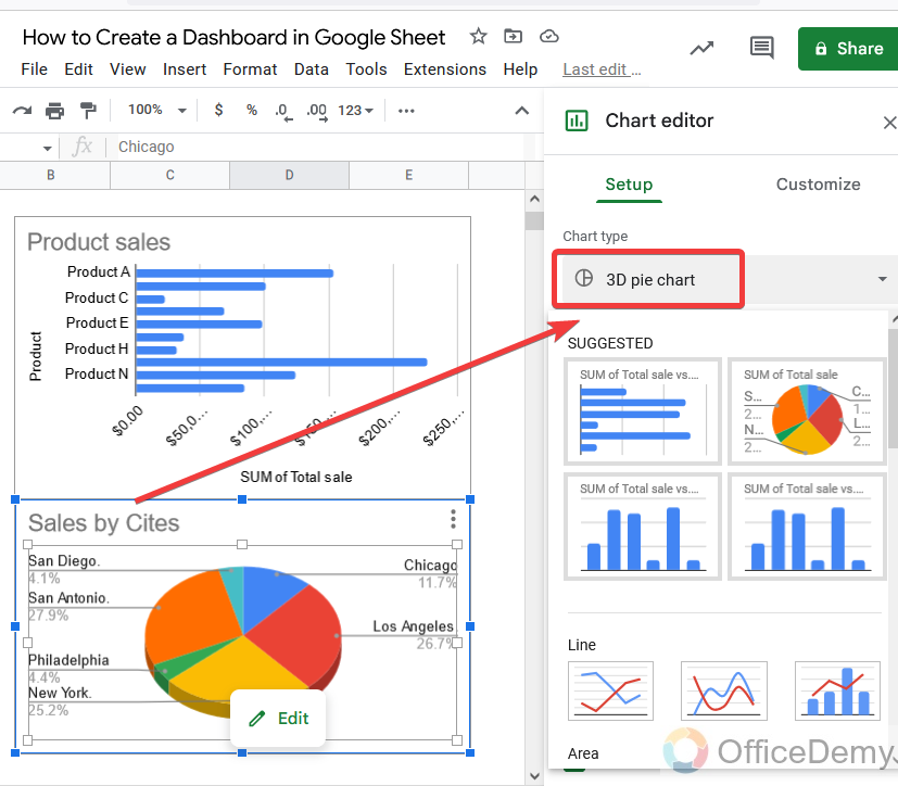
Step 20
Now I have inserted a chart for the “Cities” in our dashboard, but I want to change my chart type for cities. So you can change the chart type as well from the following highlighted option, as I have chosen here a 3d pie chart for cities revenue to look out which city is selling the most products.
Step 21
Similarly, the third chart is for the month and years, in this scenario I have selected a line chart to monitor in which duration we got the most sales. You can use charts according to your preference.
Step 22
Here I am inserting one more chart to look out for the sum of total sales, by selecting the following type of chart.
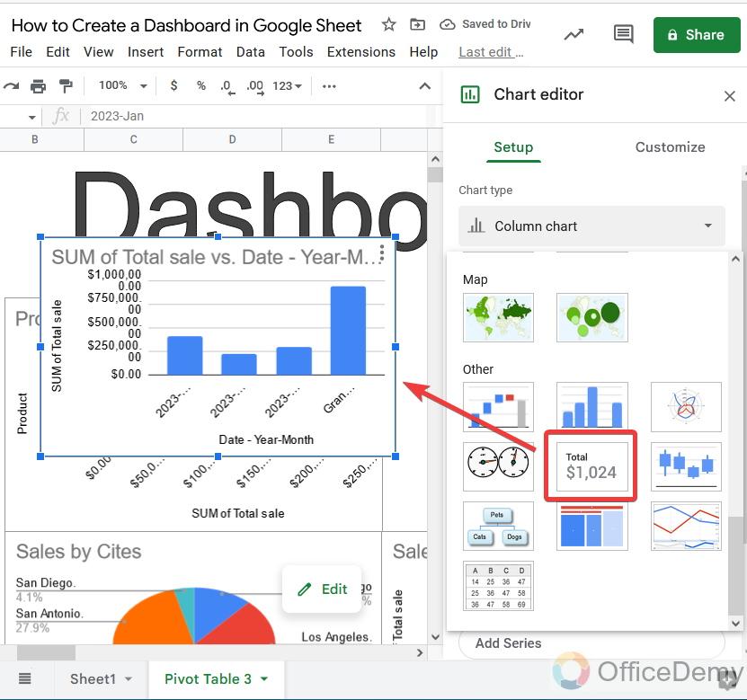
Step 23
As we need to monitor total sales, here we will remove all the values first from our chart. As in this step, I have removed the baseline value.
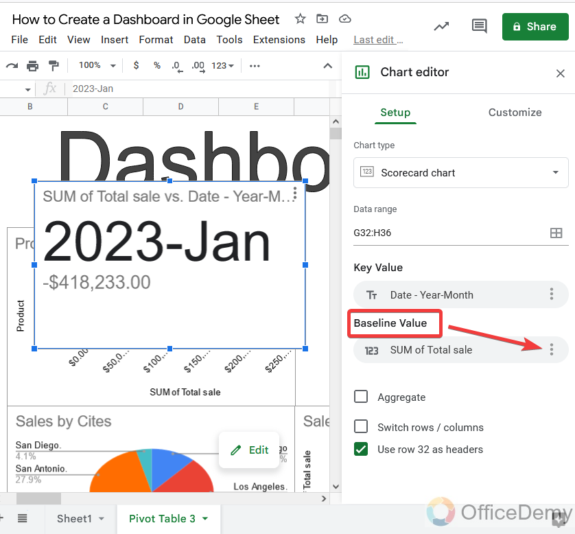
Step 24
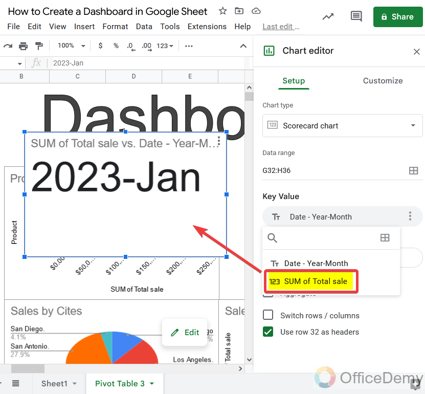
Similarly, we will remove the key value, but in the key value, we need to show the sum of the total, let’s change it.
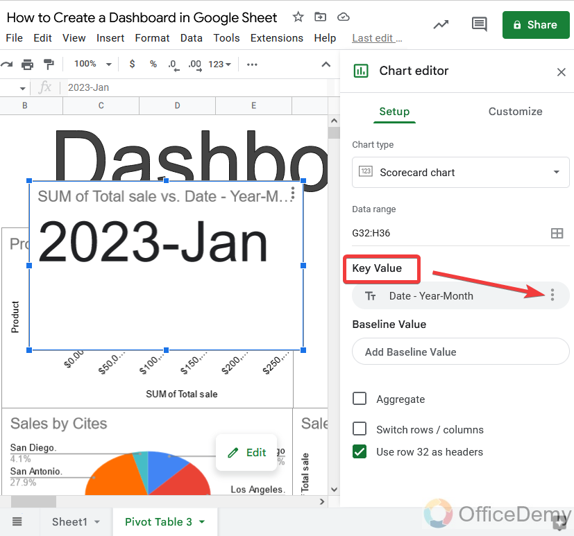
Step 25
When you will click on three dots, it will ask you what to show in the chart. Select the “Sum of total sales“.
Keep placing all the charts according to your preference as you want to monitor statistics.
Step 26
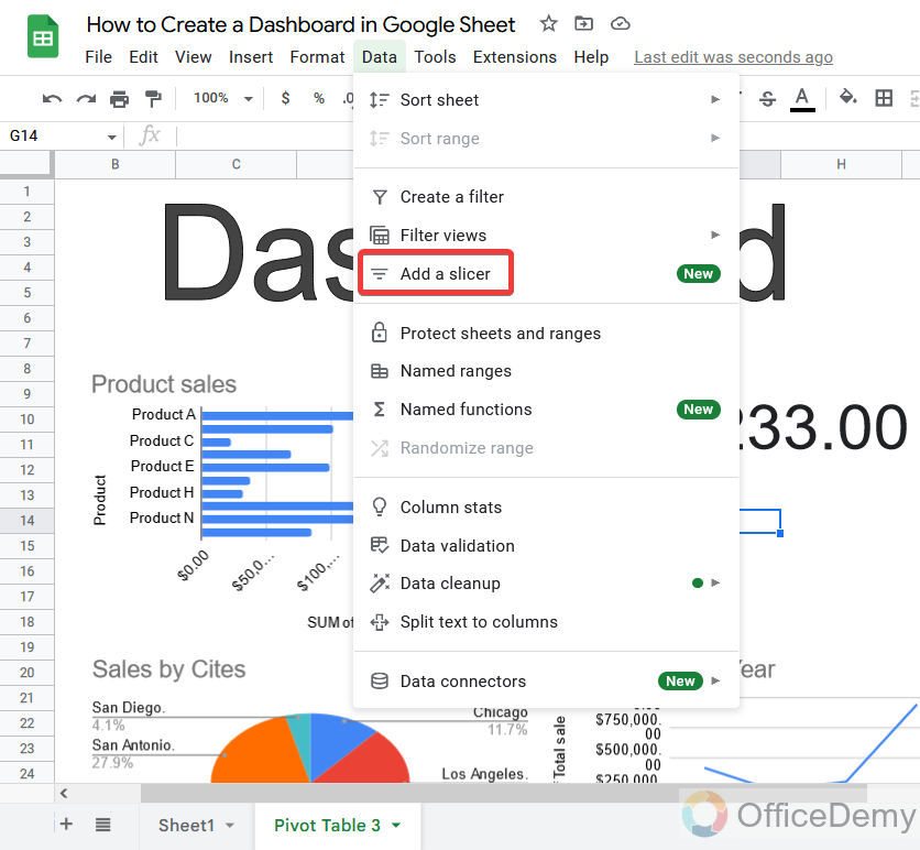
Our dashboard is almost complete, one last thing is remaining to add a slicer in our dashboard. Click on the “Data” tab of the menu bar of Google Sheets, where you will find the “add slicer” option. Click on it to add a slicer to our dashboard.
Step 27
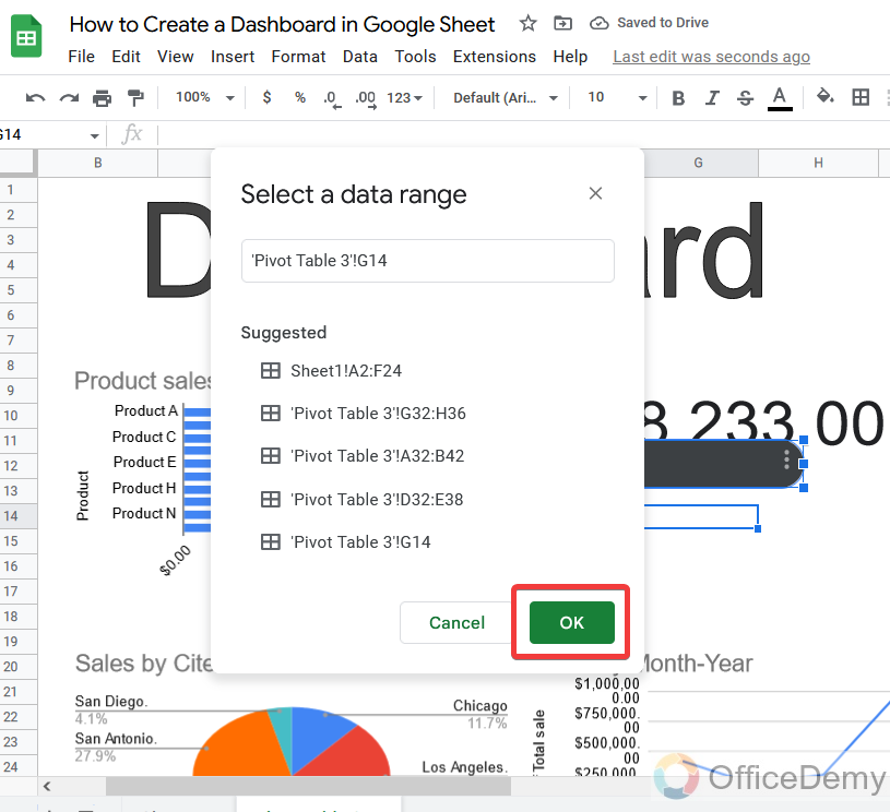
Before adding a slicer to our dashboard, Google Sheets will ask for the data range on which we will apply the slicer, give here your whole row data range, and click on the “Ok” button.
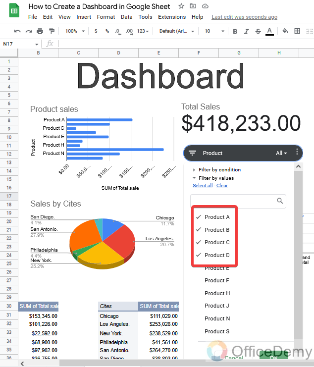
We have two major criteria “Product” and “Cities“, that’s why we may need at least two slicers in our dashboard. Similarly, as the above add one more slicer to your document.
Step 28
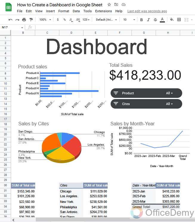
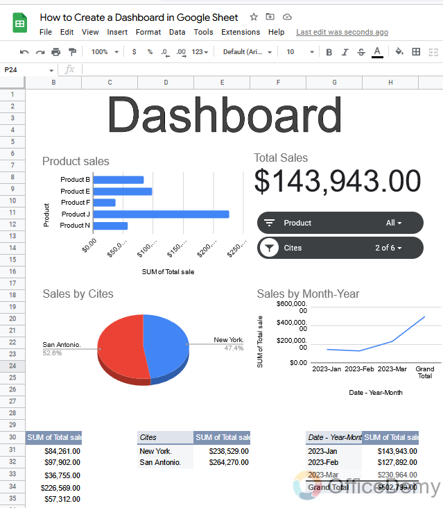
This is the complete look of a dashboard in Google Sheets. You can monitor all the data with different criteria with total income as you want. And an analysis of data with just one click that which city is selling which product and in how much quantity and what revenue is produced by which city or product.
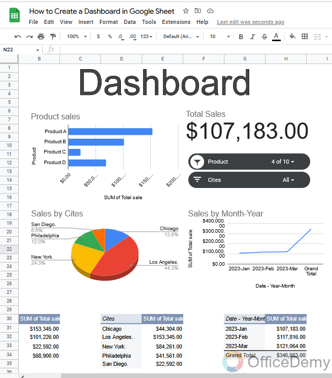
Step 29
Let’s give you a tutorial and add data to the slicer. In the first slicer, I am adding products.
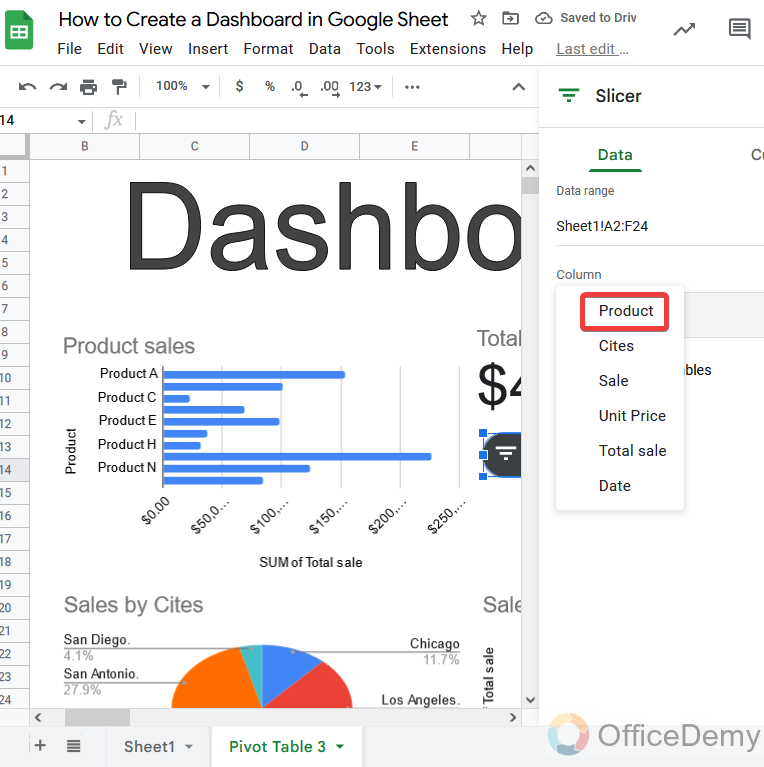
Step 30
Through this, you can charter the products, which else you want to figure out, check those products, and click on the “Ok” button.
Step 31
You will see the result of specific items which you have selected in the slicer. All analyses will automatically update according to the domain which you will give through a slicer.
Step 32
Similarly, if you want to monitor the data of different or specific cities, then add city data on the second slicer.
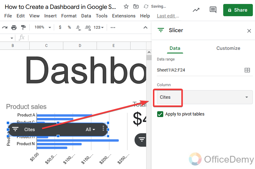
Step 33
With the help of a slicer, we will select the city which we want to analyze. As I have checked “New York“.
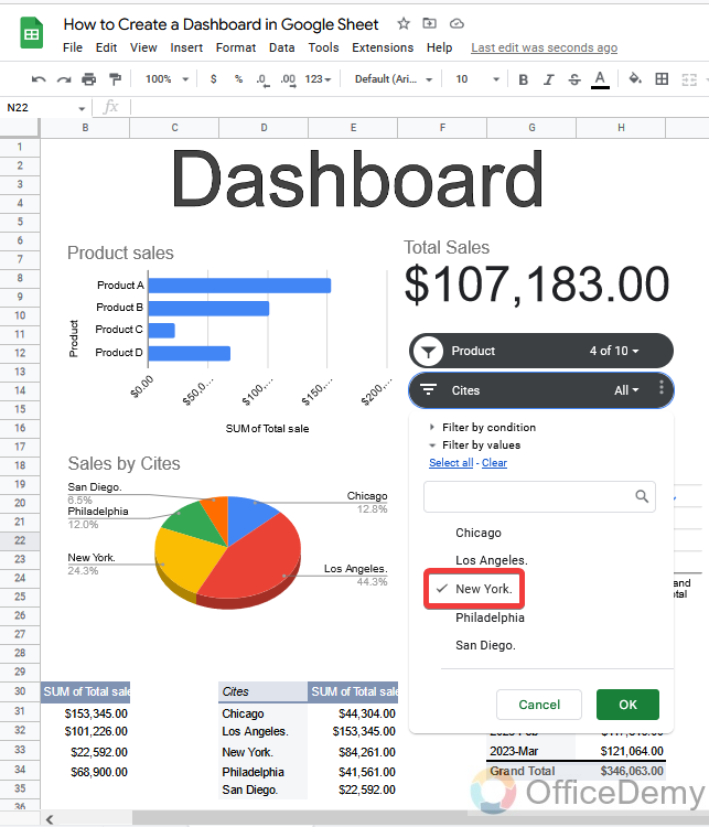
Step 34
On the dashboard in front of you have only the data of new York city which you can figure out.
Conclusion
So today we learned how to create a dashboard in Google Sheets. I hope I have given you a glance at various tricks to use in your dashboard. The procedure of creating a dashboard in Google Sheets is a little longer but the result is so comfortable. We can analyze of huge data list within a second. If you also need a dashboard for your data, then follow the above article on how to create a dashboard in Google Sheets. Thanks for reading.

