
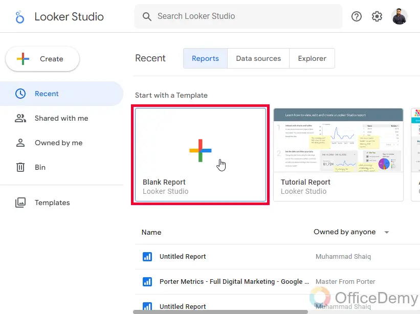
To Make & Customize Pie Chart in Google Data Studio
- Select a data source for My data source.
- Select Add a Chart.
- Pick your desired Pie chart from the options available.
- After adding a chart, customize the design which is explained in this article in detail.
Hi, everyone. In this article, we will learn how to customize pie charts in Google Data Studio. This tutorial is part of our Google Data Studio series. We have already learned some basics about creating and setting up charts. We also learned how to customize tables in Google Data Studio, but as I told you that every chart has different features and different customization buttons.
So, today we are specifically going to learn how to create and customize Pie charts in Google Data Studio. But for new visitors, I would to like start from the scratch. What is a pie chart? A pie chart looks like a circular statistical shape with some distribution of data in it representing different colors, typically called “slices” which illustrate the numerical proportion of each data point, or category. In a pie chart, the arc length of each slice is proportional to the quantity it represents.
Importance of using Pie Charts in Google Data Studio
Pie charts are a very important type of chart in Google Data Studio. When you see any reports created in Data Studio, you will see a pie chart in it. a pie chart is essential to display the data breakdown and it’s the best way to visualize the categorical data in the easiest way to make a user understand what it means.
So, knowing the features and additional functions that come with pie charts is very important to create interactive and communicative pie charts. This article is meant to teach you everything about a pie chart inside the scope of Google Data Studio, having that said. I hope you understand why we need to learn how to customize pie charts in Google Data Studio.
How to Make & Customize Pie Chart in Google Data Studio
From here, we will see what are the steps and what should be an ideal strategy to customize pie charts, there are tons of customization features we can use to edit our charts. But, not all the features are meant to use every time. We will see what features need to be used based on our needs. I will try to teach you what the features are meant for and when should we avoid them.
How to Make Pie Chart in Google Data Studio – Creating a Simple Pie Chart
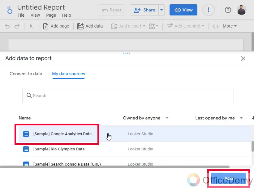
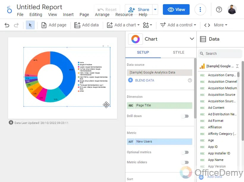
In this first section, we will learn how to create a simple pie chart in Google Data Studio, and then we will learn about the customization features. For this article, I am connecting my Data Studio with a Sample Google Analytics data source which is freely available to everyone. To learn how to connect a data source on Google Data Studio, I will recommend you the previous article of our series in the above link.
Step 1
Open Google Data Studio and connect a data source
Step 2
On your canvas, click on the “Add a chart” button, and click on “Pie chat”
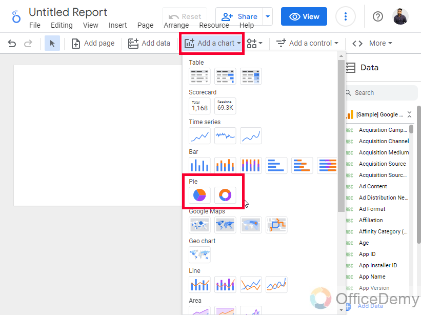
Step 3
Draw the chart anywhere on the canvas.
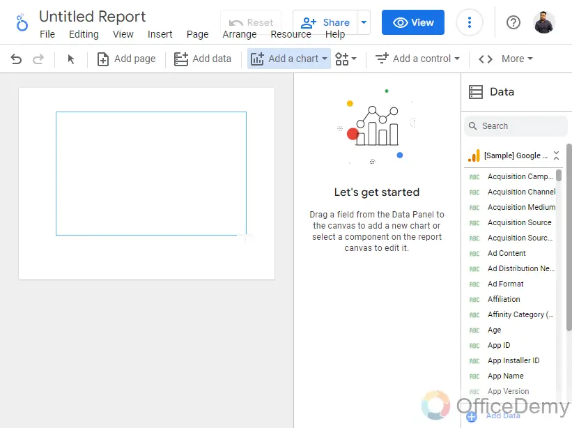
Step 4
Now, as you drew your chart, it has taken a default metric and a dimension from the connected data source.
Step 5
For an easy understanding of data select Gender in the dimension, and Users in the metric.
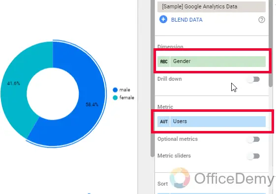
Now our simple chart is ready that is showing the distribution of male and female visitors coming to our website.
Now we will use the customize tab to learn how to customize pie charts in Google Data Studio.
How to Customize Pie Charts in Google Data Studio – Customization Features
In this section, we will learn how to customize pie charts in Google Data Studio, and we will learn the customization features, and implement them on the chart we have just created. Note that every type of chart such as a table, bar, line, scatter, geo, pie, etc have different customization features because of their different bodies, for example, you will not have an option to change the color of the series in a pie chart, understandably because pie charts don’t have any like series. Similarly, you will not have the option to customize a slice in the Geo chart because obviously geo charts don’t have anything known as a slice. Having that said, let’s move ahead and learn the customization of a pie chart.
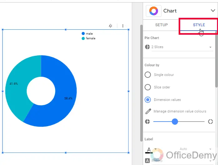
Step 1
Select the Pie chart and go to the Chart Sidebar, the default panel opened is Setup, you need to go to the Style tab
Step 2
The first option is a drop-down for the number of slices we want to have in our Pie chart.
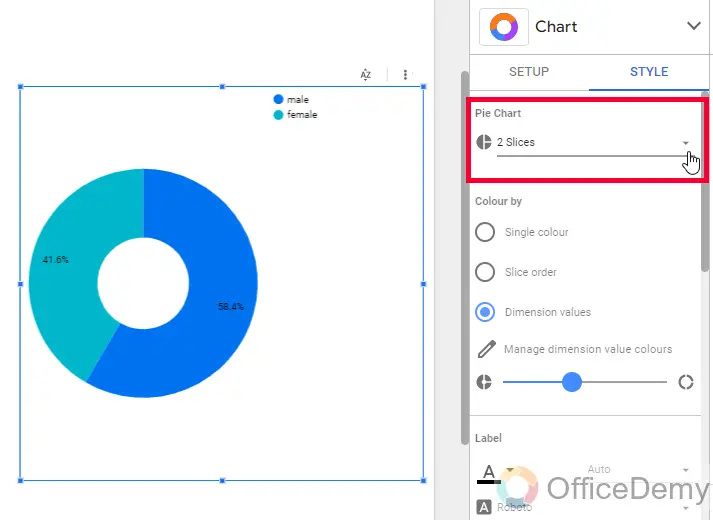
Now, understand this feature. Our Pie chart has two categories only, so if we select more than 2 slices, then there will be no change, or if we select less than 2 means 1 slice, then the chart will be demolished, it will not show the two categories as the distribution for what it was meant for. So, with this data set, this feature is useless.
Then where do we need to use this feature?
This feature is used when we have so many categories, and we don’t want to show all, we only want to show the top 5, or top 10, so we will restrict the number of slices to 5 or 10, and the rest will fall into the others category and it will not demolish our pie chart’s purpose because the purpose is to show the top 5, or top 10 which is accomplished.
Step 3
Color By
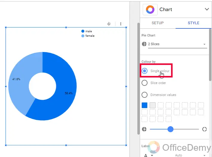
This is the second section in our pie charts customization sidebar, here we have a few options regarding colors.
These are radio buttons, from which we can select only 1 at a time.
The first option is Single Color, here we can use a default color with a lighter and darker version for different categories, doing this helps us to use only the main theme colors of our reports.
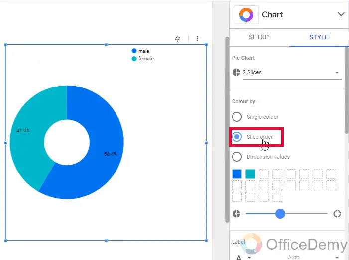
The second option is Slice Order, this option is a custom coloring option, we can click this radio button, and then we will have a color box for all the colors in our pie chart and we can pick any color for each slice.
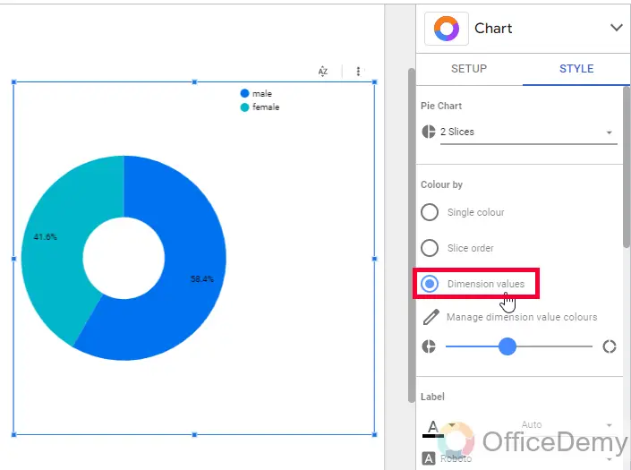
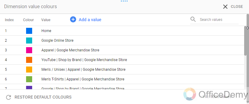
The next option is pretty cool, Dimension values, here we can assign color directly to our dimensions, and thus they will pick their colors every time even when the data is changed. This option is used when we want to lock dimension colors.
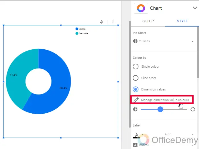
Click on the Manage dimension value colors, then you will have all your dimensions opened in a list with a color box, we can change those by clicking on it and selecting a new color.
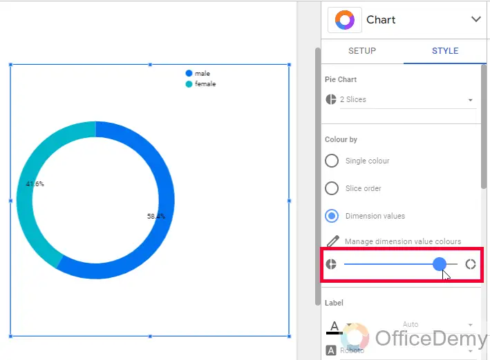
Step 4
Here, we have a meter for the pie chart’s size, you can increase/decrease the density of slices
Step 5
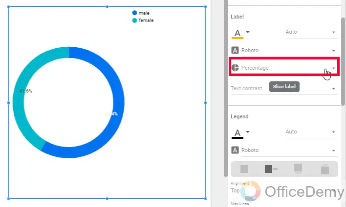
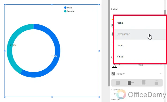
Lable
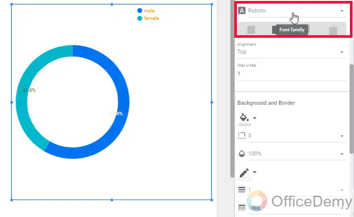
Here we have all the formatting for the text
Here, we can set the font size and Family
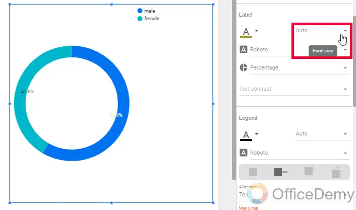
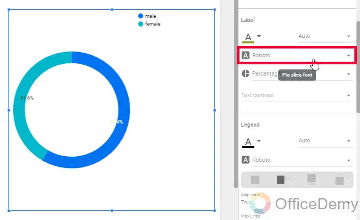
Below, we can select the data type to show the distribution, percentage, label, and so on
Step 6
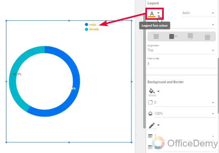
Legend
Here, we have everything about the legend of our pie chart, our chart is simple, thats why the legend is also very small. But, when a pie chart has 10 slices or more than 10, then legend becomes a big element of the pie chart.
So, firstly, we can set the legend font color
Then, the legend font size
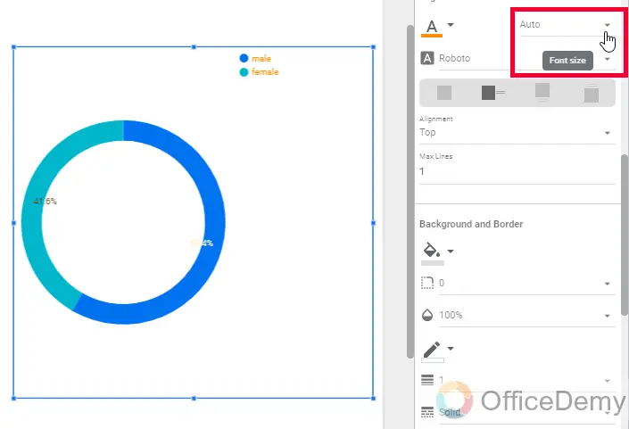
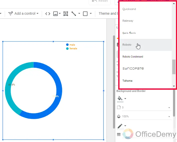
Below we can select a font family for the legend
Now here, we can set the legend’s position, we have options such as Right, Bottom, Top, and none. The option none works as auto.
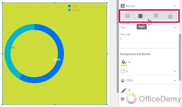
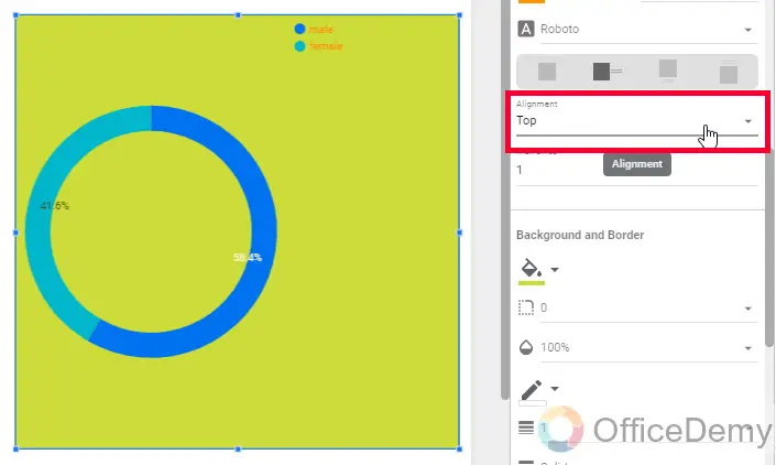
Then we have the alignment, in which we have a Top, Middle, and Bottom
Step 7
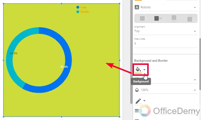
Background and border
As the name suggests, here we control the customization of the overall pie chart’s background and border
First, we have the background color drop-down for the overall pie chart’s background, not just the pie, but the entire body including the legend’s background
Then, we can set the border-radius
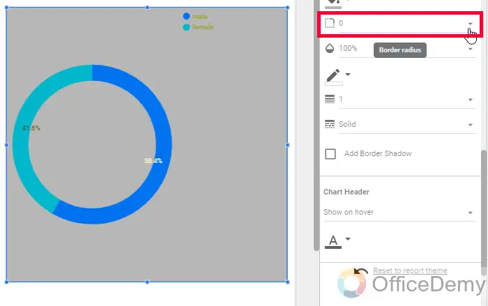
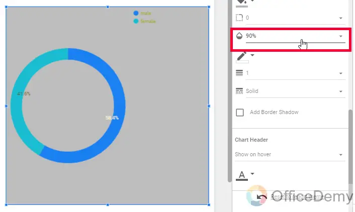
Then, we have the opacity level
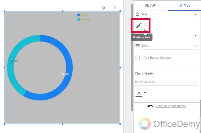
Below we have another drop-down for the outer border-color
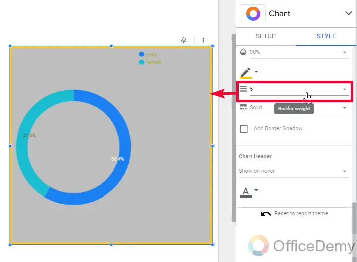
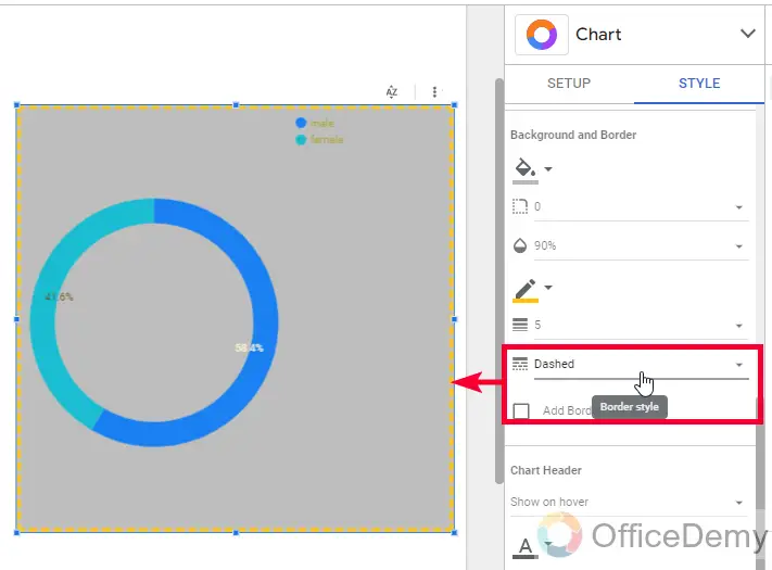
Then, We can border weight, and border style
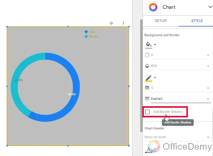
Lastly, we have a checkbox Add border shadow, here we can check this checkbox to have a shadow of our primary outer border
Step 8
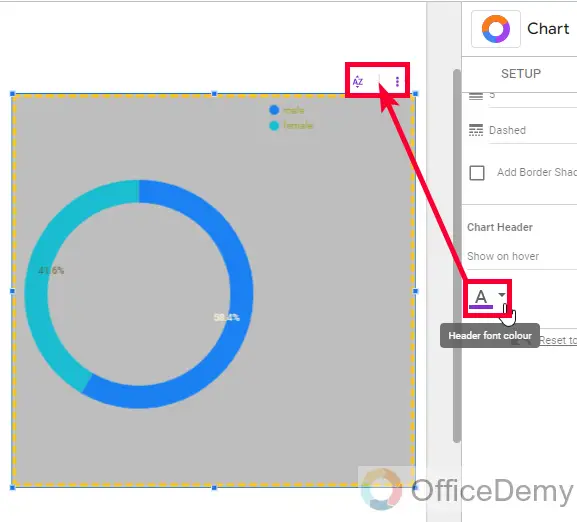
Chart header
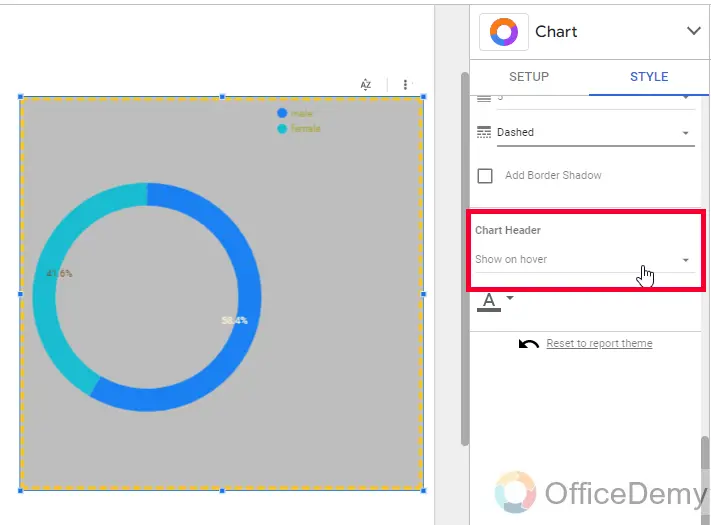
This section is only for the chart header.
First, we can set the header visibility, By default, Its “Show on hover”, we can select “Always show”, and “Do not show”
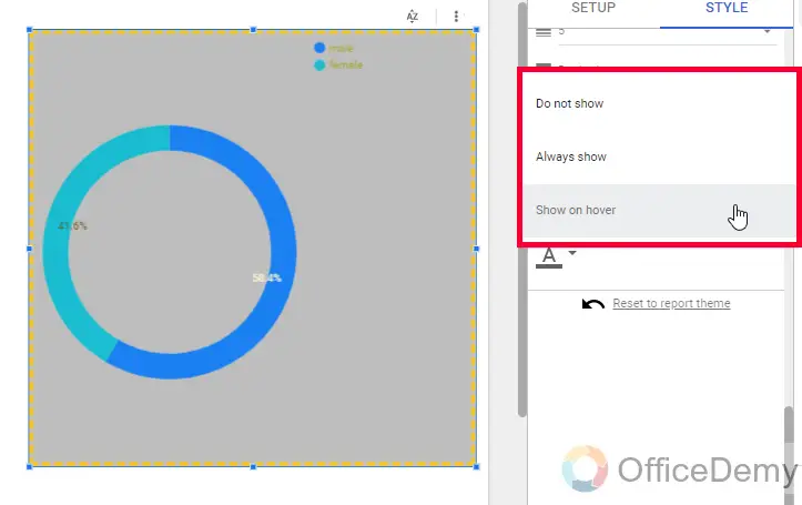
Below, we can set the font color for it using the color dropdown.
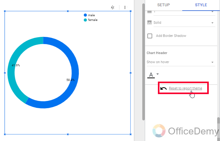
Lastly, we have a reset button “Reset to report theme” we use this button to reset the editing we have done, and we get back to the original report theme.
So, this was everything about styling/customizing pie charts in Google Data Studio. I hope you found this tutorial easy and helpful.
Important Notes
- Every chart has different customization features.
- The chart header is nothing but a group of two buttons, one is a short button and the second is more options
Frequently Asked Questions
Can I Use the Cross & Chart Filter in Google Data Studio to Customize a Pie Chart?
Yes, you can implement cross chart filter in Google Data Studio to customize a pie chart. This filter allows you to interactively slice the data in your pie chart based on the selected values from another chart. This feature enhances the flexibility and interactivity of your reports, providing a more insightful analysis for your audience.
Can I Use the Same Steps to Create a Geo Chart in Google Data Studio?
Creating geo charts in google data studio involves a specific set of steps that may not be applicable to other chart types. However, these steps can be reused for creating a similar geo chart within the same platform. So, yes, you can use the same steps to create a geo chart in Google Data Studio.
Can we have only 1 Slice in a pie chart?
Technically yes, but practically no. You have the option to select only 1 slice for your pie chart but it does not make sense. Pie charts show the categorical distribution of data, so if you keep only 1 slice then there will be no visualization for the distribution of categories. All the data will fall in the others category, and the purpose of the pie chart will be demolished.
Conclusion
Wrapping up how to customize pie charts in Google Data Studio. I tried to cover every detail of the pie charts in Data Studio. In general, pie charts are standardized globally to show the categorical distribution of data with different color slices. But, while styling it, every software or application can have different ways.
So, I hope now you are fully familiar with pie charts in Google Data Studio. I will see you soon with another helpful guide. Take care and keep learning with Office Demy.


