
To Change the Color of the Chart in Google Sheets
- Error bars and legend icons inherit colors from the series.
- You can use HEX values to create custom colors.
- Background colors are usually transparent, but you can add a lighter color for contrast.
- Gradients are not supported in Google Sheets charts.
Hi, in this article, we will learn about charts, we will see how to change color of chart in Google sheets. Whenever we create charts in Google sheets, they are by default blue color as the primary color for series, and black is the primary default color for text, but what if we don’t want to use default colors and only want to use custom colors to make a branded chart in Google sheets? We can do it easily, we have control over the chart color, we just need to learn how to change color of chart in Google sheets.
So, in this article, we will see some common kinds of charts and we will see how to change color of those charts specifically with easy customization features of charts inside Google sheets.
Importance of Changing Color of Chart in Google Sheets
We mostly work on Google sheets for our professional work, and if we are working for a company or any organization or even for a startup then we must need to follow the branding highlights of the company or the startup we are working for, so to follow these norms inside a company we need to make sure that every piece of graph or charts we make reflects the brand, so we need to have custom colors for our charts in Google sheets.
We have worked with charts more often in this series of articles, but we always worked on them using the default original colors Google sheets provide us when we create a new chart, but how would we change color of those chart in Google sheets without exporting the chart as an image, so this is why we need to learn how to change color of chart in Google sheets to make our charts and graph look more branded and as per the brand colors.
How to Change Color of Chart in Google Sheets
We firstly we will consider some colors which are supposed to be our brand colors, then we will quickly create a line chart (because a line chart has more attributes) in Google sheets, and then we will incorporate those colors, we will learn how to change the color of chart in Google sheets.
Change Color of Chart in Google Sheets – Create a Simple Line chart
In this first section, we will learn how to change color of chart in Google Sheets and will create a simple line chart to apply customization features to it.
For this section, I have some sample data of sales and months in columns A and B, let’s get started.
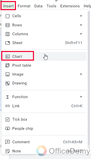
Step 1
Go to insert > click on Chart
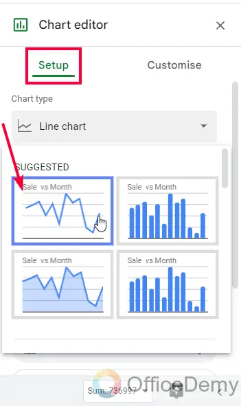
Step 2
Select the line chart
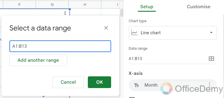
Step 3
Select the data range properly and your chart has been added to the sheets
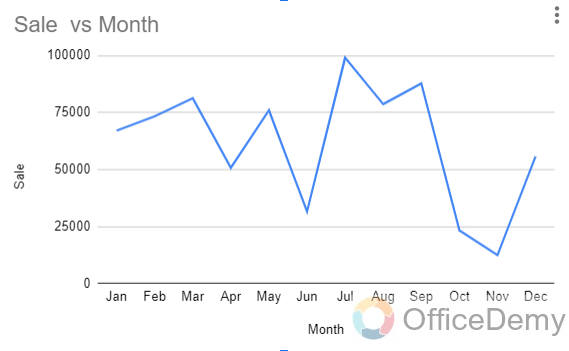
This is how you create a simple chart, we have learned to create and set up charts in many of the articles in this Google sheets series of articles.
Change Color of Chart in Google Sheets – Changing Colors of All Attributes of the Chart
In this section, we will learn how to change color of chart in Google sheets by changing the colors of all the attributes of the chart, we have so many parts of chart that have different coloring options, so it depends on us that which attribute we want to color, we can also color some attribute and leave some as default or auto. So, let’s see what attributes we have, and let’s change their colors.
let us say our brand colors are Green, Yellow, Orange, and Purple. Let’s see how we will use these colors to make our chart more branded and customized
Step 1
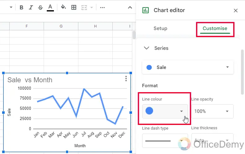
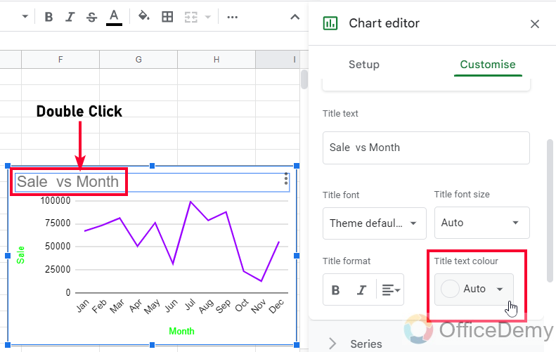
Double-click anywhere on the chart body to open the chart editor on the right side
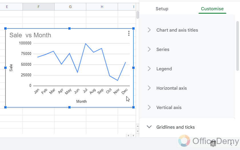
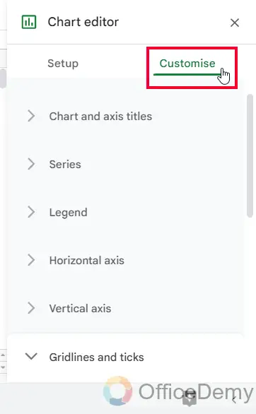
Step 2
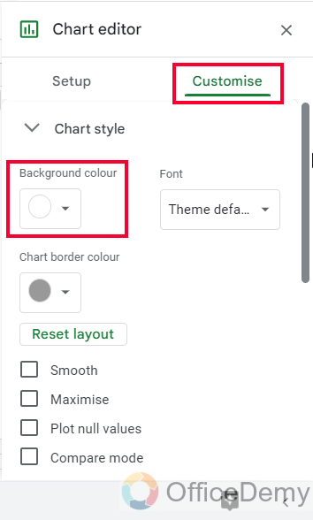
There are two tabs, go to customize tab
Step 3
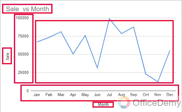
Now you can see you have so many attributes in your chart we can change those colors separately.
Step 4
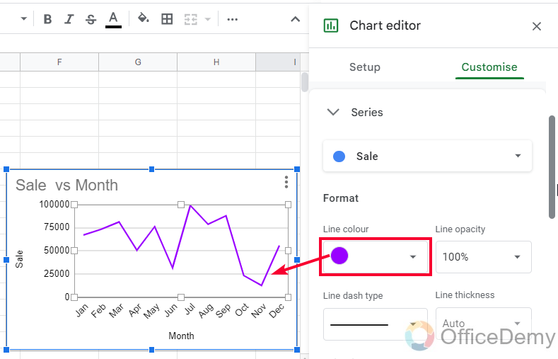
Changing the color of the series (Series is the line that tells you the ups and downs of your data, it’s blue color by default).
To change the color of the series line in the line chart simply go to the Series dropdown inside the customize tab and then in the Format tab you can change the color from the “Line Color” dropdown.
Step 5
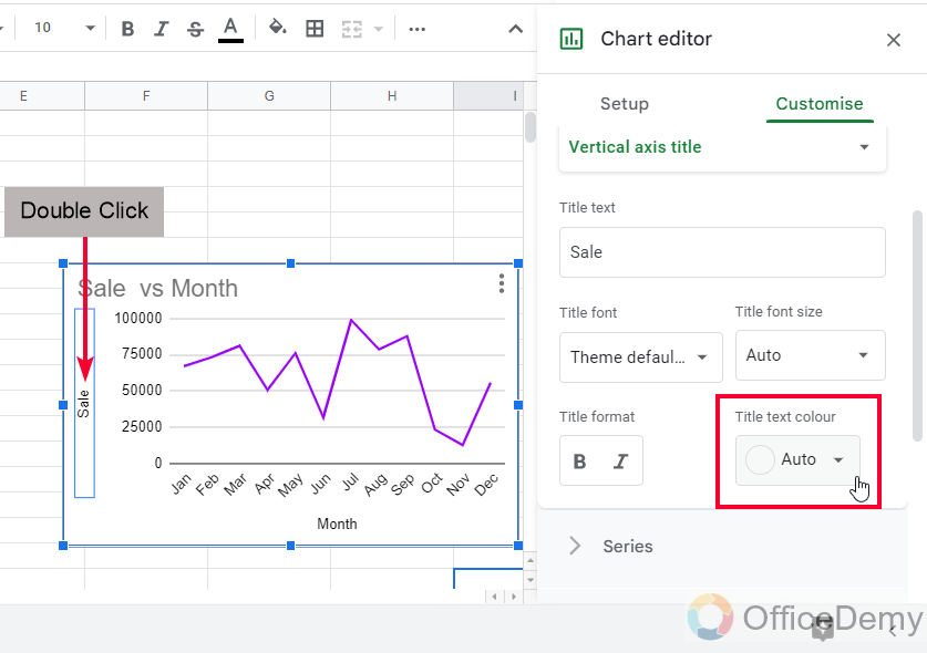
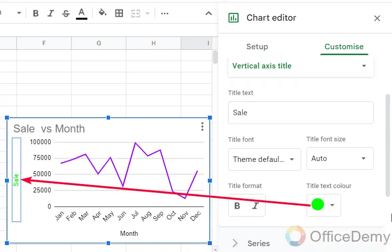
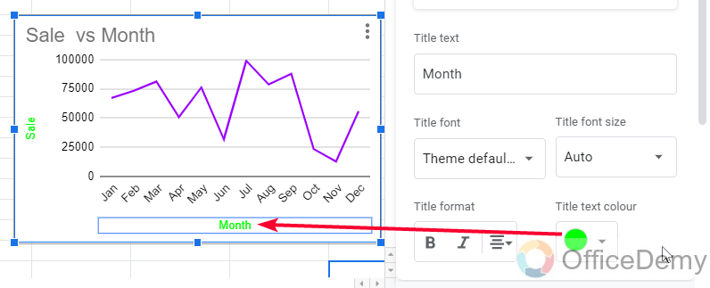
Now change the colors for vertical and horizontal axis titles (these are the axes title texts of your chart), here we have Sale and Month as our horizontal and vertical axes titles, to change their colors, simply double-click on the axis text and then will be accessed to the dropdown from which you can change the “Title text color” to any color you want, it’s same for both axes.
Step 6
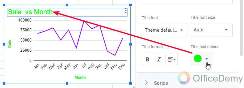
Now, another important attribute is the chart title (the Chart title is an auto-generated title for your chart, although we can edit it by double-clicking and then editing), to change its color simply double-click on it, and change its color from the “Title text color” drop down.
Step 7
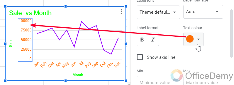
Now, we have to change the text color of our chart, we primarily have vertical and horizontal text, so simple we need to double-click on the text on the vertical axis, here it’s the sale value of each segment. You will see a “Text color” drop-down and it will change the text color of the axis you double-clicked.
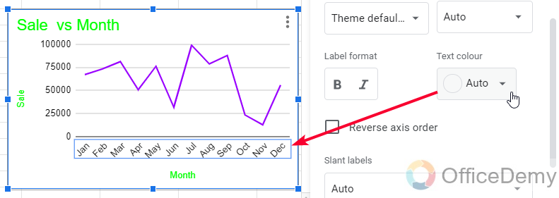
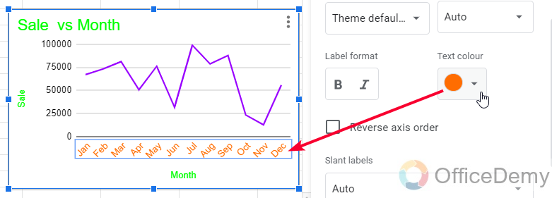
Note that both vertical and horizontal axes text can be changed using the same method.
Step 8
Now, you may want to add a background color to your chart (the background color is white by default so it does not appear, we can add any color for the background of our chart). Go to Chart editor > Customise tab > Chart Style and the first dropdown is “Background color”, we can use this dropdown to give a background color to our chart.
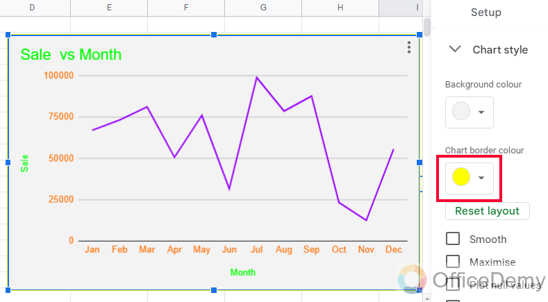
Step 9
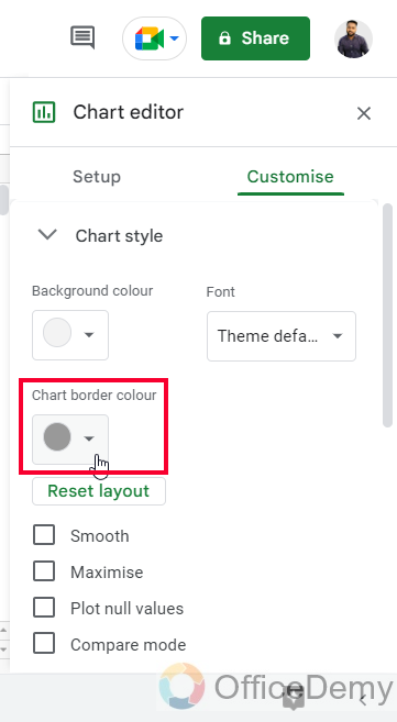
Below the background color, we have the “Chart border-color” drop-down, we can pick a color here to set as the outermost border color of our chart.
Step 10
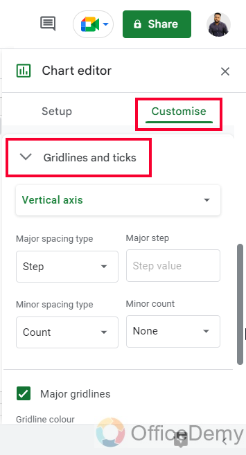
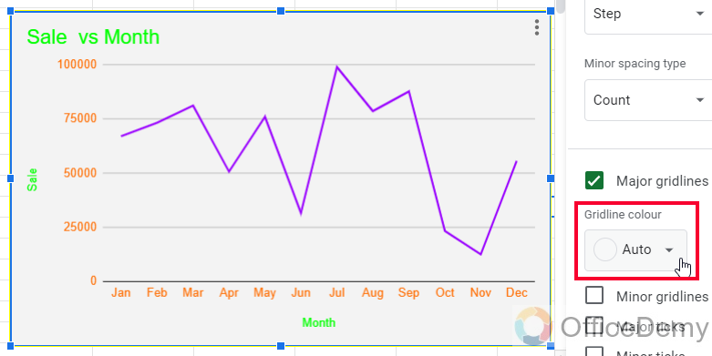
Last but not least, the color of gridlines (Gridlines are the horizontal lines in the background empty area of our charts, they are by default black color just like the text color, we can change their colors to make them look more branded). To change the gridlines color, go to Customise tab and go to the last drop which is “Gridlines and ticks”, inside this we have a drop-down “Gridline color”, use this drop-down to give any color to your gridlines.
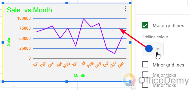
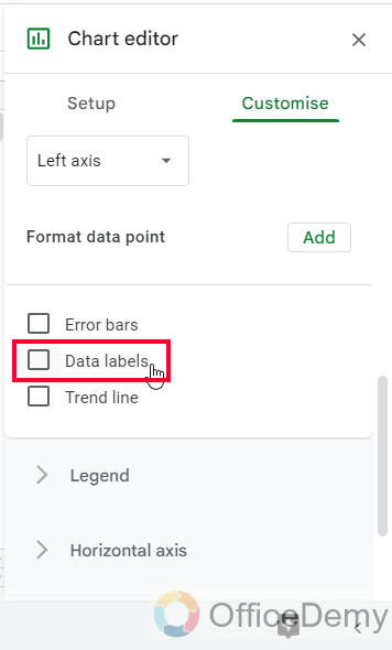
Now, we have completely changed our chart and now it looks personalized and customized. We may have error bars, data labels, and trendlines in our chart, can we change those colors as well? Yes, we can, for the error bars colors there is no option to control the color, it takes a lighter color very close to the series color, as you can see in the chart.
Step 11
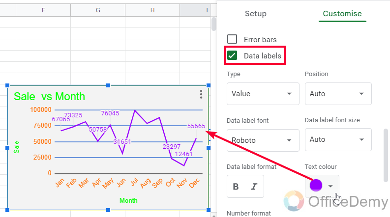
We can enable data labels inside the series drop-down, and then we have a “Text color” drop-down to change the color of data labels.
Step 12
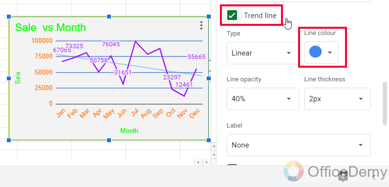
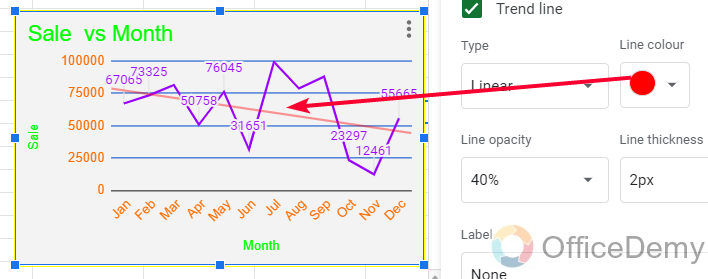
Similarly, we can enable the trendline inside the series drop-down, and then we have a “Line color” dropdown to change the color of the trendline.
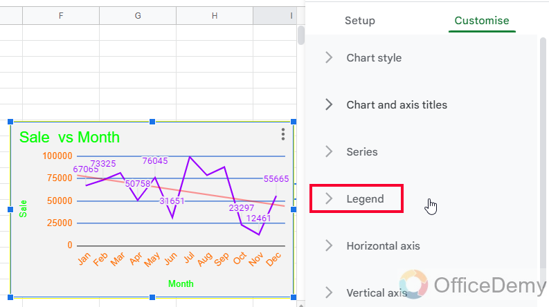
One more thing, we may have a legend in our chart, so can we control the legend color? Of course, we can, Google sheets never disappoint us by not giving tons of editing and customization options.
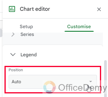
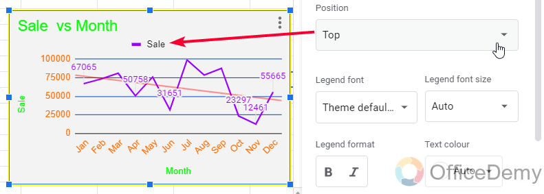
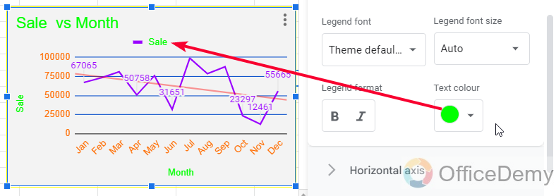
Step 13
Legend’s position can be changed other than “Auto” to make it appear on the chart, then we have a “Text color” drop-down to change the text color of the legend, note that the dot color by default comes from the color of the series, so we can only change the color of the text that is inside our legend body.
Notes on How to change color of chart in Google Sheets
- We cannot change the color of error bars and legend icons; they are default colors inherited from the series color to discriminate between multiple series in a single chart.
- We can also use a custom color, and pick a lighter or darker version of any color by HEX values or by the color code in the custom option inside the color box.
- Most of the time we do not use a background color for charts, by default there is no color in the background, but if you want to use a background color, I will recommend a lighter version of that color.
- We don’t have the option to use gradients within charts.
Frequently Asked Questions
Can we export colors from a theme to make a customized chart?
No, currently there is no feature in Google sheets to export theme colors from an image or a presentation unlike Google Slides and Google Data Studio.
Conclusion
So today, we learned how to change color of chart in Google sheets, we have seen a simple but common type of chart in Google sheets and we saw each attribute of it and then we changed colors for each attribute to make a branded chart based on four colors what we assumed as our brand color earlier in this article. I hope you have learned something new from this article, and now you will not face any problem creating and designing customized charts in Google sheets with your brand colors.
For more learning tutorials for Google Suits and Microsoft Office suite, I would recommend you to subscribe and keep in touch with us to boost your learning and improve your Office skills. Thank you


