
To Make a Map Chart in Google Sheets
- Select the data range.
- Go to the Insert tab.
- Click on the Chart option.
- Open Chart editor.
- Change the chart type to a map chart.
- Customize the chart.
Google Sheets has always proven, that when analyzing any kind of data, if it is talk of Geographical data or any geo analysis then Google Sheets has enough tools and features to analyze data. If you have data for a lot of countries, then it is good to represent it on a Map chart in Google Sheets. Here is the complete guide on how to make a map chart in Google Sheets.
Benefits of Making a Map Chart in Google Sheets
Most of the benefits of making a chart in Google Sheets is that you can show any complex data in a simple, concise, and graphical way.
Similarly, if you have geographical data in your Google Sheets then you can show it on a map chart instead of text to better understand. It takes less time to read and attracts the readers.
How to Make a Map Chart in Google Sheets
The procedure of making a map chart in Google Sheets is so easy, just you must have a data set of different locations simply you can create a chart from the insert tab and then change it to a map chart from the chart type. Follow the following instructions to make a map chart in Google Sheets.
Step 1
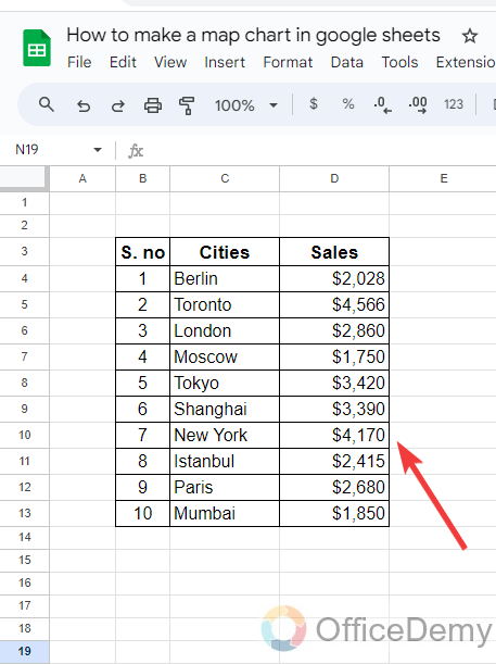
To make a map chart in Google Sheets, first, we will need such data that contains city names as you can see in the following picture, we have sample data in which there are different cities are listed with their sales.
Step 2
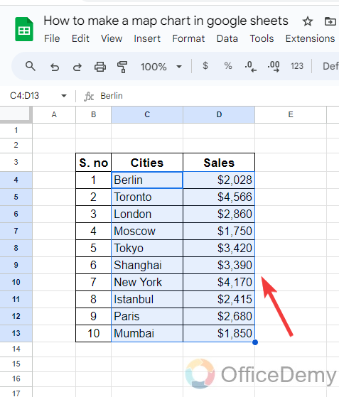
To make a map chart in Google Sheets, first, you will have to select all these data as I have selected in the following picture.
Step 3
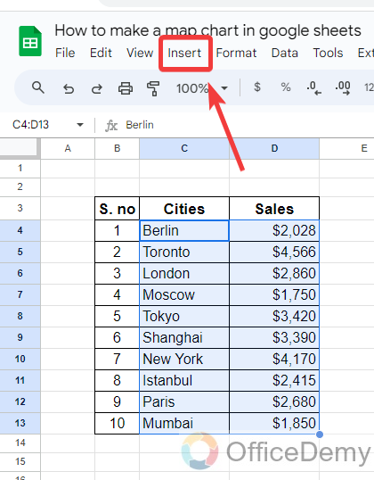
After selecting the data, go into the “Insert” tab from the menu bar of Google Sheets as highlighted in the following screenshot.
Step 4
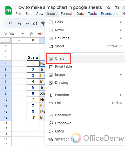
When you click on the “Insert” tab from the menu bar, a drop-down menu will open where you will see a “Chart” option through which you can insert a chart in Google Sheets.
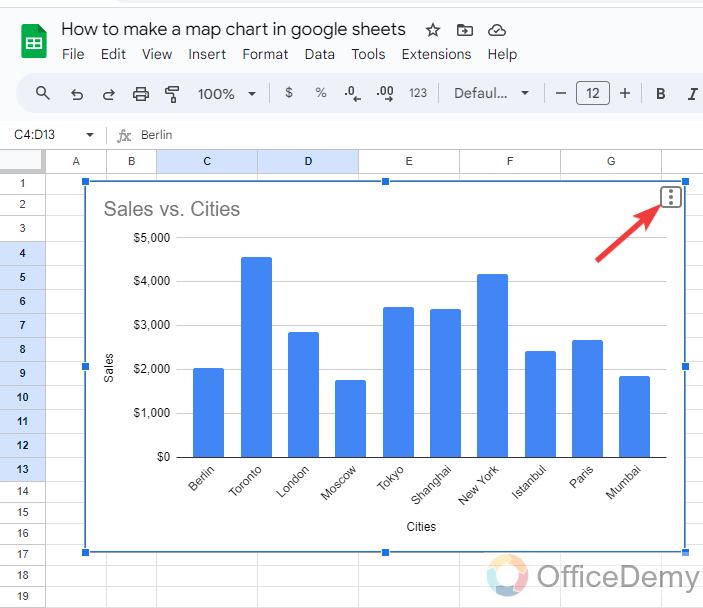
Step 5
When you click on the “Chart” option, a chart will be inserted instantly into your sheet as can be seen in the following picture. But it is a bar chart to change chart type click on the three dots option located at the right top corner of the chart.
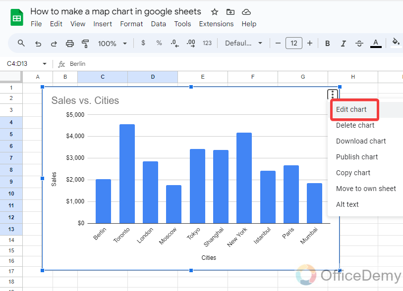
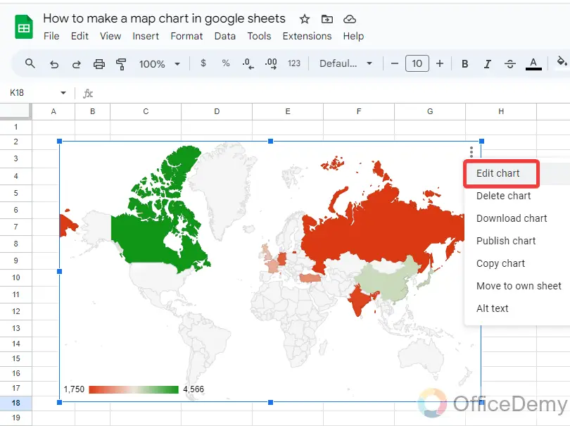
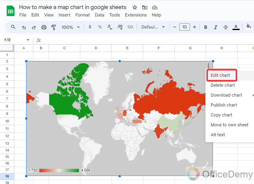
Step 6
When you click on this three-dot option, a small drop-down will open in which you will find an “Edit chart” option. You can customize your chart with the help of this option.
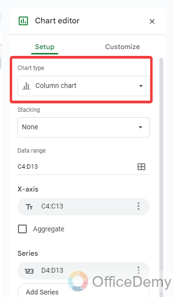
Step 7
When you click on the “Edit chart” option, a pane menu will open at the right side of the window where at first you will find a “Chart type” option as highlighted in the following picture.
Step 8
When you click on this “Chart type” drop-listed option, you will see different types of charts in the pane menu, we need to make a nap chart in Google Sheets so here we will select a map chart type.
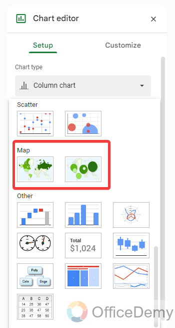
There are two types of map charts in Google Sheets, let me show you the preference of both chats one by one.
Step 9
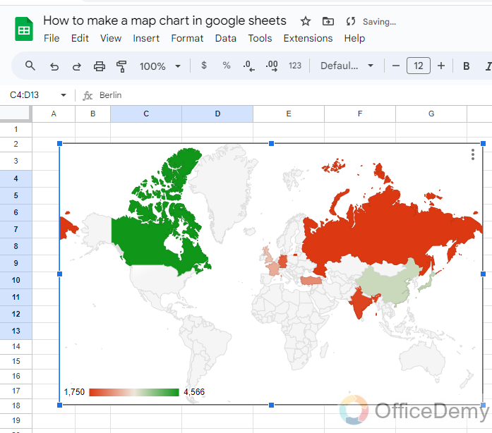
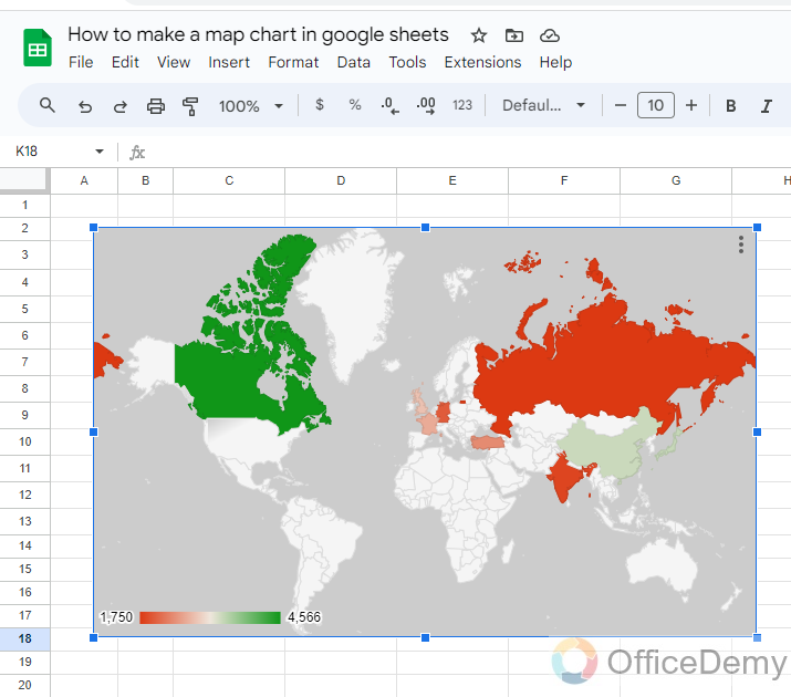
The first map chart will highlight the region according to the given data of cities and values as we can see in the following example.
Step 10
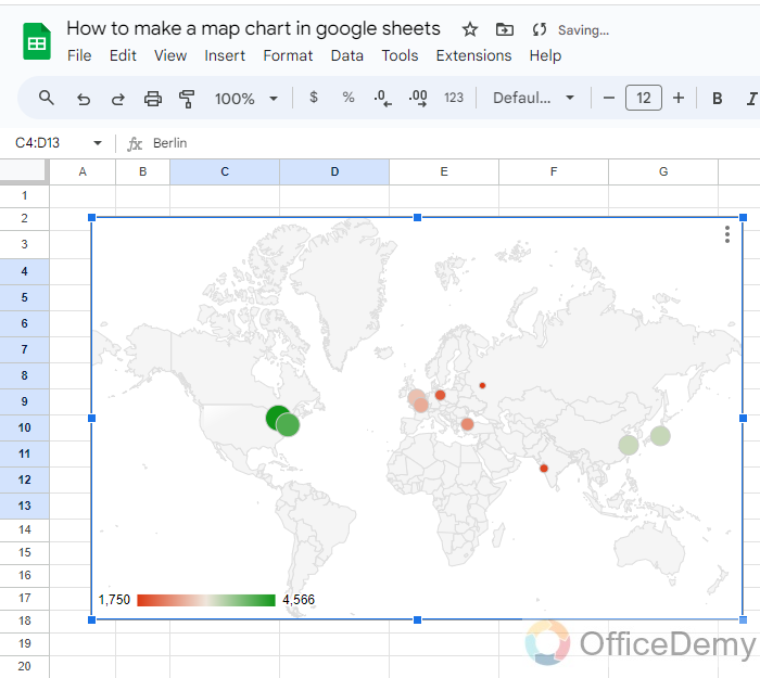
In this type of map chart, a pointing circle will be laid down on the specified places with small and large sizes according to the values as can be seen in the following example.
In this way you can create a map chart in Google Sheets, it’s up to you which map chart you prefer according to your data.
Frequently Asked Questions
How to change the background color of a map chart in Google Sheets?
By default, when we make a map chart in Google Sheets, its background color is white, but you can bring variations in the background color of the map chart if needed. You can make it more attractive and create a drawing by changing its background color. Google Sheets provides so many options for customization of charts in the same way changing the background color of a map chart is not a difficult task. If you also want to change the background color of your map chart, then below are the steps to change the background color of the map chart in Google Sheets.
Step 1
Once you have created a map chart in Google Sheets, to change the background color of the map chart, you will have to open a chart editor by clicking on the three dots option and then click on “Edit chart” from the drop-down menu.
Step 2
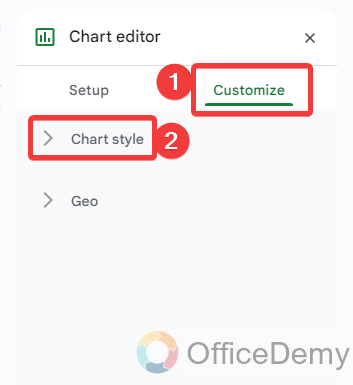
When you click on the “Edit chart” option, you will see a chart editor on the right side of the window. Click on the “Customize” tab on this chart editor and then click on “Chart style” as directed below.
Step 3
In this “Chart style” option, you will find a “Background color” option as highlighted in the following picture. You can easily change the background color of your chart by selecting your desired color from this option.

Step 4
As you can see from the result in the following picture, I have changed the background color of my map chart.
How to customize the region in the map chart in Google Sheets?
When you create a map chart in Google Sheets, have you noticed? You would see the entire world map in front of you while your data only belongs to a specific region but still, you will see the entire world map chart in Google Sheets. Don’t worry, in Google Sheets, there is also a featured option through which you can display a specific region in your chart. Let’s suppose if your data only belongs to the “Europe” region then you can select the “Europe” region with the help of the following steps to display only a Europe region in your map chart in Google Sheets.
Step 1
Firstly, open the chart editor by clicking on three dots option, when you click on three dots option a drop-down menu will open click on the “Edit chart” option.
Step 2
A pane menu to edit the chart will appear on the right side of the window, go into the “Customize” tab. When you click on the customize tab you will see a “Geo” option as highlighted in the following picture.
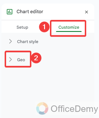
Step 3
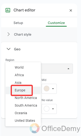
When you click on this “Geo” option, it will expand down into several options. In these options, you will see a “Region” option as highlighted in the following picture through which you can customize the region in your map chart.
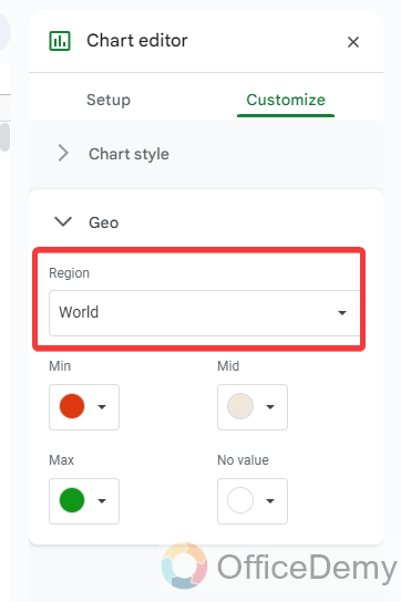
Step 4
As you can see in the following picture there are different regions specified in the drop-listed menu, you can select any one of them to zoom out. I am selecting “Europe” in the following example.
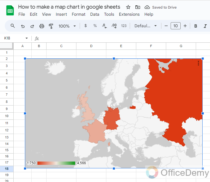
Step 5
The result is in front of you, the “Europe” region has been highlighted on the map chart in Google Sheets.
Is the Process of Making a Pareto Chart in Google Sheets Similar to Making a Map Chart?
Creating a google sheets pareto chart and making a map chart are distinct processes. While a Pareto chart visually represents the cumulative importance of different factors, a map chart showcases geographic data through color-coded areas or markers. These two chart types serve different purposes and require separate steps to generate accurate visualizations.
How to download a map chart in Google Sheets?
A: We all know that, basically a map chart is used to represent data graphically on the map of the world. But sometimes you may need to present this data to someone else privately or you may need to share it with someone or print it out, etc. due to which you may need to download your map chart separately in Google Sheets. This can be done so easily as well in Google Sheets because Google Sheets also has the option to download your chart in different file formats. Let me show you practically how to download a map chart in Google Sheets.
Step 1
To download a map chart in Google Sheets, you will have to click on the three dots option where you will see a “Download chart” option as highlighted below.
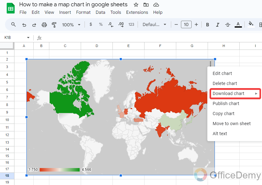
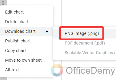
Step 2
Clicking on this download chart option will give you another expand menu where you will see the file format and select the file format for your chart. Your chart will be downloaded in the selected format.
Conclusion
We have learned how to make a map chart in Google Sheets, we have also discussed the customization of the chart. If you have such geographical data in your Google Sheets then you may also try the above tutorial, hope it will be helpful to you.


