
To Make a Bar Graph in Google Sheets
- Prepare your Data.
- Go to Insert > Chart > Pick “Bar Graph“.
- Customize the bar graph as needed.
- You can set titles, axis labels, and other formatting options from the Chart Editor.
In this article, we will discuss about how to make a Bar Graph in Google Sheets using single, double and triple bar graphs.
What is Bar Graph in Google Sheets?
Google Sheet is an online spreadsheet software that is used to keep records of large amount of data and utilize as well as manage that data. The purpose of storing data is mostly to help with the observation of data in order to make future decisions and amendments. For that purpose, we often make charts and graphs to utilize a large amount of data in a proper and precise form to get a better visualization as well as summary. Bar Graphs are used to show summary of data in the form of vertical or horizontal bars for user to analyze the data briefly. There are multiple types of Bar Graphs. These graphs may hold different number of values in them. Single Bar Graphs take one set of values, while Double and Triple Bar Graphs take two and three set of values respectively. Different Bar Graphs are adopted with the different problems and requirements of user.
Google Sheets facilitates the users to make Bar Graphs with just a matter of clicks without much effort and automates the work. Bar graphs can be made instantly and accurately using Google Sheets.
In this article, we will discuss the following about Bar Graph in Google Sheets:
- Single Bar Graph in Google Sheets
- Double Bar Graph in Google Sheets
- Triple Bar Graph in Google Sheets
The method for setting up above mentioned types of Bar Graphs are explained in an easy way below and step by step procedure and screenshots have been provided for the ease of users. Also multiple methods are explained for better understanding of the content.
Use Cases of Bar Graphs in Google Sheets
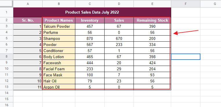
We may have a worksheet which has plenty of data on sales and inventory on a specific month of a shop. We would like to utilize that data for making future plans of filling inventory and stocking. Remember that the sales data of shop exceeds hundreds and thousands, and it is quite a difficult task to analyze them one by one by their corresponding entries. It will be much better if could analyze them on a glance in some kinds of symbols. There are so many kinds of charts and graphs that helps represent that data in properly summarized form. Here we can use Bar Graph to represent that data and analyze it easily.
Let us say that we have the following worksheet as:
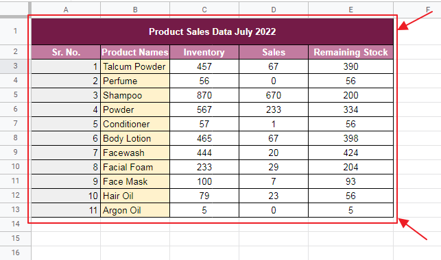
We can clearly see that it has plenty of products and 3 columns. Checking each column value for every product for analyzing would take quite a while for the whole worksheet. Easy way is that we make a Bar Graph and analyze the values in a visual way which is easier and more accurate to get a general summary of the Shop Records.
Let us demonstrate the method and use of Bar Graphs below.
How to Make a Bar Graph in Google Sheets
There are multiple ways to use Bar Graph in Google Sheets. For example, our Bar Graph may only consist of a single column values or multiple columns.
Let us discuss some for the above methods for the worksheet above:
How to set up a Bar Graph in Google Sheets
Step 1: Open the Google Sheet which contains the data to be made into a Bar Graph.
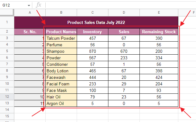
Step 2: Select the column which needs to be made up in a Bar Graph as well as the column which contains the product names for those values of sales for the purpose of displaying the name of product alongside.
You can select by dragging the mouse over the cells of one column, pressing Ctrl key and then select the other columns cells by dragging the mouse over the cells.
Here we select the column of Product Names and Inventory for Bar Graph making as:
Selected cells will highlight in blue color.
Step 2: Now make the Bar Graph using one of the method below:
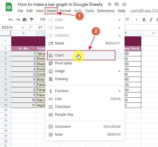
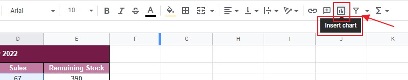
Method 1: Click on the Insert Chart icon as:
Method 2: Follow the steps as:
Insert -> Chart
Insert the chart using Insert Toolbar as:
Just as you click Charts, selected cells will make a summarized chart view as:
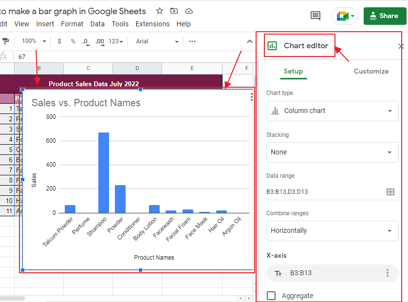
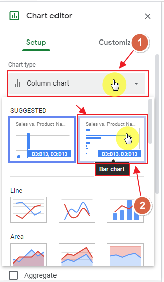
Step 3: Set up the Chart as Bar Graph.
The chart that initially appear is Column Chart. Since we want to set up a Bar Graph, let us select Bar Chart from Chart Editor by clicking Chart Type dropdown as:
You will get the Bar Graph instantly as:
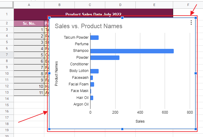
Which is the required Bar Graph based on the set of values given.
Step 4: We might need to customize the Bar Graph based on our requirements.
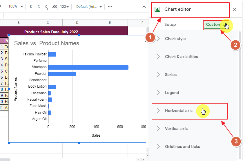
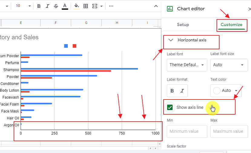
Here, let us apply horizontal X-axis line following the method below:
Go to Chart Editor and select Customize and further Horizontal Axis as:
Chart Editor -> Customize -> Horizontal Axis
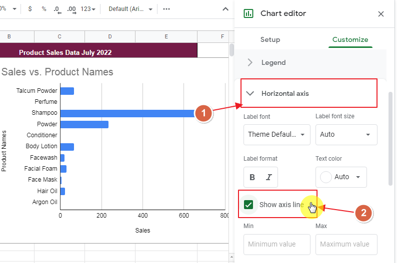
From the Horizontal Axis dropdown menu, check “Show Axis Line” and X-axis line will instantly show in Bar Graph as:
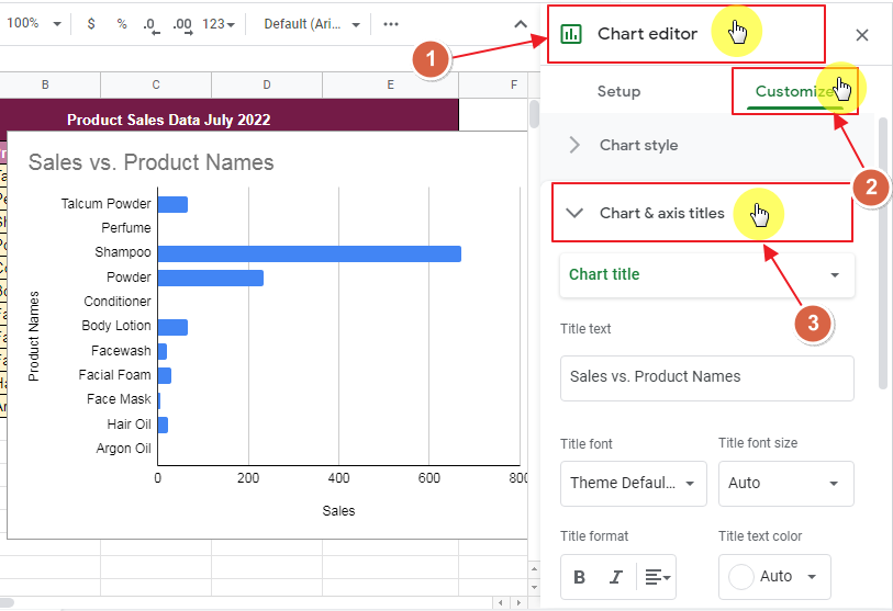
Step 5: Set up Chart and Axis Names if required.
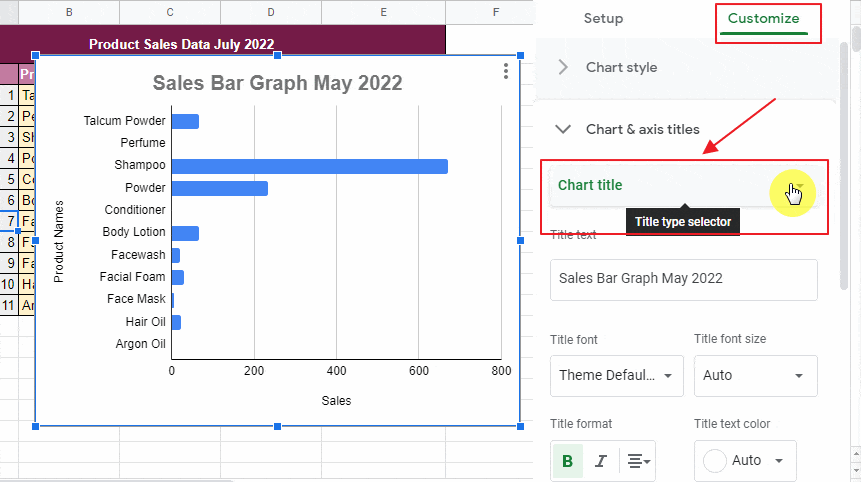
Here the name of chart by default is Sales Vs Product Names, while axis are Product Names and Sales. We would like to change the name of chart to Sales Bar Graph May 2022 and Y-Axis should be Products. We can change the names by following the method below:
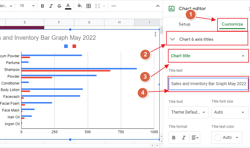
Go to Chart Editor and then Customize option. Within Customize, choose Chart and Axis Title as:
Chart Editor -> Customize -> Chart and Axis Title
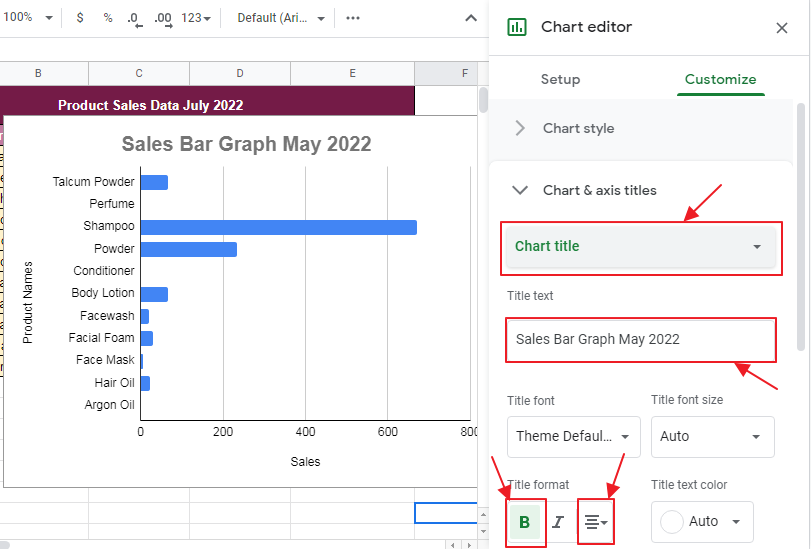
Now type in the title of your choice as:
Also, set up the Y-Axis title as:
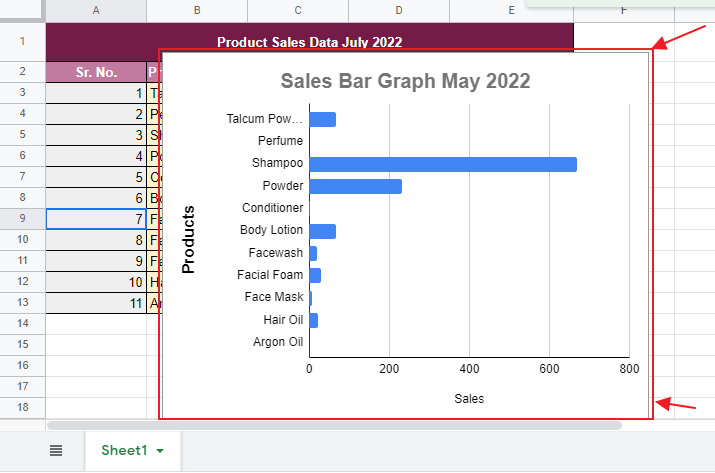
We have the final output of Bar Graph as:
How to make a Double Bar Graph in Google Sheets
Step 1: Open the Google Sheet which contains the data to be made into a Bar Graph.
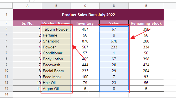
Step 2: Select the columns which needs to be made up in a Bar Graph as well as the column which contains the product names for those values of sales for the purpose of displaying the name of product alongside. Here we are selecting two columns for numerical data as we are making double bar graph and another one column for product’s names values.
You can select by dragging the mouse over the cells of one column, pressing Ctrl and then select the other columns cells by dragging the mouse over the cells.
We are selecting the columns of Product Names, Inventory and Sales for Bar Graph making as:
Selected cells are highlighting in blue color.
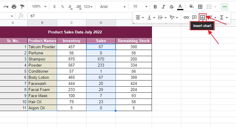
Step 2: Now make the Bar Graph using one of the method below:
Method 1: Click on the Insert Chart icon as:
Method 2: Follow the steps as:
Insert -> Chart
Just as you click Charts, selected cells will make a summarized chart view as:
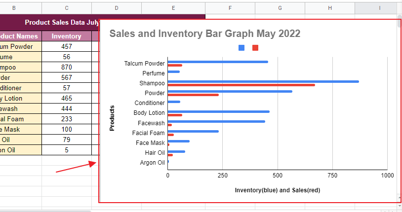
We see Red Bar represents Sales while Blue Bar represents Inventory data.
Step 3: We may need to customize the Bar Graph based on our requirements.
Here, let us apply horizontal X-axis line following the method below:
Go to Chart Editor and select Customize and further Horizontal Axis as:
Chart Editor -> Customize -> Horizontal Axis
From the Horizontal Axis dropdown menu, check “Show Axis Line” and X-axis line will instantly show in Bar Graph as:
Step 5: Set up Chart and Axis Names.
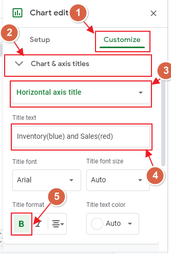
Here the name of chart by default is Inventory and Sales, while axis are Product Names and X-Axis does not have a title. We can change the name of chart to Sales and Inventory Bar Graph May 2022 and Y-Axis should be Products while X Axis “Inventory(Blue) & Sales(Red)”. We can change the names by following the method below:
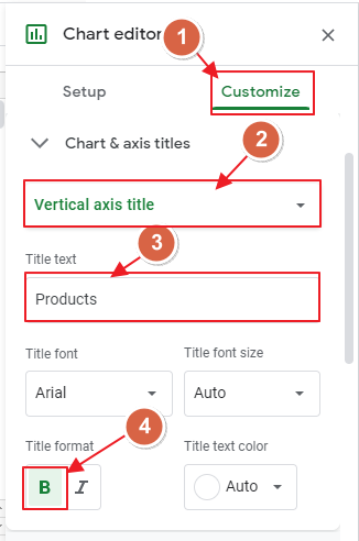
Go to Chart Editor and then Customize option. Within Customize, choose Chart and Axis Title as:
Chart Editor -> Customize -> Chart and Axis Title
And then type the title of your choice as:
Also, set up the X-Axis and Y-Axis titles in the same way as:
X-Axis setup:
Y-Axis setup:
We have the final Bar Graph as:
How to make a Triple Bar Graph in Google Sheets
Step 1: Open the Google Sheet which contains the data to be made into a Bar Graph.

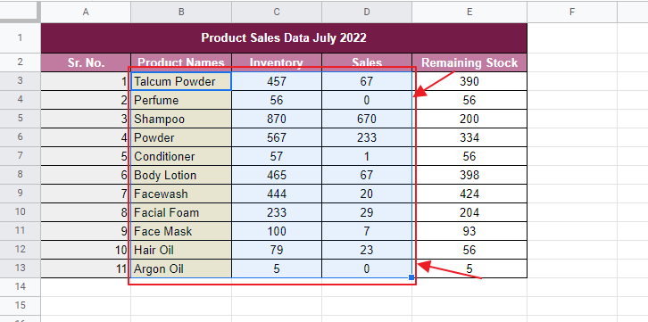
Step 2: Select the columns which needs to be made up in a Bar Graph format as well as the column which contains the product names for the purpose of displaying the name of product alongside. We are selecting three columns for numerical data as we are making Triple bar graph and another one column for product’s names values.
You can select by dragging the mouse over the cells of one column, pressing Ctrl and then select the other columns cells by dragging the mouse over the cells or by typing the range of cells to be selected in Name Box.
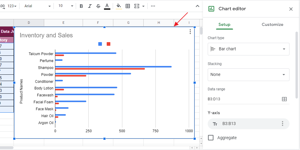
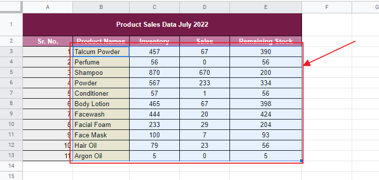
We are selecting the columns of Product Names, Inventory, Sales and remaining stock for Triple Bar Graph making as:
Step 2: Now make the Bar Graph using one of the method below:
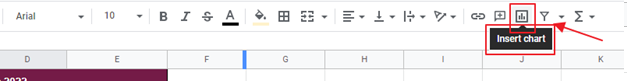
Method 1: Click on the Insert Chart icon as:
Method 2: Or Follow the steps as:
Insert -> Chart
Just as you click Charts, selected cells will make a summarized chart view and provide Chart editor as:
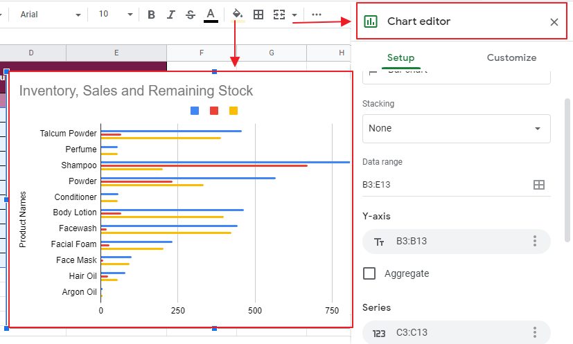
We see Red Bar represents Sales and Yellow Bar represents Remaining Stock while Blue Bar represents Inventory data.
Step 3: We may need to customize the Bar Graph based on our requirements.
Here, let us apply horizontal X-axis line following the method below:
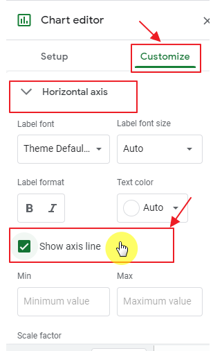
Go to Chart Editor and select Customize and further Horizontal Axis as:
Chart Editor -> Customize -> Horizontal Axis
From the Horizontal Axis dropdown menu, check “Show Axis Line” and X-axis line will instantly show in Bar Graph.
Step 5: Set up Chart and Axis Names.
We can change the titles of Chart as well as Horizontal and Vertical Axis using the same method earlier.
Go to Chart Editor and then Customize option. Within Customize, choose Chart and Axis Title as:
Chart Editor -> Customize -> Chart and Axis Title
And finally type the title of your choice. Same procedure for the Horizontal and Vertical Axis.
X-Axis setup:
Y-Axis setup:
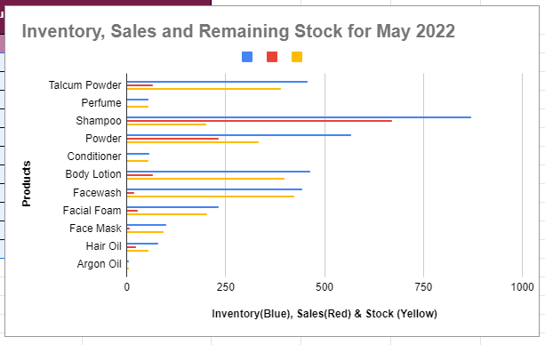
After setting titles, Triple Bar Graph has been finalized as:
Notes to Remember to Make Bar Graphs in Google Sheets
- You can delete the Graphs and Charts by clicking on the triple dot icon on the chart and then select Delete Chart.
- You can download the Graphs and Charts by clicking on the triple dot icon on the chart and then select Download Chart. You may save it as an png or jpeg file and use it later.
- Ctrl+Click multiple cells allows multiple selection of cells at a time.
Conclusion
Google Sheets Bar Graph feature allows us to create and use summary of large amounts of data in a concise manner efficiently. It enables user to find summary of large documents at a glance and hence save up a lot of precious time of user. Bar Graph can be applied in multiple ways. User may use single, double or Triple column valued Bar Graphs according to the requirements of problems and situations. Multi-column valued Bar Graphs allow user to find comparison between the different set of values very easily for a single product or item. It helps finding the differences between sets of values in the form of visualization which is much easier than going through each sets of values carefully and eventually automates the work.
In this article, multiple methods for the following topics of Bar Graph are described in an easy manner:
- how to set up a Bar Graph in Google Sheets?
- how to make a Double Bar Graph in Google Sheets?
- how to make a Triple Bar Graph in Google Sheets?
Any queries about the above described topics are most welcomed. Feel free to comment below for any questions or suggest a topic you want us to describe next. Stay tuned for more!
Thanks for Reading!


