
To Make a Beautiful Chart in Google Sheets
- Select Data.
- Go to Insert > Chart > Selet any Chart.
- Following are the types of Charts you can make in Google Sheets: Line Charts.
- Area Charts.
- Column Charts.
- Bar Charts.
- Pie Charts.
- Scatter Charts.
- Map Charts.
In this article we will learn about how to make a beautiful chart in Google Sheets.
As I talked in the previous article about the complete guide of google sheets charts, I have brought this comprehensive guide for you to learn everything about google sheers charts, in this article we will learn how to make beautiful charts in google sheets. This is a comprehensive guide that covers some mostly used charts, we will discuss the chart editor box in detail, we will see the different customization options for different charts, and much more.
Use Cases of Charts in Google Sheets
When working with charts, we need some knowledge and we need to have some good practice with a chart to make a beautiful and responsive chart, now responsive chart means that the chart we designed should communicate and interact with the reader, it should be as simple as the user reads it and quickly able to understand what this chart is about and what this chart is trying to define. So, in simple words, the chart we make for ourselves should be equally understandable by others as well.
A good chart is communicative and user-friendly, it should not be over-designed or under-designed, it must be beautiful so that a user can view it and should like it, and must be easy and quick to deliver the message for which the chart is designed. In this article, we will talk about some tips, tricks, methods, hacks, and common practices to make beautiful charts in google sheets.
How to Make a Beautiful Chart in Google Sheets
To learn how to make beautiful charts in google sheets, we have designed this article into many sections. Section-wise learning is always more effective and lasts longer than mixed learning. So, let’s get started. For the sack of practical implementation, I will create a simple chart using a simple data set, and of course, I will not emphasize how to create a chart as I have covered this topic many times in this series. So I will only be discussing the customization and some techniques that help to make beautiful charts in google sheets.
Check the following articles to learn about how to make a chart from sketch using different datasets.
How to make a beautiful Line Chart in google sheets
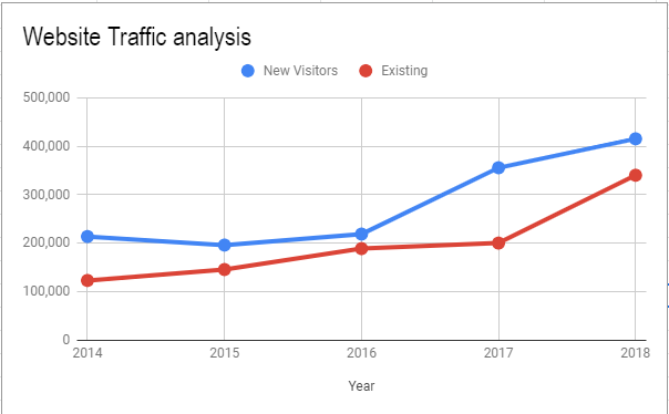
Line charts are the most commonly used type of charts in google sheets and google slides. We can plot the simplest type of data as well as some advanced and complex data into a line chart and it represents our data very beautifully with colorful lines and makes it very easy for the users to understand the data trend quite easily.
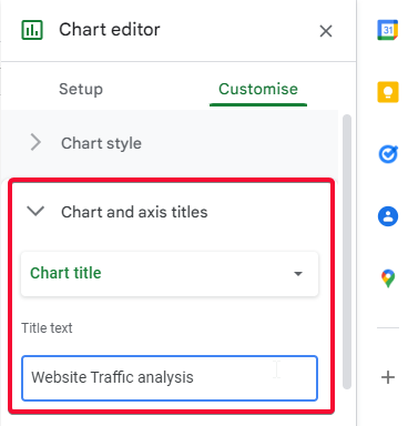
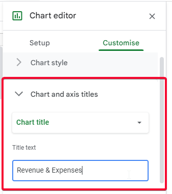
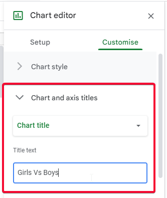
Step 1
Add a chart title
Step 2
Use minimal editing
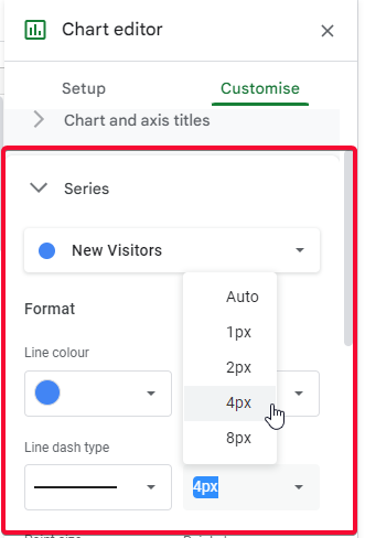
Step 3
Use lines thickness to 4px
Tip: Use a line chart when you need to display the trends of your data. Such as finding out the yearly sales trend, the profit trend, the loss trend, etc.
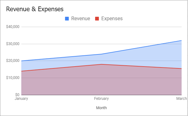
How to make a beautiful Area Chart in google sheets
Area charts are very similar to line charts, they also have lines in them but also have a thick area surface below lines making a mountain-like shape, that indicates the diversity of the data over time, if the data is changing rapidly the area will be become very inconsistent and faded up. If there is linear data and does not change rapidly the area will remain smooth.
Step 1
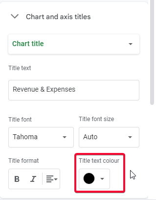
Add a chart title
Step 2
Use black text color for the title
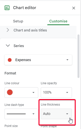
Step 3
Use lines thickness auto
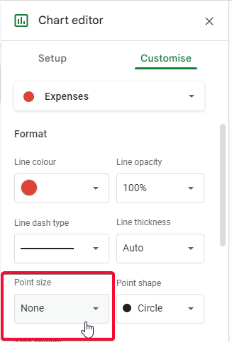
Step 4
Keep point size to none
Tip: Use an area chart to display the trends of your data over time, it is the same as a line chart but has a shaded area below the lines that shows the magnitude of the trend even when both lines intersect or overlapped.
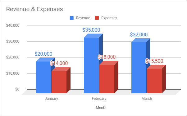
How to make a beautiful Column Chart in google sheets
Column charts are used for multiple data columns and the columns in this chart are raised and fell based on the data, the deviation in this data is calculated as the highest column minus by lowest column. Most of this chart is used in categorical data, monthly sales, etc.
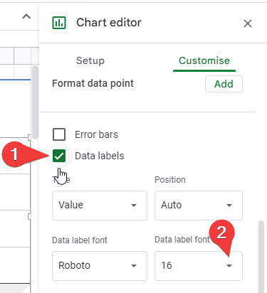
Step 1
Add a chart title
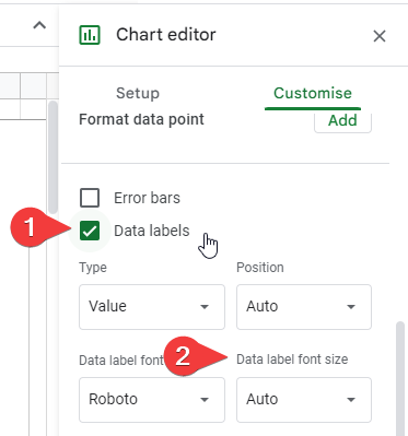
Step 2
Turn on data labels and increase the data label font size
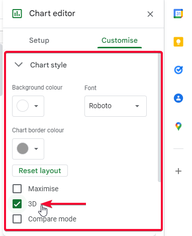
Step 3
Turn on 3D mode
Tip: Use a column chart when you want to make a comparison between two or more data sets by time or by any other factor, it’s always recommended for categorical data in which we have multiple categories.
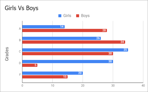
How to make a beautiful Bar Chart in google sheets
Bar charts are similar to column charts and can be used interchangeably, we mostly use a bar chart to compare individual items of the data. For example, compare items sales by location, or display a breakdown of students by their majors. The bar chart is raised from left to right side, unlike the column chart that raises in a column sequence from bottom to top.
Step 1
Add a chart title
Step 2
Turn on data labels and increase the data label font size
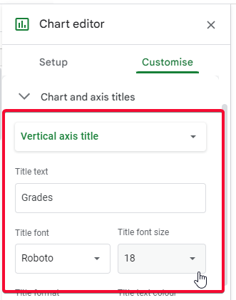
Step 3
increase the font size of the Vertical axis title
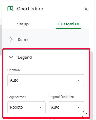
Step 4
Increase the size of the legend
Tip: Use a bar chart when you need to make an individual item comparison in a different condition, here we used the gender-based comparison of grades.
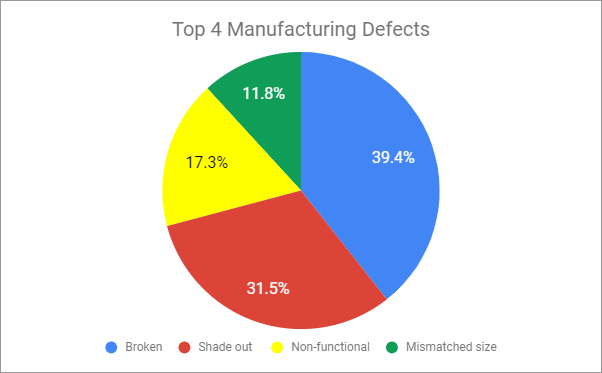
How to make a beautiful Pie Chart in google sheets
Pie charts are mostly used in market analysis and also to find out the differences of data over time, for example, to find daily top 5 manufacturing defects, now every day the defects can be changed, and also their position can be changed. To display this type of data we use a pie chart. Simply we use it to compare the different parts of the same data.
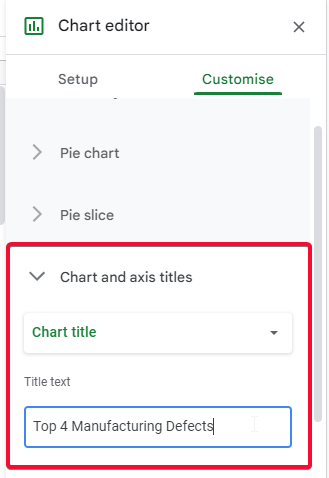
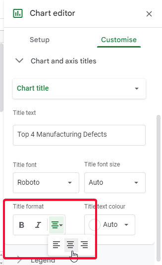
Step 1
Add a chart title and keep centered and align
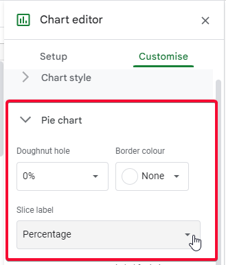
Step 2
Use percentage for slice labels
Step 3
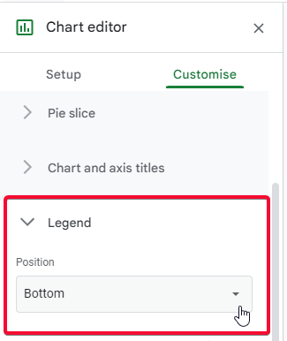
Use legend – position bottom
Step 4
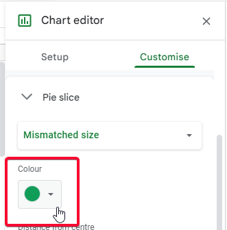
Use distinct colors for each pie slice
Tip: Use a pie chart to compare the parts of the same data, like the top 5 manufacturing defects, the contribution of different employees, comparison of different departments’ performance every month or year.
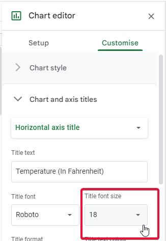
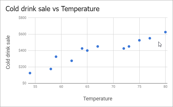
How to make a beautiful Scatter Chart in google sheets
We use scatter charts to display the numerical coordinates along the horizontal X and vertical Y axes. We use this chart to find the difference between two dependent variables, we can easily display the effect of each variable on the other variable.
Step 1
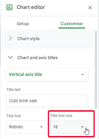
Increase vertical and horizontal axis titles size up to 16px and 18px respectively
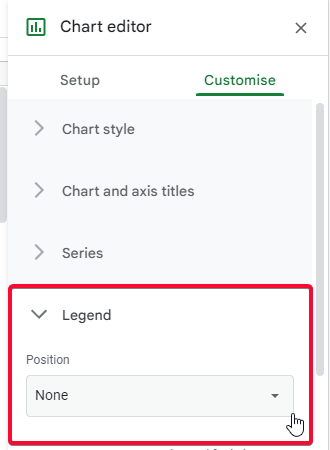
Step 2
Don’t use Legend (looks bad)
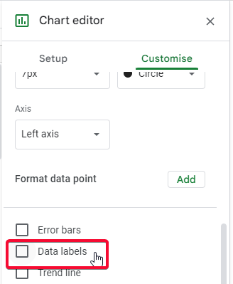
Step 3
Don’t use data labels (look bad)
Tip: Use scatter charts to display the dependency of two variables for each other, for example, the sale of cold drinks along with the different temperature scales.
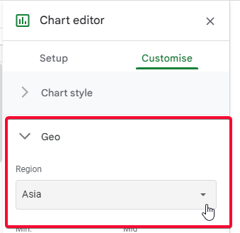
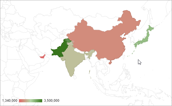
How to make a beautiful Map Chart in google sheets
We use map charts to display the geo-location or the map of any region, area, country, or city using various color, The values of that specific area is shown by several colors. The value can be anything like the number of hospitals in that area, or even the population of that region.
Step 1
Use a limited map if you have data in a certain region (e.g., Asia)
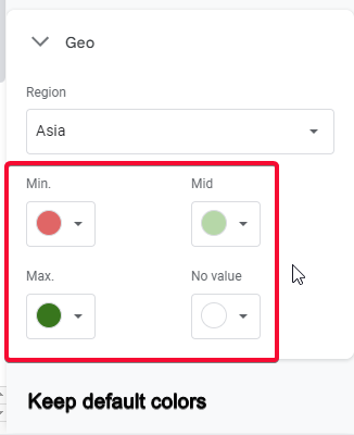
Step 2
Don’t change colors (looks bad)
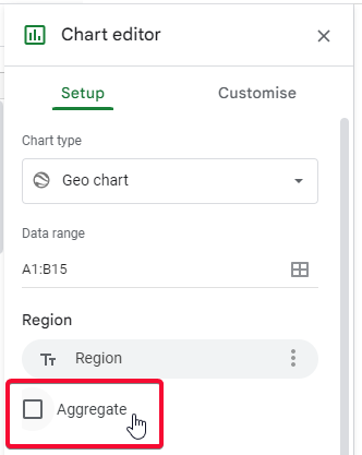
Step 3
Use the Aggregate checkbox if you want to see the number of sales
Tip: Use map charts to display the values of any data of a region, city, or country.
Notes
- Remember that the font size and colors are always your preferences, we just told you the best practices
- All the charts defined above are the main charts, we have further variations of the above charts we will see in some other article.
- The purpose of this article is to let you understand how you should make each type of chart.
- The tip with every chart is for teaching you when to use the particular type of chart.
- The customization tips taught in this lecture are not mandatory of course, you can have everything of your choice but as a newbie, we help you do what the best practice is.
- Always use the chart title to let your readers know what this chart is about
- Also, use vertical and horizontal axis titles with every chart to let readers understand what is present on the x and y axes.
- Never use a lot of colors in the chart
- always try to keep minimal details in your chart, don’t overdo it. Only keep the important detail like chart title, axes titles, legend (when needed), data labels, and error bars (when needed).
- Don’t change default colors when using map (geo) charts in google sheets
FAQ
Can I Use the Same Steps to Make a Map Chart in Google Sheets as I Would for a Regular Chart?
Creating map charts in Google Sheets follows the same steps as making a regular chart. To create map charts, utilize the Insert menu, select Chart, then choose the Geo chart option. Choose the data range, customize the chart as desired, and voila! You can now visualize your data in an interactive map chart.
What are geo charts in google sheets?
Geo charts are used for displaying the data concerning region/area/country or continent, google sheets give us a complete world map we specify the region names (spelling must be 100% correct) and google detects the region on the map, and we can easily show our data for different regions about anything like sales in a different region, traffic from different countries, business in different countries, etc.
Conclusion
This article was about the charts in google sheets, it was a comprehensive guide to teach you how to make beautiful charts in google sheets. I hope you guys enjoyed this comprehensive article. I started with the main categories of the charts in google sheets and covered seven main categories. We will surely bring the next article on this topic and will cover the sub-categories of the chart types. Also, we have not seen any chart in the others category. We will also see them and learn how they work, and how can we make them effectively and beautifully.
That’s all for this article. Thank you so much for reading. Keep learning with Office Demy and keep sharing with your social friends.


