
To Make a Dashboard in Google Data Studio
- Choose a blank report.
- Select a data source (Google Sheets).
- Set up the page size.
- Add charts and graphs.
- Customize them with your data.
- Create a header with a title and logo.
- Include filters for user interaction.
- Customize the report’s look.
- Review and finalize your dashboard.
In this article, we will learn how to make a dashboard in Google Data Studio. This tutorial includes adding elements to your dashboard and customizing your data, I will also try to cover the benefits of using Google Data Studio to visualize and represent your data more smartly. We will use two data sources, Google Analytics (sample data), and Google Sheets (any data). I am Shaiq, and I will help you get the most out of your data and improve your online presence and your business through creative and interactive dashboards that also help in your digital marketing success.
So, let’s get started. Before jumping to Google Data Studio directly, I just want to emphasize the key benefit of using Google Data Studio over other standard reporting and dashboarding tools. Google Studio provides more dynamic reports and more control over your data concerning customization and visualization.
Importance of making Dashboard in Google Data Studio
Using Google Data Studio to create dashboards, we can use so many fantastic features like date range selectors, blending options, grouping similar sources, filtering, query functions, custom fields, and so on. These features help us to create interactive dashboards, and also on the user end they help users to manipulate the data as they want and can make live scenarios of the data, we will see a couple of dashboards built using basic techniques in Google Data Studio.
We can use features like optional metric and drill down to allow a user to manipulate data and can see more data points in a single chart by just changing the data header with a single click. Google Data Studio dashboards are creator-friendly and also user friendly. We can allow or block viewers for particular actions so that the overall control of data is in the creator’s hands. So these are some good reasons to understand the need of learning how to make a dashboard in Google Data Studio. Let’s move ahead and start building a real dashboard using some sample data sources.
How to Make a Dashboard in Google Data Studio
Here, we will learn all the steps and actions required to build a good-looking and interactive function dashboard and we will also see how to share it with your audience. We will add several key points to our data and also see how to add data sources, and of course add charts elements, buttons, filters and controls, and so on. So, without any further delay. Let’s get started.
How to Make a Dashboard in Google Data Studio
Here we will see how to create the basic body of our dashboard. I will start from the very scratch so anyone can easily understand this example. Let’s go to Data Studio and start working on our first dashboard.
Step 1
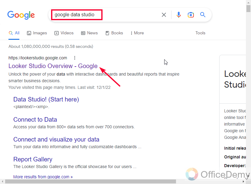
Go to the Google Data Studio home page.
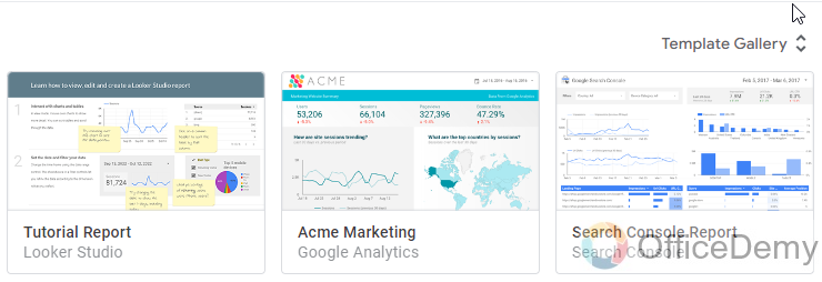
Here, you can see some starter templates on the top, and some of the recent files you have made. There are some more templates with the names of their origin, here we have Acme Marketing, E-commerce PPC, AdWords overview, and so on.
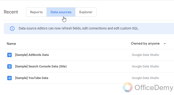
Step 2
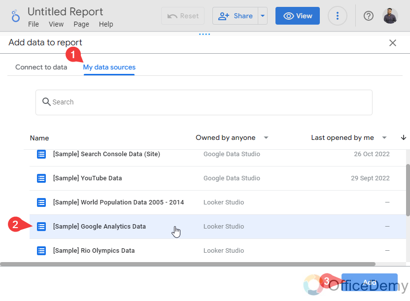
If you want to start with a sample data source, you can switch to the Data Sources tab, and then select a Data source from Google Data Studio-owned files.
Step 3
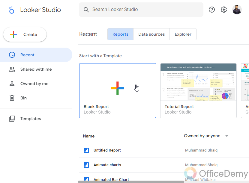
Here, I am starting with a blank Report, But, obviously if you want you can start with any template from so many available templates in the Templates Gallery, and then connect to a data source or import a template.
Step 4
A data source connectivity window will appear, select and data source and confirm it to continue.
Step 5
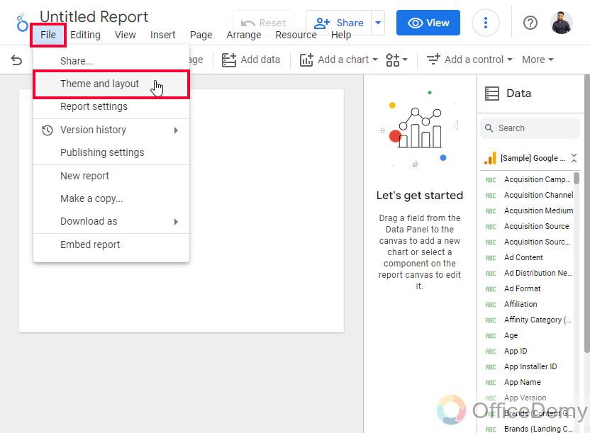
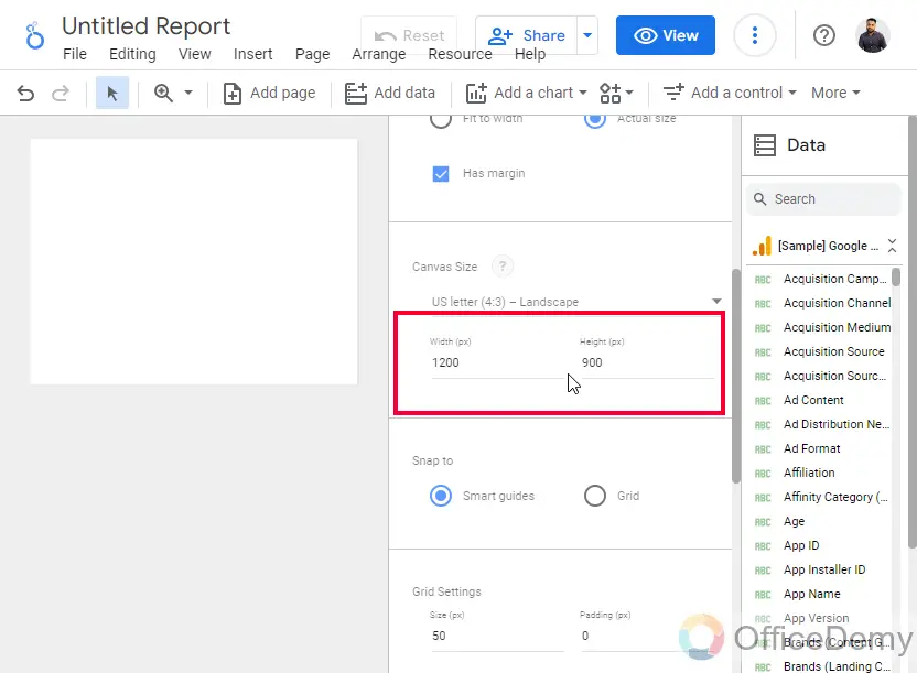
The very first action to be performed on your empty canvas is to set up the page size.
Go to File > Theme and layout > Layout > and from here you can set the width and height of the page, and also set so many things regarding your page.
Step 6
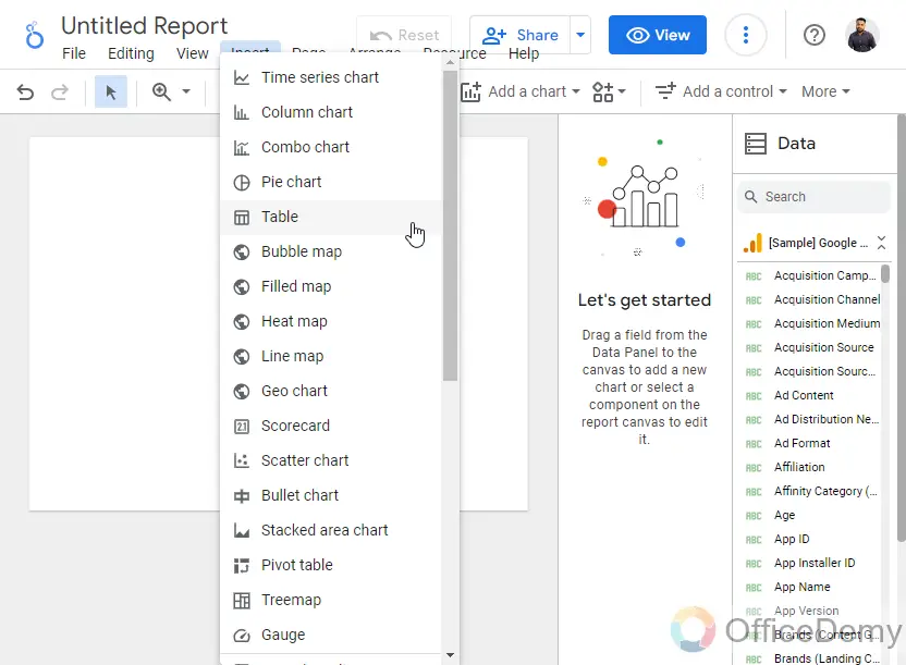
Now, it’s time to add your first chart. In the top main menu, there is a drop-down for adding a chart, click on it and pick a chart that you think is good to visualize your data.
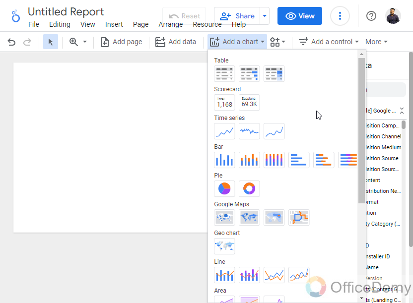
Or
Go to Insert and pick any chart from a list of charts available for free.
Step 7
For keeping it easy I am adding a scorecard here
The scorecard is the simplest form of a chart that shows the quantity of a single data value.
Add a scorecard. Go to Insert > Scorecard
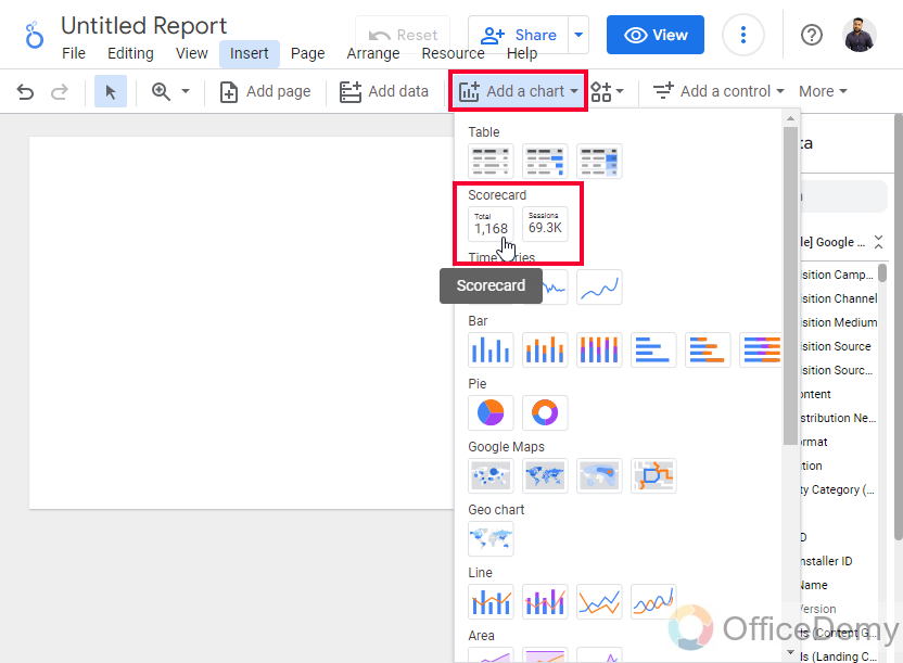
This chart shows only a single quantity, you can change the metric or dimension to show anything you want such as several new subscribers.
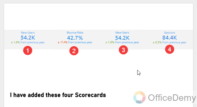
Step 8
Now you can add more scorecards, knowing that one can only show one piece of data, so if you want to show more numbers, such as several new visitors, total revenue, total cost, etc. You can add more scorecards to your report.
Step 9
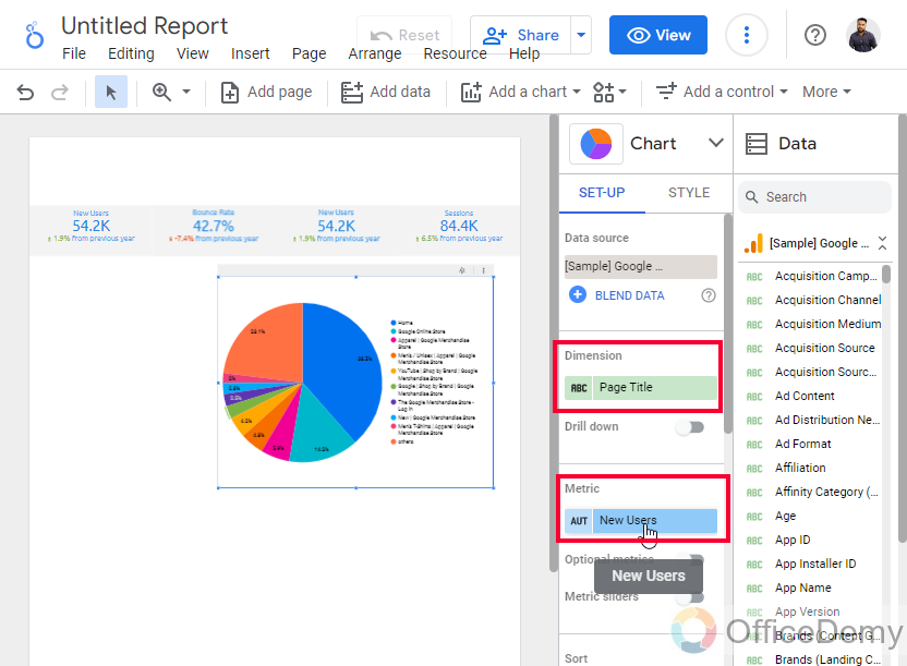
Now, let’s add a pie chart.
Go to Insert > Pie chart
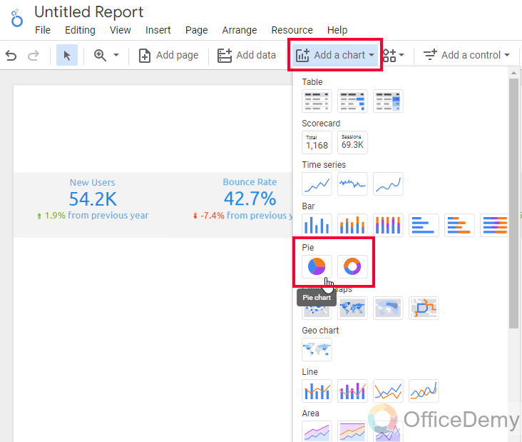
Now you can manipulate this data by changing the dimension and metrics, and you can also control the number of slices, their colors of them, their density, and much more.
Step 10
Let’s add a bar chart to show some other stats of the data
Go to Insert > Bar Chart
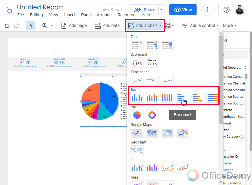
Here you can alter this chart by changing the data and styles, almost similar to styling properties with other charts.
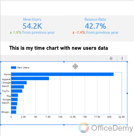
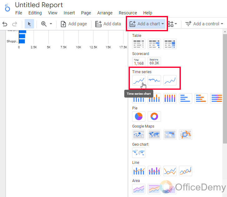
Step 11
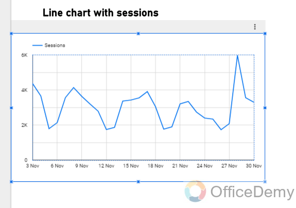
Let’s add a trendline or line chart. Insert > Time Series, and put your desired metrics and dimension to it. Note that you can customize them with colors, background colors, thickness, border colors, size, and so on
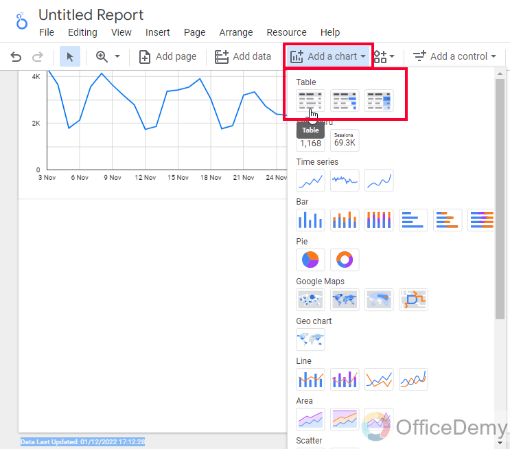
Step 12
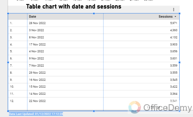
Now, let’s add tables. Tables are very essential in any dashboard. We can add a table chart from the Insert menu, and the Add a chart dropdown.
Add the table and change the metric to show whatever data you want to visualize in the table, you can control so many things in the Data and Style tabs of the table.
Now our dashboard has got some good charts and graphs, now it’s time to make it interactive and easy to understand. So, we will add some filters and controls and some content to it.
Step 13
Make space on the top, and add a rectangle to develop the header of the dashboard.
To add a shape. Go to the Shapes dropdown in the main menu, select Rectangle, and then draw it on your canvas, and then adjust its position to fit on the canvas.
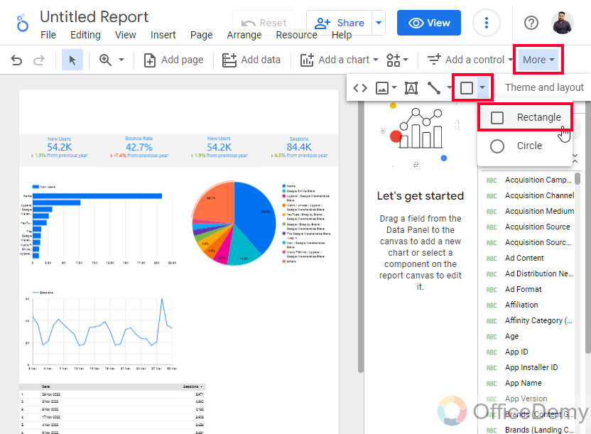
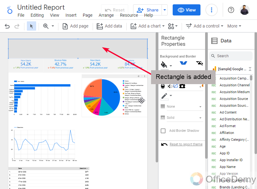
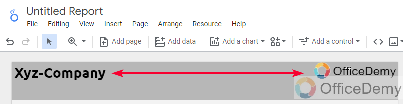
Add your theme colors, and inside the rectangle shape, add some text boxes to add some information about it. You can add a logo, a tagline, date or year, and of course the title of the dashboard.
Step 14
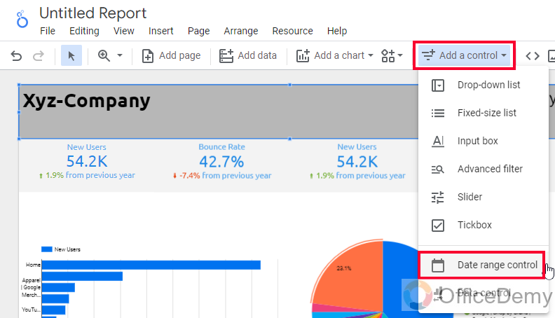
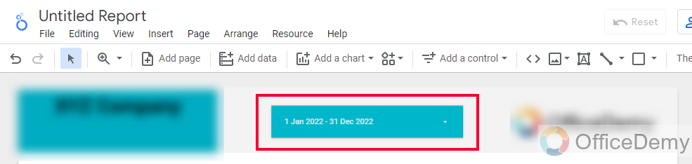
Add a date range
This is not static data; this is a visual element that can be manipulated by the user to see the data at various times
Step 15
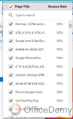
Add Filters and controls to allow viewers to manipulate the data charts such as scorecards.
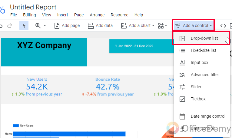
Step 16
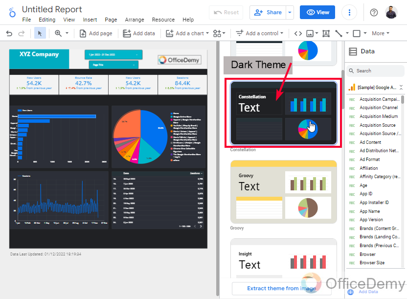
Now let’s customize the overall report as per the brand theme. Change background color, change themes, and so on.
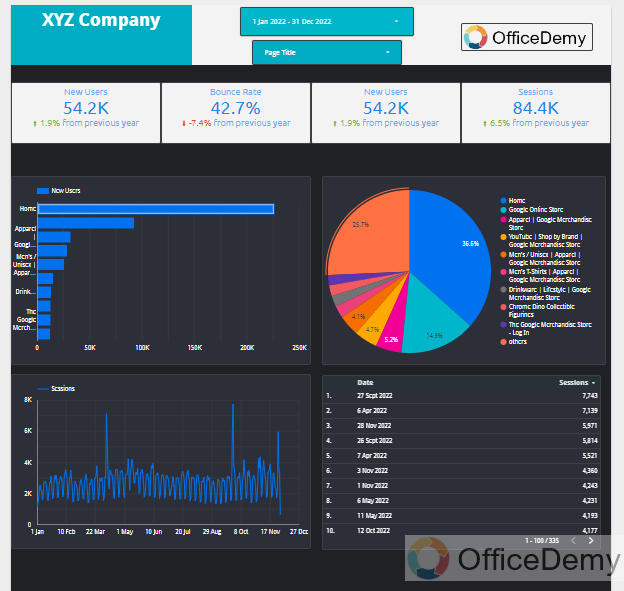
Step 17
This is how our completed dashboard looks like in Google Data Studio. I hope you like it and you can use it for free.
Get a free Dashboard template here
So, this is how to make a dashboard in Google Data Studio step by step. When we see a dashboard we see it as a complete product, but every product is made up by following the smaller steps, and this is why I tried to keep this tutorial very easy and broken into 17 easy steps to follow and to make a final dashboard like the one below. I hope you like this article, and that you have got a great understanding and practical knowledge of making a dashboard in Google Data Studio.
Frequently Asked Questions
Can I Use the Field Creation Method in Making a Dashboard in Google Data Studio?
Yes, you can utilize the field creation method in Google Data Studio when designing a dashboard. With this feature, you can generate new fields by manipulating existing ones, enabling you to transform and customize your data as desired. The field creation in google data studio provides flexibility and allows you to present your data in a more informative and visually compelling manner on your dashboard.
Can Google Data Studio Be Used to Create a Dashboard in Google Sheets?
Yes, Google Data Studio can be used for dashboard creation in google sheets. It provides a seamless integration with Google Sheets, allowing users to create visually appealing and interactive dashboards using data from their spreadsheets. With various visualization options, Google Data Studio makes it easy to analyze and present data in a dashboard format.
How to Quickly Make a Dashboard in Google Data Studio?
Simply we can add various charts and some good graphs to make an overall dashboard by adding various elements such as a header, inside header we normally keep a logo, date range, and any kind of dropdown to provide ease to the viewer or user who will interact with the dashboard after sharing, then we may add some visual elements like sidebar, lists, etc. to make the dashboard more interactive. Finally, if the dashboard looks a little difficult, you can come in handy notes with the elements. They work like a user manual to help users navigate through your dashboard. We can also customize the overall report using themes and can customize themes by changing background colors, border colors, border sizes, and so on.
Conclusion
So that’s all about how to make a dashboard in Google Data Studio. I took you through the basics and we covered everything about creating a dashboard in Google Data Studio. I started with the Google Data Studio homepage and we started a blank template, and in each step, we added components, charts, graphs, and a table to make it a complete dashboard, then we added some filters and controls, and a date range in the header section. Then we added some deco things such as a brand name, and a company logo, and inside the header, we used two controls to make dashboard data more interactive with the viewers.
I hope you like today’s article and have learned how to make a dashboard in Google Data Studio. Keep learning with Office Demy.


