
To Make a Box Plot in Google Sheets
- Generate random data.
- Calculate four values: Minimum, Lower Quartile, Upper Quartile, and Maximum using appropriate formulas.
- Select these values.
- Insert a “Candlestick chart” under the “Insert” > “Chart” menu.
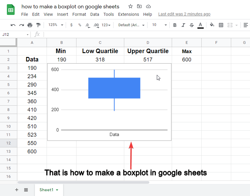
- This will create a boxplot.
In this article, we will learn how to make a boxplot in Google Sheets.
What is a Box Plot?
Boxplot is a graphical representation of any data set that has a minimum of 4 values defined. A data set that has min, max, low quartile, and upper quartile can be represented in a candlestick chart to represent as a boxplot having four values defined.
Boxplot is a built-in chart in google sheets named as a candlestick chart inside the charts. We may use it to show the four data points of a big data set to summarize our dataset to the readers. Boxplot makes it very easy and fast to read the data values from the candlestick chart and understand the dataset range.
The four required values for making a boxplot in google sheets can be calculated using built-in formulas in google sheets.
We need a minimum, lower quartile, upper quartile, and maximum value to make a boxplot for a dataset.
If you are interested to learn about how to make a box and whisker plot in google sheets, please follow the link below.
How to Make Box and Whisker Plot in Google Sheets (Best Practice)
Why do we need to learn – How to make a boxplot in google sheets?
Graphs and charts are highly engaging and readable in all kinds of data. Charts and graphs help us to represent our data that is really readable and quickly understandable by anyone reading or going through it. We have a lot of graphical presets in google sheets to represent different kinds of data efficiently. But for specifically boxplot, we choose a candlestick chart to represent our dataset. We need to learn – how to make a boxplot in google sheets to learn to make boxplots for our datasets and make our content more engaging and useful for our readers with less consumption of time.
- To help readers read a big dataset very quickly using boxplot representation.
- To make a graphical summary of a big dataset.
How to Make a Boxplot in Google Sheets
Step 1
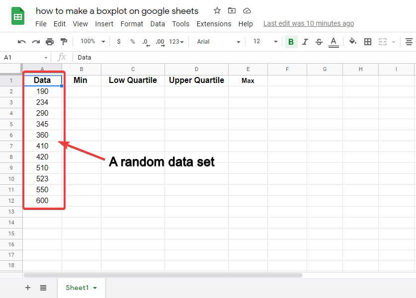
Generate a random dataset.
Step 2
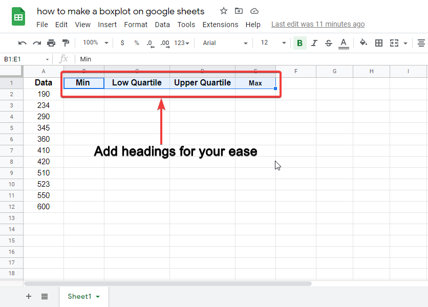
Write headings for the four values that we need to plot our boxplot.
Step 3
Add formulas and calculate the four values
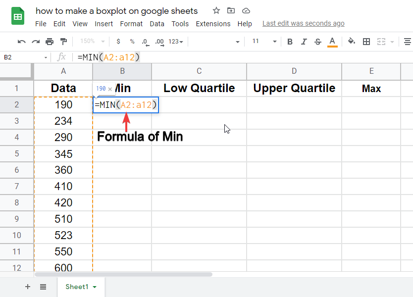
Calculate Min value using : =MIN(value1, [value2, …])
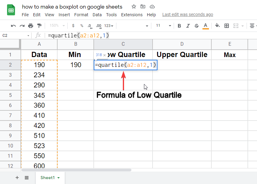
Calculate Low Quartile value using: =QUARTILE(data, quartile_number)
For Low quartile value, use quartile_number = 1
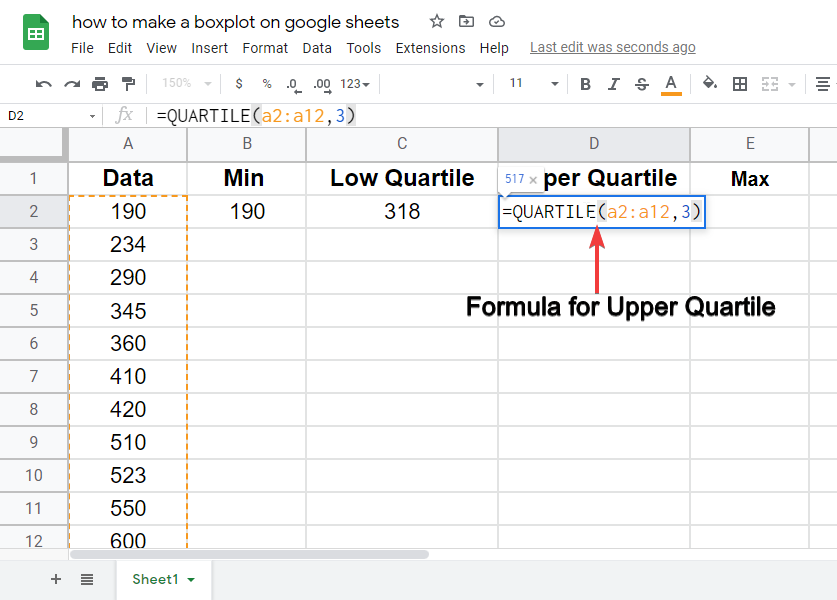
Calculate Upper Quartile value using: =QUARTILE(data, quartile_number)
For Upper quartile value, use quartile_number = 3
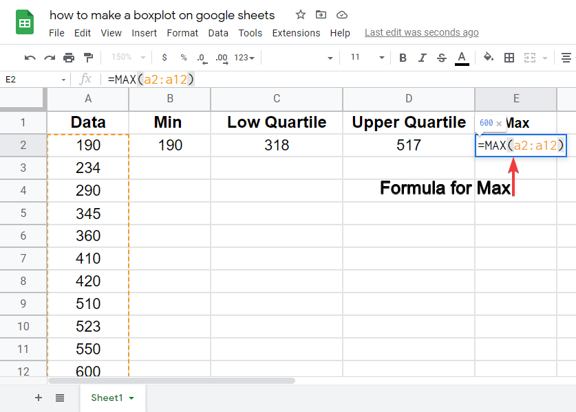
For max value calculation use the formula: =MAX(value1, [value2, …])
Step 4
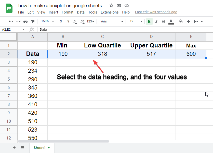
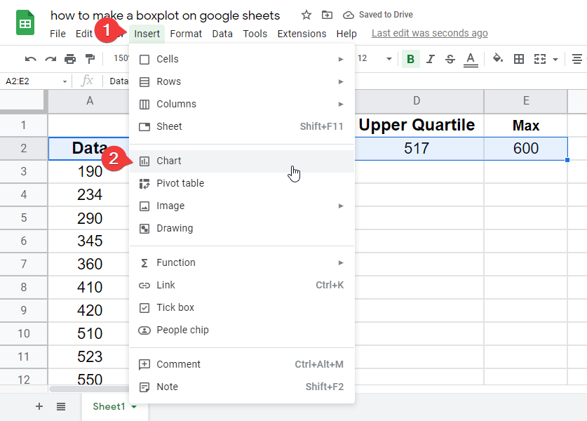
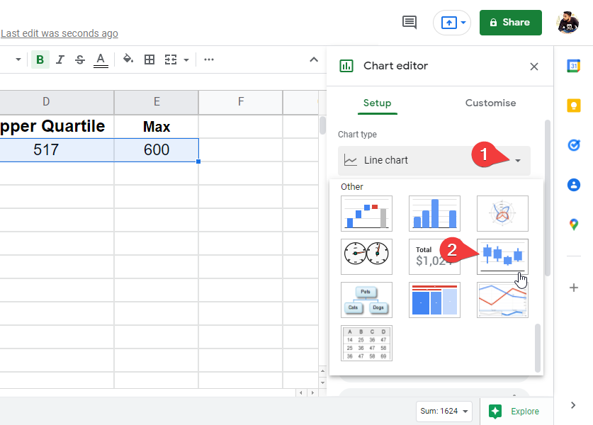
Now the data set is ready, Select the data values along with the data heading, then go to insert > chart > and find a candlestick chart. Click on it to insert.
Follow the instructions below.
Notes
- Using formulas, calculate the four values, defined in step 3.
- Select all four values along with the name of the data column. It’s required.
- For more than one data set, you will have to repeat all the steps for multiple data sets.
- You can use multiple data sets to represent their values in a single candlestick chart.
Conclusion
In this article, we learned how to make a boxplot in google sheets. We also learned about its need and when do we use it? So after this quick article, you will be able to answer; What is boxplot in google sheets? Why do we use it? What is the name of the chart we use to represent the data into a boxplot? What are the four required values for making a boxplot? What range should be selected to apply the candlestick chart on the dataset? So if you have any questions, please leave comments below, we answer all the comments. Also please don’t forget to share this quick article with your friends, and subscribe to the OfficeDemy blog for future updates.


